It’s a good time to consider making webinars part of your marketing strategy. Read best practices and see examples of webinar landing pages built in Unbounce.
It’s a good time to make webinars part of your marketing strategy. The digital event landscape has evolved dramatically in recent years, and webinars have cemented their place as a marketing powerhouse.
Let’s address the elephant in the room:
“Are webinars still relevant in 2025? Or have we all moved on to the next shiny marketing tactic?”
The short answer is, yes—webinars are not just still relevant, they’re thriving. And now’s the perfect time to double down on them.
Marketing departments have permanently shifted their approach to networking and lead generation. While in-person conferences and workshops have made a strong comeback, many companies have discovered the incredible ROI that virtual events deliver. The cost-efficiency, global reach, and scalability of webinars make them impossible to ignore.
Look at what’s happening right now: webinars are evolving at breakneck speed. We’re way beyond basic screen shares and slideshow presentations. Today’s virtual events feature interactive elements, AI-powered Q&A capabilities, and production values that rival professional broadcasts.
In this guide, we’ll explore how online events can transform your business and show you exactly how to create webinar landing pages that convert curious visitors into eager registrants.
What is a webinar landing page?
A webinar landing page is a dedicated web page designed to promote and provide essential information about an upcoming webinar event. It’s a platform where you can share details and encourage potential attendees to register for your event. Think of it as a digital poster of your event. (Ain’t no one got time to glue those things around town anymore.)
On a webinar signup landing page, you’ll find key information such as the date and time of the webinar, the topics that’ll be covered, the speakers or presenters, and any other logistical details like how to join the event. It’s essentially the digital hub where all the important information about the webinar exists.
Webinar landing pages have one main goal: to convert visitors into registered participants. To achieve this, webinar landing pages typically include a prominent call-to-action (CTA) button that encourages visitors to sign up or register for the webinar. This CTA is strategically placed to make it easy for interested individuals to take the next step and secure their spot in the event.
Valerio is a SaaS copywriter and content creator with a passion for tech and combat sports. Armed with a PhD.c in North Korean propaganda studies, he lives in Bangkok with his partner and his dog, who he tortures all day long with his tone-deaf singing. He wiles away his days playing story-driven open-world games, and reading comics and popular physics books. You can read more about him @ Copygun.com.
Banafshe is a writer and creator who loves long walks on the beach (kidding?). When she’s not selling you on her puns or her pop-culture analogies, she can be found at the busiest intersection in her city with her headphones. Which are totally not falling apart.
In addition to practical information and registration prompts, a well-designed webinar landing page can also incorporate visuals like images or videos related to the webinar’s topic or the speakers/presenters. Your webinar landing page’s content should be concise and engaging, providing a clear understanding of what attendees can expect from your webinar.
TLDR; a webinar landing page is a vital tool for marketing and promoting your online seminars. It’s a central hub of information to inform and entice your potential attendees to register for the event.
If you’re about to create a webinar landing page, congrats! You’re halfway to a successful and well-attended webinar.
Why do you need dedicated webinar landing pages?
A webinar landing page helps you consolidate your marketing efforts for your webinar. Rather than sending visitors to your already-filled-with-information website or your never-ending social media feed, a landing page specific to your webinar has tonsa’ benefits.
Focused information: A landing page provides a dedicated space to convey all essential details about your webinar. This includes the date, time, agenda, speakers, and registration process. By presenting this information in one place, you can make sure that your potential attendees have clear, concise, and easily accessible information that encourages them to secure a spot.
Conversion optimization: Landing pages are specifically designed for one primary purpose: conversion. This singular focus on conversion optimization significantly increases the likelihood of turning your interested visitors into registered participants. And who doesn’t want that?
Lead generation: Webinars are often used as a lead gen tool. Rather than getting your leads from scattered places, a webinar landing page allows you to capture valuable attendee information, such as names and email addresses, during the registration process (in a non-creepy way that’s respectful of your visitors’ data, of course.) This data becomes a valuable resource for your follow-up communication, nurturing leads, and building lasting relationships with potential customers. Rather than having a one-hit-webinar, you increase the chances for further audience engagement down the line.
How to create a webinar landing page that converts
If you’ve ever created a landing page, chances are creating a webinar landing page won’t be too different (and if you haven’t, well, we’ve got the detailed guide on how to create a landing page.)
Let’s break it down, and get that webinar on the road already.
Step 1: Get clear on your webinar landing page’s goal
Knowing your campaign goal for any landing page is key. In this case, you should pretty much just have one goal in mind: to get those virtual seats filled, baby.
Everything about your webinar landing page should be making it easy for your visitors to sign up for your webinar, plain and simple. You can of course have secondary goals you’re goin’ for (getting folks to sign up for your newsletter could be a good one, you could even kill two birds with one stone), but make sure they’re not overshadowing your main objective of filling up your webinar attendance to the brim.
Step 2: Write convincing, informative copy
Now that you know what you gotta do, it’s time to find the words to convince folks to attend your webinar series. Keep your main goal in mind, keep it simple, and keep it informative.
Remember that folks need to attend the webinar to learn about more details. Here are a few things you need to cover on your webinar landing page, while keepin’ it brief.
Content outline
For your webinar landing page, keep it short with an outline for introduction into what content you will be getting into for your webinar. Not too much, not too little.
Panel information
Webinars are hosted by real people. That’s something that really sets ‘em apart from, say, a blog (even though we think blogs are awesome too…) So it’s important to properly introduced the parties involved (hosts, moderators, guests, etc.). What are they bringing to the table, and how are they making this webinar awesome? Again, keep it brief.
Event information
When is your webinar? How long is it? What do people need to do to register? These are key pieces of information you need to cover on your webinar landing page, so your visitors can gauge their availability. You don’t want reserved seats goin’ to waste.
Step 3: Create your webinar landing page’s CTA
As we talked about, crafting your CTA for any landing page is one of the important steps. When it comes to webinar landing pages, your CTA should be straightforward and persuasive, leading visitors to register for your event. Anything from “Register now” to “Secure your spot” is fair game.
Step 4: Create your webinar landing page design
Even though copy is more important in convincing folks to take action on landing pages, the visual element can’t go ignored. Make sure your webinar landing page draws inspiration from your webinar’s topic and is also a solid representation of your brand. As you’re leading visitors from one branded experience (webinar landing page) to the next (the webinar itself) it’s important to set yourself (and your event) up for success by being consistent.
What can a webinar do for my business?
It’s no secret that savvy marketers and businesses love running webinars. After all, they can be an easy way to achieve multiple goals:
Webinars can help fill your funnel and generate more leads—and fast. If you’re a techy, you can automate this process too, saving you even more time. (For a concrete example, see how Thinkific took advantage of the Unbounce integration with ActiveCampaign to secure thousands of leads on autopilot for an online summit.)
Webinars give you a platform to educate your customers, build stronger bonds, and boost product engagement. An easy way to do this is to demo your product live and use it to execute the key points you’ve covered.
By educating your customers, you’re establishing authority and brand expertise. According to 99firms, “92% of attendees expect a live Q&A session at the end of the webinar.” That’s right: they expect it. They actually want you to teach them something. To demo something that might improve their lives. To sell them something that might give them value. They’re inviting you to build closer relationships and engage with them.
You’re networking and making yourself look smart via your guests’ expertise, boosting your own authority. It’s called the Halo effect. When you bring on stellar guests, their best qualities reflect onto you. Plus, your guests’ target audiences get to learn about you. Talk about a quick and easy way to expand your reach.
Affiliates and potential partners might approach you if they see an opportunity. Finally, offering to run webinars together can be a powerful incentive for partnering up, especially if you can offer the resources, know-how, and network to do it well.
When done right, webinars are an easy way to cover every stage of your funnel. With all that upside, we’re shocked more companies aren’t running online events. (How about a Netflix model? We’d tune in.)
The role of landing pages in webinar promotion
You can be the William Shakespeare of webinars, delivering brilliance, entertainment, and wisdom in one perfect package. Without a half-decent landing page to score some signups, though? Well, you’d be lucky to draw a crowd of crickets.
That’s why promoting your webinars is so important. If you have seats to fill, you’ve got three options:
You can build a stripped-down registration page that’s easy to set up but doesn’t really convince people to convert. Too often, these pages have lengthy forms with so many unnecessary fields, you might as well be filling out a tax form. You also have no ability to A/B test them.
You can get your web devs and designers together to create something with tons of visual appeal—but this option takes a lot of time and money that you may not have right now. (Totally understandable if you’re trying to get up and running quickly.)
You can use landing pages to help you avoid both these problems. Webinar landing pages can be a better option when it comes to running time-sensitive campaigns because you can literally set one up and get running in minutes. And if you’re a believer in wowing your target audience with beautiful design, creating one is still very easy, because you can use templates that have already been tested in the wild.
When it comes to landing pages for webinar registration, you could fill an encyclopedia with all the best practices out there. To get you started sooner, let’s stick to the few established and actionable practices that’ll reap some of the greatest rewards.
1. Before you can create a compelling landing page, you need a strong topic.
Choose a topic that grabs your audience’s attention. Ideally, it should be contemporary, relevant to the problems they face, and very actionable. Once the webinar is over, your audience should be left energized, since the next steps will be crystal clear.
2. Invite a guest to connect with new audiences.
Sure, you can rely on your star power to draw a small crowd. But that’s not getting the best bang for your buck. What’s an event if you show up all by your lonesome?
One amazing way to multiply your reach is by leveraging your guests’ audiences. Keep in mind, these people aren’t a cold audience either. They’re already warmed up because you’re working with someone they already trust. That means they’re more likely to buy from you.
Plus, if your guest is selling a complementary product or service, this could lead to some profitable partnerships, with many cross-selling opportunities to follow. (Imagine, for instance, an ice cream vendor teaming up with a company that makes nothing but ice cream cones. Brilliant.)
3. Get the most out of your webinar efforts by following up with your registrants.
Send them promotional material before and after they’ve signed up. With their permission, you can continue to nurture them by sending valuable (as in relevant and helpful) content once in a while—and keep strengthening your brand authority while you’re at it.
4. Don’t treat your webinar like a one-and-done.
What if—for some oddball reason—you host your event just once? Does that mean you can only send traffic to it for a single campaign?
Not a chance. Simply continue to run cold traffic to your webinar landing page, where your target audience will sign up for the recording with enthusiasm. Though they can’t ask questions, they also don’t have to wait for a specific time to watch. (Below, we’ll show you a super-cool example of a signup landing page for a recorded webinar.)
5. Repurpose your webinars for other channels.
If you know a good video editor, ask them to slice and dice your webinars into little clips that feature your best highlights. Share these on social media, embed them in your blog, and use them in your ads to continue to drive traffic.
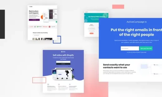
7 best webinar landing page examples to inspire your own
In this last section, we look at several landing pages that have performed particularly well by following the principles of conversion-centered design.
Built using Unbounce, these examples are some of the best webinar landing pages we’ve seen across many industries. (We’ve kept conversion rates private, but all the pages here convert between 9% and 50%.)
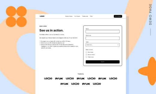
1. Tailwind
Image courtesy of Tailwind. (Click to see the whole thing.)
Tailwind’s webinar signup page has got to be one of our favorites. Talk about getting so many things right.
The visuals immediately grab your attention, along with the clear copy and smart use of social proof. But it’s also an excellent example of the congruence principle of conversion design, since all the elements on the page are in alignment, driving toward a single goal.
Let’s start with the attention ratio, which is the number of things your visitor can do on a page versus the number of things you want them to do. The attention ratio here is a beautiful 1:1. Notice that there isn’t a menu or other external links, and all the CTA buttons all serve the same conversion goal.
Did we forget to mention there’s no intimidating contact form in sight? You’ve got to click on the button to pull it up. The contact form asks for your “best” email. (We wouldn’t blame you if you thought this is a tad simplistic, but it does tickle our fancy.)
Finally, the drop-down menu on the form segments subscribers based on their specified needs. Talk about keeping things simple yet elegant.
Tailwind also does a fantastic job of presenting their guest, a proven and well-known authority in her space. In fact, we can’t tell what Tailwind is about simply by looking at the landing page. That’s because the focus is entirely on what the target audience is going to get. Not a word about the business just yet. (No hard sell.)
And that’s how it’s done. 😘👌
2. Wix
Image courtesy of Ruby. (Click to see the whole thing.)
We all know that Wix knows what they’re doin’ when it comes to websites, but it turns out they got some landing page game too. Wix’s SEO Hub is where Wix leans into SEO strategies and shares them with a more specialized audience.
What caught our eye about this particular webinar landing page is the pure simplicity of it. Wix provides you with the exact right amount of information here, with no gimmicks involved. Sometimes a short summary of what will be covered in the webinar, along with the date and time, the hosts’ bios, and a solid CTA is all you really need.
Though Wix keeps it simple with this webinar landing page, we liked the amount of space that’s dedicated to the hosts’ bios. It adds a feeling of credibility which can help you make the call to join the webinar if you’re feelin’ unsure.
3. Bandzoogle
Image courtesy of Bandzoogle. (Click to see the whole thing.)
This straightforward landing page from Bandzoogle is a fantastic example of clarity. The headline uses a proven copywriting formula: “How to do X without Y”. It works because it promises to teach you something while removing a traditional barrier.
You have to love the body copy too. It’s simple, straight to the point, and opens by hitting on a major pain point shared by many musicians: the frustrations of booking a tour.
The bullet points below are also worth closer scrutiny. Each one is 100% focused on the target audience and doesn’t beat around the bush, with zero fluff. It’s clear no copywriter is showing off here.
Then there’s email capture text. It informs the target audience that the webinar has already been recorded. Sure, this statement might catch them off-guard, but we’ll bet you the target audience appreciates the honesty and will trust you more in the longer term. (Besides, the information is still relevant.)
And their contact form? You can’t even call it that. It’s only asking for your email. And note how they weave their privacy policy into the fine print underneath. Brilliant.
If you thought short-form landing pages couldn’t do it all, one quick look at Libris’ landing page will change your mind. Libris understands that motion, more than anything, is the very first thing that captures the attention of the human eye.
But the footage isn’t showing any random attention-grabbing event. It’s a clip of two football teams walking out into the field. (Remember “sports”? That thing we used to do outside?) The focus though rests on the attendees holding up their cameras and phones to capture the event, not the actual event itself.
The powerful copy reinforces this concept throughout the landing page. What makes it effective is its focus on “you” from beginning to end, keeping it simple and hyper-relevant to the target audience.
But our favorite part about this? It’s the chatbot in the bottom corner that pops the question, “You hungry?” How could you not be tempted to answer that? (And, yes, we are hungry.)
This landing page for a weekly webinar scores leads and signups for Vyond on autopilot. (Sweet.) The headline is pretty clear, and the primary brand color is immediately recognizable by the target audience.
The 44-second video builds trust by introducing a human face, Vyond’s customer success training manager. But it quickly moves past the intro to display some striking visuals that showcase the Vyond app, as well as its ease of use.
The main CTA is “Register for the Webinar”, but there are two anchor CTAs, one sitting on each side, which both ensure that the reader stays on-page.
It’s good, but as with any landing page, a healthy mindset is to “Always Be Testing.” With #ABT in mind, you could try switching up a couple of things here: we’d recommend A/B testing against a shorter-form variant, and using Smart Traffic to see how the page performs with fewer fields.
6. Hubspot
Image courtesy of Ruby. (Click to see the whole thing.)
There’s a lot we love about Hubspot, and this webinar series landing page just made us love ‘em more. Hubspot’s landing page for their advertising webinar series gets lots of brownie points for using multimedia elements. With engaging video content playing, this webinar landing page foreshadows some quality content comin’ your way in this webinar series. Hubspot’s webinar landing page is a great example of leaning into the visual experience of your page. While copy is important—and this landing page provides all the necessary information in bite-sized copy—a creatively designed landing page can take you a long way.
7. Unbounce
We hate to brag, but this last one ticks all the boxes. Yes, it’s a webinar registration landing page by Unbounce, but that doesn’t mean we can’t be impartial.
Click to see real thing (opens in a new tab).
Just look at that landing page design. This page is oozing confidence. It’s simply here to get you ready to consume a whole jumbo 14-pack of knowledge bombs in a single webinar.
Then comes the promise of what you’ll gain by catching the webinar. How to navigate the Unbounce platform? How to choose a template and create your first page? Sign us up already. These tidbits help showcase the amount of value folks are gonna get from this webinar.
This Unbounce webinar landing page keeps it quick and gives you the bare-bones information you need, plus access to previous recordings to the webinar if you can’t make it to one live. How nice.
Using Unbounce to set up your webinar landing page
Do you remember the first landing pages you tried to build by hand? We wouldn’t blame you if you still wake up in cold sweats. If only you knew about Unbounce then. Using it to get your webinar landing page up and running is easy.
To get started, just pick a landing page template from the hundreds available. (Be sure to check out the advanced filters.) Tweak it to match your email or ad campaign if you’ve already got one running, or build the whole thing from the ground up.
Then, drag and drop and adjust to your heart’s content, all without having to write a single line of code. (But if you really need to scratch your coding itch, you always have the option of inserting custom code to fit your needs.)
Once you’re happy with your template, you can duplicate it to set up a variantor two to automatically optimize it with Smart Traffic.
And you’re all set. (Really. No more nightmares.)
SUBSCRIBE
Don’t miss out on the latest industry trends, best practices, and insider tips for your marketing campaigns
To get started, just pick a landing page template from the hundreds available. (Be sure to check out the advanced filters.) Tweak it to match your email or ad campaign if you’ve already got one running, or build the whole thing from the ground up.
Then, drag and drop and adjust to your heart’s content, all without having to write a single line of code. (But if you really need to scratch your coding itch, you always have the option of inserting custom code to fit your needs.)
Once you’re happy with your template, you can duplicate it to set up a variant or two to automatically optimize it with Smart Traffic.
And you’re all set. (Really. No more nightmares.)
Ready to answer the call (to action)?
Landing pages and webinars go together like french fries and ketchup. There are huge benefits of pairing them together to bring your events online and generate more leads and sales. If you’re convinced—heck, even if you’re not—why not start a free trial and try out one of the high-converting webinar landing pages in our template library?
Get actionable insights, expert advice, and practical tips that can help you create high-converting landing pages, improve your PPC campaigns, and grow your business online.