The only thing better than the energy of a live event? The excitement you feel before you go.
As an event marketer, your job is to inspire that feeling in potential attendees—and then turn it into action (e.g., ticket sales and registrations).
Whether you’re promoting a conference, show, activity, or even a webinar, the rules are the same: If you can create a certain level of antici—wait for it—pation for an upcoming event, you’re golden.
While building excitement for future events is easier said than done, building an awesome event landing page can help you do just that. With the right message and conversion-focused call to action (CTA), your event landing page can take visitors from “That looks kinda neat” to “I can’t miss out on this!”
What is an event landing page?
Before we go any further, let’s make sure we’re all on the same (landing?) page: So what exactly is an event landing page?
In general, a landing page is a page that visitors “land” on after they’ve clicked through from an online ad, tapped on a social media post, or entered the URL from a paper poster you taped up on the neighborhood lampposts (hey, whatever works!). A good landing page should be laser-focused on just one single goal: Getting the visitors to take the action you want them to take.
When it comes to events, that action could include buying tickets, registering, providing their contact info, or subscribing to your newsletters about the event.
Basically, you can think of an event landing page as your event’s personal billboard. It’s a special webpage dedicated solely to your virtual event, be it a webinar, an online workshop, or even a live-streamed concert. This page is where you roll out the digital red carpet for your event, showcasing all the juicy details—who, what, when, and the all-important why—in a way that’s as engaging as a chat with an old friend.
Emily is a freelance writer and content marketer from Toronto. She helps tech companies and startups develop awesome content for their blogs, websites, and social media. When she’s not writing or thinking about writing, Emily can be found chilling on her yoga mat, loitering in bookstores, or exploring the city with her super cute (and super spoiled) corgi, Wilbert.
Paul is a writer on Unbounce’s content team who lives and breathes storytelling. (It’s like oxygen but with better plotlines!) Ask him what he’s up to at any given moment and you’ll get answers ranging from folding paper dragons (y’know, origami) to catching up on the latest cool tech, and finding other ways to channel his inner geek.
Maybe you’re still wondering, “Should I bother with event landing pages?” The short answer is yes, yes you should (and with the right landing page templates, it’s no bother at all).
Here’s why: Event landing pages are the best way to drive ticket sales and registrations.
There are two main types of event landing pages:
Event registration landing pages that get visitors to sign up for an event. For free events, registration pages are designed to drive signups and reservations; for paid events, these pages are designed to sell tickets.
Lead gen landing pages where visitors can ask to receive more details. These pages are designed to build interest and capture contact information (typically an email address so you can contact them closer to the event date or once tickets go on sale, for example).
In either case, an event landing page can support your conversion goal better than a page on your website or a third-party listing. While the latter can easily get bogged down with irrelevant details and competing calls to action, a dedicated event landing page is built to do one thing: convert. Creating one helps you target specific segments and focus on messaging that gets them to RSVP.
QUICK TIP
Your next event landing page doesn’t need to take days to build. Whether you’re running an in-person event, a virtual conference, or anything in between—there’s a template ready to help you get there faster.
Unbounce has 100+ templates designed specifically for different campaign types. Just pick one, make it yours, and skip the whole “blank page” problem.
You can even filter the templates library down to only show you event landing pages. Give it a try!
What should be included on an event landing page?
Not all event landing pages are created equal—some are below par while others are so good they make fellow marketers jealous. If you want your page to be one of those really effective ones that tends to be used as examples in blog posts (like the one you’re reading now), make sure you include these elements:
The organizers
That’s you! Pull back the curtain and show your audience who you are, why you’re doing this, and what you stand for. This not only adds a dash of credibility but also lets attendees know who to high-five for organizing such a fantastic event.
Event topic and agenda
Dish out the juicy details and let people know what the event is about. Whether it’s a tech conference or a virtual salsa dancing class, make the subject sparkle. Bonus points if you can include the agenda, so guests will know what to expect throughout the event.
Time, date, and location
This is a no-brainer, especially if you actually want people to, y’know, show up. Make the time, date, and location stand out like a neon sign. If it’s an in-person event, provide all the details attendees will need to know to make their way to the event and get properly set up, including transportation, parking, and hotel accommodations if needed.
Speaker details
Your speakers are the stars of the show, so shine the spotlight on them and provide photos and details about their credentials and what they’re going to talk about. If you don’t have all the speaker details yet, no sweat—you can list speakers from previous events to give potential attendees a sense of who tends to speak at your events and what type of content they usually share.
Sponsors
Don’t forget to give a hat tip to your sponsors. They’re the silent heroes making the event possible, kind of like the roadies at a rock concert. A little logo parade can do the trick.
Strong CTA
The call to action (CTA) represents that crucial step you want visitors to take on your event landing page. It’s important to include only one CTA (or multiple CTAs that all link to the same destination) so you don’t end up splitting your reader’s focus and reducing conversion rates. Try using CTA copy and design that grabs attention and feels irresistible—something like “Get tickets for this can’t-miss event”.
Easy registration
Make signing up as easy as ordering pizza. A simple form, a few clicks, and voilà—they’re in! The less hassle, the more sign-ups.
Social media sharing
Add those nifty social share buttons. Make spreading the word about your event as easy as sharing a meme. It’s like giving your guests digital confetti to throw around on their socials.
Event landing page best practices that convert
Simply having event landing pages isn’t enough to guarantee conversions. But if you follow these event landing page design guidelines, you can use your landing pages to make a better first impression and motivate attendees to RSVP.
Here are the main event landing page best practices to keep in mind when designing your own:
Before the event
If you’ve ever organized an event before, you know there’s a lot of work that goes into the event months before it actually happens. It’s like they say: It can take a long time to become an overnight success.
Focus on a single conversion goal
Like all landing pages, pages for your events should be built around one call to action: getting attendees to register. Everything from the headline to the design to the event details provided should support this goal.
Target specific types of attendees
A major advantage of event landing pages is that you can use multiple variants to target specific types of attendees. For example, if you’re promoting a marketing conference, you might create a unique landing page to target founders specifically.
Give folks something to look forward to
Your landing page should layer on elements of FOMO and can’t-miss excitement to make visitors itch to attend. Maybe you offer a sneak peek of the upcoming speaker lineup or a fun recap of last year’s event. You could also include quotes from past attendees or photos and video clips of standout moments from a recent show.
Start capturing leads
For the months leading up to the big day, your event landing page is the perfect tool for gathering leads. Use it to collect email addresses from interested prospects, and give them updates along the way that will help convince them to get a ticket.
During the event
When the big day has arrived, your event landing page can play a different, yet still vital role.
Transform prospects into customers
An event isn’t just about delighting, networking, and creating buzz. At the end of the day, you want to make it as easy as possible for people to sign up for your product. Guess what? Your landing page is perfect for that.
You can create an attendee-specific landing page to incentivize people to sign up for your service or product. An exclusive “attendee-only” discount can add some extra incentive, and be sure to share the landing page URL and promo code wherever you can.
After the event
The event is over, so now you can breathe! But don’t forget, your event landing page can still serve some useful purposes.
Provide a recap
Everybody loves to reminisce about fun times, so make it easy for attendees to remember just how awesome your event was. Highlight videos and photos, social media comments, and summaries are just a few ways you can help attendees remember the amazing value they got out of the event (and maybe make non-attendees just a teensy bit jealous that they didn’t go?).
This could also be the perfect opportunity to drop some hints about next year’s event.
Lead generation
For those who couldn’t go to the event, or attendees who want to refresh their memories, providing gated content is a great way to generate leads. Simply by forking over their email, they can access all the wonderful material presented and captured during the event, while you get to expand your list of contacts and leads.
QUICK TIP
Some landing page builders set caps on the number of pages you can build. This makes it tough (or expensive) to build customized pages for your event. Sign up, confirmation, recap, recordings—all could count against your limits.
With Unbounce, there’s no cap.
You can build unlimited landing pages on any Unbounce plan. So for every event you run, you can build custom landing pages for the signup process, recaps, looking ahead to next year, etc.
That means if you reeeeally wanted to, you could build individual pages for every single speaker recording from a conference—no extra cost required.
Looking for a bit of event landing page inspiration? We picked these event page examples because they embody many of the principles described above. We hope you learn a thing or two about event landing page design that you can use to promote your next event.
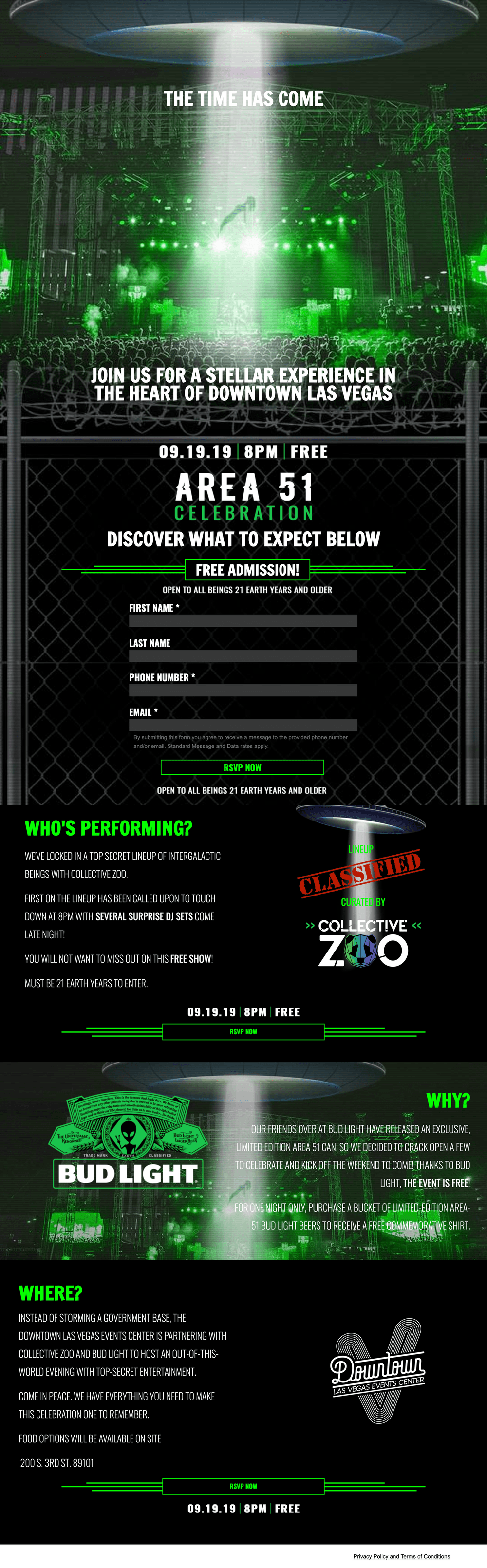
Image courtesy of Collective Zoo. Click to see the full thing.
Cerebro Marketing created this page for Collective Zoo to promote a UFO-themed concert. When people from all over America were planning to storm Area 51, this conference landing page redirected some of that hype to a free event in downtown Las Vegas.
We love that the language is totally on theme (“Discover what to expect below”) and they carry the concept through to the event details with a “classified” lineup. Plus, if you step back to reflect on the overall design, you’ll notice how much this page looks like an actual event poster you might see plastered to a street pole.
The main takeaway from this event landing page:
Your event landing page is a preview of your live event. If it’s boring or dull, people will assume your event will be, too. That’s obviously not the case, so it’s important to create an event landing page that sets the right tone. Your landing page copy and landing page design should reflect what your attendees can expect and make it impossible for them to resist signing up.
2. Artist Project Contemporary Art Fair exhibition landing page
Image courtesy of Artist Project. Click to see the full thing.
Artist Project launched this exhibition landing page to sell tickets for the Contemporary Art Fair, which ran in February 2020. The page creates a sense of FOMO and urgency to encourage guests to get tickets for the opening night party. With an action-oriented heading “Don’t Miss Toronto’s Most Exciting Art Fair!” and a time-limited offer to save 20%, the message is clear: if you want in on this, take action now.
To drum up interest in an art fair, your design needs to be on point. You can’t promote an art show without, well, showing some art. This landing page does a terrific job showcasing a range of artists and mediums to highlight the diversity featured in the fair. From mixed media reflections on war to vibrant social commentary in the form of collage, it’s clear that a huge variety of art and talent was in attendance.
In addition to previewing showcases, we also love that there are featured highlights from previous years. If you’ve been running an event for multiple years, use photos of past excitement to encourage visitors to get in on the fun.
The main takeaway from this event landing page:
Make a point to weave the heart of your event into your landing page design and copy. Use visuals to tell the story of your event and use CTA-focused copy to turn interest into action.
3. Thinkific conference landing page
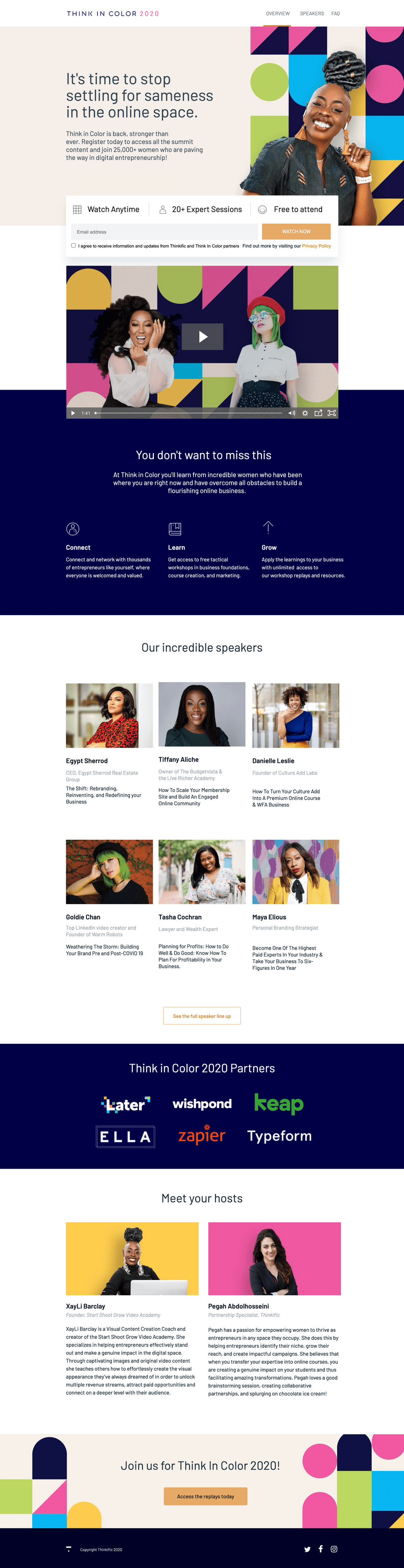
Image courtesy of Thinkific. Click to see the full thing.
We’ve all heard some variation of the marketing adage: “When you speak to everyone, you speak to no one.” Well, in this example, Thinkific does a great job of speaking to one specific demographic: women entrepreneurs in the digital space. More importantly, Thinkific highlights how the free virtual summit, Think in Color 2020, caters to this particular audience.
The images and video are particularly powerful because they show attendees that the speakers are diverse, young, intelligent women who are excited to share their industry knowledge and lift other women up.
Combined with inclusive messaging (“stop settling for sameness in the online space”) and an emphasis on the unique challenges that women face in building an online business, this landing page gives attendees plenty of incentive to get in on the action.
The main takeaway from this event landing page:
When designing a registration form, remember that less is often more. Remove potential barriers by keeping forms short and sweet. Only ask for the essential details needed to get attendees on the list and make sharing additional info optional.
4. Paint Cabin event landing page
Image courtesy of Paint Cabin. Click to see the full thing.
Created by agency Disruptive Advertising, this event landing page focuses on Paint Cabin’s virtual paint nights. The concept of this event is simple yet innovative: You can attend a live paint night from the comfort of your own home. This might sound counterintuitive at first, but the landing page fills in all the blanks before you have a chance to ask, “How does that work?”
We love the energetic headline and color contrast. “Create! Drink! Repeat!” is both descriptive and fun, and paints a clear picture of what the event is all about. The design is engaging in the way a paint night should be.
Plus, the content plays into attendees’ sense of FOMO, urging them not to “miss a thing” by “book[ing] now.” By adapting to offer private streaming as part of this “stay at home series,” Paint Cabin creates a hybrid live-virtual event to fit the times—and this example gives guests hope that they can enjoy a favorite activity no matter where they’re located.
The main takeaway from this event landing page:
Video content can be a great addition to your landing pages. Whether it’s a montage of clips from past events, a recap of last year’s convention, or a promotional video for an upcoming headliner, videos make a huge impact without taking up a ton of space on your page. Use videos to help returning guests relive the magic and give first-timers a sneak peek of what’s to come.
Editor’s note (if you’re reading this in 2023 and beyond): Although adding video was considered best practice a couple years ago, recent data shows that video on landing pages doesn’t have a huge impact on conversions. In some cases, it may even make people bounce. Yikes!
5. FraudBuzz webinar landing page
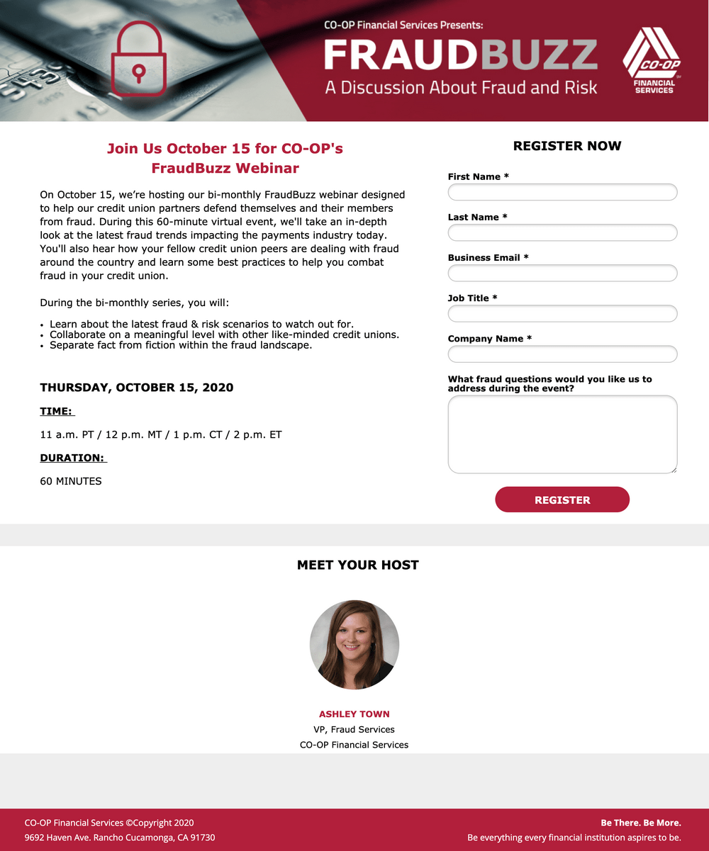
Image courtesy of Co-Op Solutions. Click to see a bigger version.
At first glance, this page comes across as fairly simple (especially in comparison to the last few examples listed above). But that’s not a bad thing. On the contrary, the clean, no-frills design sets just the right tone for the topic at hand: fraud protection and prevention.
Co-Op Financial Services created this landing page to drive registrations for its monthly webinar series, FraudBuzz. It’s short and concise, but also informative enough to do the trick.
In fact, it answers just about every question attendees might have before signing up, including:
Who? “Meet your host”
What is it? A live webinar discussion about fraud and risk.
Where and when? Presented online, with the date, time, and duration listed.
Why? “During the bi-monthly series, you will learn about…”
How to attend? Fill out the form, which is conveniently visible above the fold.
The main takeaway from this event landing page:
Your event landing page doesn’t need to be long to be helpful, and it doesn’t need to be flashy to get your message across. By providing key details and the right amount of context for whatever event you’re hosting—whether that’s a quick overview or an in-depth agenda—you can ensure your page appeals to the right type of attendees.
6. Shoelace event landing page
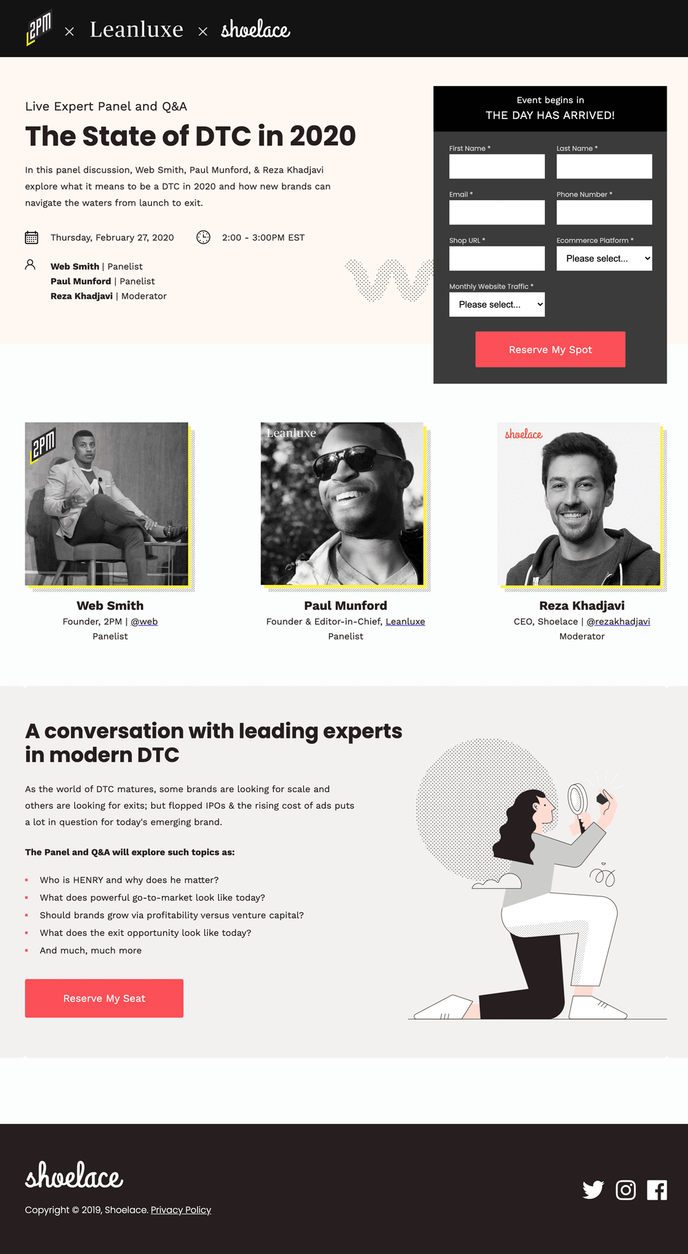
Image courtesy of Shoelace. Click to see the full thing.
The retargeting pros over at Shoelace built this event landing page for a webinar hosted earlier this year. They knocked it out of the park by telling attendees exactly what to expect—including who, what, where, when, and how to sign up.
First off, the heading and introductory blurb provide valuable context about the topic itself. Next, core details about the event, like the date, time, and duration, are laid out, and the panel members are listed.
And that’s all happening above the fold.
As you scroll down the page, you’re greeted with images of the panelists and moderator, along with their titles and companies. For those who dig deeper for more info, Shoelace delivers punchy, informative bullet points that elaborate on the topics being discussed.
The main takeaway from this event landing page:
Use your event landing pages to highlight some of the value attendees get from your event. If the main event is your speakers’ expertise, for example, make a point of introducing who they are and what they do. As you can see in the example above, including panelists’ pictures, titles, and companies is a good place to start.
7. Adobe Summit conference landing page
Image courtesy of Adobe Summit. Click to see the full thing.
As you’d expect from Adobe, a company that specializes in visual design tools, this conference landing page features a sleek, modern design. The visual motif includes a design that looks almost like flowing glass with touches of brilliant color and has an airy, inspirational feel.
As you scroll down the page you’re presented with a row of large, striking images that showcases their stellar lineup of speakers. Further down the page you see more images highlighting the main benefits of attending the conference, as well as photos from previous events.
The main takeaway from this event landing page:
The page’s design is clean, bold, and uncluttered, making it easy to absorb all of the essential details and get a good feel for what an attendee can expect at this industry-leading conference. A landing page’s design can convey a lot of information about your brand and event, even before the visitor reads any copy.
Image courtesy of tubics. Click to see the full thing.
Conference landing pages aren’t novels or even long blog posts—they’re not designed to keep visitors reading for looooong periods of time. Instead, most visitors want to land on the page, quickly get the info they need, (hopefully) select the CTA, then move on.
This event landing page from tubics is deliberately designed to encourage a quick, yet practical visiting experience. All of the headers are large and bold, making them easy to read (and hard to ignore), and the copy sprinkled throughout the page is brief and straightforward.
Even the welcome video located just below the fold is short, only 48 seconds long, and features a quick, snappy pace.
Further down the page tubics has listed the two tiers of ticket pricing, using short bullet points to describe what you get for each tier’s price.
The main takeaway from this event landing page:
Don’t make your visitors work hard to find the details they’re looking for. Present your event’s info in a way that’s easy to find and digest, and your audience will be more likely to reward you with a click on your CTA button.
How to create an event landing page
At this point you’re probably rarin’ to start building the event landing page that’s going to help your event be a colossal success. Here’s how to make it happen:
Review best practices
Up above we covered a bunch of guidelines that should be included in any event landing page that’s going to make your event shine. Feel free to refresh your memory so you don’t forget any essential elements.
Choose the right landing page builder for your event pages
Sure, we may be a little bit biased, but we think our two landing page builder tools are pretty darned nifty. (And based on how many organizations are using these tools, lots of others like ‘em too.)
Classic Builder: the designer’s dream
Craving the freedom to craft your pages down to the last pixel? Meet Classic Builder. It’s like the Swiss Army knife of landing page tools, offering complete control over design, plus the nifty option to tinker with code and scripts.
Start with our crowd-pleasing event landing page templates, then use the intuitive drag-and-drop interface to tailor every element to your brand’s heart’s content. Compatibility? No worries—Classic Builder meshes seamlessly with nearly all marketing automation or CRM tools out there. And for an extra kick, there’s Zapier, linking you to over 1,000 other tools.
Smart Builder: The AI wizard
Now, if you’re more about speed and efficiency than diving into design details, let our AI landing page builder Smart Builder be your guide. Picture assembling stunning, high-converting landing pages in just minutes—it’s almost like having a design wizard at your fingertips.
Smart Builder is your go-to when your priority is rolling out visually striking pages primed for conversions, minus the deep dive into design intricacies. Its user-friendly setup makes piecing together your page a breeze.
Design a feast for the eyes
Think of your landing page as an extension of the event venue—it needs to look the part. Go for a design that’s not just easy on the eyes but also aligns with your event’s theme. Whether it’s a sleek, professional seminar or a fun, vibrant music fest, make sure your design sets the mood right away. It’s like setting the table before a feast—make it inviting.
Not a designer? No worries, you can choose from hundreds of design templates and choose the one that best fits your event.
Write words that woo
Your copy is going to do a lot of the heavy lifting: attracting attention, conveying your brand’s tone, and providing the essential details. Craft headlines that ignite curiosity about the event and highlight the key purpose or benefit that attendees can enjoy. If you’re not wild about writing, no problem—with Smart Copy you’re just a few clicks away from filling the page with engaging, well-crafted content.
Mobile responsiveness
In today’s world, your guests are likely to RSVP from their phones, so your page better be as mobile-friendly as a food truck. Ensure that the same awesome experience is carried over to smaller screens.
Social proof
When we’re making a decision to buy something, whether it’s a restaurant meal or a new TV, it’s become standard practice to look up reviews to check other people’s thoughts and experiences. Inserting social proof testimonials to your event landing page serves a similar purpose by adding credibility to your event and showing people just what a blast the last one was. (Added bonus: A little FOMO might motivate people to hammer that CTA button.)
SUBSCRIBE
Don’t miss out on the latest industry trends, best practices, and insider tips for your marketing campaigns
A compelling CTA
Your call to action (CTA) is your final nudge to get those RSVPs rolling in. Use lively, enticing language like“Grab your spot!” or “Join the fun!” to make it as difficult as possible for your page visitors to just scroll by.
Test, tweak, and repeat
Hitting “Publish” is, alas, not the final step. Try out different designs, swap copy, and play around with CTAs. Just like finding the perfect party playlist, it might take a few tries to get everything just right. The goal is to keep testing and refining until your page is the talk of the digital town. See how landing page A/B testing works with Unbounce ->
Turn anticipation into action with event landing pages
We know how difficult and time-consuming it is to create event landing pages from scratch. If you hire outside devs to do the job, you might spend more than you’d like. Worse, building an event landing page from the ground up takes ages—and can prevent you from running campaigns with enough lead time before your event.
But you don’t need to worry about that since you’ve just finished reading this post and you now have everything you need to get started. So go ahead and start crafting the event landing pages that’ll help make your event a roaring success.
Get actionable insights, expert advice, and practical tips that can help you create high-converting landing pages, improve your PPC campaigns, and grow your business online.