When you sat down to design and develop the landing page for your website, how did you choose the colors? It’s most likely that you chose them based on your existing brand identity, or even on something as simple as what you thought looked best.
You may be interested to know that this isn’t how the most engaging landing pages are developed. Instead, successful online marketers use color theory to really make their landing page intentions clear.
What is Color Theory?
The importance of color theory is something that artists and designers have been aware of for a long time. Visual impact is greatly determined by color and colors combinations, and can even lead us to have different emotional responses.
Color theory is a wide topic, and one that has interested artists and scientists alike for centuries. Some of the earliest principles of the theory date back to 1435 when Italian renaissance man Leone Battista Alberti wrote;
“Through the mixing of colors infinite other colors are born, but there are only four true colors – as there are four elements – from which more and more other kinds of colors may be thus created. Red is the color of fire, blue of the air, green of the water, and of the earth grey and ash.”
Of course, later theorists including Leonardo De Vinci and Issac Newton proved that the three primary colors are actually red, yellow and blue.
Modern color theory was developed by American artist and teacher Albert Munsell in the late nineteenth/early twentieth century. Rather than the simplistic traditional adherence to the three historical primary colors, Munsell developed a new theory that emphasized the concepts of color space, including a framework of hue, value and chroma. Munsell’s theory incorporates key scientific findings from Helmnoltz, Maxwell and Hering. His three dimension color frameworks are fundamental to the psychological associations of color.
In the past few decades, a digital color theory has emerged. Theorists, designers and web developers have worked to investigate how color is translated and viewed via digital platforms.
How Does Color Theory Relate To Your Landing Pages?
In the digital age, color theory has become important to a much larger range of people. When consumers visit websites, they typically make up their mind within the first few seconds. This is why effective landing pages are so important for online success: if you can’t get the attention and trust of your site visitors straight away, you’re likely to lose them forever.
There are two specific ways that color theory relates to designing a successful landing page:
- Contrasting color combinations and readability
- Psychological color associations
Using these two methods and taking the time to really put some thought into the color combinations you choose for your landing page will help you to make choices based on what will be most effective, rather than making an arbitrary choice based on ‘what looks nice’.
Doing this will help you to engage visitors to your landing page in the first few seconds and significantly reduce your the bounce rate. It will also help you create effective calls-to-action and increase your sales.
What Do Your Color Choices Say To Your Visitors?
It’s important to take psychological color associations into account when you’re designing a landing page. If you don’t look into what the colors you’ve chosen mean, you may find that you’re passing on a message to your site visitors that you didn’t intend. Here’s a breakdown of some of the most popular color associations.
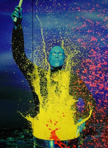
Blue stands for trustworthiness, loyalty and sincerity. It’s seen as an intellectual color that also has associations with communication, logic and coolness.
Yellow is seen as a youthful, optimistic color that grabs attention. It’s also associated with emotions, self esteem, creativity and friendliness.
Red is a very physical color which quickens the heart rate and promotes urgency. It stands for energy, courage, strength, excitement and defiance. Warmth is also a key association.
Green is often seen as the color of wealth. It’s a relaxing color which is the easiest one for the eyes to process. It promotes balance, health, refreshment and restoration, and is often associated with the environment.
Orange is an aggressive color that creates a call to action. It is associated with fun, warmth, passion and security.
Pink is generally seen as a romantic, feminine color. It stands for love, warmth, nurture, tranquility and sexuality.
Purple is a soothing color that has a spiritual element. It is associated with luxury, vision, quality and truth.
Black is a powerful color that exudes sleekness, sophistication and efficiency.
Now that you’ve learned some of the key associations of the most commonly used colors, it’s important to think about how you can use this knowledge to your advantage. Before you start to think about what colors will help your landing page to achieve its purpose, sit down and think about the associations that you want you site visitors to pick up on.
When you’ve finished making a list, take a look at the key qualities and decide which colors will best help to reflect them. These are the colors that you should be using in your landing page design. For example, if you’re hoping to promote trust, but also create a call to action, blue and orange might be the right color choices for you. If you want to hint at sophistication and femininity, pink and black would be good choices.
If you’re still not sure which colors have the associations you’re hoping to achieve, here’s a great trick. Mock up a couple of landing pages that are identical except for one thing; they use different colors. When you ask people for their opinions on the mock ups, and the message they get from each one, you’ll be amazed at how different the answers will be.
How Does Color Theory Help To Improve Readability?
It’s important to take color associations into account when designing your landing page, but it’s also vital to explore how readable your color choices are. Generally speaking, colors are more readable when they’re on a background that they have a large contrast with (for example, black on white).
A landing page will only be effective if your site visitors are able to understand what it’s saying quickly and easily. The best way to do this with color is to ensure that your text and background colors are complimentary, but contrasting.
An easy trick for finding contrasting colors is to use a color wheel. Color wheels are very important in color theory, and you’ll find lots of online tools available to help you make the most of them. This accessibility color wheel is a great place to get started and test out how readable and accessible your color choices are.
Examples of Landing Pages Made Effective By Color Theory
The more you learn about color theory, the more you’ll realize how often it’s used to share extra, almost subliminal, messages in advertising.
Take a look at the examples below to see color theory in action.
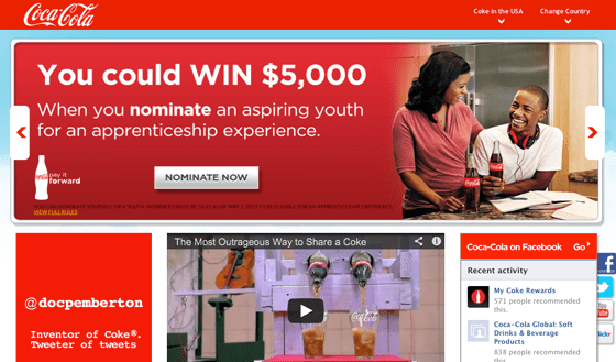
Coca Cola
Coca Cola is probably the most recognizable brand in the word. They’ve been using the classic combination of red and white for more than a hundred years, and it’s been a very successful color strategy. Not only do the colors have a great contrast, which ensures readability, the bright red shade also promotes Coca-Cola friendly qualities such as energy, courage, excitement and strength.
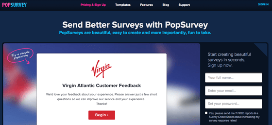
PopSurvey
PopSurvey’s landing page is predominantly blue and white. Like the Coca Cola example, this color combination is classic enough to mean that it’s easy to read, but bold enough to give off a strong brand association. When site visitors land on this predominantly blue page, they’re likely to instantly associate it with trustworthiness, logic and communication.
Apple
Apple makes a great impression with this very simple color combination. The contrast of black and white is the easiest for most people to read, and ensures that accessibility is not an issue. The crisp white background also clears the way for the black to take center stage, and subtly remind viewers of the Apple values of power, sleekness, sophistication and efficiency.
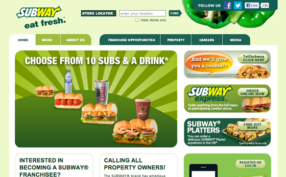
Subway
Subway predominantly use green to illustrate their landing page. As green is the color that’s easiest for the human eye to process, this site has no problems when it comes to readability. The color is also associated with health, balance and restoration, which are all key to Subway’s wider marketing messages.
When you’re designing a landing page, the possibilities for using color are almost endless. Used well, color can help you to seal the deal and turn site visitors into customers and/or subscribers. Used poorly, color can confuse the message you’re trying to promote and turn your site visitors away.
If you want to use color theory to your advantage, step away from arbitrary choices. Instead, choose your colors based on the two issues of readability and psychological association. This one little trick will help to reduce your bounce rate and make your landing pages far more engaging and successful.
