
Not all landing page videos are created equal.
Some are nausea inducing. Others, “heartbreaking works of staggering genius.” (A.k.a. they convert like wildfire.)
Consider the facts:
- Shoppers who view video are 174% more likely to purchase a product than non-video viewers.
- 52% say that watching a product video makes them more confident in their purchases.
- A well executed video on a landing page can increase conversion by as much as 80%.
And given how powerful video is in the online conversion process, “best practice” articles are everywhere…
But this is not one of them.
Instead, here is a list of worst practices. So you know what to avoid.
Why?
Because it’s easy to screw up your conversions with video and waste enormous amounts of time and money in the process.
With that in mind, let’s dive into six ways to make landing page videos that suck… and exactly what you should be doing instead.
1. Don’t educate
As stressed above, videos are one of the most effective tools to propel people toward that conversion.
But there’s a catch.
When Wyzowl surveyed over 230 companies for their State of Video Marketing 2016 study, 72% of respondents reported that video “improved the conversion rate of their website.” That’s up from 57% last year.
However, when those same companies were asked, “What is the primary reason you use video?” a mere 23% actually answered to “increase conversions.”
By a landslide, the number one reason was to “educate customers.” And though this finding applies to websites in general and not just landing pages, it does provide a key insight: A high-converting video is one that’s focused on meeting people’s real needs (i.e., educating them)… not on converting them.
The difference is subtle, but has huge implications. If your goal is to simply “get the click,” your video will reflect that. It’ll inevitably be about you and your product, you and your service, you and your email list, you and your social media account, you and your…
You get the idea.
If you want your landing page video to suck, then don’t educate your audience.
If you want it to shine, then teach your audience something valuable.
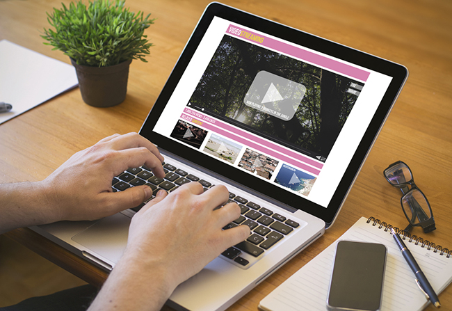
Sticker Mule, for instance, takes an educational approach with its video:

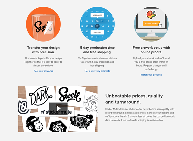
In less than a minute, Sticker Mule subtly creates demand by presenting its “transfer” stickers — also known as “vinyl-cut stickers or vinyl lettering” — as a medium for your most intricate designs.
Namely, Sticker Mule educates its audience about how “after one year of research and testing [its] developed a one-of-a-kind process” that not only reduces cost but makes application easy. As pointed out, you “Simply remove the backing, set it on the surface, rub it, and then slowly pull the transfer tape off to reveal your design.”
In other words, Sticker Mule teaches its audience exactly how to use the product, with an emphasis on simplicity and durability. And as Sticker Mule CEO Anthony Thomas told me, “After adding this video to our website, we saw our conversion rate go up by 17%.”
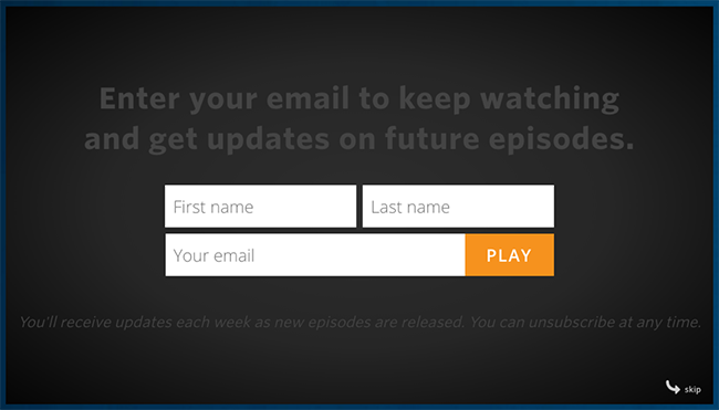
This same fundamental principle lies behind Unbounce’s new series, The Landing Page Sessions.

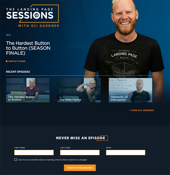
The videos are about how to use landing pages to capture leads… and not only is there a call to action on the page itself (“Send me new episodes”) but also the videos capture leads using Wistia’s Turnstile email collector. (I’ll say more about CTAs in point four.)
For now, here’s a snapshot of the latest numbers for The Landing Page Sessions:

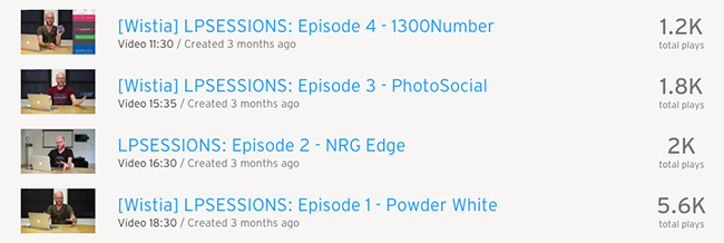
Even more impressive than views, however, are the conversions. When the first video was less than a month old, Wistia reported, “Thus far, with three released episodes, [the] campaign’s videos have received over 3,000 views and captured over 600 email addresses.”
2. Don’t make it simple
If you want your landing videos to suck, then go for complexity.
Complexity can take many shapes: technical complexity, messaging complexity, production complexity…
Consider telaFirm, the now out-of-business telephone verification service:
Notice the jargon-heavy language in response to the question, “How do I get started?”: “Verification is easy for you and your customer. telaFirm’s service is integrated into your existing website via a convenient, platform-independent API.”
In addition, instead of focusing on a single problem, a single solution and therefore a single call to action, the video attempts to pack an explanation of all telaFirm’s services into 2:22. For instance, at 1:28 they introduce “PhoneTrace,” and again rely on unnecessarily complex and technical language: “Another telaFirm advantage is the optional ability to detect and block VOIP numbers through our PhoneTrace solution …”
While initially seductive — especially if you’re going for depth — complexity is a conversion killer. It confuses, overwhelms, dilutes value and doesn’t give your audience a compelling reason to act.
The antidote is simplicity.
And this is true across the board. After surveying more than 7,000 consumers and interviewing hundreds of marketing executives and other experts globally, Harvard Business Review discovered that what makes consumers sticky — “that is, likely to follow through on an intended purchase, buy the product repeatedly, and recommend it to others” — is one common characteristic:
We looked at the impact on stickiness of more than 40 variables, including price, customers’ perceptions of a brand, and how often consumers interacted with the brand. The single biggest driver of stickiness, by far, was “decision simplicity” — the ease with which consumers can gather trustworthy information about a product and confidently and efficiently weigh their purchase options. What consumers want from marketers is, simply, simplicity.
The king of video simplicity is Dropbox. Here’s exactly what its first landing page looked like:

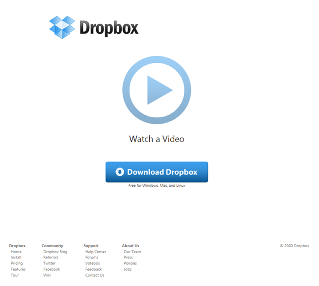
What’s more, the original explainer video used wasn’t fancy at all:
As TechCruch drove home back in 2011:
The video is banal, a simple three-minute demonstration of the technology as it is meant to work, but it was targeted at a community of technology early adopters … If you’re paying attention, you start to notice that the files he’s moving around are full of in-jokes and humorous references that were appreciated by this community of early adopters.
Drew [Houston, founder and CEO of Dropbox] recounted, “It drove hundreds of thousands of people to the website. Our beta waiting list went from 5,000 people to 75,000 people literally overnight. It totally blew us away.”
Fast forward to today and DropBox’s videos are still just as simple — if not more. Now its videos focus more on the customers and how the product itself can simplify their lives with organization, connectivity and storage.
In other words, where telaFirm focuses on the features, Dropbox zeroes in on the benefits.
But what if you have a particularly complex industry or product?
Don’t fret. Even complex ideas can be put into simple terms, especially if you use video.
Take Choozle’s video for example, whose advanced digital advertising tool is explained using simple imagery, focusing on the main benefits and — of course — starting with the pain point and addressing how the company resolves it.
To ensure your video keeps it simple, ask yourself:
- Am I zeroing in on the benefits rather than the features?
- If I do include features, is the language easy to understand for a complete outsider?
- Are there any technical terms that I need to explain… or cut entirely?
- Does my video center on one problem, one solution and one call to action?
3. Don’t tell a story
The worst thing to do is build your video around your product.
This is profoundly counterintuitive, especially when you consider the videos featured above. But, as Drew Houston explained regarding Dropbox:
To the casual observer, the Dropbox demo video looked like a normal product demonstration, but we put in about a dozen Easter eggs that were tailored for the Digg audience. References to Tay Zonday and ‘Chocolate Rain’ and allusions to Office Space and XKCD. It was a tongue-in-cheek nod to that crowd, and it kicked off a chain reaction. Within 24 hours, the video had more than 10,000 Diggs.
The point is that Dropbox’s landing page video had a host of connection points that resonated with the story its target audience already identified with. This is exactly why the Easter eggs worked. The references and allusions were tailored to reach the company’s target audience by calling subtle attention to the message: “Dropbox is just like you. We love the same things you love. Our story is your story.”
But, how do you create a compelling story when time is of the essence?
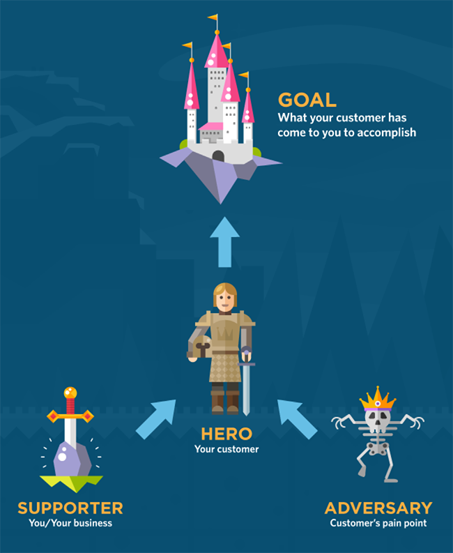
To create a compelling story, you need four ingredients: a goal, a hero, a problem and a supporter. The following graphic is a simplified version of what’s known as the Hero’s Journey or the Fairy Tale Model from Storytelling: Branding in Practice:

But what does this look like in an actual landing page video?
Take a look at GetResponse’s introduction to email marketing:
First, the goal or mission: In order to grow, online business need to “build and maintain relationships with people interested in its product or service.”
Second, the hero: The business owners themselves.
Third, the obstacle: Spending money to get visitors only to have them “scroll, click, leave, and never come back.” The video also includes two other common obstacles: lack of time and lack of expertise. However, every obstacle is framed as an obstacle to the original mission.
Fourth, the supporter: Notice that GetResponse is not the hero. Instead, the business owner is the protagonist (at the risk of sounding like a freshman English professor). GetResponse’s only role is to help guide the hero toward the solution, and that’s exactly how each feature is presented — not as an abstract function, but as a key benefit to move the hero toward the original goal.
4. Don’t have a compelling CTA
Compelling CTAs are the holy grail of landing pages… the same is true for video.
The truth is you can have the most educational, story-driven and downright enjoyable landing page video, but without a click-worthy CTA, it’s all for nothing.
To start, your video’s CTA should align not only with the content of the video itself, but also with the landing page. This doesn’t just mean being consistent. More importantly, it means being singular. Naturally, you can have more than one button. But make sure every button has the same driving outcome, and make it incredibly clear what you want the user to do is also at the top of the list.
This is where design principles come in, namely what Oli calls the attention ratio. He explains that an effective landing page should have one goal and just one way to get there. This increases the chances of your lead taking your desired action.
So, what’s this mean for your landing page video? Only give your audience one option. Eliminate all else.
You can use your videos as creative calls to action that promote your best content, guide leads along the buyer’s journey, gain subscribers, bring viewers to your website and even gather their contact information.
To do this, there are essentially two approaches available: off-video CTA and in-video CTA.
Off-video CTA
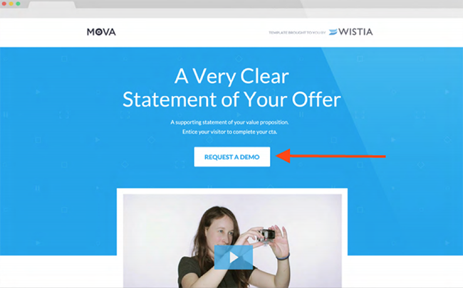
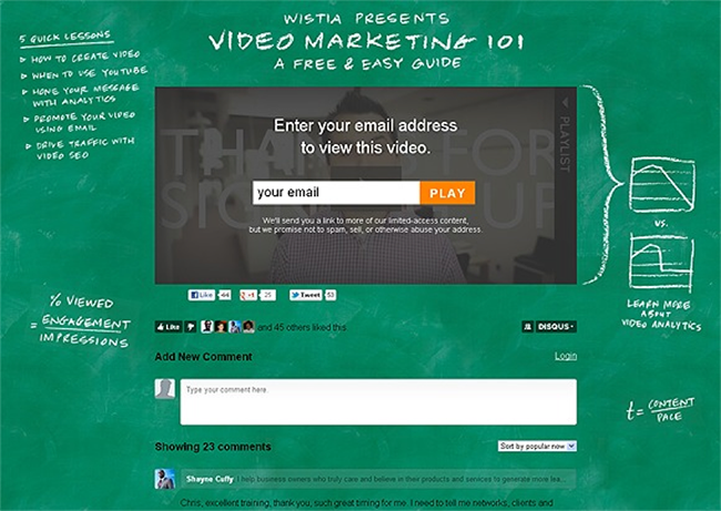
For the first approach, take a look at Wistia’s landing page. The central goal is to drive leads to request a demo. The team uses their landing page video as a supportive resource to provide educational information, as well as to offer a push toward their goal of getting those demo requests. However, be wary of not using a contrasting color for your CTA, like the one below.

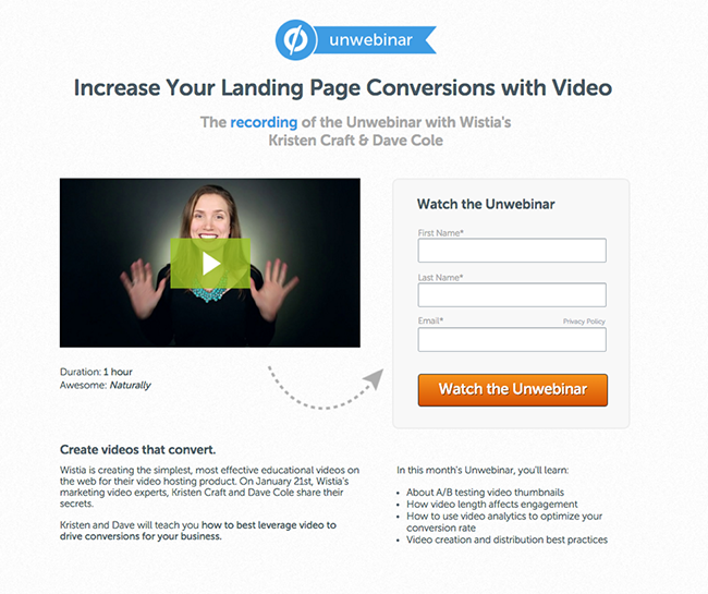
Here’s another great example that includes using a full form right next to the video as a way to unlock it:

In-video CTA
For the second approach, you can experiment with adding CTAs within your videos as gates.
Gating your video before it starts will pre-screen leads. Are they actually interested in viewing your video? Or are they just meandering around the web? Using a gate in the middle of your video is like giving them a teaser and then asking, “Want more?” Gating at the end of video will mean you’ve already qualified a viewer’s interest, so you have the opportunity to push them deeper into the sales funnel with more force.
While the video itself isn’t on a landing page but rather a microsite, Unbounce took this approach by adding a gate to its first Landing Page Sessions video at the two-minute mark using Wistia’s Turnstile:

As for landing pages, Wistia employed this method and tested an off-video CTA (A) against an in-video CTA (B):


Who won?
The off-video version (A) converted at 6%, which is pretty impressive. However, the in-video version (B) dominated, yielding an 11% conversion rate for “the same sample traffic.” That’s an 83.3% increase.
Whatever method you choose, in the end, your CTA is the golden lever to your conversions. It’s what ultimately prompts your visitor to deliver themselves unto the heaven that is your product. So make sure you make it clear, easy and relevant.
5. Don’t pay attention to the page design
Another huge conversion killer is investing all your time and energy in one amazing video… but ignoring how it appears and functions on the page.
So how do you build an effective video landing page and not just an effective landing page video?
First, keep the design simple and consistent. Do this by matching the font, color scheme and overall feel of the page to the video itself.
Next, make the video the hero by using size as its dominating factor. Size is perceived as relative to importance, so naturally, if you want your audience to watch the video, make it the most prominent element on the landing page.
As Oli Gardner puts it in his ebook on attention-driven design:
Simply stated: The bigger something is, the more noticeable it is. Size is related to Dominance, but the difference is that Size is relative to everything on the page — or page section, as opposed to its proximal relatives. Hence, the largest thing on the page can be perceived as the most important.
CrazyEgg’s previous landing page is a phenomenal example of this principle in action:

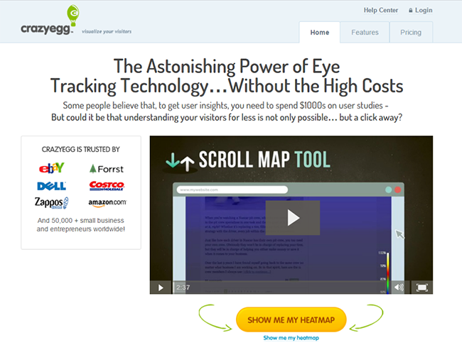
What’s more, Neil Patel reported that video drove “an extra $21,000 a month in new income.”
6. Don’t disable autoplay
Enabling autoplay is like forcing your way into your visitors’ world… without their permission.
It’s no secret that video-marketing experts Maneesh Garg, Sarah Nochimowski and Maneesh Garg all hate autoplay. And when Ask Your Target Market posed the question, “What do you think about videos that play automatically on sites like Facebook and Instagram?” the results were clear:

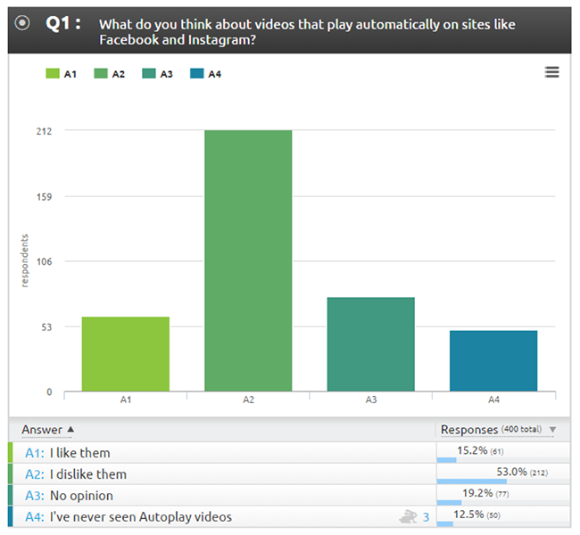
Admittedly, those number apply more directly to social media. But the sentiments behind them are nearly universal.
Full-stack marketing agency KlientBoost has a whole list of landing page video commandments, the first being “Do. Not. Autoplay. (Or Thou Shalt Be Smited).”
Autoplay is intrusive. It’s pushy. And nobody likes to have to unexpectedly scramble for the volume knob. Resist the urge to overwhelm your audience with the video that you’re excited about showing. Disable autoplay and instead make your play button obvious and prominent.
Make your landing page video suck…
There you have it.
Six surefire ways to make sure your landing page video sucks:
- Don’t educate.
- Don’t make it simple.
- Don’t tell a story.
- Don’t have a compelling CTA.
- Don’t pay attention to the page design.
- Don’t disable auto-play
Of course, if you would like to make landing page videos that convert like wildfire… might I suggesting doing the exact opposite.
If you have your own examples of landing page videos that suck (or some that don’t), be sure to share them in the comments.
Comments:
Thiên thảo
i’m thankful for these knowledge, great article. i would like to ask about something i don’t quite understand: “The bigger something is, the more noticeable it is. Size is related to Dominance, but the difference is that Size is relative to everything on the page — or page section, as opposed to its proximal relatives” . Can someone explains for me more?
Aaron Orendorff
Thanks for the kind comments.
As for the size thing … basically bigger means more attention.
Whatever the largest element on a landing page is, that’s naturally where the eye goes. So if you want your video to get seen (or your button) that’s what should take up the digital real estate.
Oli Gardner
Essentially, the difference between size and dominance is that, size is simply a measurement of how large something is. So the largest thing on a page has the largest size.
But dominance is more closely related to the relative difference between a large element, and *elements in close proximity to it*.
So while if you look at the page as a whole – say as a print out – you could see that one element is the biggest and thus dominant overall, you can use dominance to create a different effect, by placing related elements close together.
For example: Let’s say you have 5 records for sale, and you show thumbnails of them lined up together. 4 of them are 50×50 px in size and one is 200x200px in size. They are related elements sementically, but one is dominant over the others giving it emphasis and importance.
You could have put 5 photos of records throughout the page that are all 200x200px in size. They are all big, but neither is dominant.
Make sense?
Aaron Orendorff
Wow … stellar clarification, Oli. Thanks for the follow up … and attention (wink wink) to detail.
Kevin
Even though Auto Play can annoy some people I’ve noticed it converts much better…
Aaron Orendorff
It was hard to find stats on that — you know, cold hard numbers rather than best-practice advice.
I’d love to hear how auto-play versus no auto-play has lifted your conversions.
Stacy H.
Gotta agree with Kevin here, Aaron. When Twitter and Facebook started rolling out autoplay, I thought it would be terrible, but as it turns out, I don’t hate it. What I do hate is autoplaying audio, especially on a video/player that’s hidden somewhere in the sidebar or footer.
So I guess the best of both worlds would be a video that autoplays with audio muted, or better yet, doesn’t need audio at all. Think GIF, but video.
Aaron Orendorff
Thanks for weighing in … yeah, the audio element (esp. if it’s hidden) is the worst for me too!
Even worse than the worst is when it’s not even a video on the page but a pop-up.
I see that a lot on big name business sites. SUPER annoying (but I guess somebody’s will to pay them to do it.)
Steve Wilkinson
How can it convert better when people instantly close the page? ;)
All marketing aside, I think the main reason a lot of the big name sites are doing it is to drive up the number of ‘plays’ so they can have bigger numbers for (naive) advertisers. It’s the ‘hits’ equivalent of 2016.
Aaron Orendorff
Oh totally, Steve.
I’m sure the big sites could care less if the pre-roll videos (whether before an article or actual video) converts.
In fact PepsiCo’s executive said to agencies recently on that very topic: http://adage.com/article/special-report-ana-annual-meeting-2015/agencies-fire-ana-convention/300942/
Jeremy Wick
Thanks for including Sticker Mule on this, Aaron! :) I’d like to add #7 – Use the same video EVERYWHERE. We’ve seen a huge lift from having unique videos for each product page on our site.
Aaron Orendorff
You’re welcome, Jeremy. Glad to have you awesome folks in the post.
And great addition.
Uniqueness matter SO MUCH … naturally, that seem obvious when it comes to images and copy (and especially for page-specific pop-ups, rather than a one-size-fits-all, let’s-just-use-the-same-CTA-for-everyone approach), but applying that same principle at the video level is insightful.
Paulo
Great article. Thanks for sharing.
I personally do not like Auto-playing videos. I immediately close the tab that has speaker icon on it. It is annoying for me.
Aaron Orendorff
I agree … especially at the personal level. At the very least, autoplay is annoying.
Thanks for the kind words, Paulo. :)
Erik
You don’t have a second chance to make a good first impression, right Aaron?
I believe a good layout and a beautiful design really help conversions.
I can see, at glance, if a landing page is well designed. And this invites me to complete the CTA.
Thanks for sharing your knowledge, Aaron.
Tweeting right now!
Aaron Orendorff
Thx for the shares and comment!
Whenever I hear “first impression” I think of Steve Krug’s Don’t Make Me Think: A Common Sense Approach to Web Usability, “Get rid of half the words on each page, then get rid of half of what’s left.”
Painful advice for a copywriting, but geez it applies to the use of video!
true lovv
Truelovv.com is a 100% free dating site for singles and Relationship Who are looking to meet their special someone, True Lovers and after they can do romance and create a finalily relationship.
True Lovv Website is Founded because When you are FREE and you want to chat someone then you can come into our website and Do Flirt, Romance, Chatting, Messaging etc. with your life partner or your True Lover. The only reason we require these forms is so we can match you with the right man or woman, and to make you feel comfortable at our site for singles dating.http://www.truelovv.com/
Steve Wilkinson
Dear True Lovv, you might want to do a Google search on what rel=”nofollow” does. You’ll save yourself some time. :)
Sam
Nice Article and my view on auto-play is that if the viewer is taking the time to look at your content, don’t insult them by assuming they will be interested in watching your video.
It just smacks of shoving something in their face and I’ll click off a site that does it.
It should provide real value and be offered as a reward for the time they have spent on your site by being entertaining while you educate them.
Aaron Orendorff
Hear, hear, Sam.
Couldn’t agree more.
Plus it’s awesome that a few of the comments so far have been about the last point. Super encouraging that people — like you — are reading the whole thing.
Thanks! ;-)
Luis
Great article!
Love videos, but I believe that if you place them in the right spot people will play the video.
As a user there’s nothing more annoying than websites that forces us with the content. I’ll see it if I want to see it, and if I have time to see it.
Promote the video in the site or reward the visitor with a video, don’t force the user to play the video.
Aaron Orendorff
Thx, Luis … not only for your kind comment, but for actually reading all the way to the end! 100% agree: placement matters, but don’t force it. ;-)
Matthew Warren
Nice reminders about using video to teach and model, as well as keeping it simple. We often want to show everything there is to show in such a short time, but we lose the consumer immediately if the information is too complicated.
You want to make consumers feel good when watching your video- tell them a story to make them emotionally connect, and don’t annoy them with auto-play. Great points, here.
Aaron Orendorff
Thx Matthew … I’ll take any reminder I can get about simplicity, the centrality of story, and the need to invest everything with emotion.
Let me know if you’ve got a favorite video (landing page or otherwise) that nails all three.
BTW … I just shared your post: An Overview of Different Ways to Make Money With a Website (https://www.diysites.net/make-money-website-overview/). Nice one!
James Blews
Really great article. Truth be told, I’ve been an active contributor to a few of these. And, that auto-play tip, just makes me cringe; especially the volume issue you eluded to (shock-by-ear-bleeding isn’t what I look for when I optin to or buy something).
James Blews
* “alluded to” is what I meant…
Can we add “Not spell-checking before deploying” as another one?:)
Aaron Orendorff
HA! I feel your spell-checking pain. ;)
Active contributor? To some of the vids I mentioned? Which ones?
James Blews
No, no, no…I meant an active contributor in the group of improper landing page owners from the around the “internets” :) However, I’m getting better. And…I still loathe auto-play videos…
Aaron Orendorff
Good clarification … and so humble. ;)
Ashley
This has convinced me that I need to look again at my book trailer video, especially from the perspective of educating site visitors because I don’t think it’s doing enough to spell out the benefits and there is no clear call to action.
Aaron Orendorff
Good application.
I’d love to see a before and after thing if you update it, Ashley.
And yes … CTAs are SO neglected when it comes to video.
Ashley
You can see the current video at https://colourmanagementpro.com but I am going to work on a storyboard over the next day or two to try and nail down the key points then get to work on an updated version that is hopefully more effective. Once it is finished I’ll post and before & after.
Aaron Orendorff
I peaked …
Have you thought about moving the video up to make it more prominent?
And you’re totally right … I’d love to see it open with the pain of “color management” (admittedly it’s not a subject I know much about, but is it basically making something AMAZING in like PhotoShop and having the whole thing turn to crap when you transfer it to the web or print?), hit the benefits (how the ebook — that’s what it is, right? — solves those pains), and then hit ’em with a super clear CTA.
Speaking of CTAs … I had a hard time finding the button. ;)
Be sure to share the after version!
Ashley
You are essentially right about colour management and in particular the pain of getting it wrong. Most people find the subject confusing, so I worked hard to make it easy to understand and put into practice.
I did experiment with the video higher up the page at one stage but it didn’t seem to work at the time. Since then I’ve changed the website massively so I’ll experiment again with a higher video placement once the updated video is ready.
Something that worked amazingly well for me was when a targeted newsletter went out that included an animated gif showing the first few seconds of the actual video as those balloons are burst by an arrow. The click through rate was off the charts but a lot of those people watched the matching video and subsequently bought the book.
Thanks for the feedback on the CTA. I have been struggling to find a balance between high visibility and something that doesn’t make the page look trashy but I’ll take another look at that.
Aaron Orendorff
Dang, Ashley … you’re really working it. Super cool to hear about actual tactics in the comment. Looking forward to the new version.
Tweet me fo sho!
Ashley
That video is up there now after a lot of work. I shot you a DM via Twitter but I’m not sure you saw it. I’ve taken onboard your comments about placing the video high up and the add to cart button is always visible now with the sticky menu. https://colourmanagementpro.com
Aaron Orendorff
Ashley … thx SO MUCH for the follow up. (I saw your DM but lost track of it, so it was awesome you posted here too.)
I checked the video out and I love the aspirational feel of it! And nicely done with the cart button’s visibility. :-)
Rotem Gal
Very unorthodox methods… I will try and use some of them soon.
Thanks for a good read !
Aaron Orendorff
Thx, Rotem.
That’s my aim: unorthodox… but effective. ;)
EmpireHive
Truly Great Tips. I also sometime get annoyed by those weird landing page video that just autoplay.
Aaron Orendorff
Thx so much … I’m loving all the collective hatred of auto play!
Harry
Helpful details shared. I must say that all the mentioned tips are really helpful and specially the auto-play one. Thanks Aaron for sharing this post.
Aaron Orendorff
Thx, Harry. Super encouraging to hear it was helpful … twice from you even! ;-)
M. Borer
Aaron, this is a terrific post and I was glad to share it on LinkedIn! I definitely want to chime in on the auto-play hate. And thank you for reminding folks to keep it simple! There’s just no room for off-putting corporate speak and jargon in an explainer video.
Aaron Orendorff
Yes, yes, yes, and yes.
To the share, auto-play hate, simplicity and death to jargon.
Thanks again!
BTW … I totally appreciate your share, but did we actually link up on LinkedIn?
Jamie
Awesome article, Aaron!! I love the part where you mentioned the importance of the *customer being the hero*…not the product or business. Crucial detail that many people miss.
Aaron Orendorff
Thx, Jamie (cool to see you here in the comments).
Yeah, what an awesome principle … and I LOVED the visual Unbounce made for it.
I’m thinking of doing a whole post around that one idea. ;)
medvim
Hello. Thanks for this powerfull article.
I am confuse, why the simple design is avoidable? …
Aaron Orendorff
Always appreciate a compliment. ;-)
But I don’t understand your question. Could you explain it a bit more?
kashish
Thanks for a well-written, shareable post!
Aaron Orendorff
Thx Kashish … I’ll keep an eye out for your share. :)
Miljana
Great article, Aaron! You inspired me to write a roundup of similar tips on the do’s and don’t’s for videos on e-commerce sites, and I added your tip on auto-play as well with some examples (out of these only Bellroy uses auto-play with silent audio, but it’s not annoying, probably because the product is so cool). If you want you can check it out here, I’ll be super happy to hear your opinion http://blog.goodvid.io/12-dos-and-donts-for-product-videos-in-visual-commerce/
Aaron Orendorff
I clicked through … really nice piece.
Love ALL the examples, especially this one: “Do: Add user-generated product videos as testimonials.”
Thanks for including me at the end (I just Buffered it).
Do you have a strategy for getting and collecting that kind of user-generated content?
Miljana
Thanks, I’m so glad you liked it! I don’t have a post that talks specifically about aggregating UGC videos (although that’s exactly what the company I work for does), but I did mention UGC video curation as the up-and-coming trend here http://blog.goodvid.io/5-ecommerce-video-trends-for-2016/ Either way, it’s a good idea for a new article! I’ll let you know when I put down some ideas on this topic into words :)
Martin Zhel
Great post, Aaron!
I’m surprised that nowadays marketers still make silly mistakes with landing pages. Especially, when they are ready and proven templates they can use.
I like your point about educating visitors with video, not just selling to them. And I consider the “education” part to be one of the most important things in order to convert visitors into leads and customers.
Keep up the good work!
Aaron Orendorff
Yeah … “proven templates” (Unbounce should like that). ;)
Thanks for the kind words. Couldn’t agree more with the education piece, not just for videos but really that’s THE principle behind content marketing itself.
Ali Sufyan
thank you so much for sharing a brilliantly crafted information. i really loved and injoyed the whole information.
Aaron Orendorff
No, Ali, thank you. Anytime I get something I wrote called “brilliantly crafted” … well, big smile on this end (not to mention a giant kick to my ego).
Glad it was helpful.
:-D
dj kamayo
i really needed this, thanks
Aaron Orendorff
Hmmm … I’m hoping that’s not a bot comment of some sort, DJ.
But you know what? I’ll take it. :)
You’re totally welcome.
El Edwards
Great article Aaron and wonderful terrible offences to avoid! :-)
Apologies if this has already been mentioned (I read some of the comments but must confess I didn’t get through them all!) but one of my biggest bug bears with video in general is when people do a video because someone somewhere told them they “should”.
Yes, video converts great but a video with zero energy because the person creating it doesn’t really want to be doing it in the first place is simply painful! ;-)
Aaron Orendorff
Thanks, El. (Good to see your actual face!)
That’s actually a really great best (i.e., worst) practice: doing it because someone just tells you to.
Right there is probably where ALL terrible content comes from: “Why are we doing this (blogging, social media, video, landing pages)? ‘Cause we’re supposed to.”
El Edwards
Oh I couldn’t agree more! I hate “shoulds” with a passion!
dhanush
It is really important to know what not to do instead of what to do
Amazing Post !
Thanks for the share :)
Aaron Orendorff
Totally agree.
What NOT to do is a great way to reveal blind spots. Thx for the kind words.
Claudiu Murariu
I somehow feel that if you do #1 well, the others don’t matter that much (maybe with the exception of autoplay :). So a big big thumbs up to #1.
PS: I loved Oli’s explanation of dominance. :)
Aaron Orendorff
Value (i.e., ACTUALLY being helpful) turns on education. So I totally agree.
However, story is a close second in my book.
And yes, that Oli … he’s kinda a smart cookie (not that I’m sucking up or anything). :)
ASGC construction company
Awesome….Nice article…Really good…
Aaron Orendorff
Wow … three compliments in one! Thx for reading. ;-)
Adam
I personally do not like Auto-playing videos. I immediately close the tab that has speaker icon on it. It is annoying for me!
Aaron Orendorff
Couldn’t agree more, Andrew. And thanks for reading all the way to the end of the article. ;)
smatka
t is really important to know what not to do instead of what to do
Amazing Post ! nice………………….
smatka
t is really important to know what not to do instead of what to do
Amazing Post yup……….//
Aaron Orendorff
Totally agree.
The whole Don’t angle really helps me learn.
Thx!
Daryl
…so – if you came to a video landing page expecting a video, I’d set it to autoplay. Like, we have a button from our edm which says ‘play video’ and then that links to the landing page. You expect the video to play, so if it doesn’t autoplay that creates a bit of ‘friction’…
Aaron Orendorff
Gosh Daryl … that probably the first solid example of using auto play I’ve heard.
Absolutely makes sense!
Thanks for sharing.
www google search
I enjoyed over read your blog post. Your blog have nice information, I got good ideas from this amazing blog. I am always searching like this type blog post. I hope I will see again..
Danny Kronstrom
Great article and subject! Thanks :D It’s an amazing post. Thank you again! It sounds like good. You are gathering lots of different ideas in your blog. Good work my friends. Instead of thinking about what you haven’t written, look at how much you HAVE written :-)
Abhishek
Thanks for the tips, now i am aware to become one worst practices list.
google
My family members always say that I am wasting my time here at web, except
I know I am getting know-how every day by reading thes good articles or reviews.
Whatsapp login
Nowadays Architects must be technically sound i.e. they must have the knowledge of both -that is the Architecture as well as the growing IT techniques of ARCHITECTURE that is bringing innovation in thew society.
Thanks for sharing your creative article.