The big question here is: “Do the big brands produce better landing pages than the average SMB?”
Do they utilize professional designers and take advantage of their status and brand image to design experiences that work in perfect concert with their other brand properties (Website, magazines, advertising)?
In this post, I’ll look at 5 company’s landing pages and critique what’s good and bad about each of them – and things they might want to throw into an A/B test for optimization.
Remember to take note of what’s good, so you can implement them on your next landing page.
1. CarFax
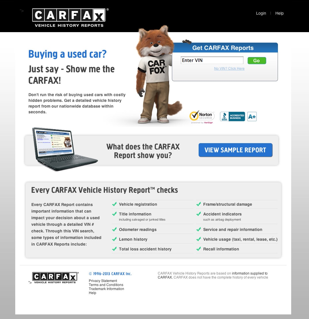
What I Like
- Try before you buy: They have a sample report for you to look at right off the bat. This is a great way to develop confidence in your visitors, letting them know what’s in store for them.
- Straight to the point: The main headline asks a question that immediately weeds out anyone that’s arrived here mistakenly. “Buying a used car?” Why yes! I’m in the right place.
- Online vs. offline: The page asks for the car’s VIN – but you’ll most likely only get that by looking for it on the car in person – luckily they have a mobile page too so you can do it on a smartphone. Wining points!
What I’d change or Test
- Nothing. I love this page! They clearly had some smart people architect and design the page.
- Button copy: Okay, I’d change one minor thing. The CTA should say “View Report” instead of “Go”.
2. Oprah Sweepstakes
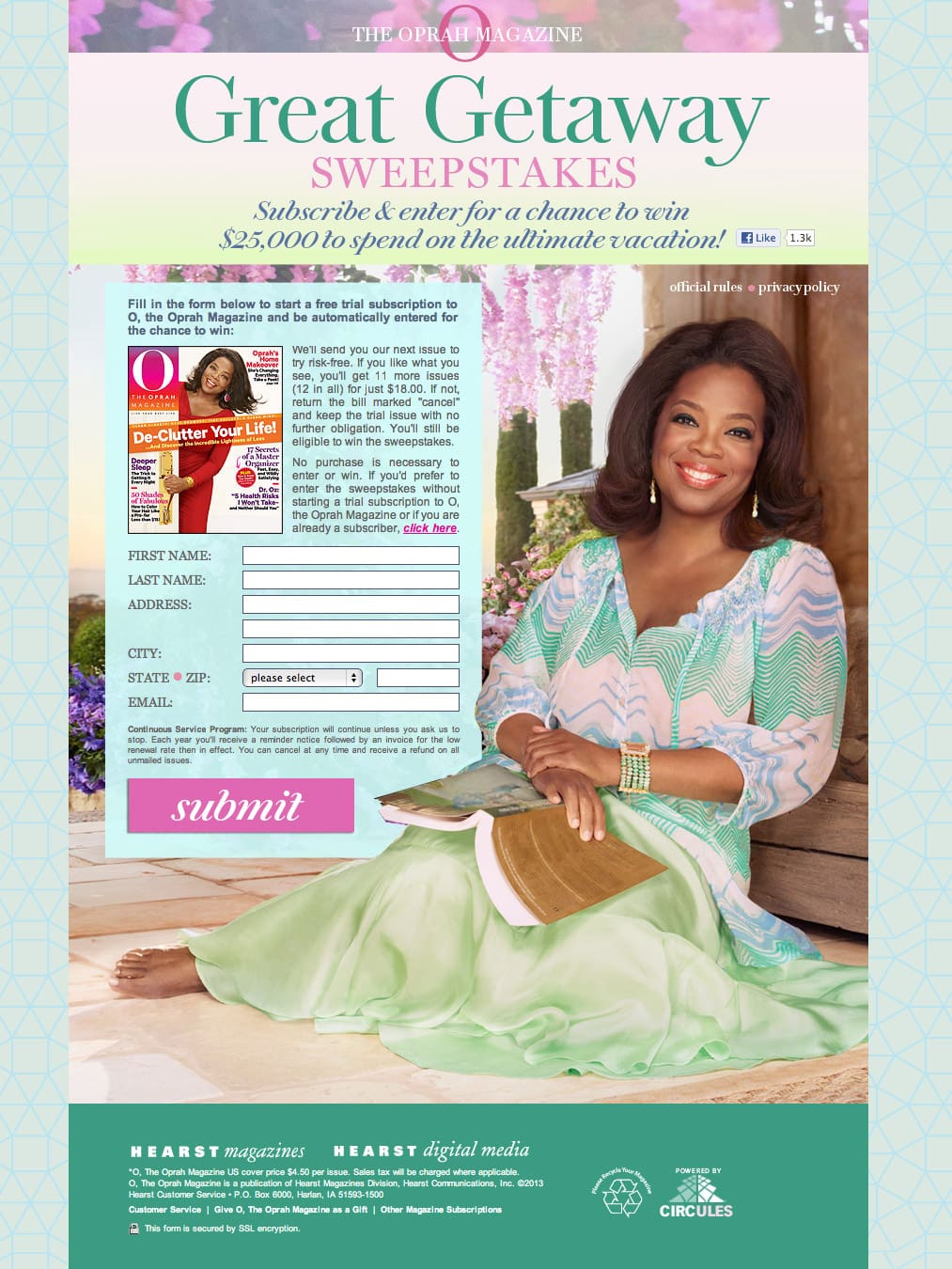
What I Like
- Media brand match: This is what I talked about at the start. There is a clear correlation between the landing page and the magazine cover. Oprah consistently appears happy, using a strong personal connection (direct eye contact) to make you feel comfortable.
What I’d change or Test
- Submit: Apparently Oprah’s designers didn’t read my last landing page examples post. The word “Submit” says nothing about what will happen when clicked. I’d change it to a double line CTA that says:
First line: Subscribe to O magazine
Second line (smaller text): To be entered in the $25k sweepstakes - Headline and sub-header could be better: It’s a double purpose page – subscribe to the magazine and get entered into the sweepstakes. But the headline only says subscribe (not to the magazine) so it could be read as “subscribe to the sweepstakes”. Minor point, but clarity is important. You don’t want have to read all that fine print.
3. Intuit
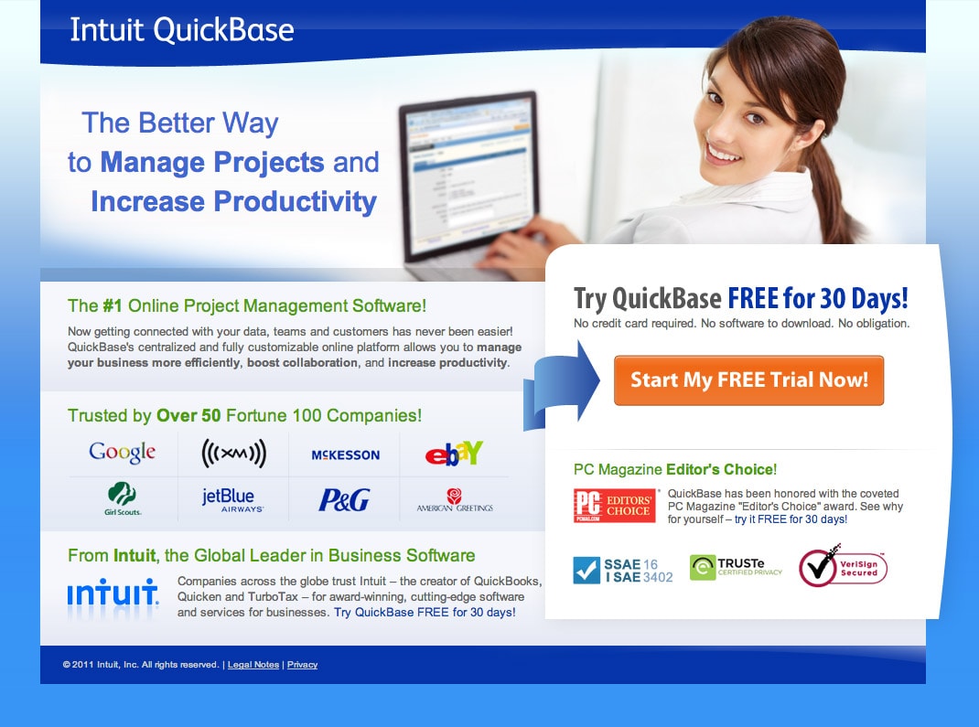
Yet more proof that the big guys are doing it right. This is an excellent landing page. Here’s why:
What I Like
- Benefit based headline: Indicates that there are other options out there, but this is a better way to do it. Instead of describing what it does it uses a benefit to enhance the headline.
- Use of directional cue: Conversion centered design standards (step 11) include using directional cues to aid the persuasive nature of a page – here an arrow is used to point you in the right direction.
- Descriptive CTA: Obvious that you are going to start a free trial.
- Social proof: The page is littered with social proof indicators: impressive list of customer logos, security symbols, and an Editor’s Choice award.
What I’d change or Test
- How much is it? There’s no mention of how much it will cost after the 30-day free trial. A good way to include this is to say: “Free for 30-days then pick a plan starting at $xx”.
- No credit card required: This is very important information to know, yet it’s buried as small text. I’d recommend making it subtext in the button to reinforce the lack of a signup barrier.
4. Aeroplan
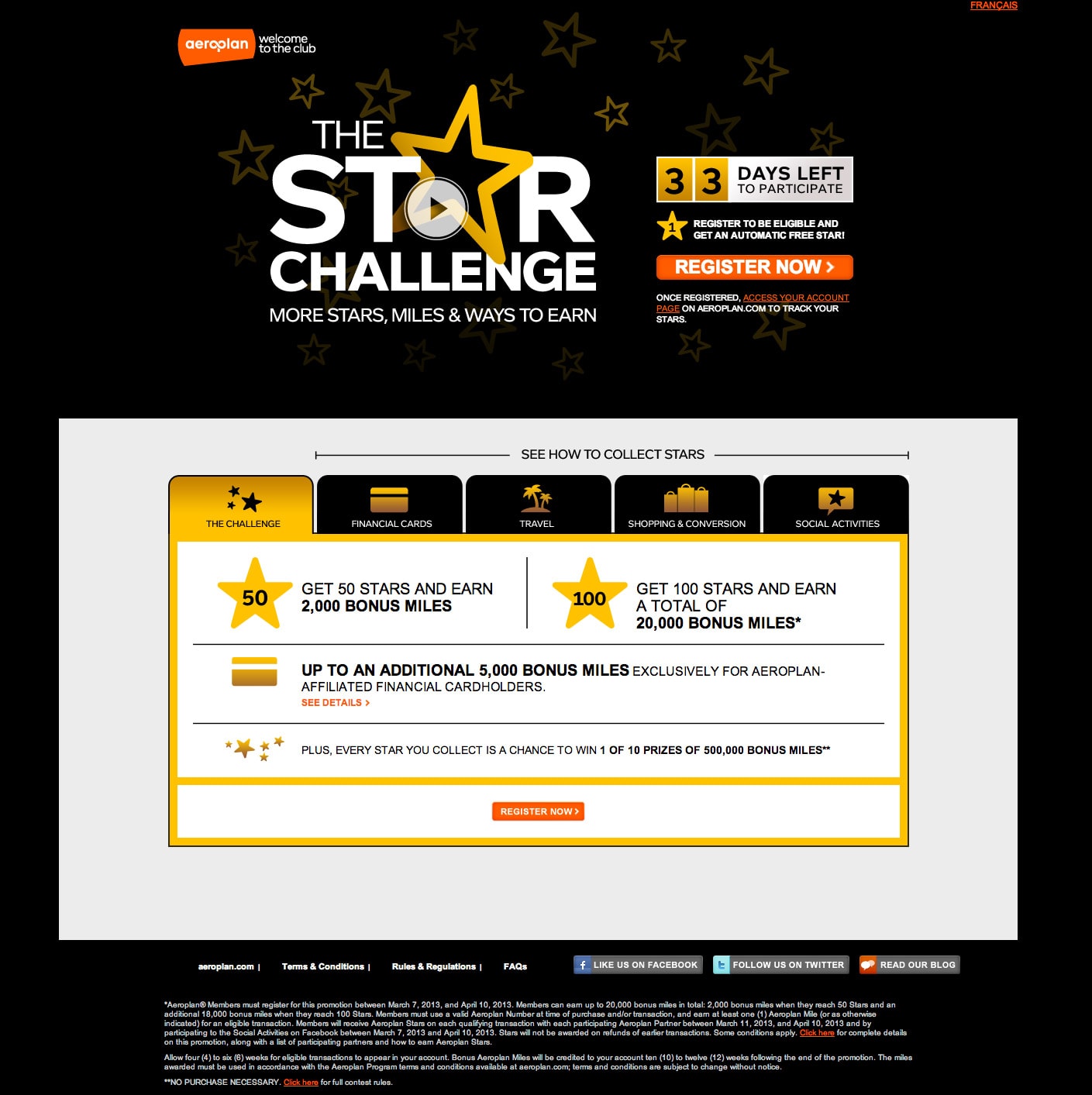
What I Like
- Urgency: The 33 days left countdown timer enhances the sense of urgency, which will improve conversions, especially among the fence-sitter visitors.
- Tabs: There’s a lot of content on the page if you consider what’s behind each tab. Using the tabbed navigation, allows them to keep the page short and group similar content in the same place.
What I’d change or Test
- Poor branding: You have to squint pretty hard to see that this is an Aeroplan promotion. I’d call it “The Aeroplan Star Challenge”.
- Tiny second CTA: Why is the CTA at the bottom so damn small? It should at least be as big as the other one. I’d also change the CTA to have 2-levels of copy (notice how much of a fan of this strategy I am yet?).
Line 1: Register Now!
Line 2: And start collecting stars - Too many leaks: There are too many distractions in the bottom of the page that would take people away from the sole purpose of the page.
5. Adobe Test & Target
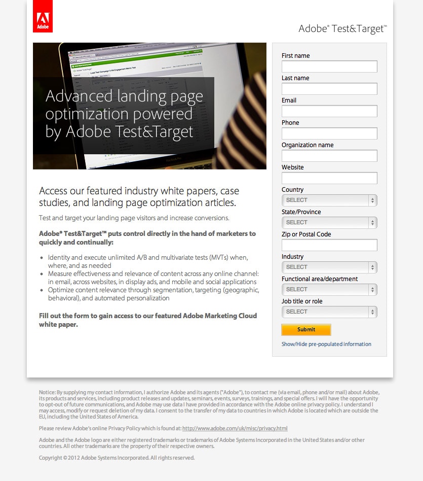
What I Like
- Accidental genius: When the page loads, the form takes about 2 seconds to appear. Clearly being pulled dynamically from a server somewhere. However, what it does is draw your attention to the form as soon as it loads. Personally I love it as a persuasion device.
- Pixel perfect headline: The use of whitespace around the headline couple with it’s clarity of communication make for a great headline.
- Hierarchy of content: Adobe break the content nicely into nicely flowing chunks:
- Page purpose
- Benefit statement
- Target market based benefit bullet points
- Action statement
Copy this flow of content – it’s really good.
What I’d change or Test
- The submit button – Jeez: Make it say “Get our Whitepaper”.
- Required? Make it clear which fields are required, this will make the form appear shorter than it is.
Which was your favorite landing page? Do you think they’re doing a good job? Better than you? If you think your landing page kicks more ass than the big guys then share it in the comments and we can discuss.
![]()
