
Irrational Grumpy Cat reactions aside, under-performing campaigns are a major downer – and not just for you.
After all, your visitors have to wade through all that stinky poop too. Think about them for a minute. They trusted you enough to click your ad or link and you let them down with a poor landing experience.
To understand a little about why they’re not performing, ask yourself six simple questions:
- Does my page have one – and only one – possible action?
- Did I establish a personal pre-click connection and carry it through to the other side of the click?
- If I scan the landing page quickly, is it clear (and obvious) what I’ll get?
- Is absolutely every element on the page talking about my campaign?
- Would I believe the trust elements on my landing page if they were on a competitor’s page?
- Did I add anything in close proximity to the call to action as extra incentive to click?
If you answer these questions honestly and clearly, you’ll have some insight into why your landing experience isn’t very good.
You: “Okay, after asking myself those questions I’ll have a sense of what I may be doing wrong, but how do I fix it all?”
I’m glad you asked. Thanks for participating.
In the interest of unhappy consumers everywhere, today I’m going to share the techniques I use to make sure the answer to these six questions is yes, yes, yes, yes, yes and yes.
Here are six things I do when I want to make marketing experiences better than Grumpy Cat memes.
1. I remove all distractions
This is a simple one, but it bears repeating.
I remove *all the distractions.*
Think about attention for a minute. Your ad captures attention. The headline on your landing page holds that attention and the way you design your page focuses attention.
You: “That’s exactly what I did!”
Okay, you designed an experience where people are highly focused on your conversion goal. Bravo.
… But then you got sloppy and added that one extra useful link for “related content.”
You: “But people should know about that other awesome thing!”
No. Stop it. Stop it now. Stop trying to be helpful with all that extra crap.
Your landing page isn’t Wikipedia.
Focus on the task at hand and on making it the simplest experience it can possibly be.
If you have any extra links on your page, cut them down with a giant scythe.
That includes links to your website, social follow icons, social share buttons and any extra guff you thought made your landing page prettier.
Always aim for an attention ratio – the ratio of things you can do, to the number of campaign conversion goals (which is always one) – of 1:1.
Side note: The only exceptions are links to your terms and conditions or privacy policy, but they should be buried at the bottom of the page as a signal that you are trustworthy – either in the eyes of a visitor, or the Google Ad bot who likes to see a connection of some kind to your site.
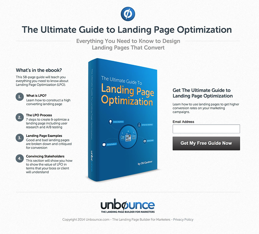
Case study: Removing distractions increases conversions
Here’s a very simple A/B test that I ran on an ebook download landing page. On the original page, you’ll notice that there is a list of other useful and relevant resources – along with some social share links:

This page has an attention ratio of 10:1.
Compare it to the following page where the links section was removed:
This time, the attention ratio is a perfect 1:1.
The result was a 31% increase in ebook downloads.
2. I add a little context
For every landing page you have, take a step back and look at how you’re sending people there. Quite often, the context you establish in your marketing communications fades or is simply forgotten by the time the landing page is visited.
You: “How can it be forgotten? I just read an email and clicked to get here.”
When I say forgotten, I mean you as the marketer forgot to continue the conversation on the landing page.
There are two aspects to context that we need to consider: information and style.
- The informational aspects of your offer need to be reinforced to allow the landing page to stand alone in communicating the specifics of your offer. When I say stand alone, I mean that if I read your landing page a day later, it would provide enough context that I don’t need to refer back to the email.
- The style is the collection of nuances that inflect your copywriting. If you switched tones mid conversation at a party, from friendly/witty/conversational to disconnected/dry/stilted, people would notice. They’d be turned off by the change and they’d go hang out with someone else at the party.
Which brings us to an important concept that I call conversation momentum:
The amount of established context differs depending on the inbound source, so here are a few scenarios that show how you can leverage conversation momentum to improve your landing page.
From an email
If you have a photo of the email author in your email, repeat it on the landing page and add a short personal message beside it:
Glad you could make it! I hope you check out {insert details of your promotion}, and if you have any questions you can always throw me an email at you@yourcompany.com.
Transparency and openness work, but only if you truly believe in being that way and are open to people contacting you.
From a guest blog post
What’s the #1 goal of guest posting? Getting that awesome link back to your website?
Wrong. It’s showing a new audience that you’re awesome and you care about bringing excellence to their brain buds.
And with greatness comes great responsibility. Guest posts are a great way to link back to your landing page, but choose your moment and use it with respect.
If you link out from a blog post in a way that’s connected to your product/service, you *must* maintain the same style of writing from the post to the destination landing page.
As soon as you leave the context of the blog post you’ll lose people. This is one of the few times that you want to write in an editorial style on your landing page.
If you start a conversation, maintain the momentum
There are many more scenarios where conversation momentum applies, from a CTA at the end of a video, to the URL on your personal business card, to the link in your Twitter bio.
The lesson here? Each situation has its own unique charms that require unique landing pages.
Are you picking up what I’m putting down? If you start a conversation, maintain the momentum all the way through the click to your landing page. Personal treatment always delights and performs well as a result.
3. I sprinkle on some clarity
We all think we’re better communicators than we really are.
Everything we say or write is as clear as crystal, and nobody ever gets confused about what it is that we’re trying to say by using our words to say the thing we need to convey as simply as possible by way of what we’re saying.
Right?
If context is king, clarity is the mumblerfiddling emperor.
Without clarity, all you have is confusion, and there’s nothing an attention-seeking back button loves more than confusion.
Take a look at this landing page:
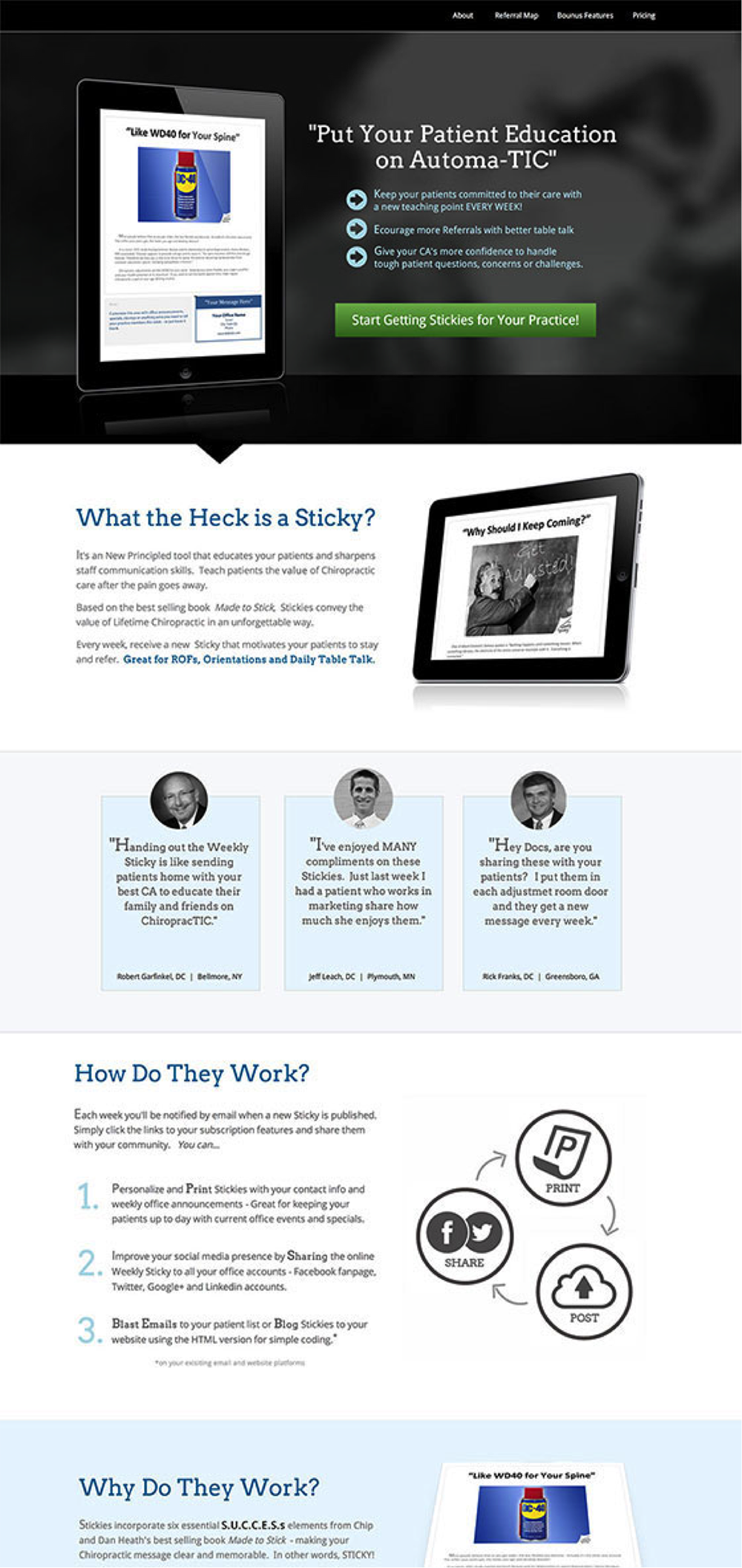
Now run through an exercise with me. We’re going to put our stinky feet in someone else’s stinky shoes and spend 5-10 seconds scanning the page, reading out the highlights that catch our eye.
Try it. Scan fast, only picking up the most obvious elements (including images) and read the words (or image meanings) out loud.
This is what I got:
PUT YOUR PATIENT EDUCATION ON AUTOMATIC, START GETTING STICKIES FOR YOUR PRACTICE, WHAT THE HECK IS A STICKY, HOW DO THEY WORK, WHY DO THEY WORK, WHAT ELSE IS INCLUDED, GET YOUR OFFICE ON OUR REFERRAL MAP, WHAT OTHER CHIROPRACTORS ARE SAYING, GET NOTIFIED WHEN NEW STICKIES ARE PUBLISHED, AND SOME MORE.
What?
Now picture someone sitting in a cold, dark basement, looking at your landing page. They’re sitting there, judging it for five seconds before leaving because they didn’t understand you. Sitting there in their own filth, judging you… okay maybe I went too far. But you get it, right? There are people out there who don’t have a clue what you’re talking about.
We don’t want that. Agreed?
So, do the exercise over again, this time with your own landing pages, and see if you can spot the areas where you’re lacking clarity.
Your customers-to-be – and your conversion rates – will thank you.
4. I align all of my things, together, in alignment

Campaign congruence is the principle of aligning every element on your landing page with the goal of your marketing campaign:
Again, this seems like an obvious concept, but unbeknownst to you, your page is probably not going to pass the congruence test.
The campaign congruence test
This is a copywriting exercise you can use to optimize your landing pages by finding elements that are incongruent (working in opposition to the purpose of the page). Here’s how it works:
- Write down the goal of your campaign.
- Create an inventory document of every element on your landing page.
- Write the copy from that element beside each element name. If the element is an image or video, write a short description of what you see when you look at it (not the contents of the video – what you see when looking at it).
- Give each element a score based on how aligned it is with your campaign goal: 0 for not aligned, 1 for kind of aligned, and 2 for fully aligned.
- Tally the score. For 12 elements, you’ll get a score out of 24.
- Rewrite or remove any element that scores 0 or 1.
- Rinse and repeat until you get 100%.
Here’s an example.
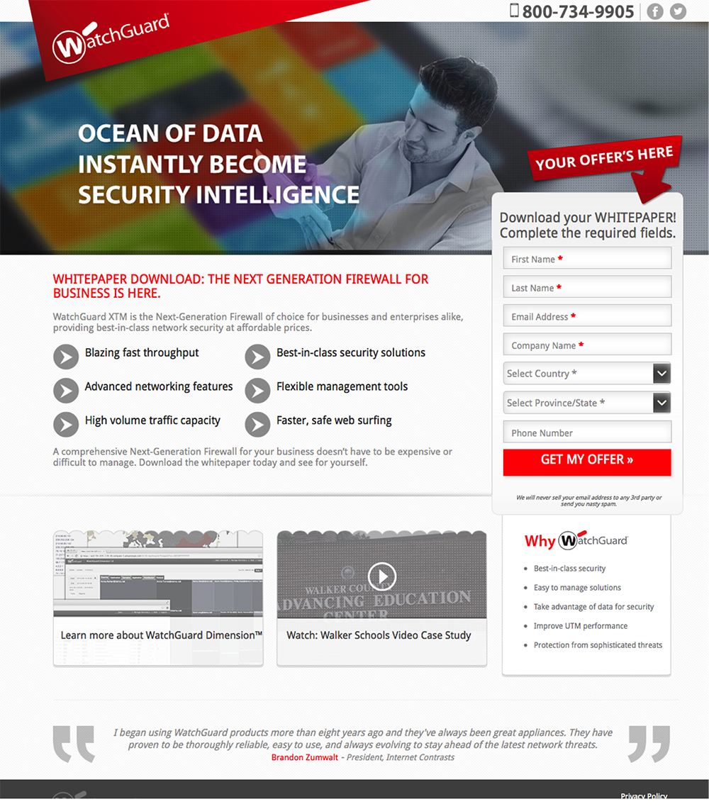
Structurally, this is a very good landing page. It has the five essential elements and has a good hierarchy of information. However, when you look at the campaign goal, it quickly becomes obvious that things aren’t in alignment.
Campaign goal = Download a whitepaper
Taking inventory of the page produces a document like this:
| Page element | Element content | Score |
|---|---|---|
| Headline | Ocean of data instantly become security intelligence | 0 |
| Subhead | Whitepaper download: The next generation firewall is here | 2 |
| Hero shot | Photo of a man holding some paper which is partially obscured | 1 |
| Intro | Watchguard XTM is the next generation firewall of choice for businesses and enterprises alike providing best in class network security at affordable prices. | 0 |
| Bullets | Blazing fast throughput Best-in-class security solutions Advanced networking features |
0 |
| Form header | Download your whitepaper! Complete the required fields | 1 |
| Form fields | Country, province/state, phone number | 0 |
| Testimonial | I began using WatchGuard products more than eight years ago… | 0 |
| Learn more | Learn more about WatchGuard Dimension | 0 |
| Why | Best-in-class security Easy to manage solutions Take advantage of data for security |
0 |
| Privacy statement | We will never sell your email to any 3rd party or send you nasty spam. | 0 |
| Call to action | Get my offer | 0 |
| Total | 4/24 |
That’s a terrible congruence score, and the reason is that virtually nothing on the page talks about the goal of the campaign, downloading a white paper!
Instead, it’s a bunch of self-serving talk about their product. You’ll have plenty of time to speak to me about your company and product when I’ve become a lead. Hold your horses and let me figure out if I want this ebook thingy.
Side note: if you have an ebook with blue pages, could you call it a blue paper?
The best part of this exercise is that it illuminates exactly where and how you need to approach fixing your copy. Try this test out on your own landing pages.
Takeaway: Be ruthless in writing landing page copy that works together for the greater good of your campaign.
5. I do a credibility check
Social proof is subjective.
You can’t realistically predict whether or not your visitors will believe what you are telling them, or perhaps more accurately, what you are saying others are telling them about you.
Your testimonials just might not be believable, the number of customers you acquired this week might be seen as fake and the list of “as seen on” logos could appear the same as every other landing page.
There’s an example I often use in my presentations from a company who will buy your motorcycle from you. This is a classic case of misrepresenting your target demographic to the extent where it looks like a flat-out lie. Take a look at the testimonials:
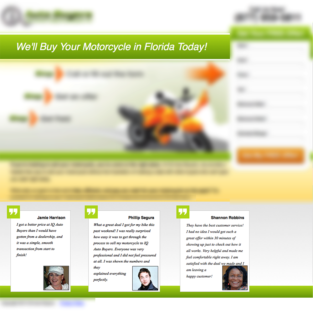
Do they look like people who ride motorcycles? From right to left, my interpretation of those photos is: grandmother, magician, grandmother who plays tennis.
They are so far removed from how you would realistically picture someone who rides and thus may have at some point sold a motorcycle. They completely destroy any hope of credibility.
So do yourself a favor and give your social proof a reality check – ask someone else what their first impression of the quote/photo/statement is.
6. I think about that overplayed phrase “Always Be Closing”
The moment when a “conversion” occurs can be considered the tipping point of your landing page campaign. There is either sufficient friction to prevent the click, or enough encouragement to make it happen.
Visualize your call to action in your mind. Think about the motivating or demotivating factors that could impact the likelihood of a click. What if a psychological trigger could be positioned in close proximity to the CTA to increase the motivation?
I call these triggers “closers.”
Consider a landing page where the campaign goal is a webinar registration. How might a visitor be tipped in favor of a registration? What are the triggers that could be applied to close the conversion?
There are two primary factors at play when making the decision to attend a webinar:
- “Does the subject matter appeal to me?” and
- “Is it at a time when I’ll be able to attend?”
Looking at the second factor, if I can’t attend, then I’m not going to register, right? Correct, until you consider the #1 most popular question asked in webinars:
Are you going to send out a recording out afterwards?
Our marketing team established this fact after they ran a ton of webinars last year. It was consistently the most asked question before, during and after each webinar – in spite of repeated announcements addressing the question.
With this information in hand, how can we design a “closer” to increase conversions?
It’s actually quite simple. Add a short statement directly beneath the CTA:

This simple statement lets people know that they don’t have to make time for the event, and that encourages more people to convert.
Another example comes from Michael Aagaard of ContentVerve. On one of his ebook download landing pages, he formed a similar hypothesis that people didn’t have enough time to read a big ebook, so he highlighted the fact that it was only a 25 minute read.
The result was a 19% increase in the number of downloads.
Next time your conversion rate sucks…
Don’t be a Grumpy Cat. Ask yourself these questions:
- Does my page have a 1:1 attention ratio?
- Am I keeping up the conversation momentum?
- Does my landing page pass the scan test?
- Is absolutely every element of the page talking about my campaign?
- How about the campaign congruence test?
- Are there any closers I can add near my CTA to push people to convert?
P.S.: If you have any examples of closers that you’ve used on your landing pages, I’d love to hear about them in the comments!


