As a marketer, you need to show prospects that you understand them… and that you give a damn.
A large part of that is providing them with a great user experience on your landing page. If you fail to do that – if you don’t align yourself with your prospects’ goals and make it easy for them to get what they want – then your conversions will suffer.
In our latest episode of Page Fights, regular judges Oli Gardner and Peep Laja were joined by guest judge Noah Kagan of AppSumo to tear apart 10 user-submitted landing pages.
In the process, the judges identified tons of common mistakes that hurt user experience (and probably conversions, too).
You can watch the full episode here:
Or if you’re strapped for time but still want to know how to deliver an exceptional user experience, read on for the top four landing page optimization tactics they shared.
1. Don’t forget about your mobile users
Noah reminded spectators that a lot of landing page traffic these days is mobile.
Prospects are going to be interacting with your landing pages on all types of devices and in all types of environments. If your landing page experience sucks on mobile, your prospects aren’t going to stick around.
To quickly test how good your mobile experience is, Noah suggested opening your landing page on a desktop and shrinking the window down to the size of a mobile screen.
When the judges ran this test for Above Average Grade Level’s landing page (below), they found that it doesn’t scale well to a mobile device. Check out the regular desktop view (left) versus the mobile version (right):
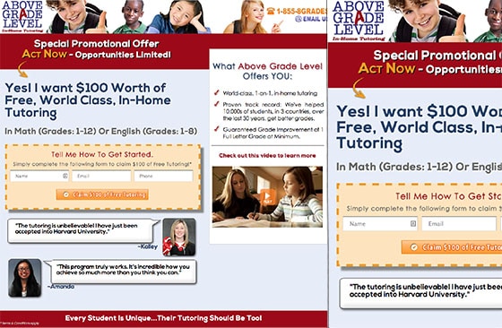
Not only does this create a crappy user experience, but it cuts off some of the most essential elements on the page: the call to action, social proof and headline.
That forces prospects to scroll back and forth on the landing page to get the information they need, causing friction. If you’ve ever struggled to read a huge page on your mobile device, you know exactly what I mean. It feels like a huge barrier and it’s frustrating. And that makes prospects bounce.
Creating an exceptional, friction-free user experience demands that your landing pages are mobile responsive. To that end, the judges shared some quick tips:
- Noah recommended cutting out any unnecessary page elements to keep your page short and sweet.
- The judges agreed that you should try to keep your CTA above the fold on as many devices as you can.
Bonus tip:
In case you needed another reason to optimize all your pages for mobile, Page Fights moderator Tommy Walker pointed out that Google recently introduced a mobile-friendly tag into their search ranking algorithm.What does that mean for your landing pages? If you fail to make them mobile-friendly, you could get penalized by Google and have your page appear lower in the search ranking.
Before you launch your next landing page, check to see if your landing page is mobile-friendly by pasting your landing page URL here.
2. Talk about your prospect, not about yourself
If you want to provide an awesome user experience, then you’ve got to deliver the right message at the right time.
Your headlines and copy are the vehicle for communicating your unique value proposition and they set the tone and mood of your page. As Noah and Peep explained, you’ve got to be sure the language you use is “human” and addresses your prospects directly.
What exactly do they mean by that?
Let’s take Polis’ landing page for example:
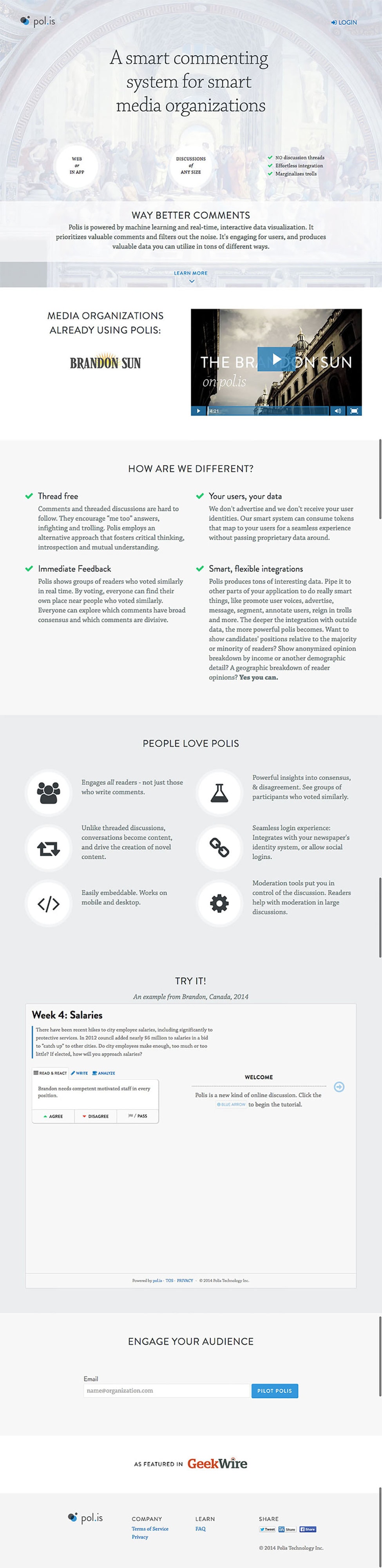
Noah criticized the headline for failing to speak directly to the prospect. He explained that you should make prospects feel like they’re talking to another human, not some guy spouting MBA jargon.
Noah suggested another headline that he felt communicated the unique value proposition in a way that would really resonate with prospects:
I can get you twice as many comments per day
The way this new headline is worded is more colloquial and less dry. More importantly, rather than simply talking about the business, it addresses what prospects actually care about: what they have to gain by signing up.
In contrast to Polis’ landing page, Oli thought that Giftip did a good job of addressing their prospects directly. Their headline nails it by both conveying their UVP and clearly explaining that they’ll relieve their prospect’s pain.
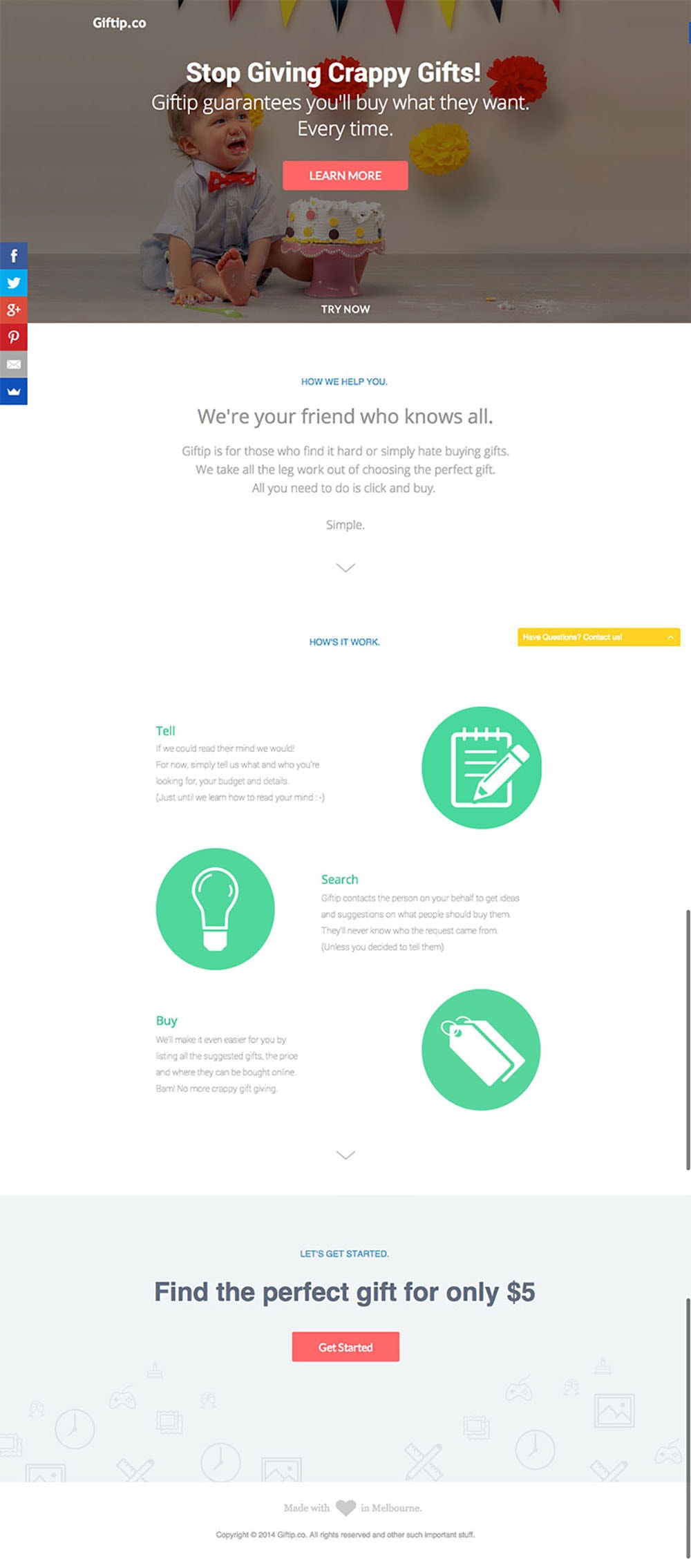
That said, Oli thought the sub-headers had room for improvement:
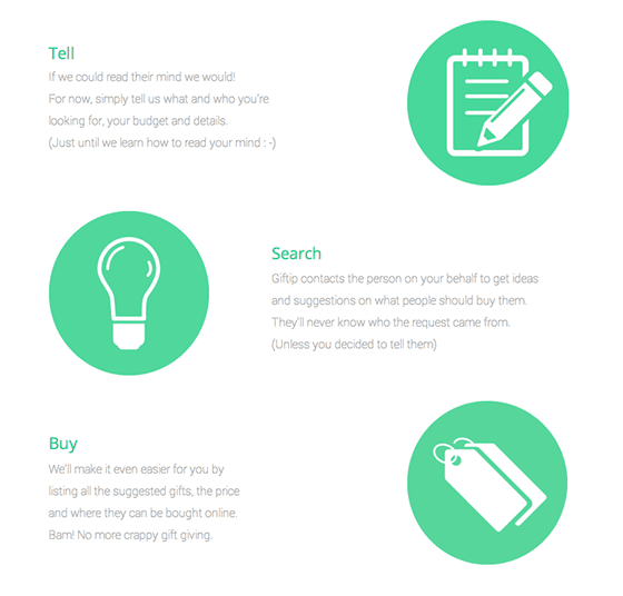
As he explained, sub-headers should be able to stand on their own – both in terms of communicating the value proposition and making sense in isolation.
Bonus tip:
Before you even touch the layout or design of your landing page, Oli and Noah recommended writing out your copy first, making sure it addresses the who, what, why and how.Creating your landing pages copy-first will help you ensure that you’re writing copy that speaks about (and directly to) the prospect, not your business.
3. Make sure you’re addressing all your prospects’ questions
When prospects land on your page, they have burning questions they want answered.
If you want to create a rich user experience, then you need to address each and every one of them.
That doesn’t necessarily have to take the form of a lengthy, salesy landing page. Consider Carcoin’s page:
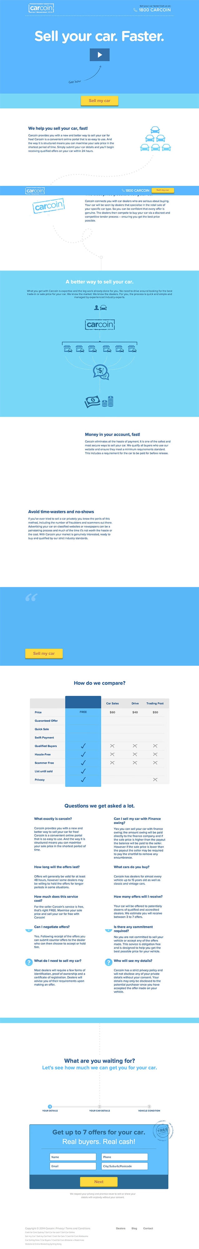
Since selling a car is a big decision, prospects will understandably have tons of questions about Carcoin’s service.
Instead of overwhelming visitors with a lengthy landing page with a wall of text, they opted for an explainer video to address some of these questions and keep the landing page design minimal.
Peep shared an important stat that you must keep in mind when putting explainer videos on your landing pages: only about 10% of visitors will watch your landing page video video from start to finish.
For that reason, it’s essential that both your landing page and your explainer video communicate your unique value proposition.
Bonus tip:
Remember that you can’t possibly anticipate everything that your prospects will want to know.For products and services that require a large commitment on the part of the customer, Noah recommended setting up additional levels of support such as live chat and a click-to-call phone number.
Giving prospects an outlet to ask questions shows that your business has truly invested in providing great customer service – and it gives you an extra opportunity to counter your prospects’ objections.
4. Don’t withhold any information
No matter what the goal of your landing page is, you should be helping your prospects make a decision.
If your landing page doesn’t give prospects all the information they need to make a decision, then they’ll get frustrated and they’ll bounce.
Have a look at Score Revolution’s landing page, which invites prospects to “Discover and license music from Danny Elfman:”

Peep took issue with this page because it asks prospects to enter their name and email address to access the scores. Without any music samples to preview, how do prospects know if they even like the music? As Peep put it, “Let me play!”
In the world of landing page optimization, you can’t just gate things for the heck of it. In order to entice your visitors to convert, you’ve got to give a little.
This page from Trumpia was guilty of a similar transgression:
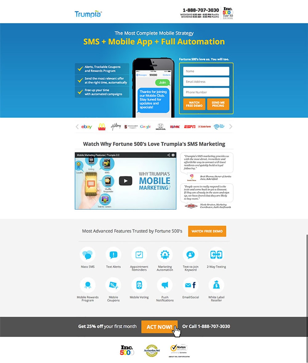
The judges pointed out that Trumpia withholds a very important piece of information on their landing page: the pricing information.
This is problematic because prospects often come to your page with a certain price range in mind. The judges explained that without giving them the information they need to assess whether you fit into their budget, prospects will become frustrated. And that kills conversions.
“I’m not gonna give you my damn email address to see how much your product costs! C’mon!” —@peeplaja #PageFights
— Tia K (@lil_tea) November 21, 2014
Your landing page needs to create an exceptional user experience
Creating an exceptional user experience is about thinking about the prospect’s journey from start to finish and proving that you care.
If your prospects don’t feel that you’ve taken their best interest to heart, then they’ll go somewhere else to get what they want – leaving you with a pretty sorry conversion rate.
To recap, here are four tips for creating exceptional landing page experiences:
- Be mobile-friendly. Optimize your landing pages for as many devices as possible.
- Don’t talk about yourself. Your prospect doesn’t want to read on and on about how great you are. Focus on demonstrating how your product or service will help alleviate your prospect’s pain.
- Make sure you’re answering all your prospects’ questions. Anticipate any questions your prospects might have and do what you can to answer them on your landing page – whether in your copy, with an explainer video, or by adding chat or click-to-call widget.
- Don’t withhold any information. Your prospects depend on you to give them all the information they need to make a decision. Demonstrate your value right on your landing page. And don’t make them give up their email address to see your prices!
Over to you – what other tactics do you use to ensure that you’re creating exceptional landing page experiences for your prospects?