Conversion Intelligence
The 7 Principles of Conversion-Centered Design
Don’t let your lack of design skills hold back your conversion potential. Learn how to think like a designer and create landing pages that not only look good—but convert better too.

You don’t have to be a designer to think like one…
Design is a blind spot for most marketers.
Unless you went to school for graphic design, this is probably not your main area of expertise. Maybe you can spot when something doesn’t look quite right on a landing page, but it’s tricky to figure out how to fix it. (Even trickier, how do you know what’ll actually convert?) Some of us fiddle with spacing and colors for hours before throwing our hands up and declaring it “good enough.” A lucky few can afford to pay a designer to work their magic—but making actual design decisions often feels so subjective.
There’s a better approach to landing page design. It starts by changing the way you think.
Because you don’t need to be born with a paintbrush in your baby hands to make something both beautiful and high-converting—all marketers can learn the principles of good design. Even if you struggle to color within the lines or still have no idea what the heck an F-pattern is. Landing page design is a skill you can develop, just like copywriting or optimization. In fact, it’s one of the keys to developing your conversion intelligence and becoming a better marketer.
You just need the right framework to get started.
What is Conversion-Centered Design?
Conversion-Centered Design (CCD) is a framework for building high-converting marketing campaigns. It encompasses all the persuasive design techniques and psychological triggers you can use to get visitors to take action on your landing pages. You can use this proven approach to net more leads, sales, and signups for your business.
Originally developed by Oli Gardner, co-founder of Unbounce, these seven principles have shaped the design of countless high-converting landing pages. Soon, we’ll be updating this resource with new design-specific insights from our machine learning. In the meantime, this is an up-to-date collection of our best tips, examples, and research on CCD.
This framework will teach you more than just how to make your landing page look beautiful. You’ll understand why a design looks beautiful, and exactly how you can improve it to get more conversions. So the next time you’re in a room and everyone is saying they like “Design A” for no particular reason? You’ll be the one person who’s able to point at “Design B” and show ‘em what they’re missing.
Conversion-Centered Design is the original framework for creating high-converting campaigns. With conversion intelligence now on the horizon, it’s time for the next evolution of landing page design.

Co-Founder, Unbounce
What Are the 7 Principles of Conversion-Centered Design?

Principle #1: Create Focus – The foundation of conversion-centered design is focus. Learn why it matters to focus your audience on one goal at a time, and how design can hold their attention.

Principle #2: Build Structure – Structure your page to influence visitors and guide them to action. Learn how to design your information hierarchy and set up your page layout.
Principle #3: Stay Consistent – Keep your pages consistent with ad matching, and design guidelines to bring in more conversions.
Principle #4: Show Benefits – The images on your page aren’t just there for show. Learn how to choose visuals that showcase the benefits of what you’re selling.
Principle #5: Draw Attention – Use your design to draw attention to the elements that matter most. Here’s how to attract visitors to your CTA buttons using colors and typography.
Principle #6: Design for Trust – Create social proof like testimonials and customer logos to build visitor confidence and prove credibility.
Principle #7: Reduce Friction – Make it as easy as possible for your visitors to convert. Here’s how to optimize your forms and mobile pages to create a seamless experience.
Principle 1: Create Focus
Every time you create a landing page, you’re competing against all the stuff out there that might distract your target audience. Some of this you can’t control—like an Instagram notification, or a juicy bit of gossip coming about a coworker. But many distractions you can control—like the links on your page, or how many options you give visitors.
That’s why the first principle of conversion-centered design is to create focus. Every design element you include on your landing page should be in service of one, singular campaign goal.
Why Focus Matters in Conversion-Centered Design
The more options or calls to action you give visitors, the more likely they’ll be to get confused or distracted. In psychology, this is known as analysis paralysis or overchoice. It’s that familiar feeling of “too many choices” you get when you spend an hour scrolling through Netflix looking for a movie to watch (only to end up looking at cat videos on your phone, instead).
Sure, it’d be great to promote your ebook, let visitors know about your newsletter, get them to follow you on Twitter, and sell them on your product at the same time. But realistically, people can only focus on one action at a time. The more choices you give visitors on a landing page, the more people will click away.
For the original Conversion Centered Design framework in 2013, we analyzed over 20,000 lead gen landing pages at Unbounce to see how the number of links on a page affects conversion rate:


As you can see, the more links there are on a landing page, the lower the conversion rate tends to be. This isn’t true in every case, but it’s strong evidence that having one goal on your page will make visitors more likely to act.
Worry first about creating FOCUS. What’s your main offer? Stick to that. Clear focus eliminates the possibility of ‘paralysis by analysis.’ Landing pages with more than one purpose typically have no purpose.

Senior Manager of Demand Gen, Talkdesk
Aim for a 1:1 Attention Ratio
To design your marketing campaign with a single goal in mind, you have to improve the attention ratio on your landing pages. Because a poor attention ratio can have a direct and negative impact on your conversion performance.
Attention ratio compares the ratio of the number of things you can do on a given page to the number of things you should do. Unbounce devised this concept to illustrate why it’s so important to eliminate distractions from your marketing campaigns. The highest-converting landing pages always have an attention ratio of 1:1.
Take a look at the current Unbounce homepage, and you’ll see it has an attention ratio of around 20:1 (not including all the links in the footer).
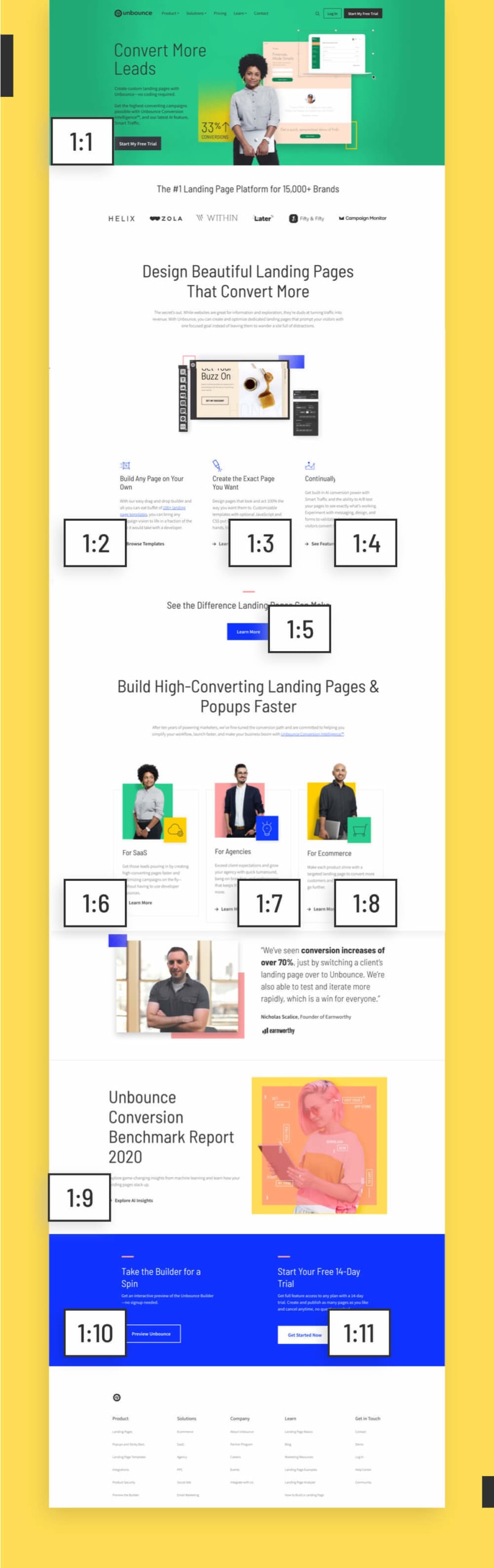

An uneven attention ratio makes sense on a website homepage. Why? Because different people are visiting this page for different reasons. Some are ready to jump in and start a free trial, sure. But others don’t even know what a landing page is yet. This page must serve different functions for different stages of awareness. A website—especially a homepage—is built for exploration.
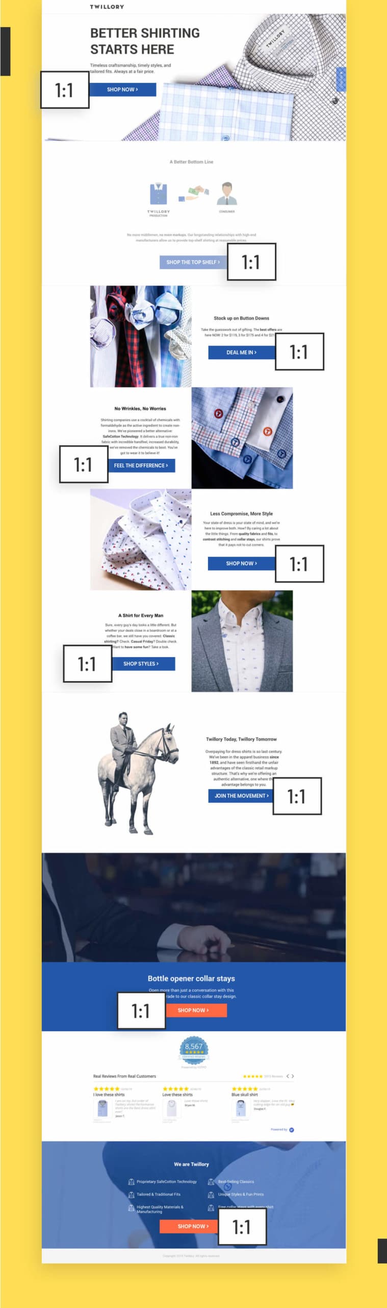
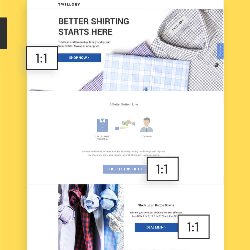
Your landing pages, though, these should be serving one campaign goal. This is why they get better conversion rates than most homepages ever do. Check out this example from Twillory with that perfect, golden 1:1 attention ratio. Every button here supports the same goal. And it’s converting at a whopping 46.86%.
Think about what you want visitors to do! If something on the page does not get them to that desired result? Remove it. Take out links that point people away, or have them open in a new tab.

Marketing & Branding Strategist and Consultant
Design for a Single Campaign Goal
Ultimately, you need to choose just ONE goal for your landing page to base your design around. Start by answering this question: “What is the main action we want visitors to take on this page?”
This will be your north star to guide the design process. Because the more you can align your page with a single goal, the more likely your page will be to convert. Create focus by applying these changes:
• Remove website navigation links and menus, and take out unnecessary links to your social channels
• Hide nice-to-know info in lightboxes or collapsible sections
• Make sure it’s obvious what you want visitors to do next by providing only one path forward (e.g., fill out this form)
Having Trouble Choosing One Goal?
A “one-size-fits-all” design won’t convert every visitor. You can use the AI-powered tool, Smart Traffic to create new landing page variants for each of your different goals. It starts automatically optimizing in as few as 50 visits!
Learn More About Smart Traffic
Principle 2: Build Structure
A conversion-centered landing page doesn’t just look good—it also subtly guides visitors to keep scrolling and take action, too.
The key here is to build structure and create a natural flow for your landing page. Balance the content in a way that’s both visually appealing and also constantly showing visitors what to do next. Not only will a great layout help you get over the anxiety of a blank canvas, it’ll also save you a lot of headaches later on.
Design Your Information Hierarchy
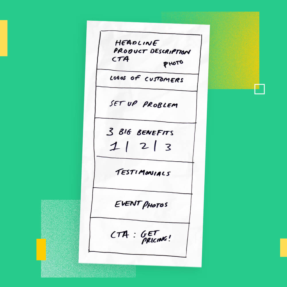
I have a marketing friend—let’s call him Frankie—who always starts out by picking a landing page template he thinks looks good and copying the layout exactly. Don’t be like Frankie. You’re skipping a step if you jump right into the templates before thinking about your own design needs first.
Start by developing an information hierarchy, instead. This is the order you present info on the page, and getting it right is a process that involves both copywriting and design. Get it wrong (or copy a template without adjusting it to suit your goals), and you might end up with a situation where you shoehorn in a company mission statement before explaining the benefits of your offer first. (Love you, Coser Template, but c’monnn.)
Think through the different components you need to support the goal of your page, and write them down in their most logical order. Highlight the pieces you think are most important to determine the layout of your page, and how large to make key sections. If you’ve done customer research or developed personas, these can help you here.
Find a Matching Landing Page Template
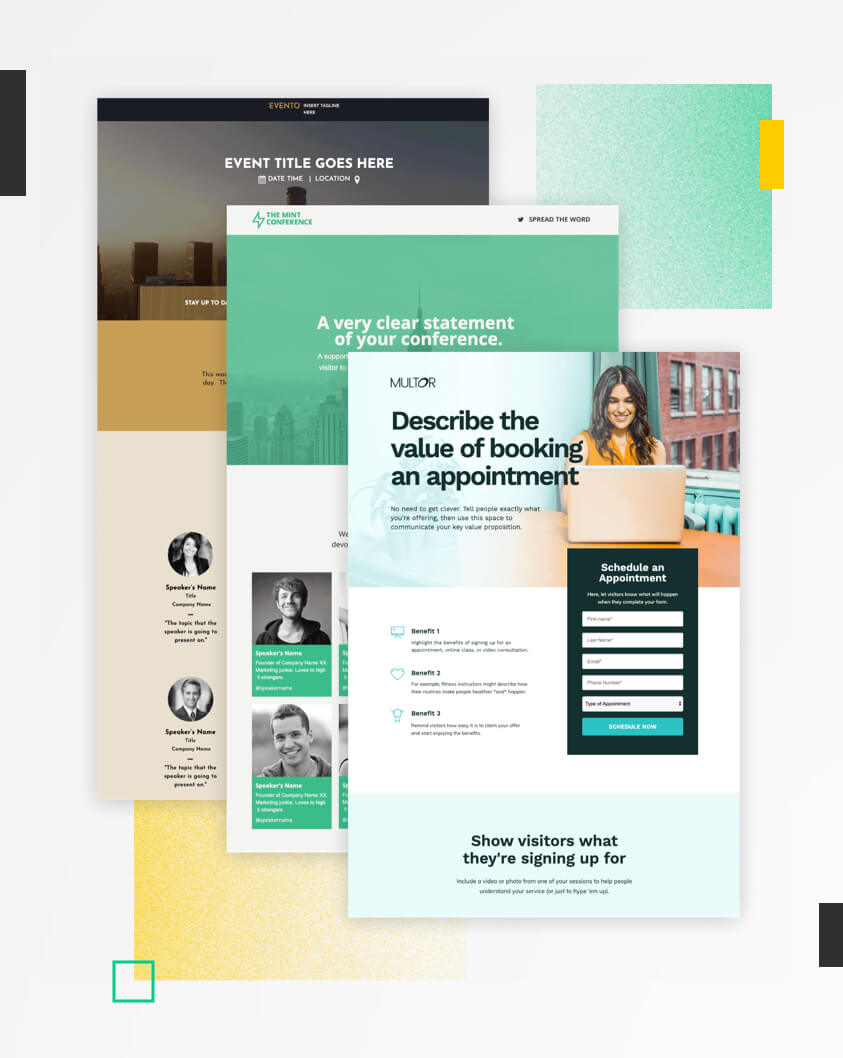
At this stage, it can be helpful to look at some landing page templates to find one that matches your information hierarchy. (There are 100+ high-converting options to choose from, so you’ve got pretty good odds.) You’ll be able to re-order the sections and customize the design in a snap to match your brand.
See Landing Page TemplatesThere has to be a balance between your visuals and content. They need to support and work together on the page. If you approach them like two separate projects, you’re going to have a much tougher time.

Senior Interactive Designer, Unbounce
Design Your Landing Page Flow


Once you’ve decided on the order of each section, it can be helpful to think through the flow from a visitor perspective. How much content will each section need? Where will the images go? How can you break up the sections so it’ll be visually interesting?
What you don’t want to do is dump content all over the place. This was the mistake developers made back in the early days of web design. It’s how we ended up with stuff like the notorious Space Jam website. (Where do they want you to click first? Who cares!)

Since then, designers have become much more strategic with the way they lay out a page. Heat maps have shown that there are two main patterns visitors follow when they’re reading online.
F-Pattern
If you’re working with a page that has a lotta copy on it, the F-pattern might be the one for you. Visitors typically start out in the top left corner, look to the right side of the screen, then down the left side until another element or line of copy catches their attention. (Creating an F-shaped pattern in the heat map.) If you have a text-heavy page, you’ll want to keep this in mind and put your most important info somewhere along these lines.
Z-Pattern
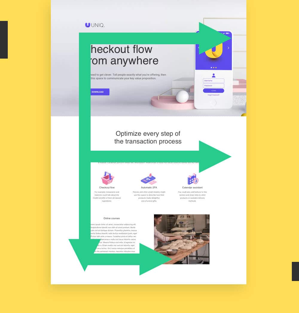
If your page is light on text, you’re better off designing for a Z-Pattern. This is how readers typically approach a page with less copy on it. You can play with this pattern by alternating between left and right-aligned content blocks in your landing page structure. This helps to break up the page in an appealing way, and creates a natural flow for the eye to follow as you scroll.
Should You Create a Full Wireframe?
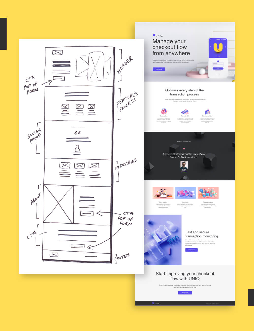
Having a solid information hierarchy should be enough for most marketers, but sometimes you need a little bit more. Before heading into Unbounce to drag and drop together the vision, a wireframe can help you visualize what goes where, how much copy you’ll need, and what the end result should look like. You can create a simple wireframe using a pen and paper, or try an online tool like Sketch or Miro to create something with higher fidelity.
Your wireframe is like the blueprint before you start building the house. You would never contract the builders until you knew the size of your rooms, or how many bedrooms you needed first.

Senior Art Director, Unbounce
Designing for mobile-first? You’ll want to create a single-column layout and remove any heavy graphics or long content sections. For more tips on designing for smartphone and mobile devices, jump ahead to Principle #7: Reduce Friction.
Principle 3: Stay Consistent
We often call landing pages “standalone.” They exist outside your website, so you have the freedom to try out new designs and iterate faster than a web developer. Just because your landing page stands alone, though, doesn’t mean your design should too.
Consider the entire ecosystem of your brand and your audience journey as you start to build out your page. When you stay consistent between your landing page and your other assets—like your website and your ads—your visitors will be more likely to feel like they’ve “landed” in the right spot.

Create a Consistent Brand Experience
Your brand is really all about the relationships you build with your target customers. Every touchpoint you have with them helps to define that relationship and how they see your company.
When it comes to your design, this means you should ideally use the same fonts, colors, and styles across your landing pages and your website, like in this example from Branch Furniture. Resist the urge to try something wildly different or experiment with a new style. When you do this, you risk creating a disconnect for customers.
Designer Tip: Use Your Website as Brand Guidelines
Large brands often create brand guidelines to keep track of their fonts, colors, and other design elements. These can range from simple (a set of three pages in a slide deck) to overwhelming (a 45-page PDF?!). If you don’t have time to create your own set of guidelines, you can always reference your website as the ultimate source of truth. As a rule of thumb, we recommend sticking to two fonts (one for headers, one for body copy), and no more than three main colors on your page.


Design Match Your Ad to Landing Page
Most marketers are already familiar with the concept of message match. But there’s also a lesser-known cousin that marketers tend to overlook: design match. This is a measure of how well your landing page design matches the visuals of your ads.
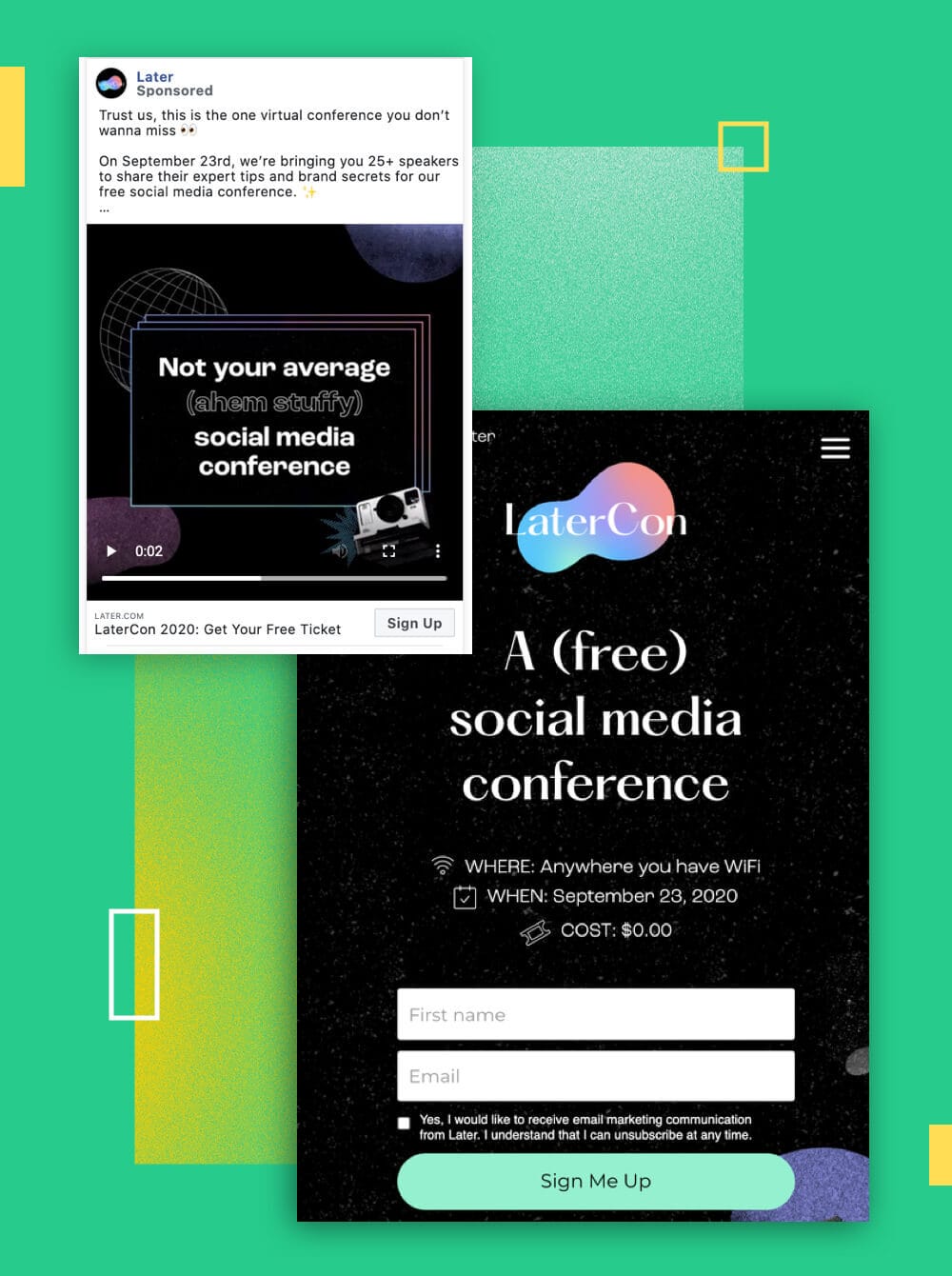
In practice, this means pulling through design elements from your hero image and color scheme to any visual ads you create. This example from Later shows how mirroring the design elements doesn’t have to be 1:1, but as long as you carry over the right pieces (e.g., dark background, floating objects, pastel colors, prominent logo) you can keep the style consistent in the minds of your visitors.
Why does it matter if your ad design matches your landing page? Our brains actually process visual information up to 60,000 times faster than text, which means design is the first thing visitors will notice on their journey from pre-click to post-click. To make the landing page feel relevant to what they saw before, you need to create that strong feeling of coupling in the minds of your visitors.
I'm a firm believer in ensuring that the content on your landing page is relevant and consistent with the content that drove the visitor to your page. If you're running paid ads on social—include some of the ad copy, the image used in the ad, and any other branding elements.

Director of Marketing, HeyOrca!
Principle 4: Show Benefits
Have you ever heard the phrase you should “show not tell”? When it comes to landing page design, the visuals are your opportunity to show audiences why they should care about your offer. Photography, illustrations, and videos can help you connect with your visitors on a deeper level and capture those intangible emotional benefits (like joy, or pain relief) you can’t fully express with copy alone.
It’s not about choosing images because they look nice or match the color scheme of your page. You want to show benefits so visitors can visualize what your offer will do for them—and how it’ll improve their lives.
Clear vs. Clever: How Do You Choose a Hero Image?
The hero shot is the first visual that visitors see when they land. It should be attention-grabbing, but also clearly show the benefits of your offer. This is by far the most important visual on your landing page, so spend extra time to make sure it’s hitting the right marks.
Above all else, you want your hero shot to be clear. Visitors should be able to see your hero image and understand what your landing page is all about—even if they don’t read the headline. Don’t worry about getting too cute or clever with it—you might risk confusing visitors with something wildly unexpected. (Although this fantastic example from SnackNation shows how you can sometimes achieve both.)

Clarity above everything. 50% of websites, ads, etc ... are simply not clear. Such a basic mistake. But one so many people make. The smart stuff only works if *what you're selling* and *why I should care* are easy to understand.

Founder, Marketingexamples.com
The Three Types of Hero Shots
Photographs
The defacto standard for most landing pages, photographs of real people and objects help make the design of your page more tangible and trustworthy. You can shoot your own photography in-house, or use Unbounce to access more than 1,000,000 free professional-grade images.
Illustrations
Use custom illustrations to represent a more playful brand personality or abstract ideas. This has recently become a more popular design trend, but you’ll want to consider the additional time and resources they require to create.
Videos
A video background or feature video can help you showcase more nuanced benefits without taking up too much room on the page. These can be the most difficult to produce, but can also be more engaging for audiences and directly prompt them to take action.
People vs. Product Photos
There’s compelling evidence to suggest that featuring a photograph of a real-life person will get you a higher conversion rate than a photo or screenshot of your product. This is because showing photos of people tend to be more memorable and increase empathy for the viewers, making them more likely to buy. (A famous case study from Basecamp showed that photo of a person to a landing page boosted conversions by over 102.5%.)
The best-case scenario? Get photos of real customers interacting with your product or service, like this example from Bouquet Bar and Power Digital Marketing. These tend to be much more compelling than generic stock photos, and they show visitors very clearly what they can expect from your offer.


Use Images to Express Emotional Benefits
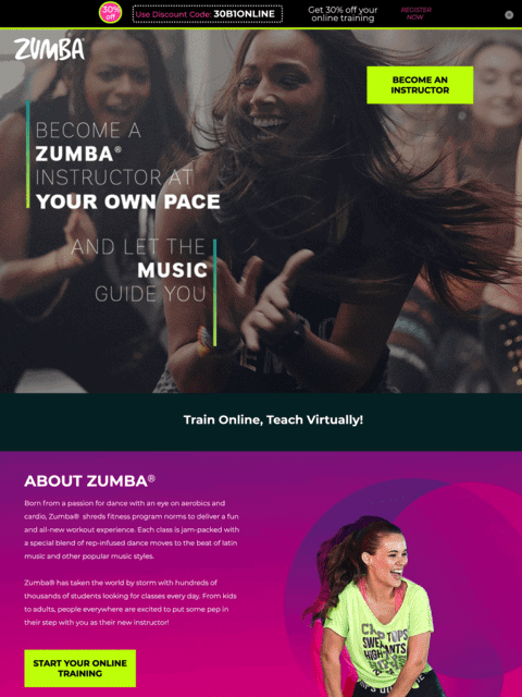
If you want to build a strong bond with your visitors, choose visuals that feature positive emotions like joy, pride, or love. This Unbounce-built example courtesy of Zumba and the agency MuteSix shows how you can use images like an aspirational mirror—they reflect the emotional state your visitors are hoping to achieve. This can come down to really subtle cues, too: in one experiment, a software developer found that adding a smile to a photo increased total profits by 10.7% over five weeks.
Feeling Negative?
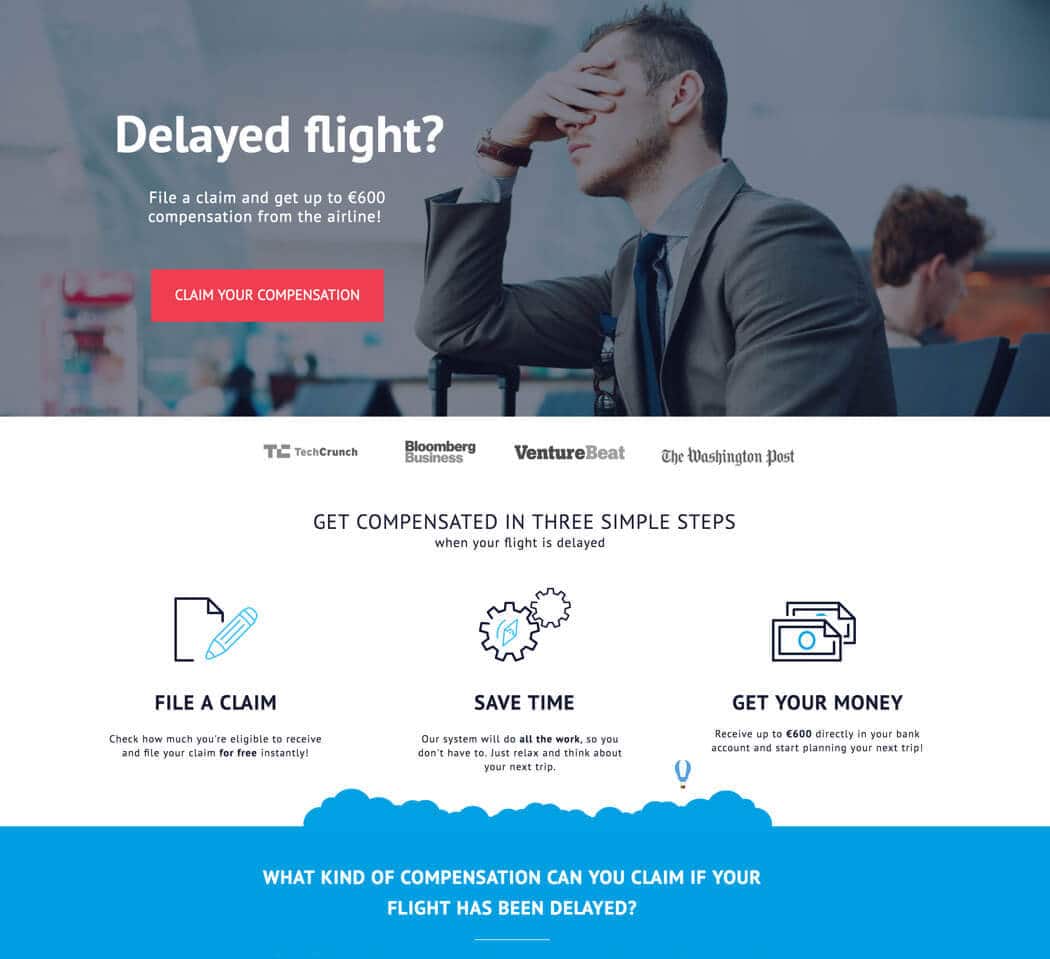
You can also use images to express negative emotions and agitate your visitor’s pain points. This Unbounce-built example from ClaimCompass shows the all-too-real frustration of waiting on a delayed flight. It’s netting a 30% conversion rate by tapping into what visitors are feeling when they visit the page (you can imagine them in the airport doing this exact pose) and enticing them with an offer to claim compensation from the airline.
Designer Tip: Perform a “Squint Test”
As you start to pull in more images onto your landing page design, it can be helpful to perform a “squint test.” Zoom out of the design of your page and squint your eyes so you can’t read any of the copy. Can you still get a sense of what your landing page is about? The images should be telling a subtle, visual story about the benefits of your offer.


Principle 5: Draw Attention
Attention is why peacocks have evolved to grow colorful plumage, why tabloid magazines feature outlandish quotes in large print on their covers, and why so many people include photos of cute dogs in their Tinder profiles.
Colors, fonts, patterns, and shapes. These are the subtle (and sometimes, not-so-subtle) design elements that help you draw attention to particular points of interest on your landing page. You can use them to catch the eye of your visitors and point to what matters most on your page: the CTA.
Use Color Theory to Influence Visitors


When it comes to color theory and color psychology, there are a lot of misconceptions. You can spend an entire afternoon reading about what emotions people associate with different colors, or digging into a case study where a green button converted better than a red button.
Take all of it with a huge grain of pink Himalayan salt. While color might have some impact on your conversion rates and influence your visitors on a subconscious level, there are no hard and fast rules that’ll work for everyone. That said, here are some of the more important things to keep in mind when picking out your palette.
Choose Contrasting Colors
To choose which colors to use on your landing page, start with your brand colors. You can use a color calculator to find matching colors that look good together, or contrasting colors to help certain elements stand out. While most landing pages use white as their primary background, you ought to also try experimenting with other pops of color to add some visual interest and break up your page.
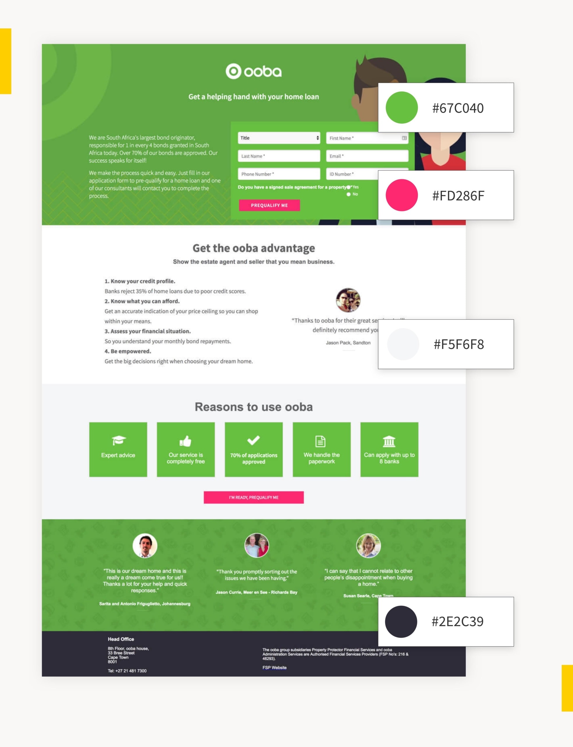
In most cases, it’s best to use a maximum of three to four colors (not including the ones that show up in photos or other visuals). Take a look at this Unbounce-built landing page from Ooba for an example of how it’s done. If you try to add too many, your design will be difficult and disjointed for visitors to process.
Use a Key Color to Highlight Your CTA
Once you start applying your colors to your landing page, there’s another important design rule to keep in mind. You should always reserve one of your colors—ideally, the boldest and most eye-catching one—and apply it only to your call to actions. This way, they’ll naturally jump out more to visitors and grab their attention.
Designer Tip: Use Negative Space to Draw Attention
We have a tendency to overstuff our landing pages with far too much content. Graphics, photos, videos, colors, and big blocks of text can overwhelm visitors and cause them to lose focus. Try giving your most important benefits or CTAs more room to breathe, like in this Unbounce example from Australian Life Tech. This is called “white space” or “negative space” in design—and it proves that sometimes less is more.

Create Contrast with Fonts and Typography
Nobody is going to read every single piece of copy on your page. (Except maybe your boss. Eep.) Most people are going to skim. That’s why it helps to have a strong visual hierarchy in place so visitors have an easier time picking out important information. Decide which content is need-to-know on your page, and use headers, bold, italics, point form, and colors to help frame it in the best possible light.


Use Directional Cues in Your Images
Marketers have done a lot of research using eye-tracking tools and heat maps to figure out where people tend to look first, and have discovered you can use directional cues like eyelines or arrows to draw their attention.
You can use this strategy on a landing page to direct your visitor to your headline or your CTA button. Check out how the eyelines line up to naturally draw your attention in these two examples.


We include imagery that is not only industry or content-specific, but the subject is looking at the action in which we want the user to take. This has resulted in higher conversion rates.

Design and Development Lead, Delmain

Design Your CTA Buttons to Get More Clicks
- Button Sizing – Your CTA button (and font-weight) should be about twice the size of your body copy in order to draw attention. Ideally, you want it to be the second thing visitors look at after reading the headline of the section.
- Button Effects – Gradients, bevels, and drop shadows can all help your button look more enticing to click. But if you want to go with a more modern flat design approach, you should also enable a “hover state” so your button changes colors when visitors scroll over.
- Button Placement – In general it’s a good idea to have one CTA “above the fold” and one at the bottom of the page for visitors who scroll all the way down. If your page involves a fair bit of scrolling, you may want to include more as regular reminders for visitors about the next step. (Be wary though—add too many, and you’ll just seem pushy.)
Start with a High-Converting Template
Browse over 100+ high-converting landing page templates. These have been custom-made by the Unbounce team to help you draw attention and score more conversions.
See Landing Page Templates
Principle 6: Design for Trust
Your visitors are taking a leap of faith when they click an ad. The internet is full of sketchy websites and spam offers that are literally “too good to be true.” If this is the first time someone is interacting with your brand, you need to design for trust. Prove your credibility by putting together social proof that’s not just convincing, but believable.
Design Trustworthy Customer Testimonials
A poorly designed testimonial can actually make your landing page seem less trustworthy. If you don’t include certain trust signals, visitors will assume you’ve just made up a fake customer and written this review yourself. Here are some tips to counter that.
1. Use a Well-Framed Headshot – A headshot photo is your first point of evidence that this review comes from a real person. (Look—they have two eyes, a nose, and everything!) Not only will a smiling photo draw attention to the testimonial, it’ll also serve as a mirror for your target audience to show how happy they can expect to be.
Make sure you source a high-resolution photograph where you can clearly see the face of your customer. Don’t crop your image in too close though—researchers have found that extreme close-ups tend to make the subject look less competent and trustworthy. Pull it back so you can see their shoulders, and leave room at the top so you get a full view, like in this example from a Thinkific landing page.

2. Highlight Key Details – A photo isn’t always enough, though. To prove your testimonial is legit, you also need to highlight identifying details. Typically, this means the full customer name—not just “Alex H” or “Aaron B”—and other details like the job title, company name, or location. Within the quote itself, you can also use bold or highlighting effects to catch the attention of visitors. This is a great way to emphasize key benefits and make your testimonials easier to scan.

3. Feature Multiple Testimonials – One testimonial can sometimes be powerful enough to persuade visitors. But if this is the first time someone is interacting with your brand, you can bring even more trust to the table by including a collection of reviews on the page. In social psychology, this is because of something called the bandwagon effect. Visitors are more likely to try something for themselves if it seems like “everybody is doing it,” like in this Unbounce landing page example from MixMax.

Designer Tip: Don’t Let Logo Bars Be Distracting
Because logos tend to be designed to catch a visitor’s eye with unusual shapes and colors, it’s typically best to desaturate any customer logos you feature on the page. You’ll also want to size them slightly smaller so they’re not distracting from the rest of your design. This example from Alchemy Fine Home shows how you can represent customers or media placements without distracting from the rest of your design…

Help Your Most Important Social Proof Stand Out
It’s not just about what gets said in your testimonials, it’s about where you place them on the landing page too. Size the text slightly larger than your typical body font so it naturally commands more attention, and leave lots of breathing room around each quote so visitors take notice. This example from Grass Roots and the agency MuteSix does a great job of it.


Want to give them even more oomph? Add in branded elements—like illustrations, colors, or shapes—to help frame each customer quote and align it with the rest of your design. This example from Unbounce customer Packlane perfectly integrates their brand style and carries that through into the design of the testimonial itself.


Remember: It’s All About Trust
Your visitors are savvy. They can sniff out if a testimonial is fake, or if you’re rounding up your review scores a little too high. Don’t give them a reason to click away and start searching third-party review sites for outside opinions—make sure…
- Each testimonial has enough personal details to make it both relatable and credible.
- Your social proof is placed well within your information hierarchy.
- Where appropriate, you’ve included other types of social proof as well—including awards, ratings, social shares, and logos.
Principle 7: Reduce Friction
Sometimes we get so caught up trying to make our landing pages look good, we forget about making sure they work properly too. But any problems visitors encounter on the page—whether it’s a minor inconvenience, or a design-breaking glitch—might end up costing you conversions.
This is why you need to account for user experience (UX) and reduce friction wherever possible. Here are some tips to make sure your design is seamlessly functional and delightful for every type of audience.
Simplify Your Forms
Nobody likes filling out forms. Unless you’re some sort of bureaucratic weirdo who gets a kick out of ticking little boxes, it’s usually a hassle. Visitors see a form and typically think just one word: “Ugh.”
That being said, there are some simple design improvements you can make to reduce friction and ensure visitors have a better experience.
Minimize the Pain
The most common mistake when it comes to designing a form is asking for too much information. Based on Unbounce machine learning analysis, we can confirm there are differences in the optimal number of form fields you should include on a landing page depending on your industry. Our team is still crunching the numbers, but we can tell you now that in most cases—shorter does tend to perform better.
This doesn’t mean you should just cut all your form fields though. The info you’re collecting can be valuable for qualifying leads and getting to know more about what problems they’re trying to solve. Trim the fat where you can, but keep any must-have form fields you can’t afford to lose.
Use no more than three to five fields for a form. The number depends on your goals and what information is most important to your lead generation/sales efforts.

Senior Digital Marketing Manager, Greenhouse Digital
Know When to Ask for a Name
Our machine learning model found that having “name” (first, last, or just “name”) listed as a form field on a landing page can have a correlation with lower conversion rates in these industries:
• Ecommerce, Education, Catering, Travel, Medical Practitioners, Business Services, Legal, and Finance
In these four industries, you’re pretty safe to ask for someone’s name in a form, as there doesn’t seem to be such correlation with lower page performance:
• Agencies, SaaS, Family Support, Real Estate
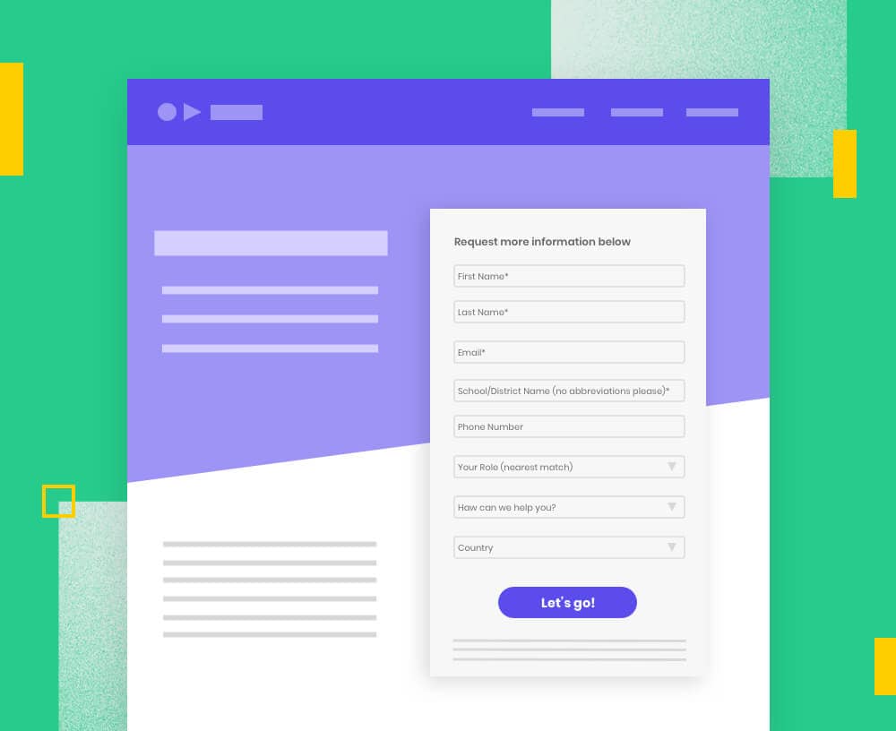
Use Multi-Step Forms
You’re more likely to see higher conversion rates if you use a multi-step form. It’s less intimidating and increases the chances of visitors actually filling out their information. (Plus, by splitting your questions up, you can save more sensitive or difficult questions for later on after they’ve already started.)
Notice the progress bar at the top? This isn’t just there because it looks nice—it also subtly helps reinforce visitors to let them know how quickly they’re progressing and show them the end is in sight. Head on over the Unbounce community for step-by-step instructions on how to add a multi-step form to your landing page.


Get Your Landing Page Mobile-Ready
Worldwide, more web traffic comes from mobile devices than desktop computers. So before you hit publish, you’ll wanna make sure your landing page design is functional and looks good on smartphones too…
• Keep your design simple – Rearrange your content into a single column (around 980 pixels wide) to see what it would look like on a smartphone, and make adjustments based on this new design. See which elements (like extra multimedia, or unnecessary sections) you can lift out.
• Cut down on copy – Distill the information on your page to just the essentials, and make it easy for visitors to skim. Bullet points and short sentences are your friends.
• Nail your design “above the fold” – Most people spend less time on mobile pages than on desktop and bounce rates are way higher. That means your design needs to connect with visitors the moment they hit your page.


Make sure the content is represented well through your page layout, and always think about the user experience. I’ve seen way too many landing pages that have great content but unfortunately the layout makes the content harder to read or makes it visually boring and unbalanced.

Content and Digital Marketing Associate, ATS Automation
Check Your Page Speed
Quick load times are essential to converting with mobile landing pages. According to data from the Unbounce Page Speed Report, folks have much shorter attention spans on their mobile than they do on a desktop. This means you want to keep things extra lightweight on your mobile landing pages. Check out some of our tips to get things running faster.

Design for Accessibility
Finally, conversion-centered design should always be as accessible as possible. Consider people who may be experiencing varying degrees of auditory, cognitive, physical, speech, and visual disabilities. Use tools like this online contrast checker to keep your copy legible and be sure to include alt-tags for any important graphics on your page. For more information, check out the W3C Guide to Diverse Abilities and Barriers.


The power of the web is in its universality. Access by everyone regardless of disability is an essential aspect.

Inventor, World Wide Web
Your Landing Page Design Journey Doesn’t End Here
Create focus. Build structure. Stay consistent. Show benefits. Draw attention. Design for trust. Reduce friction.
These seven principles are the Unbounce framework for designing better landing pages. Put them into practice on your next marketing campaign, and you’ll immediately be able to tell the difference in how your page looks and feels. (Even your designer friend with that color wheel at their desk will be très impressed.) But there’s still a lot of room within these principles to get creative and try out new ideas—so how do you know if your design is actually working to get you more conversions?
Well, that’s where things get interesting.
Because there’s no such thing as a perfect design that works for every visitor. Some people are going to always prefer “Design A” while others respond better to “Design B.” Now, you can serve up both options (and so many more) using Smart Traffic. This AI-powered optimization tool automatically routes visitors to the landing page they’re most likely to convert on, which gives you the unlimited creative freedom to explore what works best for your visitors.
Get ready to evolve your design skills and optimize with conversion intelligence.
Don't feel like you need your design to be perfect. Get that MVP out and test, test, test!

Director of Growth Marketing, VRIFY

Optimize Your Design with AI Power
Pair your marketing skills with the power of AI and machine learning. Smart Traffic helps you convert more often by “automagically” delivering the best landing page design to each and every visitor.
Learn More about Smart Traffic