What is a call to action?
Calls to action (CTAs) are short phrases or buttons on your website that tell visitors what to do next—like “Sign up now” or “Get your free guide.”
Think of them as the digital version of a salesperson pointing customers toward the checkout counter. CTAs guide visitors to take specific steps that help achieve your marketing goals, whether that’s joining your email list, downloading content, or making a purchase.
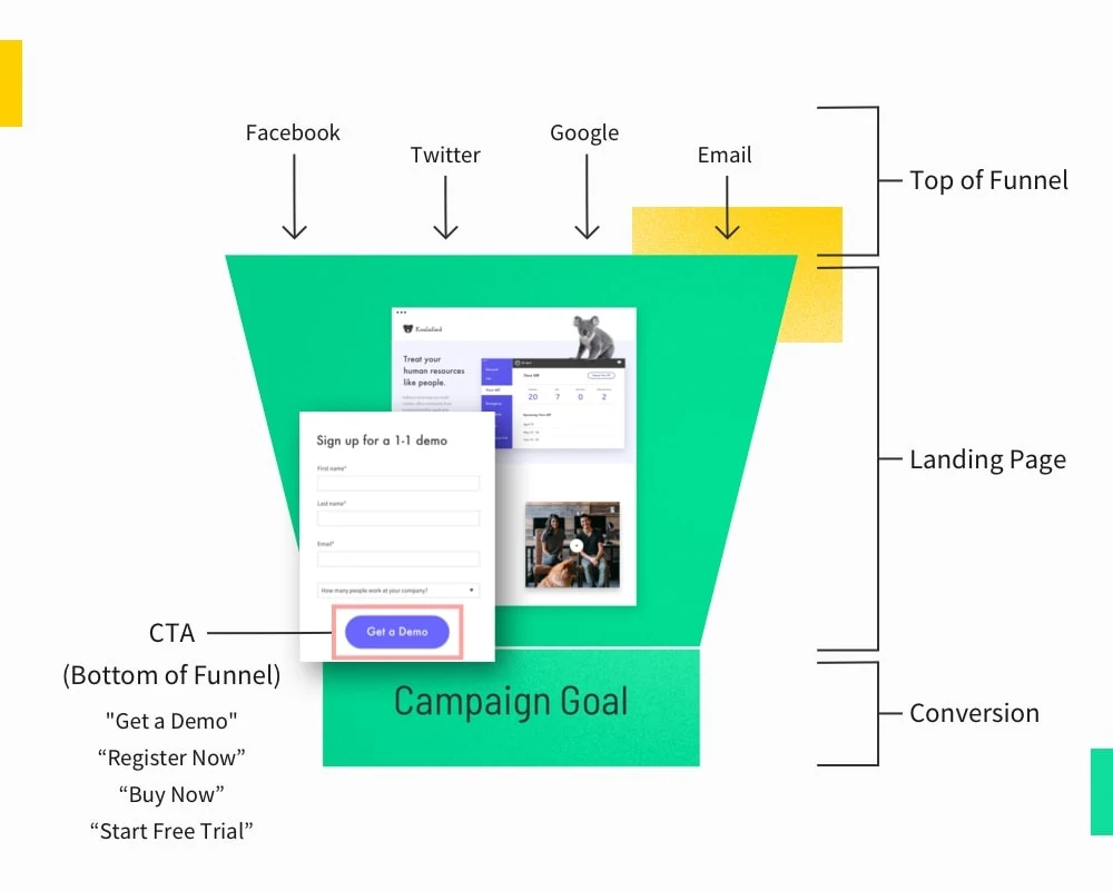
Every landing page needs a call to action (CTA)—a short phrase that guides visitors to take a desired action. While the body copy reflects your unique value proposition (you know, all the juicy benefits to the visitor), your CTA is the site of conversion, with one focused, action-oriented button.
It may only require a few words, or it could be a phrase, but your CTA should be clear about how to convert and what users can expect by converting.
Let’s say you want more sign-ups for your yodeling class. “Register for a yodeling class” clearly indicates that by clicking the button, users will register for a yodeling class. Plain and simple. With a clear and direct CTA, everyone wins. You turn interested prospects into paying yodelers, and they become the coolest cats on the block.
Why are calls to action important?
Your call to action is an essential part of your landing page. You may express your value proposition well, but to actually convert your prospect, there needs to be an action for them to take. Imagine your landing page without a CTA—your prospects would float around the rim of your marketing funnel with nowhere to go! CTAs provide clear, easy direction on how to convert.
Are all calls to action CTA buttons?
A CTA usually comes in the form of a clickable button. Why? It streamlines the action required to convert. “Click here to sign up.” (That’s it—really!) No fuss, no muss. Once clicked, it carries your leads through the marketing funnel and transforms them into valuable conversions.
The purpose of CTA buttons is to draw the reader’s attention to the CTA and entice users to convert by clicking it. So when you start designing your landing page, think about how you can highlight the button. This may also mean toning down other elements, so it doesn’t have to compete with them.
Design tip: When it comes to CTA buttons, no need to get fancy. Stay true to the basics and make sure:
- They have a defined shape or border.
- They are a different, contrasting color from the background.
- They have intentional, action-oriented copy on them.
- The link works! (Seriously, this is important.)

Use simple tactics to attract the user’s gaze—like Mixmax does here. To stand out, Mixmax simply puts a bright green button against a plain dark background to really draw attention to its CTA. Or if it’s a text CTA, make sure the hyperlink is a contrasting color so visitors know it’s clickable.
Common types of CTAs (with examples)
There are six main types of call to action examples you’ll use across your marketing materials and email campaigns. Each one serves a different purpose in moving people toward conversion.
1. Sign-up CTAs
Want to grow your email list and generate leads? Sign-up CTAs like “Join our newsletter” or “Join this free webinar” are your bread and butter.
These work great at the end of a blog post where readers (ideally your target audience) are already engaged with your content. The key is offering something valuable in exchange for their email—like exclusive content or early access to deals.
Sign-up CTA examples:
- “Join our weekly marketing tips”
- “Get industry updates in your inbox”
- “Subscribe for exclusive deals”
- “Sign up for free templates”
- “Join 10,000+ marketers”
- “Get the inside scoop”
2. Download CTAs
These CTAs are used to share valuable resources while capturing leads. Think “Download your free guide” or “Get the checklist.”
If the resource you’re offering is valuable enough, download CTAs are a great to encourage users to exchange their contact info (thus, inviting you into their inbox) to get it. Just make sure what you’re offering matches what your target audience needs.
Download CTA examples:
- “Download your free guide”
- “Get the 2025 report”
- “Grab your template”
- “Download our pricing sheet”
- “Get the checklist”
- “Save your copy”
- “Access the toolkit”
3. Purchase CTAs
Ready to make the sale? Purchase CTAs like “Buy now” or “Add to cart” need to be crystal clear about what happens next. Place these prominently on product pages and at natural decision points in your sales journey.
Purchase CTA examples:
- “Buy now”
- “Add to cart”
- “Get it now”
- “Complete purchase”
- “Secure your spot”
- “Claim your offer”
4. Learn More CTAs
Sometimes visitors need more info before converting. That’s where “Learn more” or “See how it works” CTAs come in. Use these to bridge the gap between initial interest and conversion, especially for complex products or services.
In most cases, these should be a secondary CTA on your landing pages. This will allow to you to still carry potential customers who are ready to act toward your ideal conversion goal, while still offering an additional path for prospective customers who aren’t quite ready.
Learn More CTA examples:
- “See how it works”
- “Learn more”
- “Discover features”
- “Read customer stories”
- “View case studies”
- “Explore solutions”
- “Watch the demo”
5. Trial CTAs
Free trials are conversion goldmines. CTAs like “Start your free trial” or “Try it free for 30 days” let people test drive your product with zero risk. These work best when you highlight the “free” aspect and specify the trial length.
Trial CTA examples:
- “Start your free trial”
- “Try free for 14 days”
- “Get started free”
- “Test it out”
- “Start your test drive”
- “Begin your free month”
6. Book/Schedule CTAs
These CTAs are ideal for service businesses or enterprise software companies. Think “Book a demo” or “Schedule a call.” They help you land meetings with prospects, typically when you’re selling something with a higher ticket price that requires a consultative selling process.
Make it clear how long the meeting will take and what visitors will get out of it. This can help turn a simple CTA into a compelling call to action.
Book/Schedule CTA examples:
- “Book your demo”
- “Schedule a call”
- “Get a free consultation”
- “Book your strategy session”
- “Reserve your spot”
- “Get expert advice”
- “Talk to our team”
How to write calls to action that convert
Your call to action can make or break your conversion rates. Here’s how to write CTAs that motivate people to click, sign up, and buy.
Step 1: Define your conversion goal
Whatever your conversion goal may be, the purpose of CTAs is to support the act of converting.
That being said, you can’t just throw a big, shiny button on your landing page and expect your conversion rates to soar. Your CTAs will vary for every campaign. So in order to maximize conversions each time, you need to define your goal first.
A conversion goal is a measurable objective based on the action you want users to take on your landing page. Depending on your campaign and industry, some common conversion goals may be:
- Increasing sales
- Attracting high-quality leads
- Acquiring new members
- Gaining subscriptions
- Booking consultations
- Increasing registrants

Get the gist? Once you define your objective, it’ll be much easier to write copy and design a button that supports your goal. For some inspo, it wouldn’t hurt to take a look at these CTA examples—to see what exactly you gotta do to score some clicks.
Step 2: Understand how your target audience is thinking
Here’s the deal: your website visitors all have different things on their mind when they land on your page. Just like you wouldn’t propose marriage on a first date (we hope), you shouldn’t ask for a huge commitment from someone who just “met” your brand.
Think about it this way—when someone hits your pricing page, they’re probably at least close to being ready to buy. They’ve done their research and they’re comparing options. That’s when a “buy now” or “start your free trial” CTA makes perfect sense.
But what about someone who just clicked on your Facebook ad? They might need to warm up first. Maybe they’re interested, but they want to understand more about what you do. Dropping a “buy now” CTA in front of them is like trying to close a sale before saying hello. For these folks, a softer CTA like “see how it works” or “get the guide” might work better.
The key is matching your CTA to where people are in their customer journey.
- Are they just starting to research? Hit them with helpful content.
- Ready to talk details? Offer a demo.
- On the fence about buying? Show them a case study.
When you sync up your CTAs with what visitors actually want to do next, your conversion rates will thank you.
Step 3: Write your CTA copy with intention
To write a strong call to action, you need straightforward language and action words that convert. Using clear action verbs and action phrases makes all the difference.
Many marketers overlook this task because it’s usually only a few words. While that’s true (i.e. “Sign up for our noon-hour webinar to hear about 2025 marketing tactics” doesn’t really have a ring to it) let’s make sure it’s not too simple—to the point of ambiguity. When prompting readers, make every word count towards your conversion goal.
When you read CTA buttons such as “get started” and “try now,” are you also leaning in expecting another word or two? Get started with what? Try… what? By the time your audience reaches the CTA, they should have no more questions—they’re so close to converting you could smell it! But if you leave room to question what they’re committing to, you also leave room for them to bounce. Your compelling calls need to be crystal clear.

We know CTAs ain’t easy to piece together in a few words. To help you check off the boxes, consider these questions:
- Does my CTA reflect my value proposition?
- Does my CTA include the action needed to convert?
- Can a visitor easily convert with my CTA?
- Is it clear what the users are committing to by clicking my CTA?
- Does my CTA align with my conversion goal?
Copywriting tip: Using first and second-person pronouns—words such as “me” and “my” or “you” and “yours”—helps the audience envision themselves buying or using your product. Get them excited before they’ve even purchased it!

And hey—if you’re in the SaaS industry and lookin’ for a second opinion, it doesn’t hurt to plug your landing page in the Unbounce Copy Analyzer. If your copy needs some sprucing up, it’ll provide instant recommendations—that includes how to create a higher-converting CTA.
Where to place your calls to action
When positioning your CTA button(s), consider how users will consume and scroll through your content, and place it somewhere that’s convenient for them to click. Following standard reading flow, it’s safe to assume that most users will continue down the page. So for your landing page, it makes sense to have one at the top (near your headline), as well as at the bottom of your landing page. If your landing page is long, peppering them throughout doesn’t hurt. Repeating yourself is totally okay here.

How to optimize your call to action
Once you’ve mastered the basics, it’s time to explore CTA optimization.
You’ve done all the legwork—why not squeeze all the conversions you can get out of it? Plus, if you’re paying for traffic, the an effective CTA could also play a huge role in lowering the cost-per-lead or sale
In marketing, optimization is the process of making improvements to your content so more visitors take action and you get more conversions—in a cost-efficient way. What changes can be made to optimize your CTA to increase conversions?
That’s a great question, hey? But the answer can be very different for each campaign. We recommend doing some A/B testing to uncover your path to optimization. However, instead of testing two buttons on the same landing page, create different variants of your landing page so you can isolate each CTA you test. This’ll give you a clearer understanding as to which one is performing the best.

What exactly should you be testing?
- Copy: Believe it or not, there’s a lot of ways you can tell someone to make a purchase in a few words. Play around with different pronouns, verbs, fonts and sizes to see how you can inspire the most action!
- Color: Bright, contrasting colors are great for your CTA button. But oh, the options! Red? Green? Yellow? Orange? Heck, try ‘em all and see what’s attracting clicks.
- Shape and size: Changes to shape and size may not be as grand as a color swap, but trialling different options is worthy to explore. You want to make sure it stands out from the rest of the copy and design. Don’t forget to see how it looks on mobile!
- Click triggers: Although these may not actually be on the CTA button itself, it’s worth testing the surrounding copy and design as well. Calling attention to limited supplies or timed offers, for example, are two copywriting tactics to get people to click right away.
Tracking tip: You can also monitor your visitors’ interaction with your landing page using a heat map software. Are people gravitating towards your CTA or skipping right past it? This is a great tool for tracking your visitors’ experience and discovering sections of your landing page that need some fine-tuning.
Common questions about CTAs
Let’s get your burning CTA questions answered. Here are the questions we hear marketers like you ask us most often about creating calls to action that convert.
Does every call to action need to be a CTA button?
Your CTA doesn’t necessarily need to be a button—it could be anchor text or an image, for example. But here’s why we recommend ‘em: what they are (and what they represent) is familiar to most visitors. This is one area of your landing page that doesn’t need to be super creative.
Can I include multiple calls to action on one landing page?
Yes, absolutely.
But if you use multiple CTAs, they should all reflect the same conversion goal—even if they’re worded slightly differently. So yes—you can use multiple CTAs, but they should all still roll up to one CTA.
Like your landing page, your call to action should also be focused. Incorporating several CTAs that reflect different conversion goals may distract or deter your audience from converting the way you want them to.
Imagine you just made a killer pitch for your dog walking service—so persuasive that your prospects are ready to leave their doggo in your hands! They scroll to the bottom and see “book a walk,” AND “view my rates.” Perhaps they would’ve committed right away. By offering more information on pricing, though, they’ll likely take a look at that first. And if the price isn’t what they had in mind, they might bounce before even giving your service a chance.
Humans are indecisive creatures. Offering more choices might bite you (and your conversion rate) in the behind.
If you absolutely must include multiple CTAs, make sure it’s crystal clear which is your main CTA and which is the second CTA. For example, you can use formatting to place the most emphasis on the primary action you want website visitors to take, then use much more simplified formatting for your secondary CTAs (like a learn more button).
Why is my landing page not converting?
Is your CTA not performing the way you’d hoped? Maybe it doesn’t reflect your conversion goal properly.
A common mistake is using top-of-funnel CTAs for bottom-funnel prospects.
We see ‘em all the time—“get in touch,” “show me more,” and “read on”—so they must work, right? Well, there’s a time and a place for them. If you’re targeting cold prospects or a new audience (who are unfamiliar with your brand), guiding them to more info makes sense. You’re warming them up to eventually convert.
But if you want to turn interested visitors into customers, they’re sitting at the bottom of the marketing funnel ready to be swept off their feet. They don’t need to “learn more”—so why give them time or reasons to change their mind?
A CTA, as its name suggests, is about getting people up off their butts to help achieve your campaign goal. If you’re a professional dog walker and seeking more clients, “see my rates,” would be a top of funnel CTA, whereas “book a walk” would be suitable for bottom-funnel prospects. See the difference? A question you should constantly ask yourself is: will this CTA inspire the action that I actually want them to take? If it’s to see your rates, that’s great! But if you want to book the walk, you gotta talk the right talk
What makes a good call to action for ecommerce?
A good call to action guides shoppers through your online store without feeling pushy. The best CTAs for ecommerce brands work like a helpful sales person—they show up at just the right moment with exactly what your customer needs.
A great call to action matches where your shopper is in their journey. For example:
- “Add to cart” works perfectly for straightforward products under $100
- “See payment options” helps ease concerns about bigger purchases
- “Shop the collection” guides browsers who are still exploring
- “Check availability” creates urgency for limited stock items
- “Get 10% off your first order” captures emails from new visitors
- “See reviews” builds trust when shoppers need social proof
- “View sizing guide” removes purchase barriers
- “Start your free trial” converts subscription shoppers
How do I design CTAs that grab attention?
Your call to action buttons need to catch your user’s attention instantly. Start with a high contrast color scheme—think a dark blue background with white text, or flip it with a white background and bold text.
For your main call to action button, avoid using a plain text link. Instead, feature text that stands out from the rest of your page. Call to action buttons should be impossible to miss, but not overwhelming.
What’s the difference between CTAs on a landing page vs. home page?
Your home page and landing pages serve different purposes in your marketing campaigns. A web page like your home page typically needs multiple CTAs because visitors arrive with different goals. Landing pages work better with a single, focused different CTA that matches your marketing campaign objective.
While your web pages (like your homepage) can offer various options, landing pages should limit choices to increase conversions.
AI-Powered Optimization
If you’re really looking to uncover your conversion potential, kick your optimization efforts up a notch using Unbounce’s Smart Traffic feature. Using machine learning, it’ll send the right landing page variant to the right visitor, according to their preferences. You can create variants with different CTAs, and Smart Traffic ensures your visitors see the one most likely to convert. No more lengthy testing to find a “one-size-fits-all” champion landing page.
