So you’re running a Facebook ad campaign.
You’ve created the best Facebook ad your client or company has ever seen: eye-catching photos, the world’s best copy, click-worthy headlines and on-point targeting.
Now, you sit and wait.
But as time goes by, you notice that you’re getting a high number of clicks but only a small number of conversions.
These aren’t the results you expected. Your Facebook ad’s potential has gone up in smoke.
There are many factors that can increase Facebook ad conversion rates, but at the end of the day, running a successful Facebook ad campaign is not just about creating click-worthy ads. It’s about guaranteeing that leads follow a seamless path from beginning to end
After the click, leads need to land on a dedicated landing page that clearly outlines what your ad promised. Otherwise, you leave them feeling as though they’ve made a “bad click” and have wound up in the wrong place.
Not sure what we mean?
Let’s learn from the mistakes of others. We’ve trawled the internet and looked at over 50 different Facebook ad campaign examples, from the ad to their corresponding landing pages. We picked out 9 of our favorites to demonstrate what great Facebook ad campaigns do (and don’t) look like.
Each critique will offer you a few basic tips that can help drive down Facebook ad costs all while giving leads the confidence they need to convert. Let’s dig in.
1. Skillshare
Skillshare offers you a plethora of videos to learn new creative skills.
Their ad is colorful and contrasts with the blue and white of the Facebook news feed. Coupled with a clear value proposition (“Unlock your potential with hundreds of online classes”), this ad is super noticeable and click-worthy:
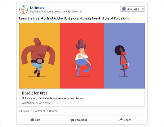
And the use of the word “free” doesn’t hurt. Let’s see where I land when I click.
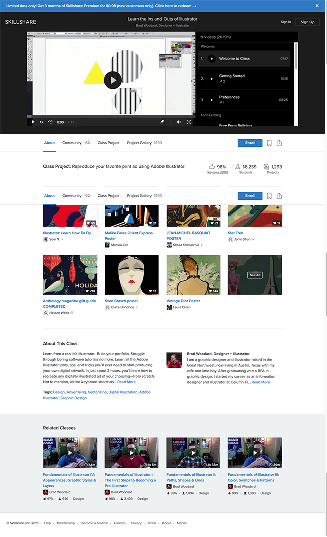
At first glance, the page I landed on has nothing to do with the ad I clicked. The design and copy are drastically different, leading me to believe that I made a “bad” click.
Things that are not working:
- The ad mentioned a free Adobe Illustrator class, but it took some time for me to notice that the video at the top is about the class in question. That’s poor message match — a headline reassuring me that I’m in the right place (by borrowing copy from the ad) would go a long way.
- The eye-catching image used in the ad isn’t represented on the page I landed on — not even in the video still. Better design match — the measure of how closely the design of a landing page matches the ad that brought visitors there — would create a better experience for prospects and probably increase conversions down the line, too.
- At first glance, it seems that there is no call to action button or banner that shows people can they sign up for the limited time offer from the ad. A closer looks shows a soft call to action above the video: “Learn the Ins and Outs of Illustrator.” Make it easy for people to convert with a big, clear CTA that matches the offer from your ad.
- This Facebook ad leads to a webpage with lots of video, tabs and reviews — in other words, there is no dedicated landing page with a single goal. As our own Oli Gardner says: “One page. One purpose. Period.” Your leads click on your ad to cash in on your offer. Don’t distract them with other noise.
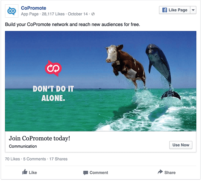
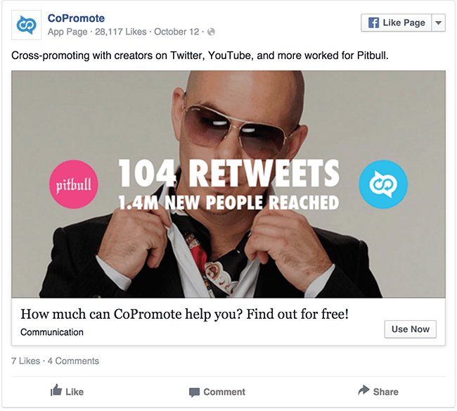
2. CoPromote
CoPromote provides content creators with a way to grow their audience by cross-promoting each other’s work.
And as connoisseurs of content, they sure know how to attract attention with their Facebook ads. Their clever ads — a self-assured cow riding shotgun with a dolphin and a photo of Pitbull superimposed with an impressive stat — are sure to stand out from the usual news feed noise.
But after the click, does CoPromote deliver on the landing page front? Both ads lead to the same in-app landing page:
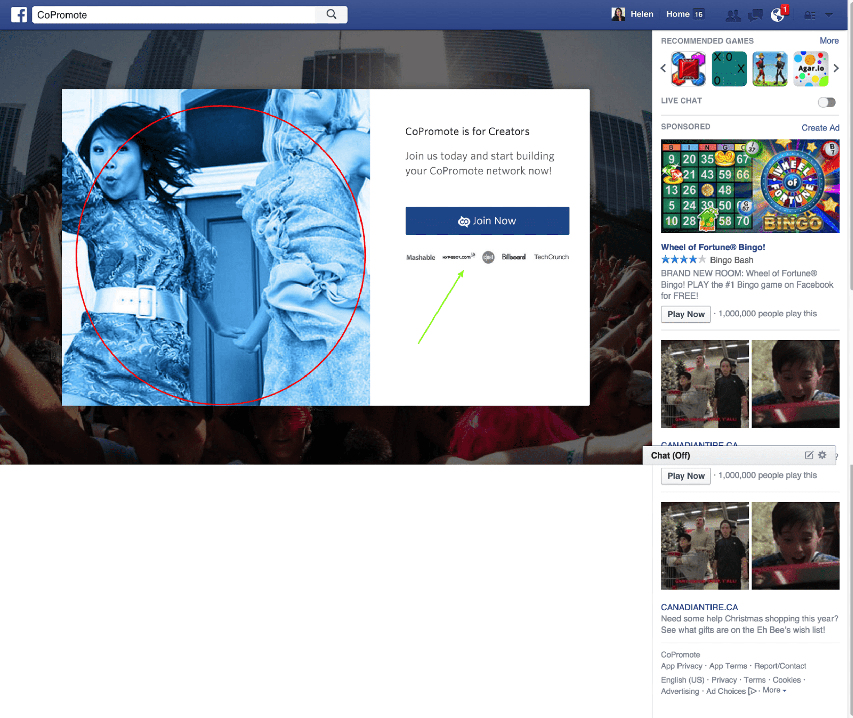
There are so many questions going through my mind. Am I still in Facebook? Where did Pitbull go? Is this just a fashion brand’s landing page?
Things that are not working:
- Both ads lead to a single, generic in-app page. Every ad — with its unique copy and design — should have its own dedicated landing page. Generic pages like this one cause anxiety because they don’t continue the conversation you started in your ad.
- The in-app Facebook landing page could work, if only it elaborated on the messaging from the ad. Ads have limited real estate and require you to be concise — but the corresponding landing page has extra space and should be used to clarify the offer, elaborate on benefits and squash doubts leads might have about joining.
- There is nothing about the landing page that matches visually with the ad that brought you there. In fact, their choice of such different imagery is jarring. Is this a fashion app?
- While the in-app Facebook landing page keeps people on the same page and has a singular goal, there are still so many places people can click to distract them from the main goal of “Join Now.” Especially if they are simultaneously being retargeted in the sidebar by other brands. That makes for pretty poor attention ratio.
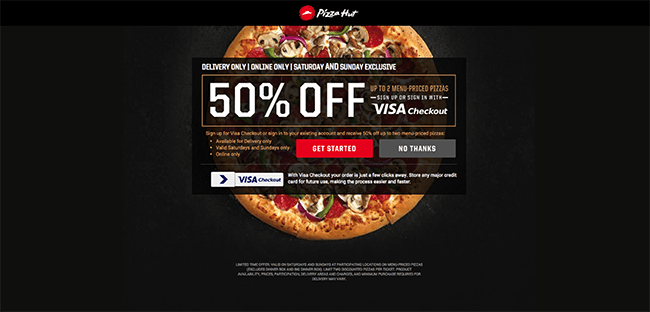
3. Visa meets Pizza Hut
In this ad, Visa has joined forces with Pizza Hut to offer some sweet discounts. This ad, specifically, offers 50% off your next order when you use your Visa card at the checkout. What a cheesy deal:
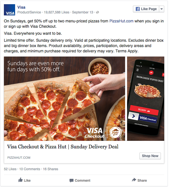
Especially if you haven’t eaten recently, the crisp image of the pizza is the first thing to grab your attention. The other frame shows a phone with the Pizza Hut phone app — pretty sweet context of use. You can just picture yourself using the app to get your hands on the pizza on the left.
So how does their landing page fare?
This landing page has a clear offer that is front and center: “50% off your order if you use Visa Checkout.” All in all, pretty decent message and design match. It’s a smooth trajectory: you’ve clicked on a pizza deal and ended up on with a pizza deal.
Things that are not working:
- The ad copy could be a little more specific and much more delightful. The main offer is subtly buried in a wall of text or on the photo when it should be front and center in a headline.
- Though the CTA is bold and clear, there are a few clickable URLs on the page that could serve as conversion leaks.
- The “Visa Checkout” logo looks like a button but isn’t. This creates confusion and friction.
4. Target
As the second largest discount retailer, Target shares weekly deals on Facebook to entice you to buy.
The ad below advertises a lovely “buy one, get one 50% off” discount.
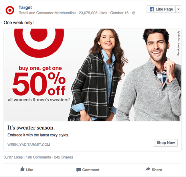
The ad design is minimalist, with hero shots of nice-looking people who are smiling (I’m assuming) because they’re loving those comfy sweaters. But what happens when you click on ‘em?
Is it throwback Thursday? I’ve haven’t seen a website that looked like a brochure in ages.
Things that are not working:
- The beautiful minimalism of the ad is lost in a sea of options on the landing page. Although the weekly deals may apply to more items than the sweaters, I really did expect to see more sweaters since it’s what the Facebook ad alluded to. A landing page with a singular campaign goal or even a curated list of items might be more effective here.
- The various font sizes sprawled across the page make for confusing information hierarchy. What is the headline? Which copy should the lead be focusing on when they land on this brochure-style page? It’s hard to keep focused and that can cause prospects to bounce.
- There are so many numbers detailing different price points that it’s easy to forgot about the 50% deal. One page, one purpose, please.
- There are so many places for me to click on this brochure-page I don’t know where to start. With a 12:1 attention ratio, I could spend hours clicking — but I’m much more likely to get overwhelmed and bounce.
5. MetLife
Metlife is one of the largest insurance and benefits providers in the world. This Facebook ad is selling car insurance as a work benefit option:
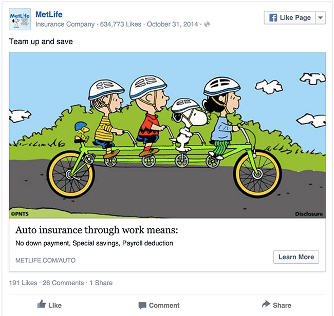
MetLife has used Peanuts characters as part of their marketing for many years, whether in television or printed ads. Here we see the team “getting ahead” on their tandem bicycle.
But where does this cute ad lead?
![Metlife landing page example and critique]](https://unbounce.com/photos/metllifelandingpage.png)
… To this landing page with a photo of a woman sitting in her car.
Things that are not working:
- While the image of the car certainly relates to the auto insurance mentioned in the ad, the drastically different imagery creates a jarring experience for visitors. This landing page feels cold in comparison to the warm, friendly Facebook ad. Where’d Snoopy go?
- The ad copy isn’t mirrored in the landing page. Subtle differences like “car insurance” instead of “auto insurance” create cognitive dissonance and create doubt in the mind of prospects.
- The landing page design leaves a lot of blank spaces on the righthand side. It’s distracting and makes the page seem broken. Especially for a service like insurance where prospects need to give up a lot of personal information, you need to do everything you can to make your operation seem trustworthy.
6. Glassdoor
Glassdoor provides employer reviews that help guide people hunting for a job.
This Facebook ad is meant to attract recruiters and HR professionals to Glassdoor’s Annual Employer Branding Summit in San Francisco. It shows a diligent man working on his laptop.
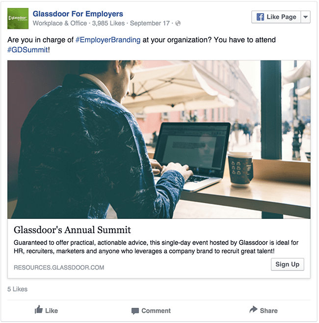
So where do leads go once they click on this nice image?
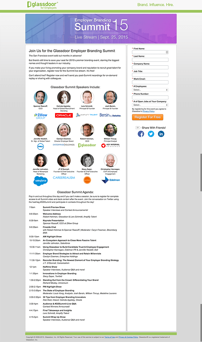
Oh boy. Where should I start? There are obvious design and message match issues, but what else is awry here?
Things that are not working:
- For starters, the ad itself has room for improvement. The two hashtags (#EmployerBranding and #GDsummit) really only serve as a distraction from the main goal of the ad: get people to click on the CTA. Hashtags can help bring awareness to your event, but are probably better served in a piece of content rather than an ad that you’re spending dollars on.
- While the event registration page does a great job of incorporating social proof by flaunting their speakers, it falls short on selling the benefits of attending the conference. Especially for such a large ticket item, an agenda overview isn’t enough to communicate to prospects why they should attend. A trailer video could go a long way in creating hype and showing potential attendees what value the conference will bring them.
7. Growth Geeks
Growth Geeks is a marketplace for gaining access to professionals services in topics such as growth hacking, performance marketing, social media and more.
Their ad below flaunts one of their professionals: a “growth geek” named Vincent who can be hired on the site for help with Facebook ads. The call to action invites you to “Click here to meet Vincent:”
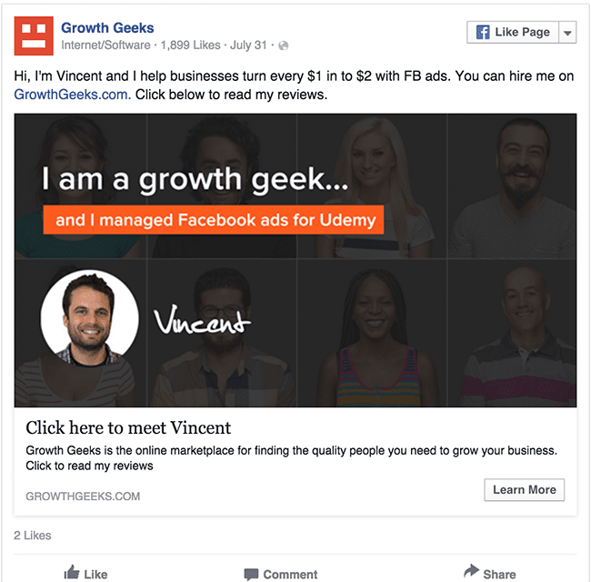
So what happens when you enthusiastically click?
Vincent? :(
Things that are not working:
- Once you click through, you’re taken to a catch-all page where you won’t learn more about Vincent or even other Facebook ad experts. Instead, you get a promo video and a massive, overwhelming list of other professionals providing different services. It’s great that they’re created specific ads for specific types of professionals, but their landing pages should be just as specific. If a lead clicked to meet Vincent, they should be taken to a page where they can do just that!That’s not to say that you need to work overtime creating 50 corresponding landing pages for each of your ads. Tools like dynamic text replacement can help you leverage a single page to be customized for each unique ad you create. Because at the end of the day, more specificity = better Facebook ad conversion rates.
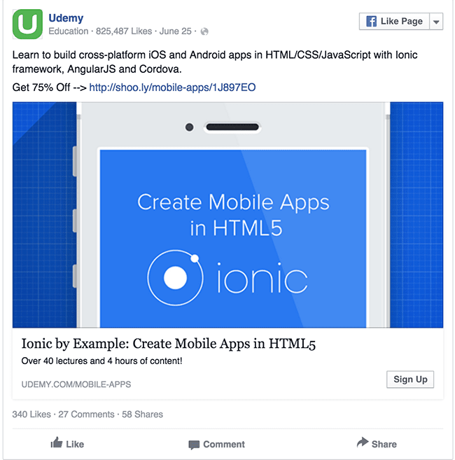
8. Udemy
Udemy is an online educational marketplace that provides over 30,000 courses on a variety of topics from coding to productivity.
The copy for Udemy’s ad below is a bit of a mouthful, with a lot of technical information packed into a single ad. It might be worth testing a contrasting color — this blue is similar enough to Facebook blue that it could potentially blend into the newsfeed.
Let’s see what’s beyond the click.
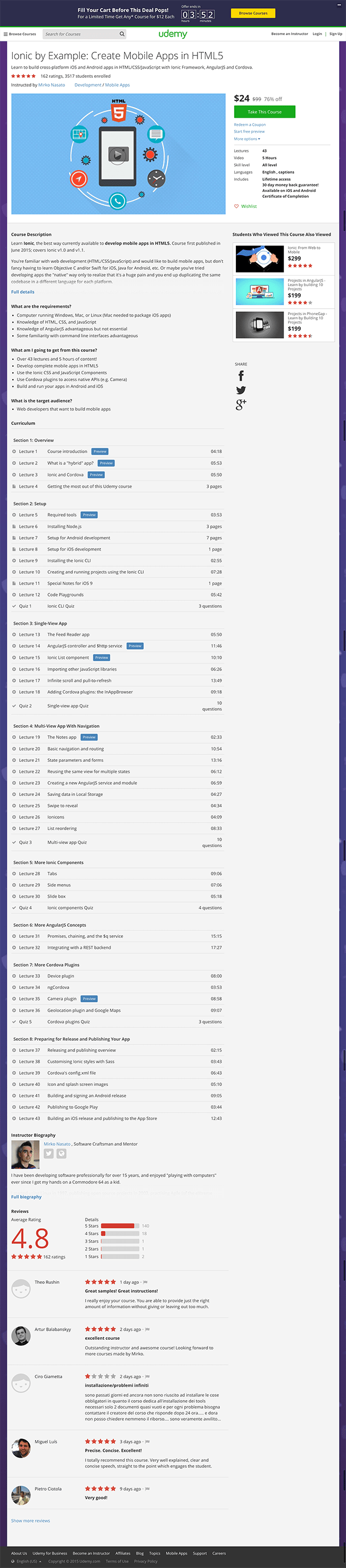
Things that are not working:
- The sheer amount of copy on this page is overwhelming. While they do a good job of speaking to benefits and setting expectations, it might be worth testing against a shorter page with a selection of chapters. If the long landing page works best, it might be a good idea to include another CTA button near the bottom, to capture diligent prospects who read the entire page.
- Similarly, the social proof gets buried under the massive course breakdown. It might be worth testing placing some ratings up top, closer to the CTA, for prospects who will never scroll all the way down.
- The color palette and imagery from the ad aren’t reflected in the landing page. Using a similar still in the video on the landing page could be a smart way to recall the Facebook ad.
- The “Take this course” CTA button is off to the right and easy to miss, especially next to the large video still. This would be a great thing to test.
So what does a delightful Facebook ad campaign look like?
So we’ve seen a ton of facebook ad campaign examples that leave much to be desired — but what does a successful Facebook ad campaign look like? Let’s have a look at a company that is leading with clarity in their ads and landing pages.
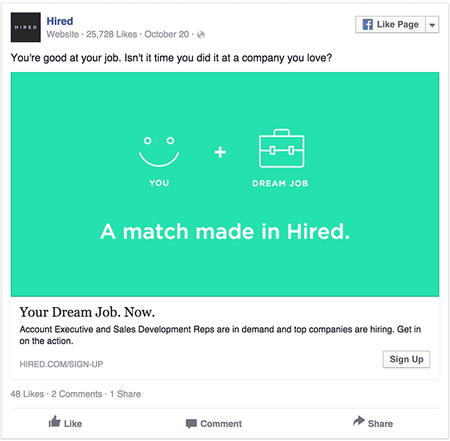
9. Hired
One of the best examples out of the 50 plus examples I looked at was from Hired: a job marketplace for sales professionals.
Their ads use an eye-catching green that contrasts well will Facebook’s classic blue and white. Better yet, their copy is short and sweet and drives straight to the pain point their lead may be experiencing:
And the corresponding landing page?
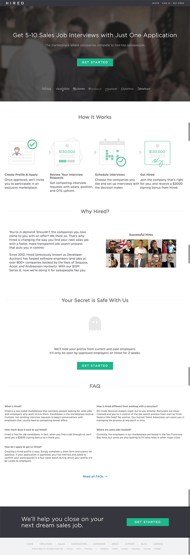
Boom.
Things that are working:
- The landing page expands on their value proposition by offering specific benefits: “5-10 Job Interviews with one application.”
- They use much of the same language from their ad on their landing page, though they may want to test matching their headline from their ad exactly with that of their landing page.
- The color palette from their ad carries across to their landing page, with an eye-popping CTA button in that familiar bright green.
- Hired’s landing page has a CTA button at the top and two at the bottom. Some offers are more complex or higher commitment, and may require longer landing pages to really make the sale. If that’s the case, you want to be sure to have multiple CTAs so that people have one in reach to click when they’re sufficiently persuaded.
- All of the call to action buttons on their landing page have one goal: to get leads to sign up. That said, there are a few hyperlinks on this page and Hired may want to test removing them to see if that helps focus attention.
All in all, an awesome effort. Way to go, Hired!
The bottom line
We don’t have access to these companies’ stats or conversion rate data — these ad campaigns may have actually produced significant results. But at what cost?
When your Facebook ad is disconnected from the corresponding landing page, you create poor experiences for them. And that’s bad news for everyone.
So don’t cut any corners with your Facebook ad campaigns. Continue the conversation from your ad to your landing page, and keep prospects focused on the singular goal of your campaign. No distractions.