Methodology
How We Created This Report
The insights in the 2021 Conversion Benchmark Report are the result of a months-long analysis by our proprietary machine learning model and some very smart humans. Here, we’ll answer key questions that’ll help you interpret and apply the results.
(If you’re looking for the scientific process behind our analysis, a complete methodology for the report can be found here.)
Methodology
Benchmarks
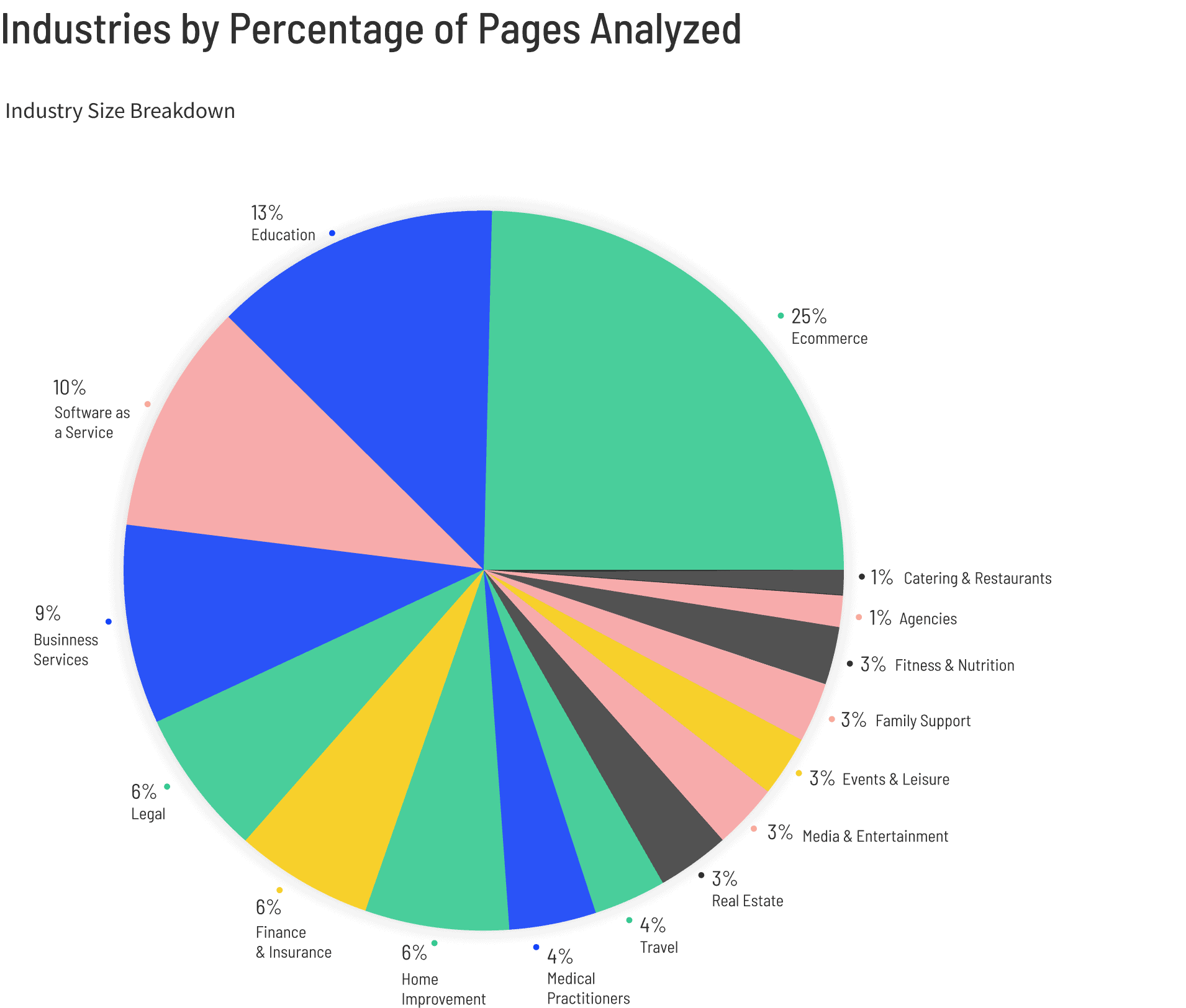
The conversion data analyzed in this report comes from November 3rd, 2019 to November 3rd, 2020 (except for traffic data—see below). Our benchmarks are derived from more than 44 thousand Unbounce customer landing pages, including almost 264 million visits that culminated in over 33 million conversions.
Accelerate results with simple CRO
Access the full Conversion Benchmark Report for detailed industry benchmarks, in-depth conversion rate insights, top-performing channels, and more.
We used our machine learning model to sort the pages available into topics (like industrial tools or medical law), based on the content of these landing pages. We then manually refined the output to match 16 industries from the Global Industry Classification Standard and the North American Industry Classification System.
Finally, we used the following criteria to keep our data clean:
- We didn’t include analysis of any industries, subcategories, or conversion types with fewer than 400 pages.
- We removed pages with fewer than 500 visitors or no conversions.
- We excluded subcategories that we felt might skew the results (e.g., political campaigns, religious topics, terms and conditions).
- When there are pages with the same domain that have almost identical copy, we took a random sample of five pages. This is called “domain sampling.”
Note: We altered our process this year to sample up to five near-identical pages from each domain, whereas last year we only sampled one. This change has led to very slight (<0.5%) changes to the 2020 median conversion rates (referenced throughout) than we reported last year.
This report uses the median conversion rate benchmarks for each industry, rather than the mean (average). As a measure of central tendency, the median is less impacted by outliers (pages that are converting seriously well or super poorly) than the average. We believe this provides a more useful picture of how you stack up compared to other marketers in your industry.
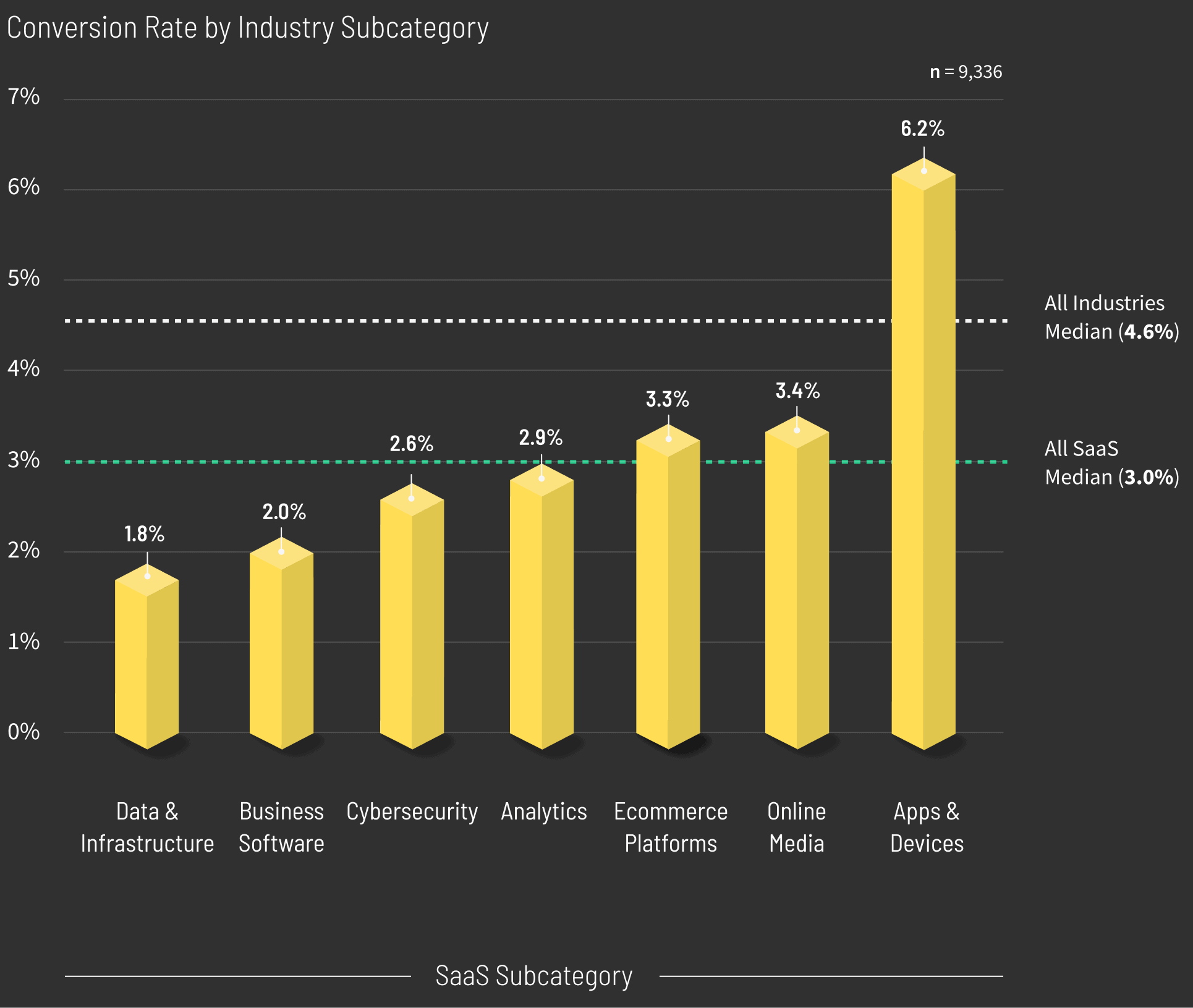
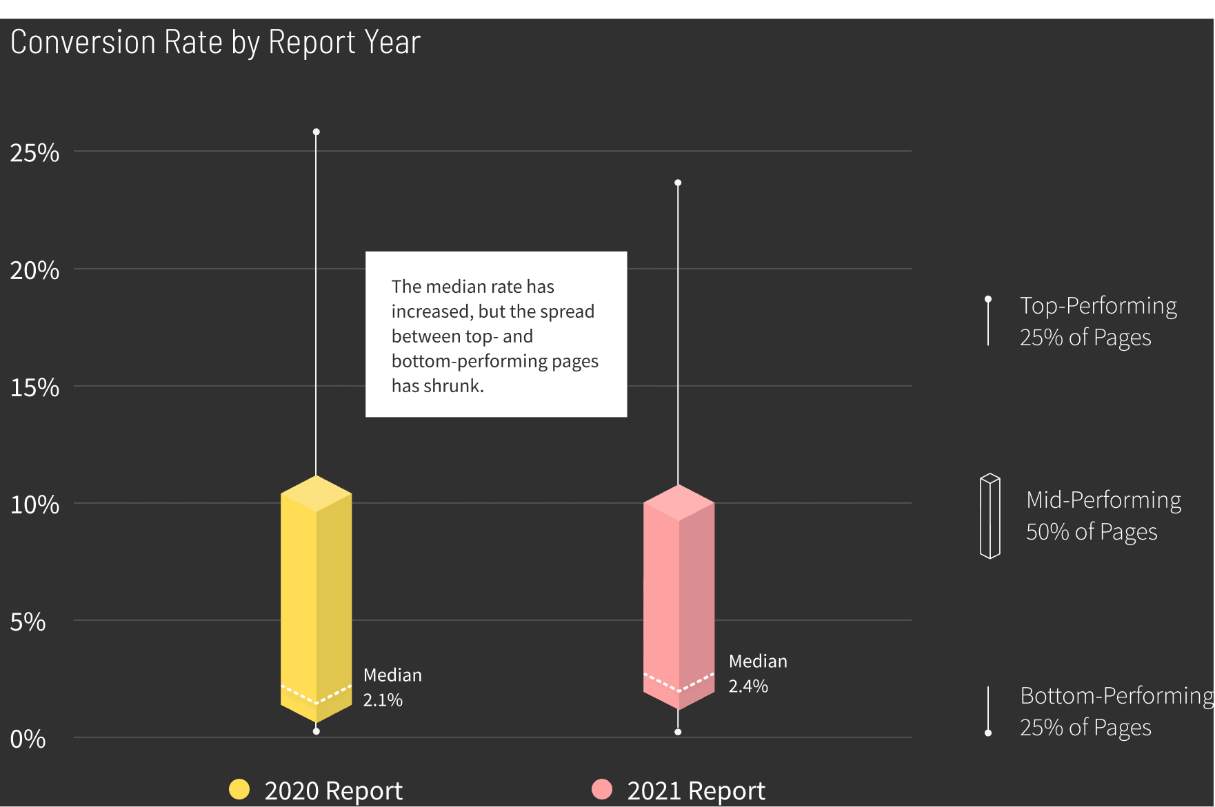
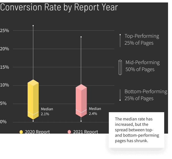
Example: Software as a Service
This year, we’ve also included box plots to help visualize the distribution of landing pages. The ‘box’ represents where most pages sit. (Note the median isn’t in the middle, as pages are rarely distributed evenly.) The vertical lines (or “whiskers”) represent the range of the remaining pages, excluding extreme outliers.
For a more detailed explanation of how to interpret a box plot, check out our complete methodology.
Example: Agencies
Methodology
Traffic
Our traffic channel data comes from August 1st to November 30th, 2020. We used all of the same criteria to sort pages as we did for the report’s main data set (see above), excluding any channels with less than 400 pages. Our analysis looks only at the two most common conversion types: click-through and form-fill pages.
To show the performance of a channel, we looked at the number of visitors it had sent to landing pages within an industry, then the number of those visitors who had actually converted. We then used box plots to show the distribution of conversion rates for each channel.
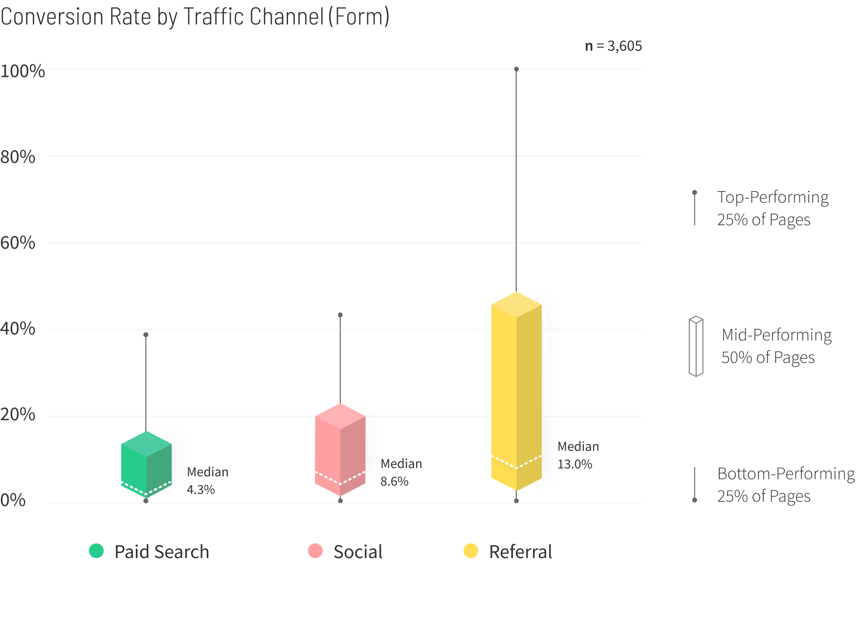
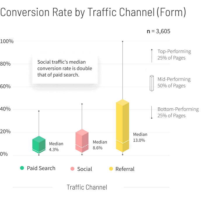
For your next lead gen campaign, think about throwing some extra budget at social ads and see how they perform. (The results might surprise you.)
Methodology
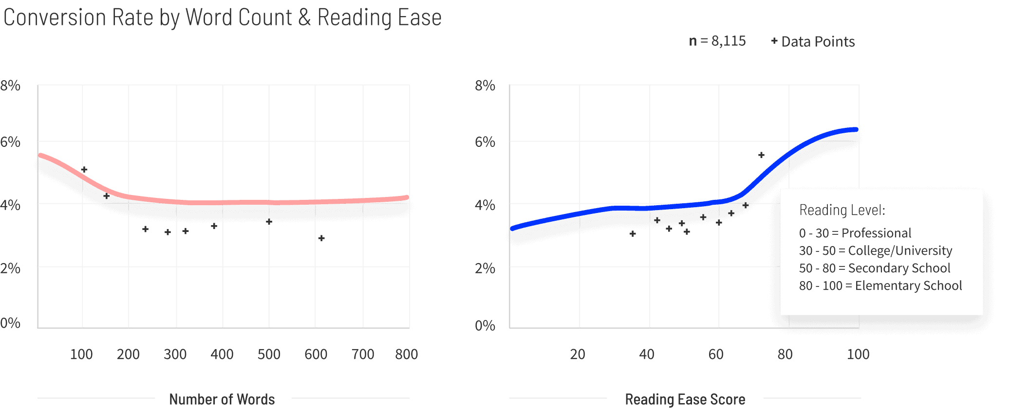
Readability
When we say “word count,” we’re talking about the sum of all the meaningful text our machine learning model finds on a particular landing page (including headings, calls to action, supporting copy, testimonials, and fine print). It doesn’t include text featured in images or video, and only analyzes English pages.
To find out how easy or difficult these landing pages are to read, we assigned each page a Flesch reading ease score (FRES) based on the number of words per sentence and the number of syllables per word. The higher the score, the easier it is to read.
Example: Business Services
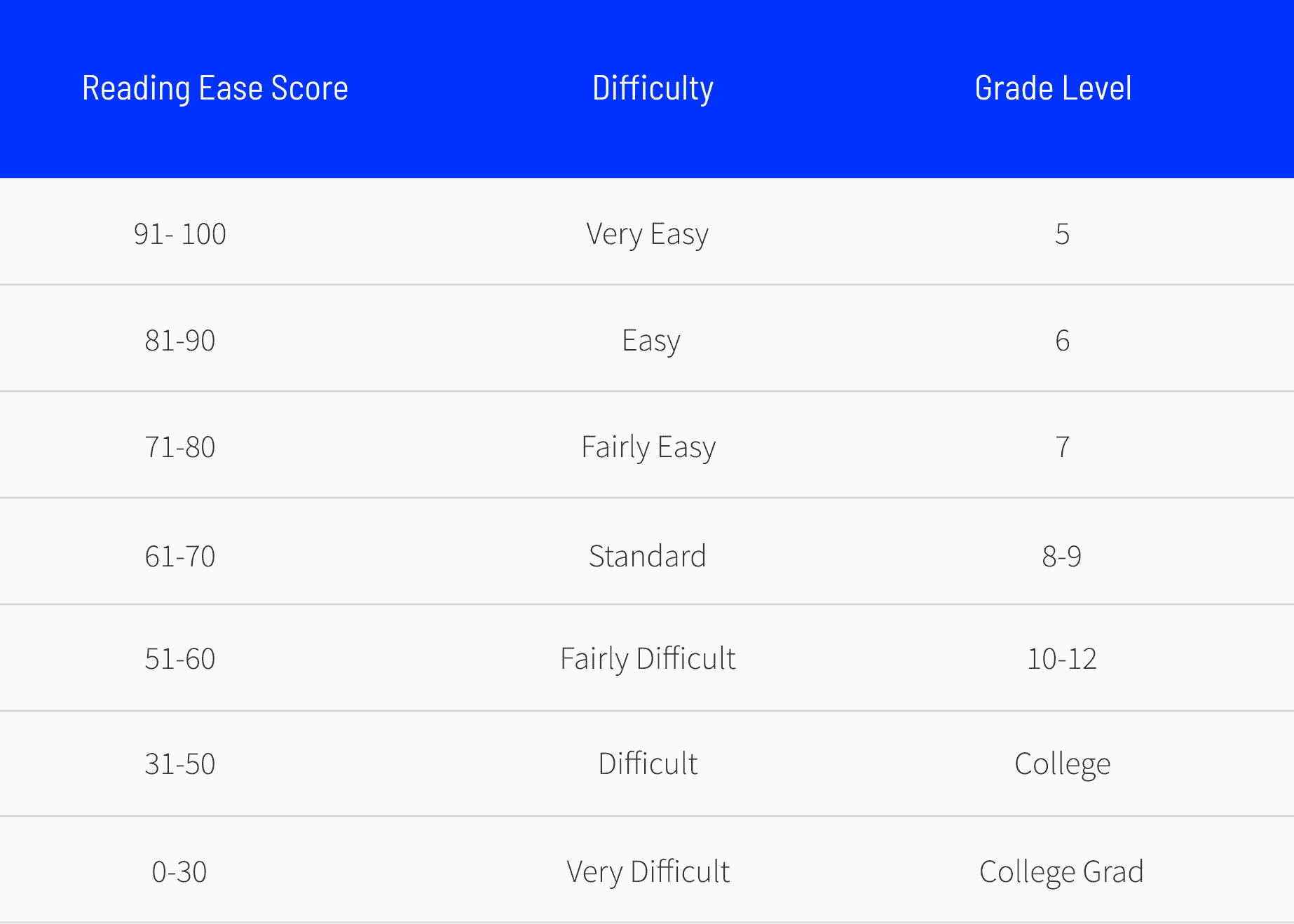
Flesch scores can also be translated to grade levels—however, grade levels aren’t consistent across school districts, countries, or time periods. That said, you can use this table as a rough guide to figure out how easy you need your landing page copy to be for your best conversion rates possible:
There are plenty of websites you can use to find the FRES of your own writing, and tools like Grammarly and Yoast can also provide you with readability scores as you compose. Heck, we’ve got our own copy analyzer for both SaaS and ecommerce (and either one will tell you the reading ease and word count of any landing page).
Methodology
Sentiment
Our sentiment analysis is based on the NRC’s Emotion Lexicon (also known as EmoLex), a list of English words associated with eight basic emotions (anger, fear, anticipation, trust, surprise, sadness, joy, and disgust) and two sentiments (positive and negative). We used machine learning to detect the concentration of these sentiment-associated words on each landing page as a way of determining overall emotions related to the copy that appeared.
Example: Medical Services
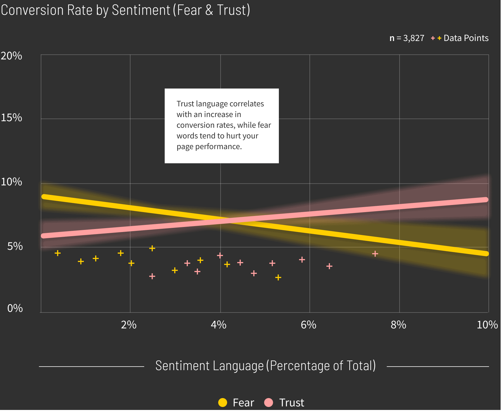
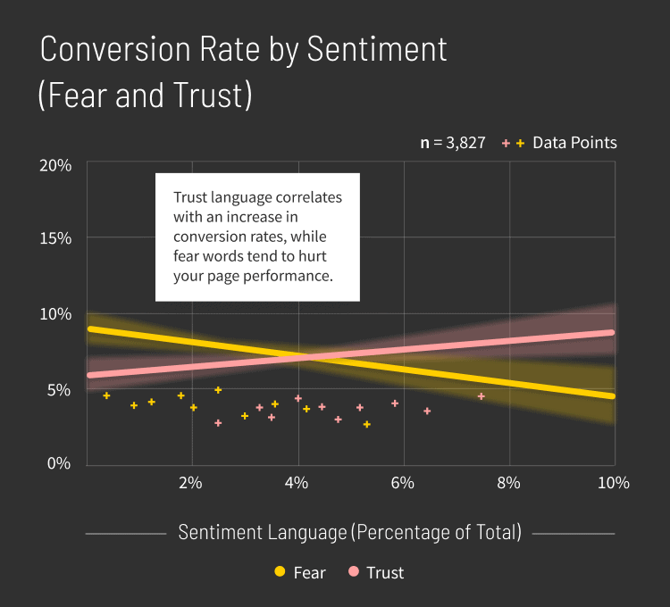
Words from the EmoLex are used to detect emotion, but shouldn’t necessarily be your guide to expressing them. Instead, aim to convey sentiments in as natural a way possible. (Hiring a talented copywriter helps.) Though you can use the words in the lexicon as a starting point, stuffing them on your landing pages misses the mark and isn’t our intent by providing them.
Use the insights in the relevant industry section to figure out which ones might have a positive or negative impact. As always, we’d recommend using Smart Traffic to see how different emotions resonate with your visitors.
Methodology
COVID-19
To look at how the pandemic may have affected industries, we compared traffic data from August 1st to November 30th, 2019 with the same time period in 2020. It’s worth noting that these two years are not enough to indicate a trend, nor can we attribute these changes to COVID-19 with certainty. The insights from this analysis should be viewed as signals only.
We used the following criteria to keep our data clean:
- We removed pages with fewer than 500 visitors or no conversions.
- When there are pages with the same domain that have almost identical copy, we took a random sample of 5 pages. This is called “domain sampling.”
To give a rounded view on the growth in traffic year-over-year, we look at both the relative difference in the aggregation of all visitors to the industry, as well as the median visitors at the page level.

Methodology
Check out the insights for your industry.
Dive into the data. You can jump right to your industry (or any industry—go wild!) using the left-hand menu, or by selecting one of the options below.
Software as a Service I Business Services I Home Improvement I Ecommerce I Legal I Real Estate
Contributors
Garrett Hughes, Sherry He, Floss Taylor, Chrystalene Buhler, Jen Chin, Jordan Dawe, Ha Dinh, Sarah Gooding, Scott Hind, Phil Jama, Carolyn Laihow, Jon Leher, Tommy Levi, Carla Lynn, Colin Loughran, Francois Marchand, Cecilia Martinez, Emily Matick, Simon Mathonnet, Jonathan Moon, Ayesha Renyard, Chelsea Scholz, James Thompson, Alana Thorburn-Watt, Leslie Ty, Bradley Wou, Nicole Wright