Is it possible to design the perfect popup? One so fiercely potent that people just can’t refuse to convert?
Of course not.
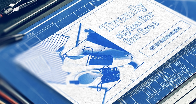
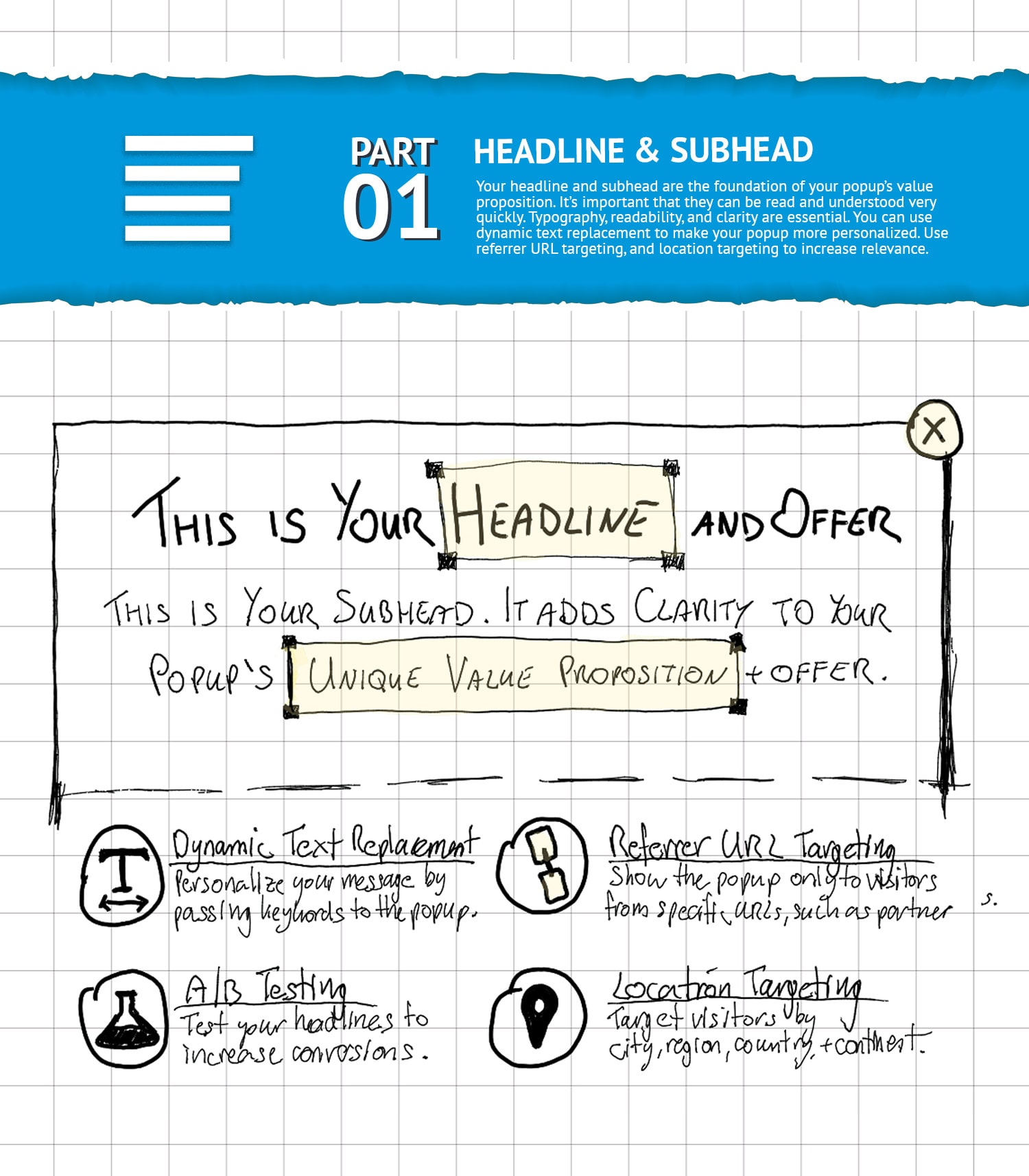
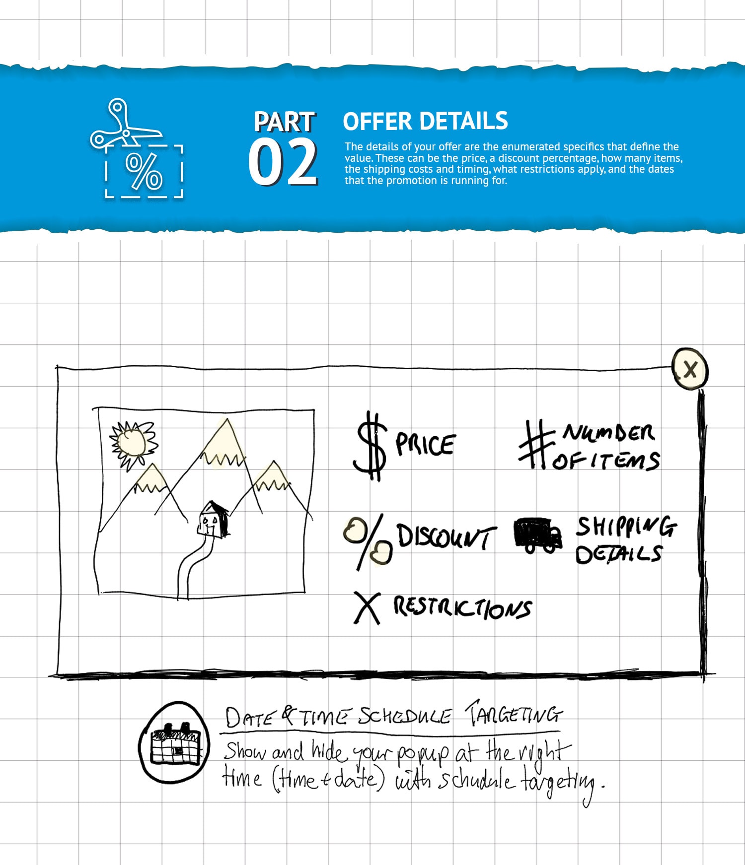
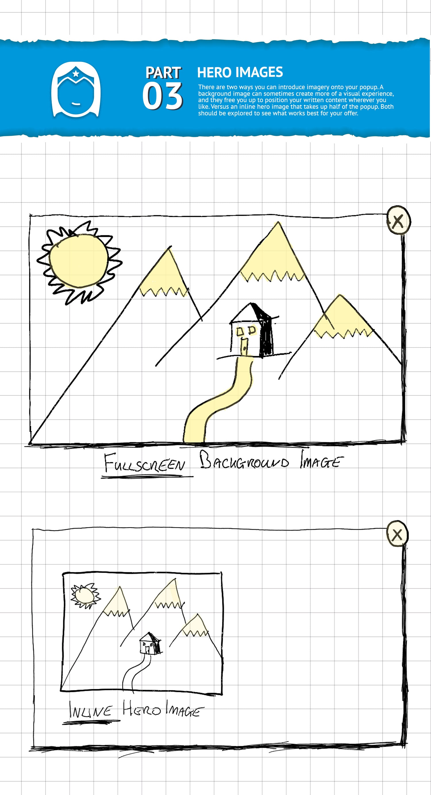
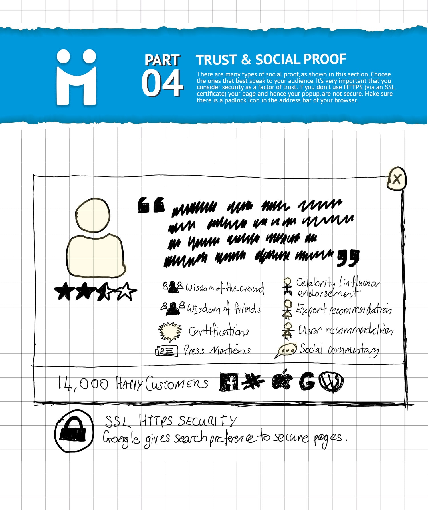
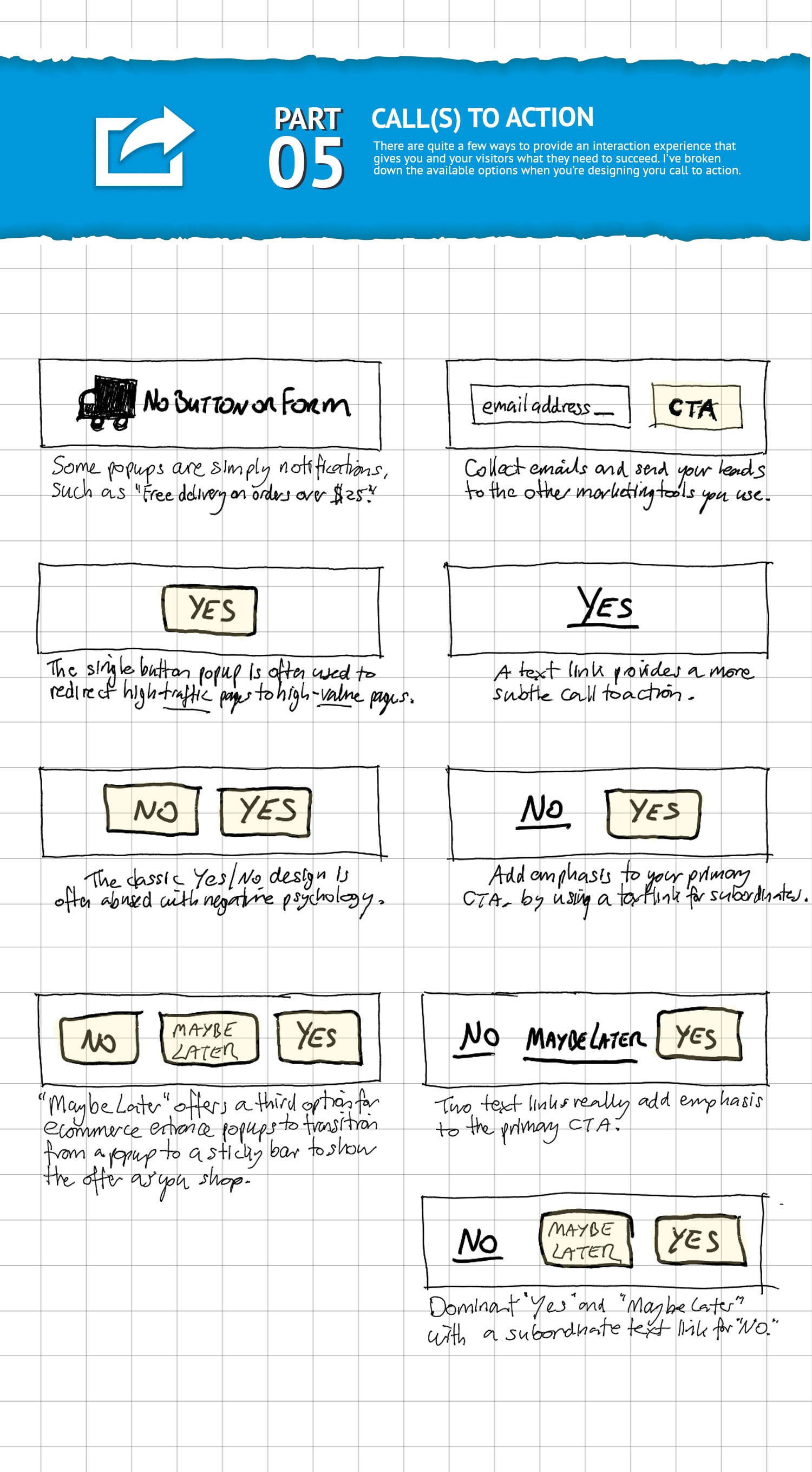
As small as seemingly simple as a popup is, it’s still important to understand a little about its anatomy. There are five primary elements to make up the architecture of a popup, and then there’s a layer of interaction design beneath that which deals with the functional aspects such as triggers and targeting.
The five primary elements of a popup blueprint are:
- Headline and subhead
- Offer details
- Hero images
- Trust and social proof
- Call to Action
Using a structural approach to your popup designs helps us avoid mistakes and choose the right interaction modes and content elements that will create a good conversion experience.
Obviously, you can’t use every version of every element on a single small popup, but you can choose the best parts of each anatomical section to craft something that presents your offer in the best possible way.
An important thing to know is that the circled icons beneath each section represent Unbounce functionality that allows you to make your popups way more awesome than they would be if you simply showed it to everyone.
Got any weird and wonderful popup designs?
If you have designs that include elements I didn’t include in the blueprint, share them in the comments so I can add them to my layout specs.
Popups that don’t suck, rule! Make better popups, please.
Cheers,
Oli
p.s. See what Unbounce Popups look like on your website with the new Live Preview Tool. It’s really cool.
p.p.s. Don’t forget to subscribe to the weekly updates for the rest of Product Awareness Month. If you click that link a popup will appear!


