
You want your page to look professional and modern, but are you getting lost in the aesthetics and losing sight of the true goal: conversions? You need a balance of both, and we want to help.
For the second year in a row, Unbounce has teamed up with our friends at ThemeForest to offer designers a chance to show off their best landing page designs. We put up $14,000 in prize money and put out the call for designers to give us their best in 13 different categories.
We’re sharing seven of the winning landing page templates right here!
Find out why we thought these were the best in their categories, and discover which elements they contain that will help you get more conversions. You can view the complete list of winners here, but make sure you read on to learn more about the secrets to high-converting landing page design.
1. Mediclick
Designer: Surjith Ctly
Prize: Best Medical Template
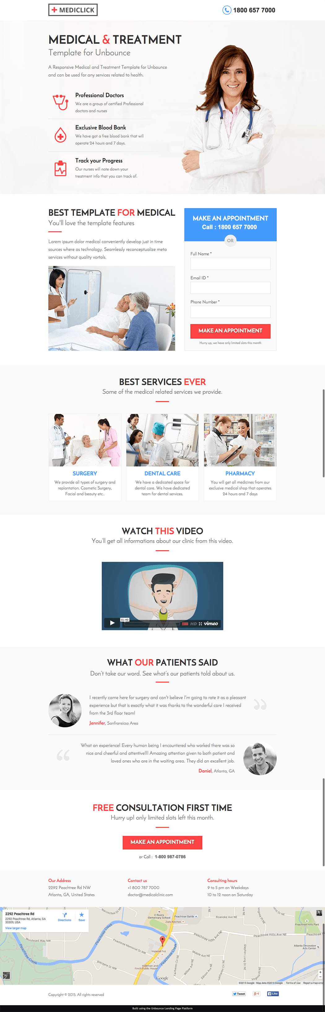
The minimalist design of this Mediclick template provides the means to deliver a consistent message. The sections are broken up nicely, and the map on the bottom is especially helpful in providing much-needed location context. Not to mention the blazingly obvious call to action (CTA)!
They’ve also included a CTA towards the bottom that scrolls back up to the top of the form when clicked. This is a great addition for readers who might require a little more convincing before they click.
There are two variations of this template to choose from, one with the form and CTA above the fold, the other with those elements directly below it. Test both to find out which one works best for your audience.
2. Donate
Designer: Ewebcraft
Prize: Best Nonprofit Template
Correction: The “Hope” template by xvelopers was the actual winner for this category. Ewebcraft’s template is still pretty beautiful, though. Congrats to both.

This landing page template for nonprofits by Donate starts out with a strong and very compelling header section.
The visually distinct sections allow you to guide your visitor’s eye through a clear and linear narrative. The stats section is a very nice touch here and could go a long way towards helping readers understand why they should donate to your cause or organization.
Would we add anything? Maybe a “Donate Now” button at the bottom to give readers another chance to convert. Other than that, this is a solid landing page template that is sure to help do a lot of good.
3. QuickTravel
Designer: Nasirwd
Prizes: Best Travel Template, Best Lead Generation Template

Finding great landing pages in the travel industry isn’t easy. They’re as rare as a tropical vacation with no sunburn.
This travel landing page is focused on one goal, with just one CTA on the page. It does a great job of conveying the magic of going on a trip — even without any real copy there I’m ready to pack my bags!
Vacations are expensive, and people might need a little more convincing to reduce their anxiety about the high price tag. To counter that, this template provides sections devoted to describing the benefits of the offer and allows for the addition of large images and videos.
It’s not every day that you get to see a landing page that is both beautiful to look at and laser-focused on conversion. This page has both of those things in spades.
4. Flat Vault
Designer: creativeCary
Prize: Best Multi-Purpose Template
Correction: The ProPage template by PixFort was the winner of this category. We still think this is a pretty great landing page, though!
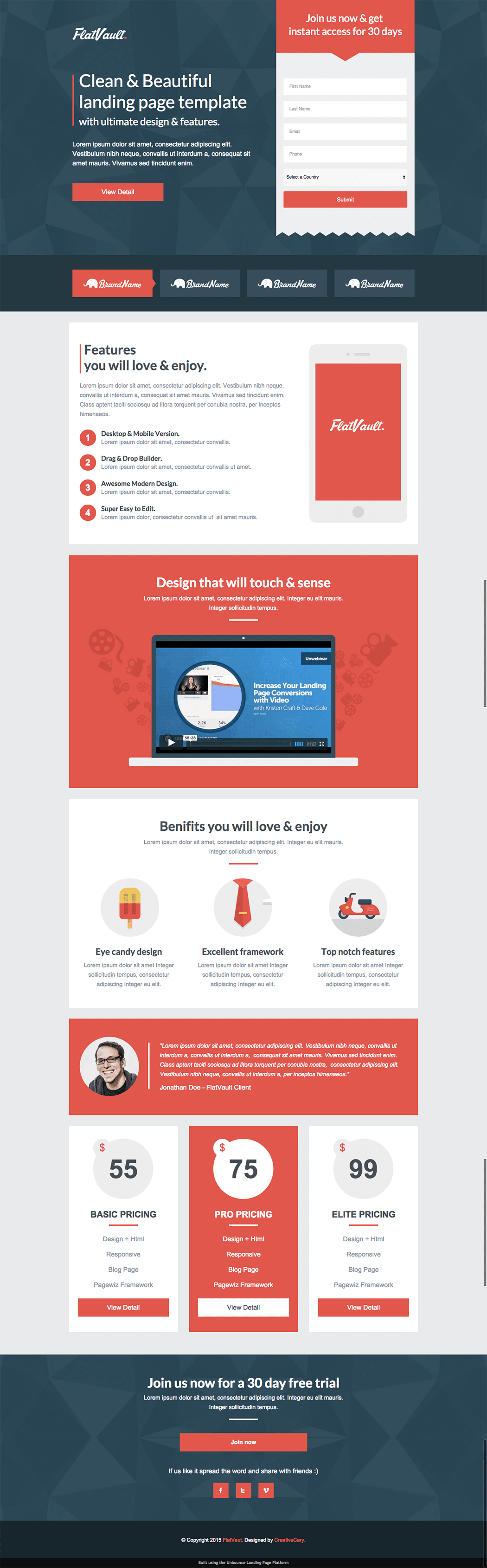
I love this Flat Vault landing page! It uses a trendy and modern aesthetic while incorporating a lot of core conversion rate optimization concepts. Sometimes too many colors can be distracting, so you can appreciate the minimal color palette on this page.
The headline is clear and easy to read. The form stands out enough to get people to pay attention to it, and the CTA button jumps out at you like a red spot on a white shirt (in a good way). You may want to test that CTA button with a fourth color, just to see if you can get it to contrast more with the rest of the page.
There’s a well laid-out spot to add a video and a few very catchy icons that add a nice design element without being too distracting. This page is also mobile responsive and collapses nicely to reach those mobile customers everyone keeps talking about these days.
5. Explore
Designer: Xvelopers
Prize: Best Updated Template

This section includes landing pages that were updated in the last year. They may have added a mobile responsive element, or undergone a complete overhaul. Either way, the winner this year is this outstanding travel landing page template.
If you’re going to convince someone to go somewhere, you’re going to want to show them some nice, big aspirational images like the one at the top of this landing page. The first section below the fold, which grabs your eye immediately, is a great place to include the three quick benefits.
The page also gives you clear contrast between the three sections. They’re not just cookie cutter boxes, and each of them stands on its own. And the most important aspect? The CTA remains consistent throughout.
6. iStartup
Designer: Xstyler
Prize: Best SaaS Trial Signup Template

This landing page has a lot of great stuff going for it. Above the fold, you’ve got space for a hero shot, a nice big headline and your value prop, with a form and CTA thrown in for good measure.
If you’re using this template, you may want to test the ghost button against a regular CTA button with more contrast. Ghost buttons look cool, but everyone I’ve talked to that has used them says that contrasting buttons work better every time.
That said, the rest of the page makes great use of whitespace for readability and includes another appropriately placed CTA button to convert readers who went all the way down the page.
7. Avira
Designer: Xknothing
Prize: Best Real Estate Template
Correction: The Luxra template by twisted-d was the winner of this category. Sorry for the confusion!

Having researched real estate in a couple of different cities, I can tell you two things about real estate landing pages. First, they’re often not actual landing pages. Second, they often look like they were built using AngelFire in 1998.
Not this real estate landing page template, though! This page is a breath of fresh air that provides enough room for your content to breathe. The fonts are well chosen and the style is modern. And there’s plenty of space to add photos and entice someone to contact you about that special property.
The use of the testimonial above the fold is a bit unorthodox, but it’s crazy enough that it just might work! In the Conversion Marketer’s Guide to Landing Page Copywriting, Joanna Wiebe says the following:
[The] testimonial is a marketing message – but it’s far more powerful than regular marketing copy because you’re not the one saying it.
This is a great way to get people interested based on some social proof right away. Nice touch!
8. Flare
Designer: Morad
Prize: Best Startup Template
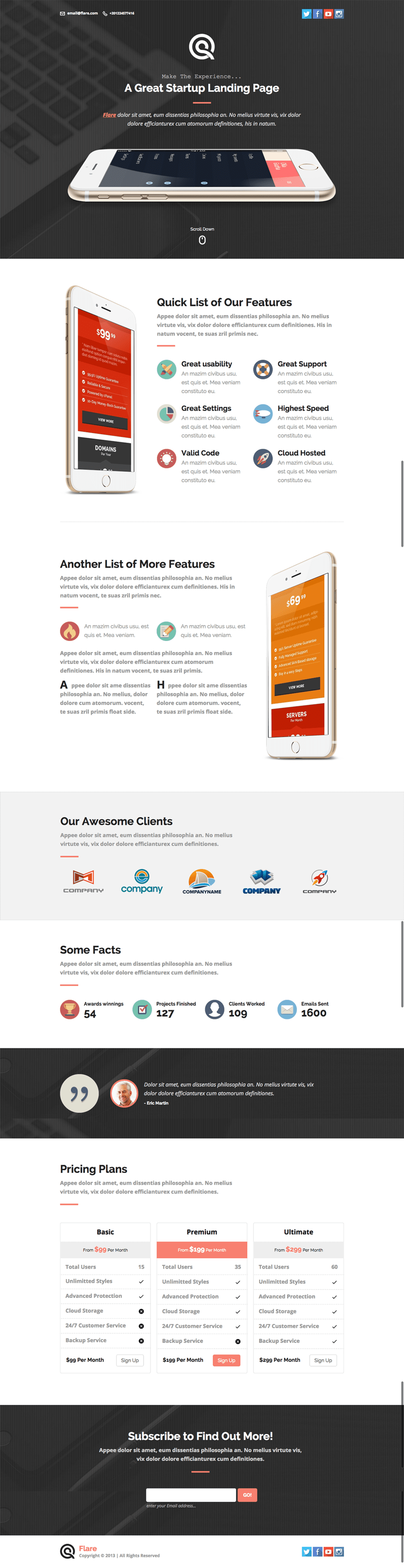
There’s something very exciting about promoting a startup. You want the world to know all about what you do, and you want to tell them everything.
The problem is, you can’t tell them everything. You need to emphasize what makes you unique – and this template has a big section above the fold to help you show off your hero shot, your catchy headline and your value prop.
There are two separate sections for feature lists to help people understand what you’re all about. Use one or both, and take advantage of the minimal space for copy by keeping your messages brief.
Providing great-looking spots for social proof and a few factoids about your startup are also a nice touch.
A bright future for landing page design
All in all, what we saw this year was that landing page designers are becoming a lot more savvy about conversion centered design. Very few designers appear to be going for form over function, and it’s encouraging to know that Unbounce customers have such a great field of landing page templates to choose from.
Congratulations to the winners, and to the many designers who took the time to show us their best. You can find all of these templates and a whole lot more in the Unbounce landing page template section over at the Themeforest marketplace. If you’re hungry for even more templates, check out our made-in-house Unbounce landing page templates.
Which landing page template is your favorite? Let us know in the comments!

