Ok, It’s a silly joke, I know. I’ll be sued by the buttons’ union. Nevertheless, these three workhorses of a product page seem to reappear at the core of every e-commerce optimization project I get involved in. Here’s how an effective design of the three Ps will boost your conversion rate.
Let’s start with the picture. It’s a well known fact that the quality of product images have a strong impact on conversion. Since images are so powerful to us humans, the picture will ALWAYS be the first thing that the visitor sees on the page. Then consider that the tendency of looking and reading left to right is still a dominant behavior, even online. Conclusion: Things you really want the user to see, like the price and the button should be placed to the right and possibly below the picture.
But not only direction is important, distance also plays a great role. One of the key principles of human perception is that “Things that are shown together belong together”. So visitors will look for the price and the button in the near vicinity of the image. Put it too far away and there’s a risk they won’t see it, or at the least will have to search for it actively, instead of just finding it effortlessly.
One of the key principles of human perception is that “Things that are shown together belong together”.
So what about the price? Since it’s a piece of text this has historically been treated like all text on the page – Arial font size 4, or whatever your body text happens to be. Instead you should make your price stand out on the page. A large font size, bold formatting, and a different color. That’s pretty much it.
Finally the button should be clearly visible too. Red or not red, that’s not the question. Just make sure it has a different color and formatting than other items on the page so that you highlight this button‘s very special role.
Micro Visits – the reason why all this matters
At this point you might think that I’m overreacting. I mean – how hard can it be to find a picture, a price and a button on a page? In fact – very hard. In order to understand this you need to see the full context of the visitor’s interaction with your page. They don’t see it like you see it.
Since people compare prices and features they will often leave and come back to your page several times during a visit. I call this “Micro Visits”. They will open different product pages, including your competitors’, and flip back and forth in order to find what they think match their needs best. If they open new windows or tabs there’s chance you won’t even see these Micro Visits in your web analytics data.
What looks like a 20 second average visit to the product page might in fact be several Micro Visits, each one as short as fractions of a second. And if you’re communicating with someone at split second pace you better be focused on what you’re trying to get across. Like picture, and price.
Finally, at one of those Micro Visits you manage to raise the interest to a “near-buy” level and then your button is handily placed just close to the objects which have the attention, and then; you have a click – congratulations!
Some real world examples
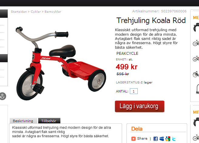
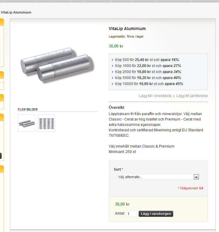
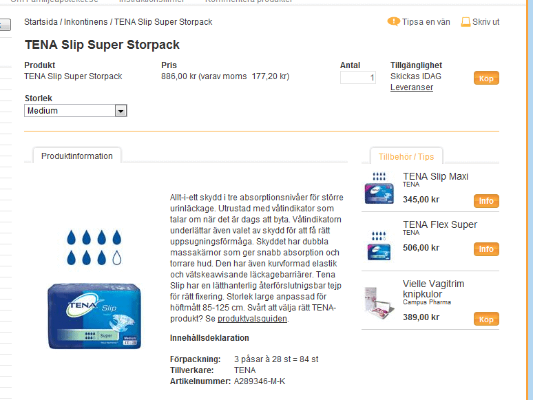
Here are three examples of pages that I’ve worked with recently. I think it’s pretty easy to see which one does a good job and which one doesn’t. What do you think?
In the third case below, they’ve managed to put action buttons on related articles closer to the image than the action button for the article itself. This page is very confusing and you find yourself going back and forth trying to find out what to do.
Here’s what you can do right now
If you think there’s some truth in what I’ve just written – go put yourself in your visitor’s shoes:
- Open up product pages for the same or similar products on all your competitors’ sites
- Start flipping back and forth
- See where it’s easy to catch the triple-Ps without any effort
- If your page is the best – congratulations!
- If not – closely examine the difference between what you consider being the best one and your own
In any case – pick up the little tweaks, and nuances of all these product pages and start testing your product page templates. That’s the only way of knowing what works best for you.


