For some reason, we’ve reduced “conversion” to mean visitor’s opting in to an email list or buying products from specific pages. Why?
Isn’t a “conversion” when your visitor takes any desired action on your site?
Wouldn’t that mean “sharing” or “leaving a comment” could also be considered a conversion in addition to subscribing and buying things?
We are told, “every page is a landing page.” We are also told to design landing pages to be unique with a single intention… yet we force content into our blogs so that it all looks & feels identical.
As it is right now, I write a post and hope that people leave comments. I hope that people share, but without any subtle design cues that there is a preferred action – design wise, my blog posts lack purpose.
On the verge of a website redesign, these are the thoughts and questions that keep me up at night.
Not wanting to invest thousands into development without testing my design theories, I’m using landing pages to test blog designs that are focused on each conversion type. That way, when it is time to invest in a new blog, I’ll know exactly what’ll work best.
The Four Types Of Content Marketing
To understand my design philosophies, you should first understand how I write. First and foremost, I am a content marketer.
But I’m not one of those “Know, Trust & Like” content marketers. Marketing – at it’s core – is about testing creative, measuring results, iterating on successes & learning from your failures. Being trust worty and honest in your creative are useful tools, but they’re not the end goal.
No analytics platform I can think of allows you to measure the amount of “Know” acquired from a piece of content.
However, what we can measure are the following:
- Social Shares – (Viral Content)
- Comments – (Discussion Content)
- Email Optins – (Lead Content)
- Sales – (Sales Content)
Since I’ve started focusing my content to meet one of these four conversion goals, I’ve experienced a significant lift for the desired conversion. This is likely because each content type also corresponds with different aspects of the marketing funnel.
- Viral = Awareness
- Discussion = Consideration
- Leads = Conversion
- Sales = Loyalty
Using this framework can help you set up quantifiable success metrics around nearly every piece of content you create, helping you become a better “content marketer.”
Incorporating these principles into design (rather than just focusing on the writing) takes this framework a step further and bakes intention into nearly aspect of your site, not just on the pages meant to get leads and customers.
1. Designing For Viral Content
If I engineer a piece of content to get shared, why should I visually package it the same as every other piece on the blog? Shouldn’t there be a slightly stronger emphasis on social sharing and does design play a role in that? Expanding reach is important, so by having the visual packaging of that content do that for me maximizes my promo efforts.
As an example of this in action, here’s “4 Facebook Advertising Techniques Every Marketer Should Know.”
This page is pure, actionable information, but it doesn’t leave a whole lot of room for conversation beyond “Great Post!”.
Instead, it’s soul purpose is to be shared, so I wanted to incorporate design elements emphasize that point.
Custom calls to action at the bottom of every article
The most blatant example of this is when you reach the bottom of the article. Rather than use the same “sign up for updates” email opt in, I’ve included a customized call to action for the article to be shared.
It’s important to note that with each “viral” piece, this call to action area will be customized to break expectations & reduce “ad blindness”
Micro-shares embedded throughout the content
Understanding that the web is becoming more and more visual, useful screenshots, infographics, and video contain share buttons with micro calls to action.
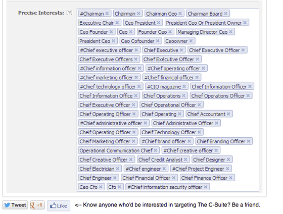
For instance, here’s a screenshot from the “How to Target C-Suite Executives” section from the Facebook Advertising article I was talking about earlier.
Instead of relying on whatever image you put at the beginning of an article, why not let all of of the images work together as a promotional team?
This is part of how “Growth Hacker” Dao Nguyen has grown Buzzfeed & how other growth hackers have accelerate some very popular ventures.
If you wanted to make images easily sharable on your own blog, you could use a service like Marker.ly to make that happen almost right away.
Oh, one more thing:
Sound bites, Facts & (sadly) catch phrases drive traffic – why not make them easy to RT from within the article?http://t.co/zrKI3CHUes
— Tommy Walker (@tommyismyname) July 24, 2013
Y U No Let Me Comment?!
Something else, which may seem counter intuitive, is that I purposefully did not include comments at the bottom of the article. This is for a few reasons.
First, the purpose of this article is to be shared and to inform, not pull comments (most of which would be “Great post!” anyways).
Second, from what I’ve experienced, there is a certain level of attrition that happens with blog comments.
Conversation doesn’t go on forever and there’s a certain “late to the party” vibe that comes from seeing old comments if you’re visiting a blog for the first time.
With this kind of content, it just makes sense to get rid of them all together.
I would much rather focus on having that piece of content spread, than splitting the viewer’s attention.
But, just in case someone does want to ask a question, or give some other form of feedback, there is a subtle “If you have any questions, email me” link before the main call to action.

What I’m Testing
Of course, like with any landing page, this will be an ongoing testing process.
Being one person on a limited budget, this is why I’m using Unbounce to test & tweak until I know what works best. That way, when I hire a developer to fully code the blog, I’ll already know what I’ll need to bake into the site to make it grow without my assistance.
With the call to action at the bottom of the post, I’ll be testing new button images as well as including “Share by email” “Grab link” “Stumble” & “Reddit” links.
With embedded images, I’ll test adding additional image heavy social networks like Pinterst & Tumblr to the share options, as well where I position the buttons on the image.
I also test adding share buttons to light-boxed images to see if that makes any improvement in the virility of that image content.
I may also experiment by adding a triggered light-box when the visitor gets to the bottom of the article, similar to what Upworthy does when a video ends.
2. Designing For Discussion Content
On the other hand, we have Discussion Content.
Discussion content is meant to be thought provoking, inspiring, bewildering, whatever. The primary point of this type of content is of course start a conversation.
Something I believe is broken with the typical blog is that you must scroll to the bottom of the post to leave a comment.
When I read a thought-provoking article, it’s individual lines or thoughts that compel me to comment, not the article as a whole.
But to comment on a single line, I have to highlight the line, scroll down, paste, leave my thoughts, click submit, wait for the page to reload, then find where I left off. How incredibly distracting.
I’m not the only one who believes this is a problem either.
Forward thinking websites like Medium use a commenting system that allows visitors to leave their thoughts on individual paragraphs.
Filament.io (Digital Telepathy‘s incubator) is also working on a project called Highlite that proposes to put comments on the side.
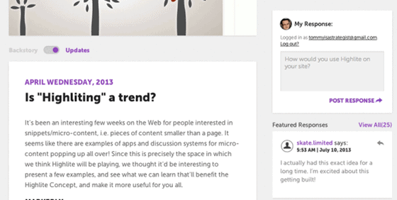
Both of these are perfectly viable solutions, however, personally, I believe commenting on individual paragraphs is overkill, and while I really like what Highlite is doing with their sidebar conversation, I wish their comments used persistent navigation techniques.
With the discussion content on my site, I’m doing just that.
As you scroll down the page, the comment box floats on the sidebar and follows you as you scroll down the screen.
My hypothesis is that by having the comment box be persistent, the visitor can quickly respond to snippets within the article, without having to be completely taken away from it.
You might also imagine this will improve the overall time on site for these pages, because there will essentially be two conversations happening, the one I spark with the article, and the ongoing one visitors have with each other on the sidebar.
What I’m Testing
Though these pages aren’t fully live yet, I’ll test seeing if the sharing of these pages goes up by adding social icons directly above the comment box.
Because Facebook’s comment box already allows for optional publishing to the social network, I’ll be interested to see if adding Twitter, Google+ and Reddit buttons will extend the conversation.
Also, in split test versions of this page, I’ll be using different comment systems, like Disqus & Livefyre to determine which (if any) will drive better conversation.
What All This Means To You
So, you’ve sat here and read all about what I’m doing, but what does this mean for you?
3 things:
- Start thinking about ways your existing website can start working with you.Whether it’s using Markerly, embedding tweets, polite light-boxing, or something else entirely – give your blog a function beyond just being standard packaging for everything you produce.
- Even if you’re not putting your comments on the sidebar, you recognize the difference between content intended to be shared and content meant to be discussed. Stop trying to produce content that tries to do everything all at once. This concept alone can help you focus on how you create better content, and can improve your presence overall.
- Everything is a test. If you’re on a budget, and don’t have an on call developer, it’s better perform tests in flexible, lower risk environment (like Unbounce) before investing several thousands of dollars on development, which may not be fully optimized.
Once you get the budget, take the best elements from those tests, and work them into the final design. But for the love of Pete, don’t go into development without having data to back up your new design choices.
Other than that, I’d love to get your thoughts on everything we’ve discussed here, and how else it could all work for you. Any ideas or comments on how you can ramp-up your site by testing your blog design? Are there things in here that you’re already doing, or do you think I’m just full of crap?
Sound off in the comments below, and lets see if we can start making a better internet together.
![]()
