Keep ’em guessing.
It may work on a first date but it’s not a good tactic for your landing pages.
Why?
Because ambiguity in your copy can be a conversion killer.
Many marketers seem to have a difficult time writing copy that keys their prospects into exactly what they need to do. More often than not, that leaves them with landing page copy that keeps prospects guessing.
And guessing leads to confusion… which leads to frustration… which usually leads to a bounce.
Not sure if your landing page is riddled with less than straightforward copy? Worried that ambiguity is hurting your conversions? Here are a few common copywriting mistakes to avoid.
1. Not giving your visitors enough information to make a decision
How many times have you arrived on a landing page with an offer but struggled to find the price? You search and hunt… until you realize the person who created the landing page is going to make you click through to get it.
In this landing page for the Knoxville Bridal Show, we’re told that we can save $2 off tickets for a limited time. Sounds great… except we’re not told how much the tickets cost or how long “limited” really is.
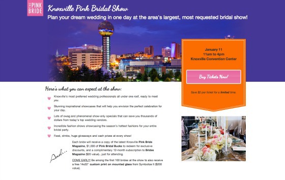
The page generates more questions than answers. We’re left wondering whether we really want to click that pink button when we have no idea what the price will be on the other side.
Solution: Give people known outcomes
Studies on ambiguity aversion have shown that people would rather choose an option with known outcomes over options with unknown outcomes. Even in situations where the probability of coming out ahead is higher but the risks are unknown, overwhelmingly people will opt for the “devil they know.”
The Ellsberg paradox demonstrates this aversion to assuming any risk that is difficult or impossible to calculate. In multiple experiments, individuals were asked to bet on the probability of picking a colored ball out of an urn.
One urn had 50 black balls and 50 white balls, while the other urn had 100 balls total, but the ratio of black to white was not disclosed. When told they could win $100 by picking a black ball, participants routinely chose the urn where they knew the ratio between the ball colors.
Since we know that ambiguity can wreak havoc with the choices people make, simply adding the ticket price above or below the button can help to reduce any anxiety about what’s on the other side of the click.
How you can apply this to your own landing pages
- If you’re using “limited availability” urgency triggers, be specific about how long the limited availability lasts. Don’t leave people guessing – remember, people like to know their odds of having a positive outcome.
- Test placing micro copy below the button that tells them what they can expect as soon as they move on to the next page. You may find that it makes them more likely to complete the desired action.
2. Sending prospects mixed messages
Sometimes we think we’re being clear in our writing when we’re actually doing the exact opposite. Have you ever been on a landing page that tells you one thing and then contradicts itself elsewhere on the page?
This guitar lesson landing page can’t seem to decide if it’s a sales page or a lead generation page:
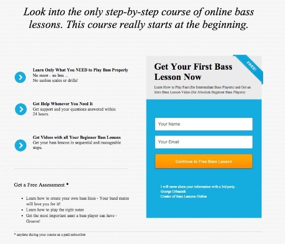
The call to action tells us we’ll get a free lesson by giving our information. The bullet point copy talks about the paid course – then teases us with a free assessment.
Read the fine print after the asterisk and you realize the freebie assessment is part of the paid course. Suddenly, I’m confused… which means I start questioning what’s going to happen after I hit the orange button.
Not good. As Steve Krug, the web usability expert says, “Don’t make me think!” Now I’m thinking about hidden charges and if I really want that so called “free” bass lesson.
Solution: Create trust by sending a consistent message about your offer
Consumers are looking for reasons to trust you. A 2012 global study from the Edelman Trust Barometer found that a whopping 90% of the 11,000 people they polled claimed they wanted companies to be as transparent as possible.
When your copy is presented in such a way that is contradictory or misleading, you’re giving your visitors a reason to think twice about taking you up on your offer… and trust in your message.
Bass Guitar Lesson’s landing page references way too many offers interchangeably (a free assessment, a paid course, and a free guitar lesson). To eliminate confusion, the copy should focus on the main goal of the page: telling the visitor why trading his email for a free guitar lesson is a no-brainer.
How you can apply this to your own landing pages
- Make your landing page copy all about the offer on the page… not about something further in your sales funnel.
- Choose one goal for your landing page and make sure all your copy supports it. When you focus on one goal, visitors are less likely to feel confused or misled.
The upshot of being crystal clear about your offer? If your visitors have confidence in getting something free from you, purchasing down the road won’t feel like such an insurmountable hurdle.
3. Writing copy that leaves visitors wondering where the H-E-double hockey stick they’ve landed
As Oli Gardner has talked about multiple times, your landing page must have good message match with the ad sending traffic to it. Here’s how he defines message match:
Think expectations and meeting them. Your goal is to make the experience seamless from one page to the next so that there’s no confusion as to whether or not your prospect has ended up where they wanted to go.
Check out this ad from Expertmarket.us:
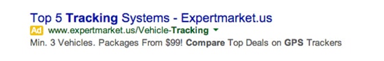
Much like any other PPC ad you’d find on Google, it leads with keywords people will be searching for, along with copy letting prospects know what they will find after they click – in this case, a variety of pricing packages and a comparison of competitor deals.
But click on that ad and this is where you end up:
With Expert Market’s landing page, the first thing that draws the eye is the moving block that says, “Packages from $99” (yes, it moves on the live page.) There’s no discernible headline – only what’s in the call to action box.
What’s worse, the ad headline “Top 5 GPS tracking systems” is subordinated to the middle bullet point. It’s not even the first one.
Plus, the landing page uses “tracking systems” and “tracking prices” interchangeably. In the bullet points, it tells us we’ll get quotes, but in the button we’re told to compare prices.
We’re left wondering if this is where we really want to be and if the solution will give us what we need.
Solution: Keep language consistent to assure prospects they’re in the right place
For the Expert Market landing page, I’d recommend creating a headline that uses the same language as the ad to indicate to prospects that they’re in the right place. Because it’s so clear, the second bullet point would make a great headline:
Get quotes for the top 5 GPS tracking systems
To continue with the seamless experience, I’d change the sub-headline and button copy in the CTA box to reflect the action in the headline. For example, a sub-headline of, “Get quotes with packages from $99” with a CTA button that reads, “Show me quotes now.”
How you can apply this to your own landing pages
- Start by creating message match between the headlines on your ad and landing page.
- Keep actions consistent throughout the copy on your landing page. If your headline tells people they will be getting quotes, then your call to action should do the same.
- Use button copy verbiage that doesn’t imply work on the part of the visitor (eg. “Show me quotes now” instead of “Compare prices”).
When in doubt, ask yourself…
Not sure if your landing page is playing a guessing game with your visitors?
Try this. With each copy element on the page, ask yourself:
Can absolutely anyone coming to the page understand exactly what this means?
You’re offering a “Free Demo.” Great… but will your average prospect know that it’s an online video demo and not an in-person demo? It may seem obvious to you. Your prospect may disagree.
It’s these small details that can mean the difference between a conversion and a bounce. How much is it worth to your business to test and find out?