Friction has become a buzzword in the world of conversion rate optimization. We’re all looking to reduce it, but we don’t know where to start.
Many of us dive headfirst into writing the copy for our landing pages without first taking the time to understand our visitors’ pain points. We lose the plot before we even get started. Visitors get frustrated. We lose out on conversions.
Huge bummer.
The good news is that when it comes to reducing friction on your landing page, there is a logical place to start. I’m here to key you in on an incredibly helpful theoretical tool, the Fogg Behavior Model, that will help you avoid those areas of friction in your writing and influence your landing page visitors to take action.
Ready to kick friction’s ass?
Let’s start with defining friction
The Oxford dictionary defines friction as “The resistance that one surface or object encounters when moving over another.”
When it comes to landing pages, think of it as the resistance your visitors have to completing a task. Our goal is to create elements that make it easy for visitors to take action.
In terms of copy, these elements include things like:
- Clear and relevant value propositions
- Lists of benefits that match expectations
- Enough information to make a decision
What’s the Fogg Model and how can it help me increase conversions?
Dr. B.J. Fogg, a professor at Stanford University and the founder of the Persuasive Technology Lab, developed a model to explain what influences behavior.
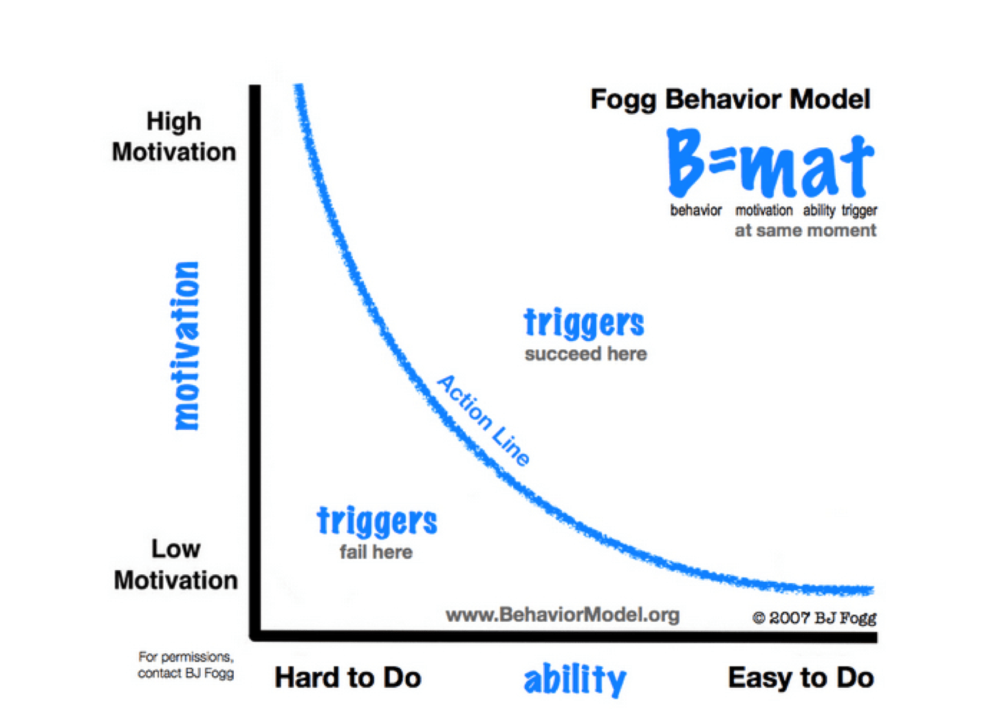
According to Fogg’s model, behavior occurs with the presence of three elements: motivation, ability and triggers. When the expected behavior doesn’t take place, it means that one of the three elements is missing.
For instance, you may be highly motivated to eat organic foods, but if you only have access to Burger King for meals, it will be impossible to behave accordingly. Or you may be triggered to turn on your television when you see the remote, but if the television doesn’t work, you’ll be disappointed when nothing happens.
When it comes to landing pages, the model can help identify where your visitors get tripped up along the way to performing a task – and ultimately, this insight can help improve conversions.
Taking Fogg’s model, let’s break down examples of where resistance can crop up and how to counter it with respect to the three elements of behavior: motivation, ability and triggers.
1. Motivation
If people are seeking out your services or products online, they have some degree of motivation pushing them to do so. Your job is to key into that motivation with your copy. One of the ways friction arises is when there’s a disconnect between the visitor’s motivation and what’s presented on the landing page.
Looking for landing pages to assess, I turned to Google and clicked on a few ads. Here’s one that came up when I searched for online marketing courses.
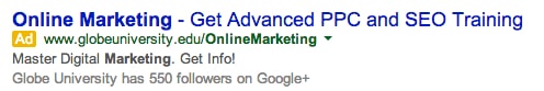
It tells me that I’ll be able to “master digital marketing” and “get advanced PPC and SEO training.” Sounds good to me. The only problem is that when I clicked on the ad, this is the landing page that popped up.
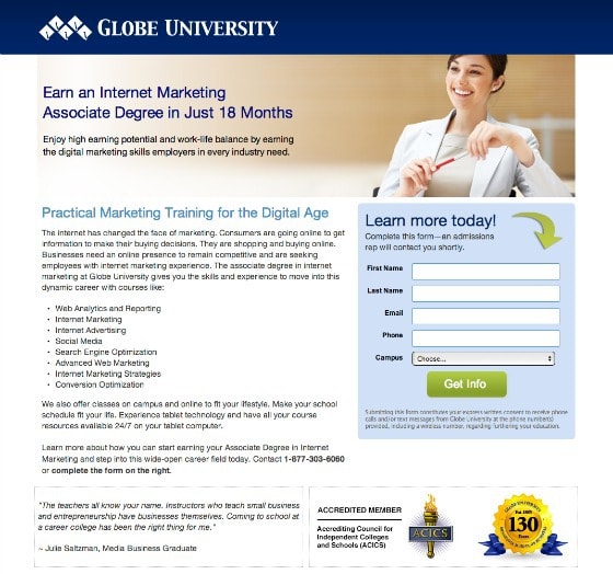
Hmm… there’s no mention of advanced PPC and SEO training. Plus, the info it’s giving me appears to relate to an associate degree. What happened to that specific training advertised?
Immediately, I’m faced with a disconnect between what initially motivated me to click through to the page and what’s being presented. My expectations are not matched by what I see – leaving me primed to hit the back button and resume my search. This is what’s known as bad message match and you can read more about it here.
“The landing page headline should reinforce the scent from the ad that delivered your visitor to the page; that’s persuasive momentum.” – Bryan Eisenberg
The other issue affecting motivation on this page centers around the call to action button. The copy around the button informs me that I’ll receive a phone call after filling out the form. But the button text, “Get Info,” gives me the impression I will receive some sort of prospectus in the mail.
The Globe University page has committed a CRO cardinal sin: forcing me to think too much about why I’ve landed there and whether I’ll get what I want.
As Steve Krug, the web usability expert, says, “Don’t make me think!”
In contrast, the landing page for Lewis Howes’ LinkedIn course makes the motivating factors behind taking his course immediately clear. There are multiple benefits that speak directly to someone interested in using LinkedIn to further their career.
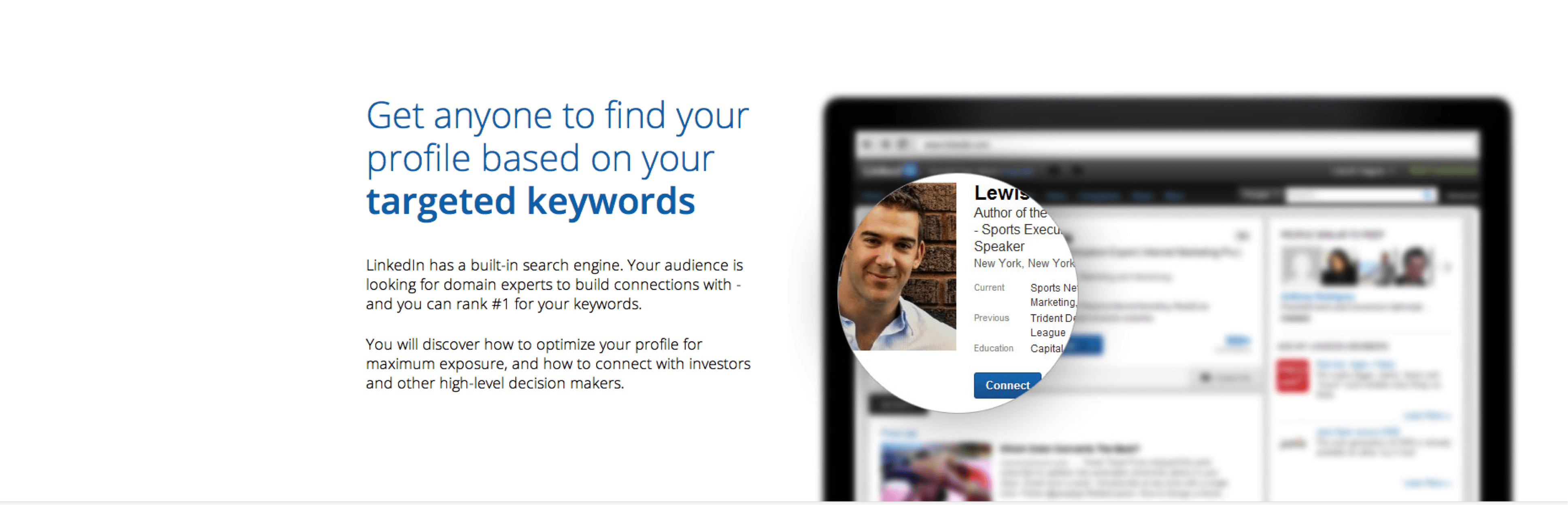
Additionally, the copy is highly customer centric. The word “get” has been used multiple times, driving home the many benefits the lead will gain from the offer.
When emphasis on potential motivations for taking the course is coupled with persuasive copy, the likelihood of the visitor moving down the page and tripping the trigger increases.
2. Ability
Ability speaks to how easy it is for your visitor to accomplish the desired behavior on a page, in regards to time, money, or cognitive resources.
Some people may have more money than time. They may be more willing to hire a graphic designer than take a class online to learn how to do it themselves.
Again, this is where understanding your target market makes a significant difference in creating copy that will dispel friction.
If your customer doesn’t feel as though he has the ability to take action because he is confused or the task is too difficult, chances are he won’t.
Dr. Fogg equates ability with simplicity.
“A task is truly simple until it requires resources a person does not possess.” – BJ Fogg
Information that is difficult to read or understand reduces the likelihood of people taking action. There have been several studies about how processing fluency – or the ease at which people complete a mental task – affects behavior.
A Song and Schwarz study from 2008 found that people asked to follow instructions written in hard-to-read fonts were more likely to perceive the behavior as more difficult.
Take a look at this product page for Norton AntiVirus software. This page screams cognitive overload; too many pieces of information bundled together in such a way that our brains cannot retain much in short-term memory.
In order to be able to make a decision on which piece of software to download, we are forced to read mountains of text in small fonts.
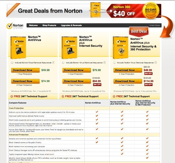
Not to mention that we are contending with multiple triggers. Deciphering which package to go for practically requires a PhD in anti-virus software innovation. The ability to complete the required behavior is hampered by how fluent or, in this case, how fractured the information is.
In regards to ability, painting a clear and concise picture of your product or offer will reduce friction.
In 2005, Robert Cialdini and Petia Petrova conducted a study in which they observed that consumers overvalued products that were easier to imagine. Presenting a product in a vivid way with matching, evocative verbiage positively impacted the customer’s perception of the product (and increased the likelihood of purchase).
Consider this page from the retailer Modcloth.
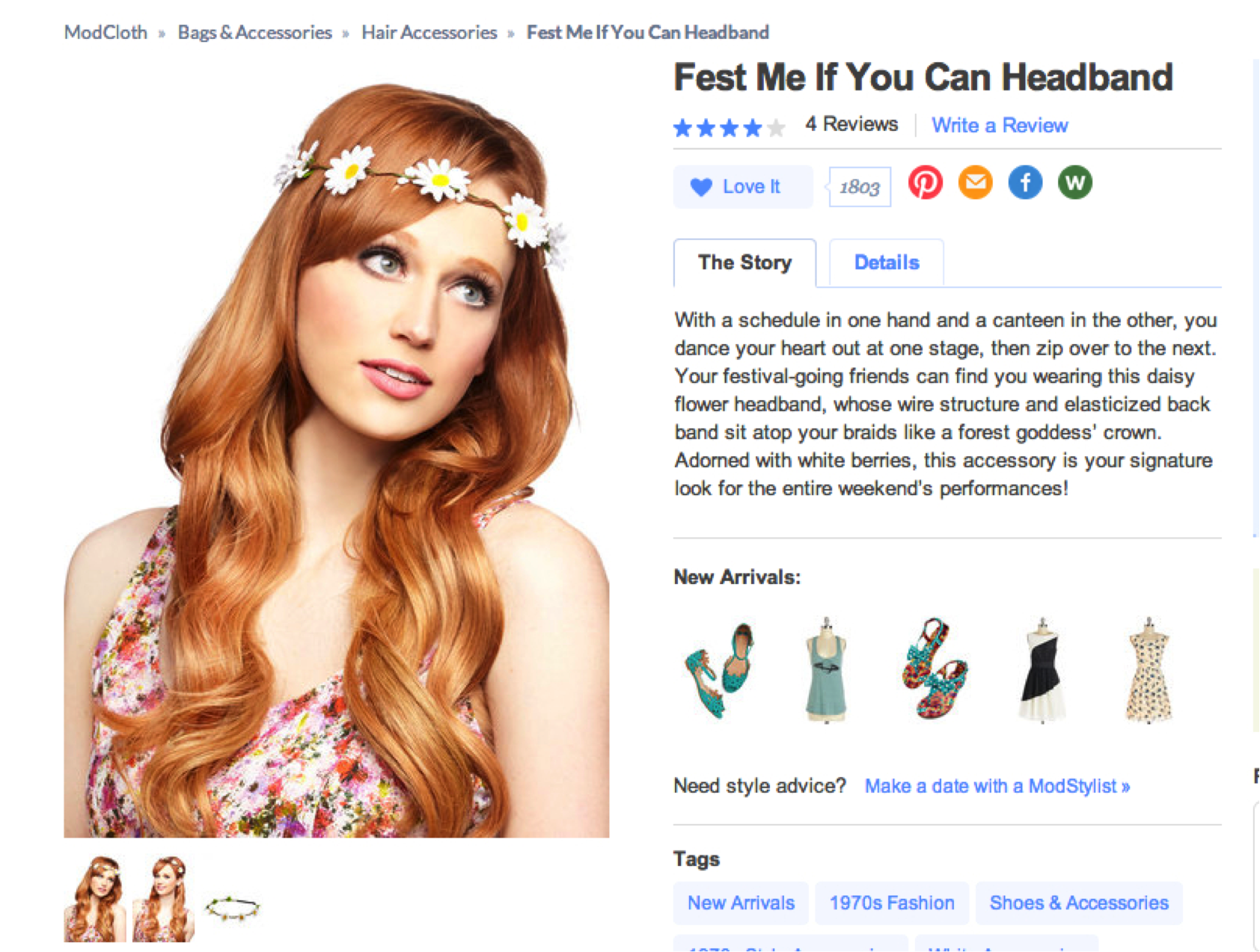
Modcloth does a very good job of combining vivid graphic and written imagery together in this way on their product pages.
Their product description of a “forest goddess’ crown” fits perfectly with the photo of the young woman and very vividly reflects the image Modcloth wants the product to convey.
3. Triggers
Last but not least, every landing page needs a trigger to elicit the desired action: a CTA.
Trigger friction can arise for a variety of reasons. Maybe your CTA is placed before your visitors are ready to act, or maybe your visitors don’t understand what you’re asking them to do. In every case, it is likely that your CTA is not intimately tied to the motivation of your visitors.
For example, an A/B test conducted by Michael Aagaard on a B2C landing page resulted in a 304% conversion lift when the call to action box (sign up form) was moved below the fold.
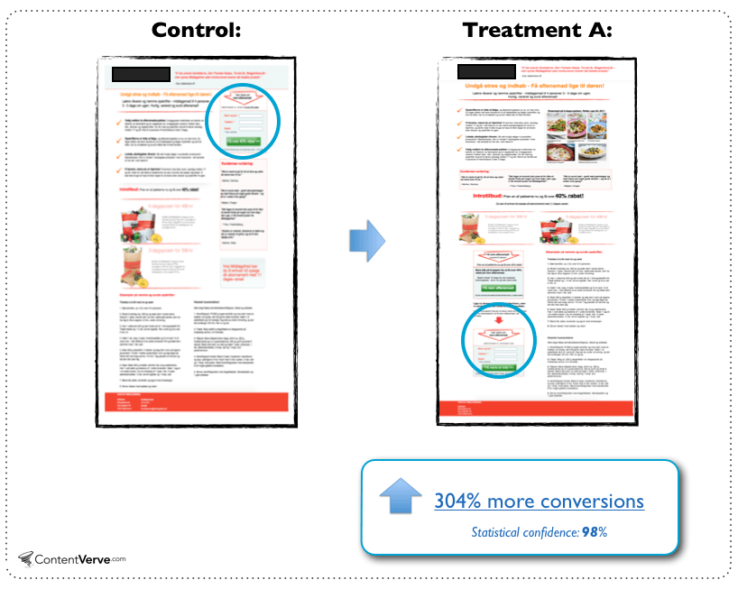
In this case, he found that placing the CTA further down the page was more effective for highly complex products/offers. Visitors to the page needed more information before they were ready to take the next step.
Along with ideal placement, creating triggers that are clear and logically move people down a desired path makes for better user experience.
The folks over at Basecamp, the project management software service, have a clear call to action that lets visitors know exactly where they will be taken after clicking the button.
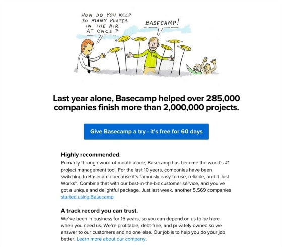
After clicking through the visitor is rewarded with a simple form, concise bullet points and another button that alleviates any fear that there’s anything but a free trial waiting at the end of the process.
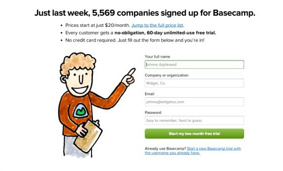
The smart marketers at Basecamp go out of their way to reduce any friction surrounding their calls to action, upping their chances of getting people to sign up.
Putting it all together for better copy and less friction
The Fogg Model is a great way to add structure to the copy on your landing page.
If you ever find yourself starting at a blank page wondering where to begin, go back to the model and ask yourself these questions:
- What motivates my target customers?
- How can my copy affect their (real or perceived) ability to take action?
- Based on what I know about my visitors, how should I frame the copy to tap into their motivations and where should I place the appropriate triggers?
Then, sit back down and write.
Imagine how much better the process could be.
And think about the possibility of more conversions.

