
While everyone is talking about the growth of social media and all it has to offer let’s not forget about the importance of email.
According to ExactTarget, email is the top channel for delivering marketing messages. Their research shows that “77% of consumers prefer to receive permission-based marketing communications through email.”
With email being such an effective marketing channel let’s look at 7 ways that you can increase your email opt-ins and get more subscribers to grow this valuable channel for your business.
1. Obtrusive But Effective
Most people dislike pop ups and overlays (where the area around the pop up box becomes darkened to provide more contrast and focus to the pop up area). And though many find them obtrusive, they are fast becoming one of the most effective ways to get more subscribers and leads.
In fact, eConsultancy reports that an average overlay will increase opt-ins by up to 400%.
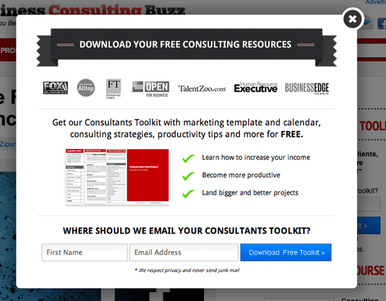
At Business Consulting Buzz we’ve tested several pop-ups and overlays and found that our current pop-up (pictured below) accounts for about 50% of our opt-ins and grew our monthly subscriber count by roughly 150%.
If you’ve decided that you’re not going to use an overlay because you don’t like the idea of it ‘popping’ up in your readers’ face, that’s fine. But remember, if you’re goal is to increase subscribers, it doesn’t really matter what you think. It matters what your readers think.
The question is, “do your readers find it obtrusive?”
Don’t ask your mom, your uncle Charlie, or your spouse. Test it.
And while you’re conducting that test, here are a few things that you may want to think about:
- Design: Like landing pages, the design of your popup can have a huge influence on your results. Make it look good and trustworthy. It should be consistent with your brand so people don’t think it’s an advertisement.
- Headline: Testing your overlay’s headline is a great test to run. It’s one of the most important areas that your reader will see. Consider what will get their attention? Can you speak to a problem they have? What benefit are they going to get?
- Timing: You can set your popup or overlay to appear at different times from when someone has landed on your site. Marketers report all kinds of results for timing. Some say 15 seconds is the ultimate, others that 60 seconds is the best. I say, forget about what others say. Do your own tests and see what works best for your site.
- Size: How big is your overlay going to be? The general rule of thumb is that you want it big enough to get people’s attention, but not so big that it feels like you’ve got a big box and nothing to say in it. Another factor you should consider is how will your overlay appear on mobile and tablet formats?
There are several plugins and services that you can use to help with launching your overlay. Some are free, others paid. The downside of many is that you can’t customize the design of your overlay, and instead are required to use one of their templates. In that case, you may just want to contract a programmer.
Here are a few overlay and pop up plugins and services:
2. Hot Technology
A new technology by BounceExchange is getting significant traction recently. The service will display an overlay on your site when the user moves their cursor to the top of the page to click a back or close button. Neil Patel reports that he increased his leads by 10-20% as a result of using this technology.
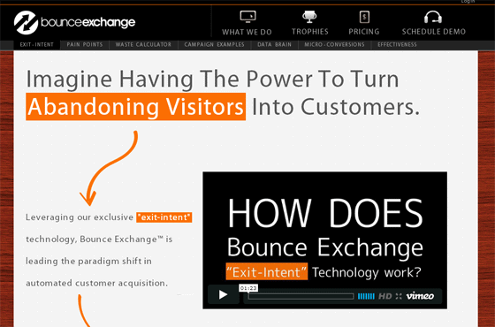
Starting at $2495/mo as of this writing, this service isn’t cheap and isn’t for everyone. However, I have found, but not tested, a free code set that a SEO forum user called ‘GoForJacob’ wrote – and supposedly gives you a similar result. A search for “goforjacob popup” will bring up the page.
3. Play Inline
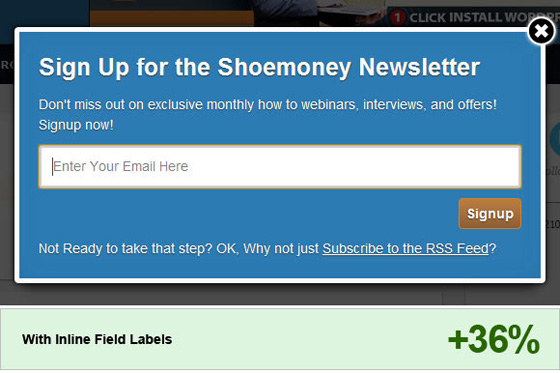
Conversion Voodoo shared a case study where an overlay on the Shoemoney blog increased its signups by 36% simply by adding “Enter Your Email Here” inline the form field.
Before the test the form field didn’t have any text inside of it. This result makes sense because it becomes clear to the user exactly what they should enter and as soon as they start typing their email address the default text is ‘removed.’
4. Avoid Distractions
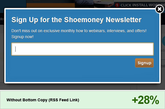
A follow up test generated an additional 28% increase in signups, simply by removing one line. The overlay had a line of text below the ‘Signup’ button that read “Not Ready to take that step? OK, Why not just Subscribe to the RSS Feed?” Removing that single line generated a significant 28% increase in subscribers.
5. Go to the Bar
Another popular option with marketers is having a colored bar that sits at the top of your website and asks visitors to take a specified action.
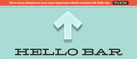
Two companies that offer this technology are HelloBar and ViperBar. Using this bar is a great way to get your visitors attention without being too intrusive. Plus you can customize colors and text to make the bar fit in as much as you want (or don’t want).
6. Look At the Page
Your opt-in forms don’t just appear in overlays and top bars. The landing page, where the opt-in form is still most often found, is a major factor in your conversion rate.
Every landing page should have 5 key elements.
- Headline: this is typically the first thing that will grab the attention of the user. David Ogilvy, legendary ad man, is well known for saying that your headline accounts for 80% of your ad’s effectiveness. So spend time on it and test it.
- Benefits: your landing page should contain a short list of benefits that get the user excited and more interested in what you have to offer.
- Call-to-action: novice marketers often make the mistake of not including a call-to-action, also known as ‘the offer.’ If you don’t offer your users a strong enough reason to opt-in and give you their email address, they won’t.
- Opt-in form: this is where people will actually signup. Nuff said.
- Social Proof: the more credible you are, the more likely people are going to be to signup. If you’re an established brand this won’t be much of an issue for you. But for everyone else, you’ll want to consider testimonials, videos, reviews, audios and any social mentions and sites you’ve been featured on. This proof will help you look like an authority and build give more credibility.
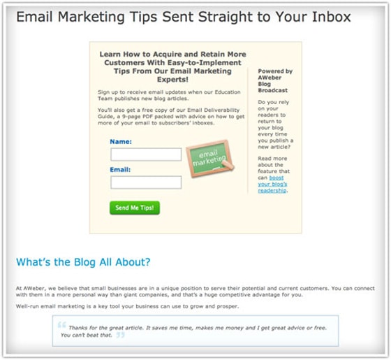
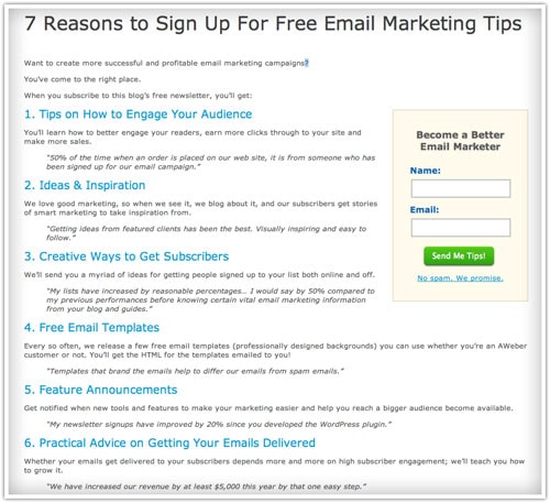
Aweber increased their newsletter signups by 321% by converting their landing page into a text heavy page that read “7 Reason to Sign Up For Free Email Marketing Tips.” As you can see below the original page had little text and offered few benefits.
The winning landing page offered plenty of benefits and social proof as you can see from the 7 points which focus on benefits and the testimonials offered throughout.
7. A Single or Double?
Congratulations, you’ve worked hard to convince your readers to opt-in. You now have another big decision to make, and it’s often one filled with controversy.
Will you go with single or double opt-in? What’s the Difference?
Single opt-in is when a user enters their email and information into your opt-in form and when they click the ‘submit’ button are automatically added to your list.
Double opt-in is when the user enters their information in your opt-in form. They are then sent an email and have to click a link in that email to confirm that they want to be on your list. If they don’t click the link, you won’t be able to follow up with them.
The pros of single opt-in are:
- You remove a step from people who want to signup.
- You’ll usually grow your list more quickly.
- Peter Sandeen says that “You can make the most of your thank you page and instead of saying “Check your email for a confirmation link” you can say something like “You’ll get what you asked for in a few minutes, but before that you might want to…” and get them to take a desired action.”
The cons of single opt-in are:
- You might pay more for your email service because of higher subscriber numbers (with a percentage of those being bogus emails).
- Harder to prove that the person that signed up actually wanted to. This is important for list providers and is the main reason they recommend double opt-in.
- Potentially lower engagement because your subscribers had to jump through less hoops and may be less qualified.
What Does the Data Say?
I can offer you several recommendations about whether single or double opt-in is better for you. But the reality is you need to test it yourself.
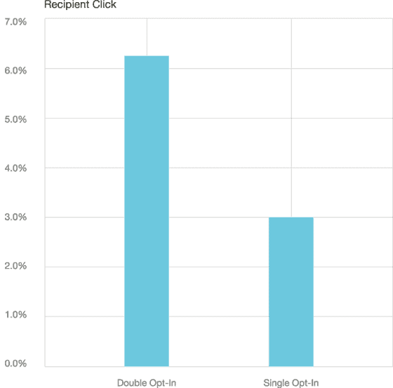
Mailchimp published data showing that double opt-in provides better results. The chart below shows that double opt-in received about a 40% better open rate.

Click rate with double opt-in also improved from 3% to over 6%.
Looking at this data you might think that double opt-in is the way to go. Not so fast.
Jarom Adair decided to run his own test and got very different results.
He set up 2 email lists, one with single opt-in and the other with double opt-in.
He got 1000 people to join each list and then started running some tests. Here’s what he found:
Subscribers: In the same time it took him to get 1000 subscribers to his double opt-in list he got 1249 subscribers to his single opt-in list. That’s almost a 25% increase in the number of subscribers with no extra effort on his part.
Engagement: Numbers don’t matter as much as engagement, right? So Jarom set up a 5-part series of autoresponder emails and looked at the differences between open and click rates. Here’s what he found:
Single opt-in: 63.8% open rate and 17% click through rate
Double opt-in: 57.6 % open rate and 15.6% click through rate
Okay, well engagement is one thing, but what really counts is sales…
Orders: Jarom then sent an identical sales email to each list which resulted in the following sales:
Single opt-in: 14
Double opt-in: 12
The data from Maichimp and Jarom Adair would lead you in different directions. So which is the right one for you?
There is no simple answer, other than to say that you need to TEST.
Put these 7 tests into practice and you’ll be well on your way to improving your conversion rates and building a bigger list.

