Just a few weeks ago, we tasked copywriters of all stripes with a simple mission:
“Write some copy about this robot vacuum that plays music.”
 More specifically, we tasked them with writing a great landing page for people to sign up to hear more about DJ Rumba in the lead-up to its (completely fictional) release.
We reviewed every single entry, looking for pages that were not only well-written, but smartly used each piece of copy to support the goal of the campaign and push the visitor towards completing the call to action: submitting their email address.
We then selected the 10 finest examples to be critiqued by our panel of expert copywriters; you’ll find commentary from Joanna Wiebe from Copy Hackers, Demian Farnworth from Copyblogger, Henneke Duistermaat from Enchanted, and others below.
We need you to vote for the winner
Now the fate of the 10 finalists is in your hands – or, more accurately, whichever finger you use to click things.
Cast your vote for the landing page you’d choose to anchor the DJ Rumba launch campaign. You can vote for as many pages as you’d like, but you can only vote once per page.
The copywriter behind the page that has the most votes by May 18th will be on their way to the Call to Action Conference in Vancouver in September, with two runners-up receiving tickets to the Conversion Road Trip city of their choice next month.
Happy voting!
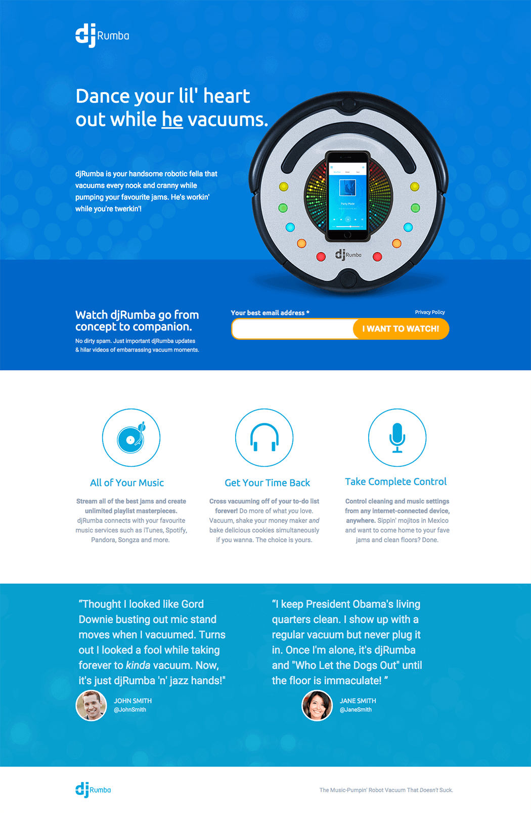
1. Brian Lenney
Judges’ comments

The headline is too clever but it got my attention and made me read the first paragraph. Good test option. That said, know when to quit: cut the paragraph after “Meet DJ Rumba.”
The offer is unclear and introduces anxiety and distrust – how will you ship with only my email address?
Good voice – funny, and could work for an audience that wants a singing vacuum. (BTW: 30 second rule? I thought it was 5 seconds!)

The Swanson testimonial nails it. The headline, not so much.
You are assuming too much: perhaps the target market does like to dance naked. But who is that?
I feel like the language defines who the target market is (someone who uses the word “crib”), but then I question if these same people could afford DJ Rumba. Or if their roommates or parents would appreciate dancing naked in the crib even if they could.
2. Andrew Morris
Judges’ comments

The headline is clever without being confusing. It grabs my attention and makes me want to read on, meaning it does its job.
The CTA button copy, on the other hand, is a turn-off. Save my place for what? It doesn’t tell me what I’m going to get and there’s no consistency with the headline or sub-head.
The “benefits” copy is vague. What am I chilling, choosing and cheering? Don’t make me connect the dots. I also think it’s weird that the benefits focus on music instead of cleaning. Is my biggest pain point when vacuuming carrying around a boombox? Is Space Jam currently in theatres? I don’t think so.

The sub-heading is pretty good – it explains the DJ Rumba in clear language.
The button copy, however, is weak – what does “save my place” mean?
I’d also like to see a stronger reason for signing up (and change the “we” focus to “you” focus). The three feature boxes could more clearly explain both features and benefits. I still don’t quite understand how DJ Rumba works.
3. Shana Haynie
Judges’ comments

The headline and sub-headline are weak – too many words, too little clarity and too much attempt at hipster punch.
The opt-in text reminds me that I can’t have this now… disappointing and not compelling.
The three boxes of content are weak on features/advantages and lacking in benefits. It seems the only reason I’d want this is to dance, and I’d need more reasons to care about the device.

The headline lacks clarity. I’d consider reworking the last two sentences in the first paragraph into the headline and sub-head. Those are great lines that tell me what I’m looking at and address a possible pain point.
Make the three benefits standout with value added sub-heads. “It’s fun!” doesn’t tell me anything.
The rest of the copy is terrific.
4. Michaela Stalnaker
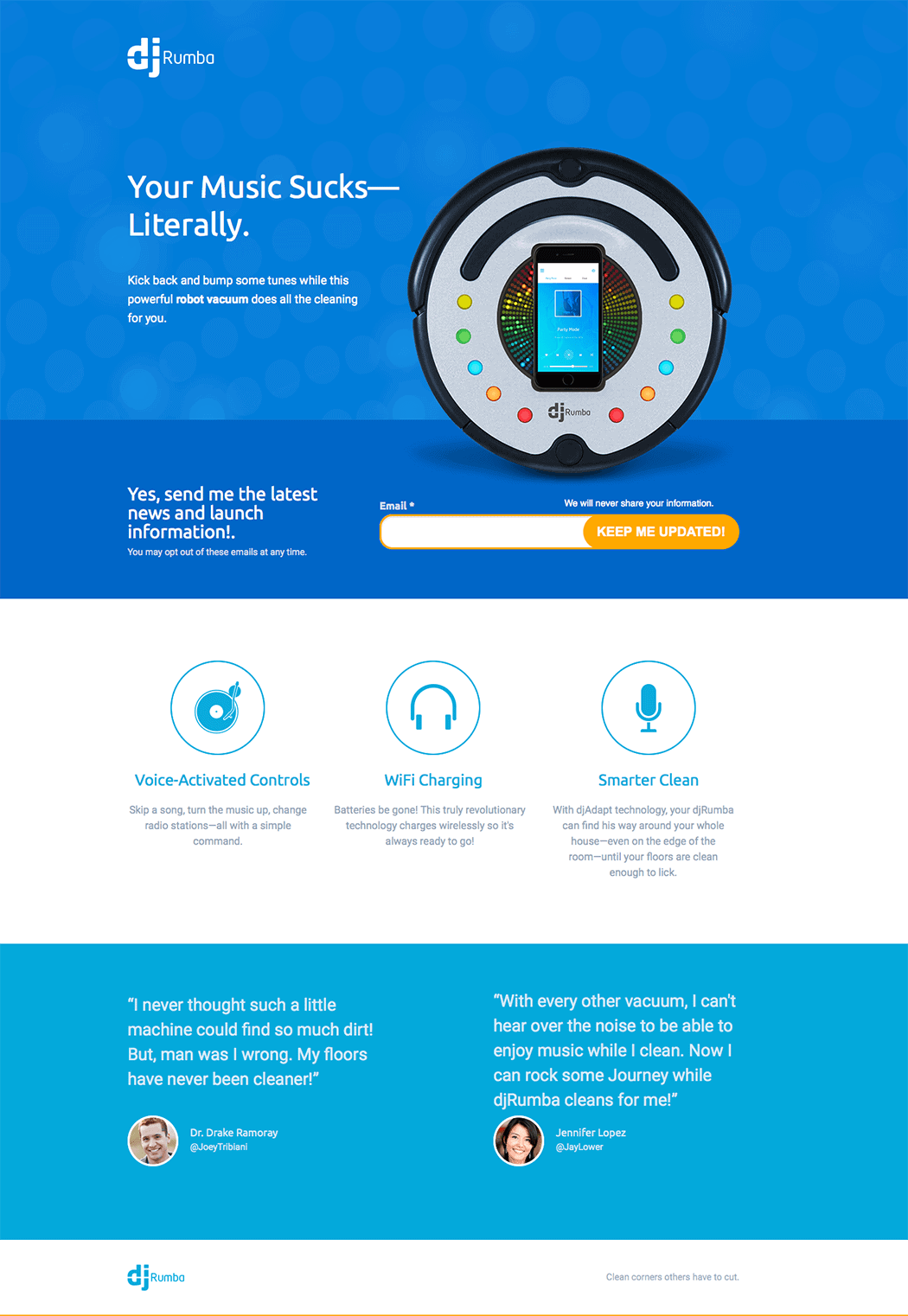
Judges’ comments

I think the second paragraph is fine. The headline is what causes some issues. “Literally” is very ambiguous. Something a bit more direct would help a great deal: “Your music sucks – and that’s a good thing” would be more my speed.
If you do that, then the second paragraph makes a lot more sense and ties it together. And put features further up the page. They’ll sell me!

The headline catches my attention but there is no punch line. The second paragraph falls flat.
Not sure what problem the device solves for me – my bad taste in music? Why can’t you explain what the product is?
Not interested in opting in, the fake enthusiasm is a true boner killer.
The three benefits below the fold are decent, but it’s too late.
5. Jenn DiMaria
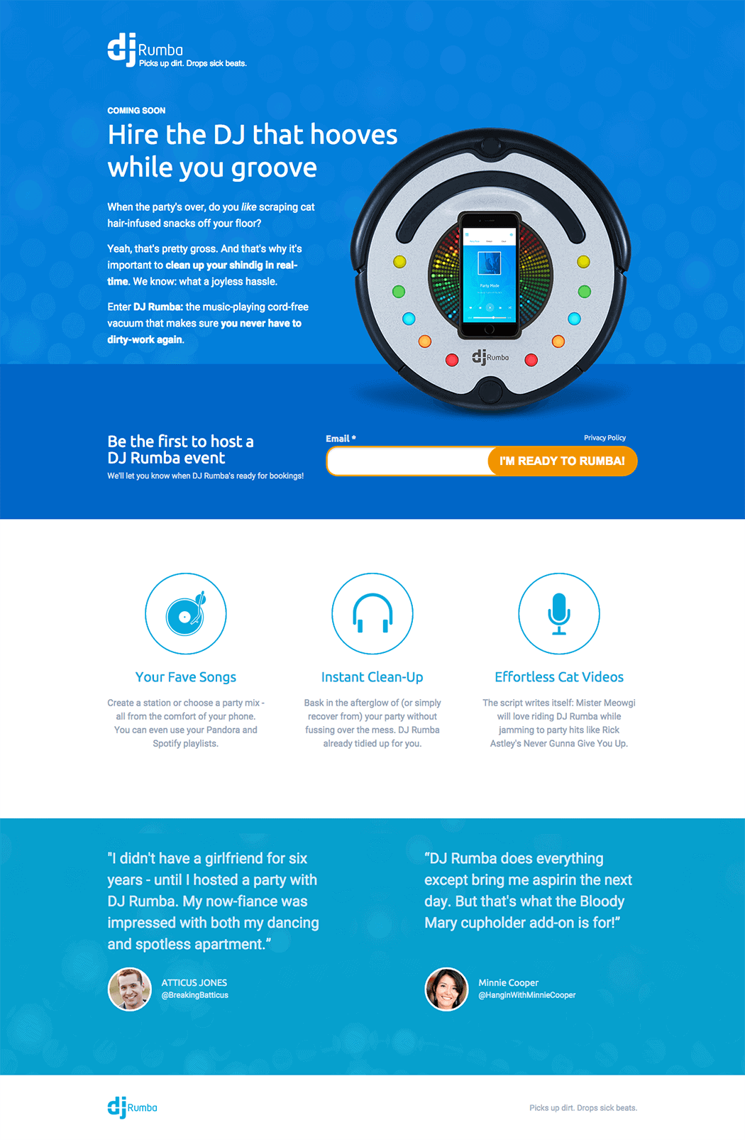
Judges’ comments

Took me two readings to “get” the headline, which fails the clarity over clever test.
Lede copy hits the pain points of post-party cleanup and ties the USP of the device into the solution. Not bad.
I wouldn’t use an opt-in for a video view – not enough of a value proposition. Display the video on the page and craft a more compelling CTA for get the opt-in related to hosting a Rhumba party.
Testimonials are off the mark in content.

The fact that it’s coming soon made me less interested right away.
The intro paragraph was a bit long and too specific to appeal to a broad audience.
The event reference again removed clarity – as did the funny yet unhelpful cat video benefit.
The list of integrations was smart but could have benefited from more visual emphasis on Spotify and Pandora.
Entertaining testimonials.
6. Brian Sun
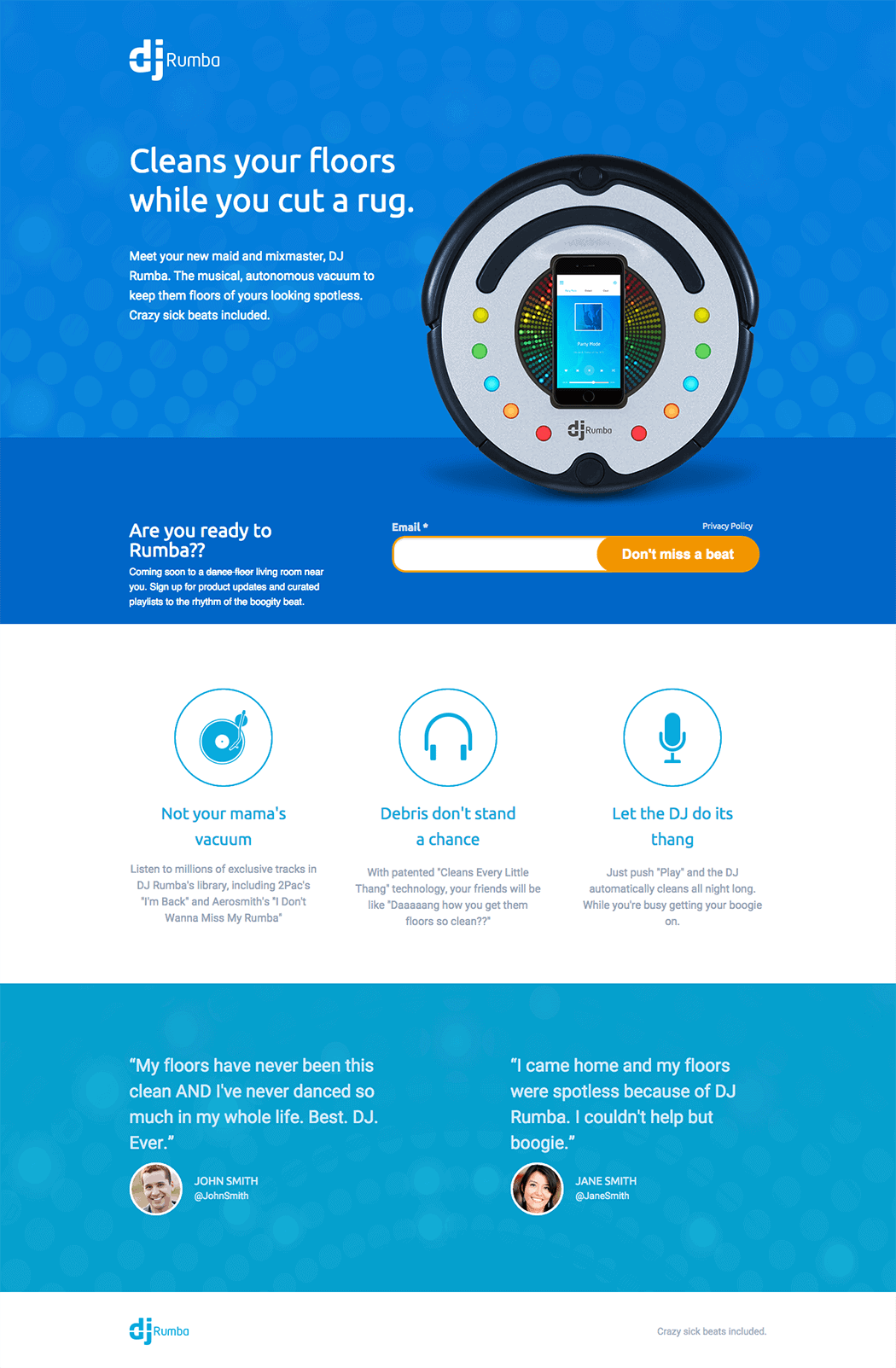
Judges’ comments
What’s the offer?!
The headline starts well but fails at “cut a rug” – too clever!
The hero copy sounds like the writer’s not sure what’s desirable about DJ Rumba. What one thing will improve in my life when I sign up? Why am I signing up? What could prevent me from signing up?
“Are you ready to Rumba?” = no; replace with what I get when I sign up.
Testimonials are flat. Redo.
The headline is cute, though I’m not sure most folks under 70 will be familiar with the expression “cut a rug.” I bet this page would kill will the “jitterbug” generation!
The sub-head is a bit wordy, but does a good job explaining what DJ Rumba is and does so in a fun way.
I like “Are you ready to rumba?” as a way of transitioning into the ask but the button copy veers into “too clever” territory. Does filling out the form get me a vacuum? Cool music? Some boring newsletter? I’m not going to click if I don’t know what I’m getting.
The testimonials say the same thing in pretty much the same way and don’t address any of my concerns or questions. That’s a waste of copy.
7. Kendra Savich
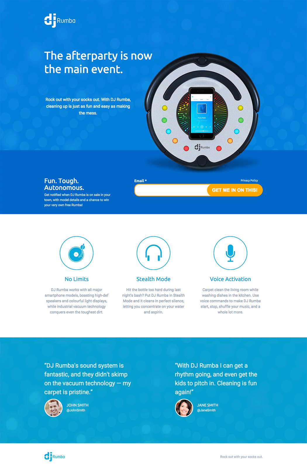
Judges’ comments
That’s an interesting headline. I want to say it works, but it’s really trying to accomplish too much. DJ Rumba is not going to sort the aluminum cans from the bottles, empty ash trays and rub out merlot stains. All it can really do is vacuum your carpets. But you don’t even know if it does that well. There is one mention, in the email sub-offer: we hear that it is “tough,” but what does tough mean? One testimonial mentions his carpets were pristine.
So the writer focuses on the music too much. As a potential customer, my questions are how good is the sound quality (one testimonial suggests they didn’t skimp on the sound technology… but what does that mean?) How good is the vacuum?
With these hanging questions, the CTA fails. Instead, how about an enticing cliffhanger?
The headline and sub-heading fail to explain what the DJ Rumba is.
The main call to action “Fun. Tough. Autonomous.” is weak, but I like the sub text, giving me several reasons to sign up to the notification list (if only I’d understood what the DJ Rumba is!).
The three feature boxes aren’t bad, but don’t give me a compelling argument. Needs more clarity what DJ Rumba offers.
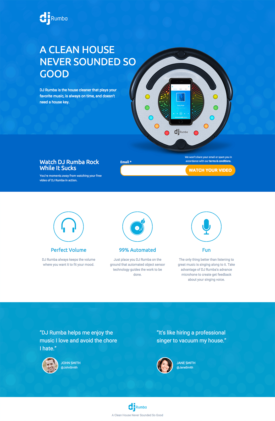
8. Josh Garofalo
Judges’ comments
I like the shorter copy and whitespace. While the headline isn’t compelling, the sub-headline hints at what the device is.
Twerking isn’t appealing, and the target market is unclear. I dislike the slang (hilar, sippin’), but the three boxes of content below the opt-in tell me about features and possible advantages.
Benefits are lacking – why should I care about these features?
First, think carefully about the pronoun. Does “he” work for this audience? I’m honestly not sure.
Second, “‘lil” is too patronizing. I’d get rid of it – it’ll make the headline more direct and avoid conveying the wrong message.
Improve the call to action. What’s in it for me? I want to know when it’s available. So tell me that’s what you’ll do.
9. JP Vasellina
Judges’ comments
I’d think about swapping the headline and sub-headline to make it obvious to the visitor what this thing is.
The microcopy on top of the CTA button is distracting and now puts the idea of spam in my head.
The benefit copy needs work. There are typos and it isn’t particularly compelling. I’d rework so the copy makes it clear how much better life will be by using this product.
This headline hits the mark a bit closer, and made me want to read the lede copy. Unfortunately, this copy is weak and too short to hold interest.
I wouldn’t use an opt-in for a video demonstration – not enough of a value proposition. Display the video on the page and craft a more compelling CTA for get the opt-in.
Testimonials here seem to work.
10. Sarah Davis
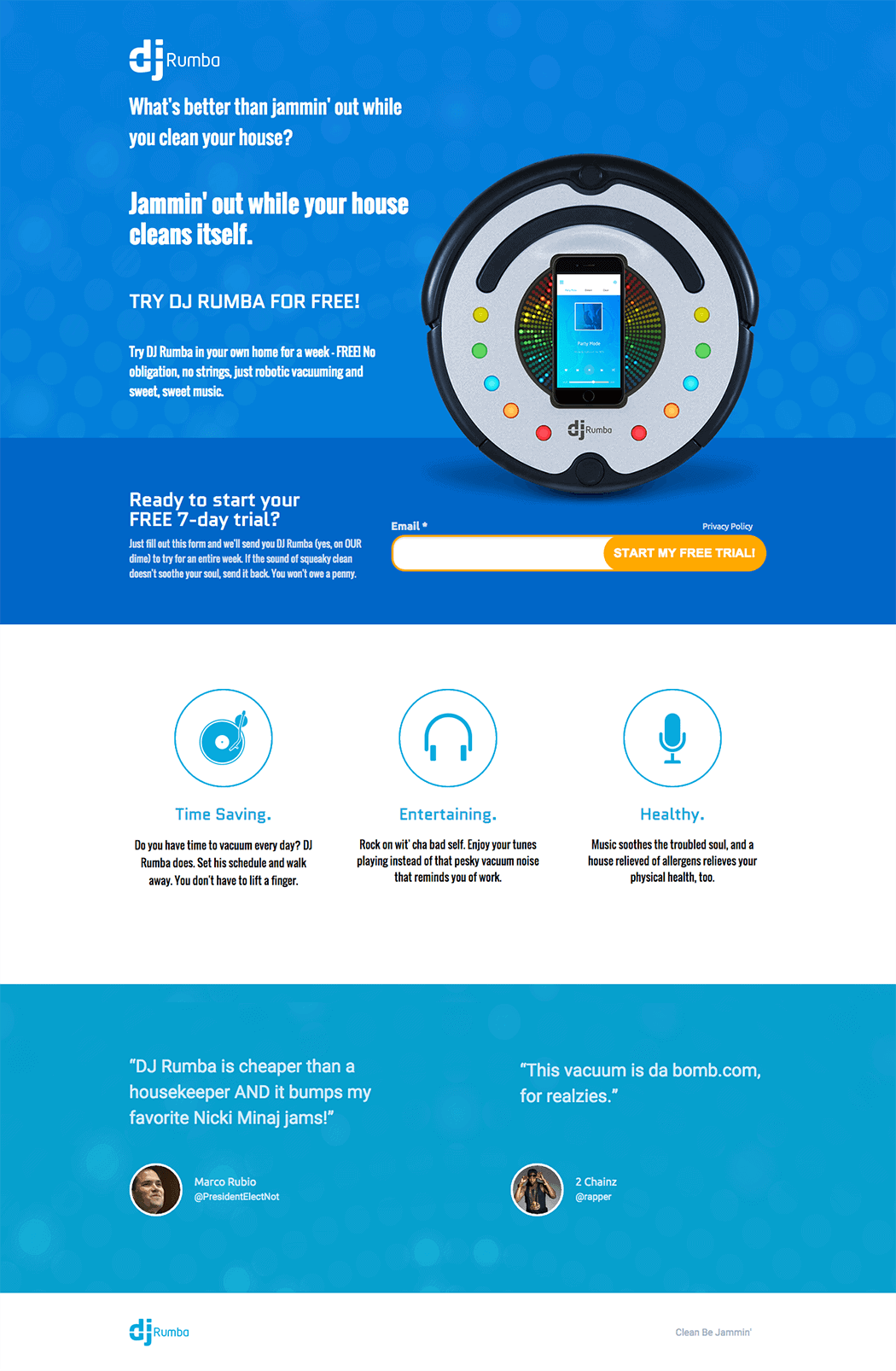
Judges’ comments
Reading the copy on this page gave me a shit-eating grin from start to finish. Truly delightful copy.
The Q&A headline/sub-head kicked things off with humor and simplicity. The use of rhymes throughout tied in well with the theme, and the benefits clearly articulated why my life would be improved by using it. The free trial added a nice touch of persuasion.
The headline already loses me – I can think of 100 things better than jammin’ out.
Poor clarity: I don’t understand what the product is, it’s not really explained.
The benefit of the product is not explained well, very little is done to increase my motivation.
And I’m not interested in free trial before knowing how much it’s gonna cost down the line.
A huge thanks goes out to our judges and to everyone who submitted a landing page; it was hard to choose just ten!
Don’t be shy – we’d love to hear what you think about the finalists (and the contest itself) in the comments. May the best DJ Rumba copywriter win!

