What’s the most important ingredient of a successful landing page? Witty copy? A beautiful design? An oh-so-clickable CTA?
It’s clarity — creating a page that allows anyone to quickly determine what your offer is and if it’s right for them. If someone can’t understand what you’re selling, they’re certainly not going to be interested in buying it.
Unfortunately, it’s also incredibly easy to mess it up. Creating a clear page requires that you put yourself in the shoes of your audience, ignoring all of the context that you have and they don’t. Which is easier said than done.
That’s probably why it was the most prominent problem with the landing pages in this month’s episode of Page Fights — a grand digital coliseum (okay, it’s a Google Hangout) in which landing pages are critiqued by a team of expert judges, including Unbounce’s own Oli Gardner, Peep Laja from Conversion XL, and this month’s guest Jay Baer, author of Youtility.
Read on for the top clarity lessons culled from this month’s episode, or check out the recording for a more visceral landing page takedown experience.
1. You’re not showing the product
It might seem too obvious to point out, but showing the product you’re selling is critically important. If your product is visible, like a physical item or software, show it. If you’re selling an invisible good — like insurance — illustrate the positive impact it will have on the user’s life.
This is crucial to helping your customer imagine themselves using the product and experiencing its benefits.
Hey Gluten Free, a gluten-free product subscription service, comes close to pulling this off, but falls short in the execution.
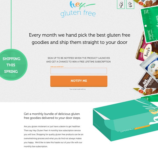
This landing page was a favorite among the judges, and Oli thought the headline did a great job of effectively communicating the product’s value to prospects. But compared to the strong copy, the imagery didn’t carry its weight.
They’ve relegated their actual product shots to a cluttered corner of the hero image, while illustrations of boxes adorn the rest of the page. As Jay pointed out, this introduces a lot of uncertainty:
Well, this might sorta kinda maybe be the product we eventually give you.
Hey Gluten Free is unique in that their product is essentially randomized, with a different box of goodies arriving every month. Still, this landing page could have been elevated from strong to stellar by displaying an actual box, with actual products inside, front-and-center.
PetitePuf, an organic cotton candy cart service, made a similar mistake.
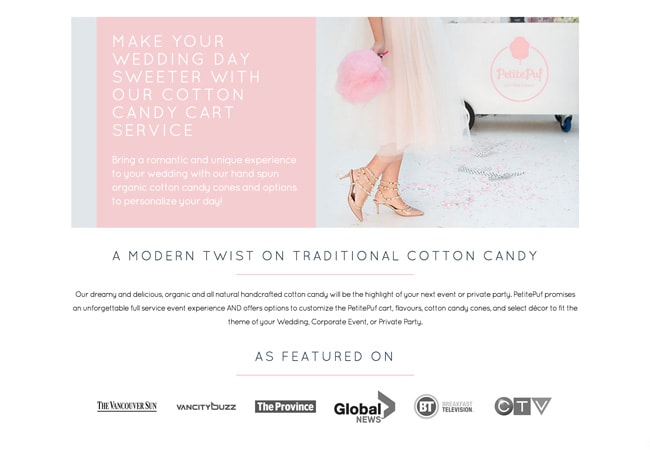
While you’re welcome to rent a cart — complete with various flavours, décor and “spinning artists” — for your next classic muscle car jamboree, their core focus is on catering weddings. Their site is packed with beautiful photos of nuptial table-settings, happy brides and brides-to-be and seriously delicious-looking candy floss.
It’s a shame, then, that none of this imagery made it onto their landing page.
The sole photo here features the cart and cotton candy as an obscured background decoration, with a lone, faceless woman in the foreground. Jay suggested more product and customer-centric photography and perhaps a short video showing people enjoying the candy.
Whichever way they decide to approach it, PetitePuf would be wise to heed Oli’s advice:
Bring the delight the cotton candy will bring to your wedding guests front and center.
2. You’re speaking your own language, not your audience’s
PetitePuf’s troubles didn’t end with their imagery – Peep took them to task for their confusing form copy.
I understand you want to be cute, but that shouldn’t impede reading your content.
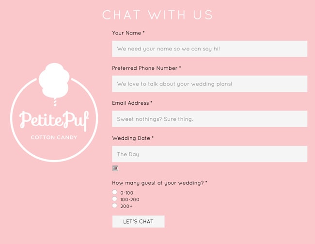
In general, the judges had many problems with their form copy:
- “Chat With Us” is a misleading and ineffective headline. Not only is this not a chat, but the headline should reinforce what the user is here to do. In this case, that’s requesting a quote or finding out more about the service.
- As Jay mentioned, “We need your name so we can say hi!” is a strange and unnecessary justification.
- “Sweet nothings? Sure thing.” What?
While nobody would suggest that sterile copy is something that PetitePuf should aspire to, anything that makes your proposition more difficult to understands needs to go.
But at least PetitePuf’s copy calamities were confined to the form alone. The same can’t be said of Bosky, purveyor of sunglasses made with FSC certified wood.
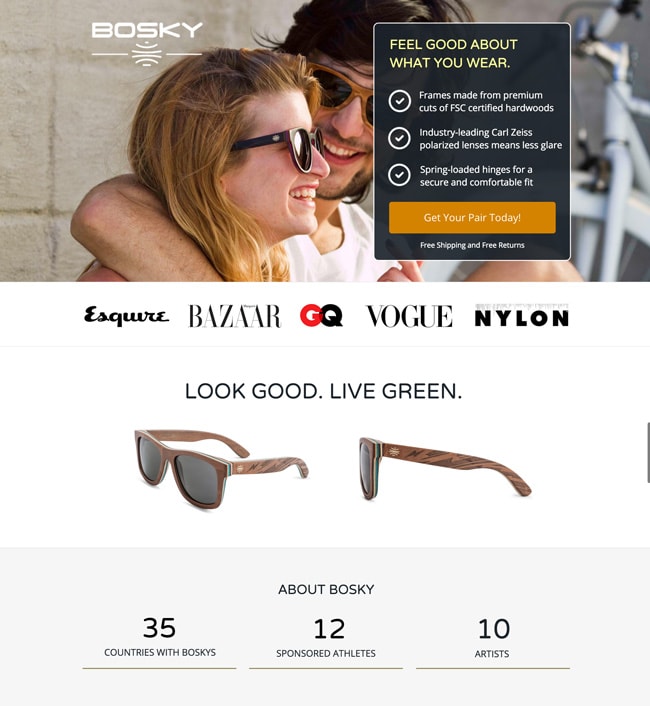
First problem: what on earth is FSC certified wood?
As Jay pointed out, Bosky’s page is packed with confusing copy, extolling the virtues of “base-six curvature,” “skateboard construction” (???) and “stainless steel hinges with a three-point mount” – all while burying what these features actually mean for the wearer.
Jay’s advice:
What these guys need is 20% as much copy and just an FAQ. Describe in clear language what it is you do well.
Terminology that might seem accurate or downright impressive to you has a good chance of being totally lost on an unfamiliar reader. Unless your page is targeted at a demographic that lets you assume a base level of knowledge, you should really write your page without making any assumptions.
3. You’re telling the story backwards
Clarity isn’t just about what you say. It’s also about how you say it and, in this case, what order you say it in.
vetPromotion is a social media management tool aimed at busy veterinary practice owners.
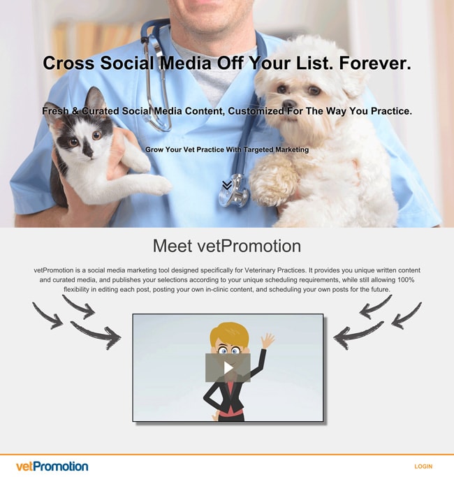
It’s a pretty cool idea, but vetPromotion has to convince those managers that social media marketing is something that should be a priority to veterinary business. It’s here that vetPromotion drops the ball, digs a hole and buries the ball in it.
Only after explaining their product in several (increasingly confusing) ways do they begin stating the case for social media in vet practices.
This was totally backwards. To their credit, vetPromotion took the feedback to heart and overhauled their page after the show, doing more to prime their prospects on the benefits of social media before going for the conversion.
So what does this mean for your landing pages?
If your product makes it “easier to do X,” you have to convince your audience that “X” is worth doing at all.
4. You’re putting form before function
Landing pages can — and should! — strive to be beautiful and fun, but that should never get in the way of your visitor understanding the value of your offering.
Consider this page from Imation. It’s about their Nexsan line of enterprise data storage. But can you tell?
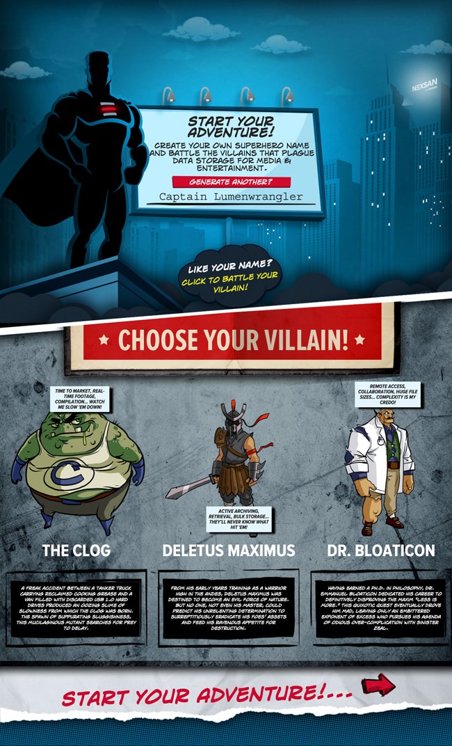
Here’s what Peep had to say about it:
I’ve never in my life seen such a disconnect between a landing page and the product a company is selling.
To be clear, it’s immediately apparent to anyone who visits that this page has had a ton of effort, money and love poured into it.
But that doesn’t make it good.
It doesn’t show or explain their product in any meaningful way. It’s packed with tons of copy, but none of it explains what Nexsan is, what problem it is they solve and why anybody should care.
It’s obvious that Nexsan was trying to inject some delight into the fairly dry topic of enterprise data storage, but the execution falls short. The idea is heavy-handed, the plot uncompelling and the five-click, seven-form-field ask far too demanding for what’s given in return: a pretty boring comic strip.

To their credit, Nexsan seemed to take the criticism in stride:
Hi, we’re here for the roast! Oh, we are the roast..? #PageFight @unbounce @jaybaer @peeplaja @oligardner pic.twitter.com/BelMdDo7C4
— Nexsan (@Nexsan) April 10, 2015
Save the neck for me! @Nexsan @unbounce @jaybaer @peeplaja @oligardner #PageFights pic.twitter.com/1BpfIs5fP1
— Deletus Maximus (@Deletus_Maximus) April 10, 2015
But hopefully they’ll take it to heart, too. Oli said it best:
What this page needs is a superhero named Captain Clarity.
Captain Clarity is the hero this page deserves, and gosh, does it ever need him right now.
Your prospects don’t come to your landing page to be impressed by flashy artwork or a self-indulgent narrative. They come to you because they have a real problem. It’s your job to help them solve it as expediently as possible.
Bring clarity through real cleverness
“Clever” is a word that’s gotten a pretty bad rap among conversion rate optimizers. But when we call out landing pages for being too “clever,” what we really mean is that they’re failing to achieve the cleverness that they’re striving for.
To be clever is to be ingenious and adaptive, ready to approach problems from a new perspective. And it’s also about knowing when restraint is warranted.
So I encourage you: be truly clever. Seek out ways of communicating your value that are uniquely yours, while remembering that your audience is counting on you to be clear and honest with them.
