
Online videos are the internet’s gift to the world. As shameless procrastinators we have instant access to all the adorable kittens, baby bloopers, and awkward moments that ours hearts desire.
But once we put our marketing hats on, videos give us more than just entertainment — they give us conversion power . Especially when those videos live on a landing page.
Why Landing Page Videos Matter
Landing page videos are perfect for demonstrating the benefits of whatever product or service you’re marketing in a concise, entertaining and informative way.
According to fellow Unbounce writer Andrew Angus, explainer videos have the potential to boost conversions by as much as 20% .
The power of landing page videos is far from surprising. Studies on web use have show that humans have an attention span of about 8 seconds. Our pet goldfish? Their attention spans are 9 seconds.
Thing is, landing page videos won’t work if they’re done wrong. That’s why we’ve assembled the following list – to empower you to create the best landing page videos evar. Let’s get to it.
5 Video Landing Page Examples To Inspire You
1. CrazyEgg
Created by: Demo Duck
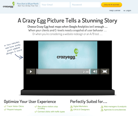
What on earth is a heatmap? Sometimes as marketers we forget that we’re speaking a language that is completely foreign to most humans. CrazyEgg, a company that sells heatmapping software, realized that words could not do its product justice.
So they hired the Demo Duck crew to explain (in less than a minute) why small businesses need more than Google Analytics to boost website conversions.
3 Things I Like About the Video
- The video speaks directly to audiences who are problem-aware, but not solution-aware
- The video communicates a clear value proposition for how businesses can make more money
- The video is well-integrated into CrazyEgg’s homepage — strong visual cues guide the user’s attention toward the videos and down the page
Bonus Points: The CrazyEgg team is rigorous about measuring how its landing page explainer video translates into conversions. The video helped CrazyEgg generate an extra $21K per month in revenue.
3 Things I’d Change
- The introduction frame of the video could be shorter and get right to the point
- The video can include a clearer call to action to “learn more” or read customer stories on the homepage
- Customer testimonials could be closer to the video on the homepage (you have to scroll down to see the social proof)
2. Giving Stage
Created by: Homemade
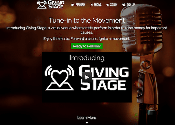
Giving Stage is a San Francisco-based startup that’s building a “virtual venue” where artists can perform to raise money for charity. It’s a cool idea but a mouthful to explain. You really need to see it to understand what a virtual venue is all about. Hence, this explainer video.
3 Things I Like About the Video
- The video has a strong human interest angle and features the company’s founders
- The video provides a thorough yet concise introduction to Giving Stage — without saying a word
- Just as music is a focal point of Giving Stage, it’s a focal point of the video
3 Things I’d Change
- There should be two strong CTAs on the landing page right after the video — one for performers to learn more and one for audiences
- It would be great for the landing page to feature some stats about funds raised as well as audience testimonials (once the startup is up and running, though — they’re just starting out)
- I’d love to see a screencast of an actual show once the startup is more established
3. IT Man
Created by: Barq Video
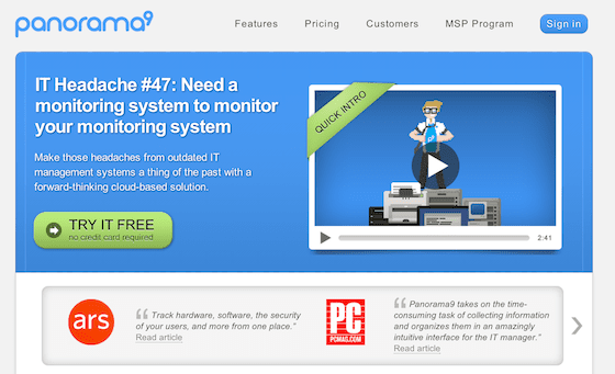
Panorama9 is an IT monitoring system for IT monitoring systems. Sounds really boring, right? But their explainer video features IT Man — a throwback to Super Mario Brothers and PacMan — who ensures that boring is nowhere to be found in this video.
The video is downright hilarious (and not for the faint of heart). Any IT sales professional who watches this will get a kick, guaranteed.
3 Things I Like About the Video
- Nerd humor that the company’s target audience will definitely love
- It has a storyline, narrative hook and plot – rare for an explainer video
- It offers a glimpse “behind the scenes” of Panorama9’s products and services
3 Things I’d Change
- The video needs stronger integration with Panorama9’s homepage — the pop-up is a distraction from the website’s core call-to-action
- The introduction could be condensed to get to the product overview sooner
- An action-oriented CTA would boost the video’s conclusion – and conversion potential
4. Rypple (now Work.com)
Created by: Switch Video
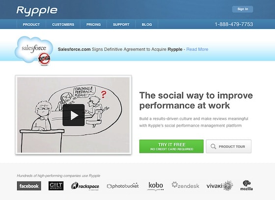
Rypple is a social performance management platform for busy, time-strapped professionals. Haven’t heard of it? You probably have heard of Work.com, which is owned by SalesForce.
Before Rypple was Work.com, the company had this beautiful explainer video on its website. The video was so inspiring that commenters actually noted the acquisition on YouTube:
“I like this Rypple PR YouTube video – I can see why Salesforce.com acquired them”
3 Things I Like About the Video
- The video has a storyline with heavy human interest
- It describes the problem that Rypple is solving, in detail
- The video is well-integrated with the landing page, right next to the CTA and with client logos right below it
3 Things I’d Change
- The video focuses heavily on the problem and could focus more on Rypple as the solution
- I don’t really see the “social” connection between the video and the landing page headline (Am I missing something?)
- I think the “product tour” would have been the stronger CTA following the explainer video
5. ZenCash
Created by: DemoDuck
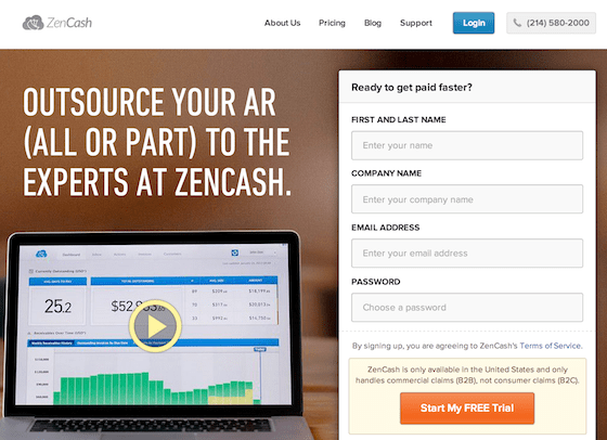
ZenCash is a platform that helps business owners simplify their accounts receivables process. The explainer video has a unique, hand-sketched style that audiences seem to find compelling.
According to ZenCash, 74% of website visitors click play and watch more than 64% of the video, on average.
3 Things I Like About the Video
- The landing page experience is cohesive and streamlined: the video is front and center – so users can see the benefits of the service right away – the form is short, and the CTA is bold
- The style of the video is beautiful and unique
- The company’s unique value proposition is communicated clearly and boldly
Bonus points: The video is very short! Less than 2 minutes.
3 Things I’d Change
- The explainer video should be integrated into ZenCash’s homepage
- The customer testimonials could be closer to the video, above the landing page fold
- Who are the “experts” that the ZenCash homepage advertises?
Final Thoughts
Remember that your landing page videos don’t exist in a bubble.
When planning your script, storyline, and visuals you need to think of how these elements fit into your overall conversion strategy and landing page experience.
What landing page videos make you jealous?

