10 free trial landing page examples (with A/B testing ideas)
You’ve got a great product. Your customer service is on point. Everything is running smoothly.
And now you want to attract new customers to your business.
One of the best ways to do this?
Free trial offers on dedicated landing pages.
TABLE OF CONTENTS

Josh Gallant
Josh is the founder of Backstage SEO, an organic growth firm that helps SaaS companies capture demand. He’s a self-proclaimed spreadsheet nerd by day, volunteer soccer coach on weekends, and wannabe fantasy football expert every fall.
» More blog posts by Josh Gallant
If you work in the software-as-a-service (SaaS) world, then you’re no doubt aware of the need to keep the top of your funnel loaded up with fresh leads for your marketing machine.
But a lot of buyers want to see your product in action.
They want to take the time to play with it, put it through its paces, and even break it (or at the very least, push it to its limits).
A free trial is an amazing way to help not only feed your lead generation efforts, it’s also an awesome way to prime bottom-funnel leads and make sure they’re ready to talk to your sales team about making a deal.
And really, who wouldn’t want to try out a free product or service?
It’s an easy sell!
…or, at least, it should be.
That’s where free trial landing pages come into play.
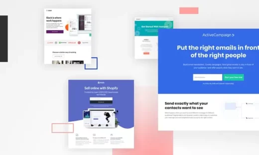
10 best free trial landing page examples
Free trial landing pages are powerful tools to attract new customers to your business. Check out these 10 examples to see how the pros do it and get some ideas for your own.
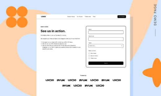
1. Hotjar
Hotjar is a must-have for marketers looking to boost engagement and conversion rates—and naturally it feels like they’ve applied their own insights to this landing page.

Building a good landing page requires an understanding of how a user will move across the page. Canny marketers can use a few clever design tricks to guide a visitor’s eyes to the most important elements—in this case, the free trial CTA.
Set on a white background, the hero image on this landing page really pops out. But what makes this one interesting is how elements on that image seem to point the viewer towards the CTA.
Notice how the line on the image looks a bit like an arrow?
It’s a really subtle yet really clever little bit of design work.
And even if it’s not enough, what follows is incredible social proof—”Trusted by 1,262,773 websites in 180+ countries” not only calls out the success they’ve had, it also implies that number keeps on growing.
Hotjar keeps it simple while guiding the user to what matters most.
2. Semrush
Search and analytics platform Semrush’s free trial landing page is a classic and focuses on the conversion first and foremost. The bright orange of the CTA button immediately draws the eye, offset by the negative white space, which makes it abundantly clear what you’re here for.

That said, if you need more reasons to click, the page’s designers have loaded it up with social proof. Immediately below the CTA, we get to see some of the big names that use Semrush as part of their day-to-day marketing efforts. It’s only after this social proof that we see the value propositions for different needs.
And this is all above the fold!
If we scroll a bit more, we’re treated to even more social proof alongside statistics about the platform and awards and ratings Semrush has won.
And as we scroll, the header stays with us, a constant reminder that the free trial is just a click away.
Semrush have heavily tailored their landing page towards that outcome, and the clean, streamlined approach serves it well.
3. Adobe
Adobe is a giant in the SaaS world, delivering a range of software products to clients working on the creative side of things.

(And by “a range,” we really mean “a product catalog of nearly 100 applications.”)
“Photoshop” has basically become a verb—even if you don’t know Adobe, you know their tools. The landing page here is simple and relies on that brand play, and takes a “more is more” approach to the offer.
The main CTA is to try out Creative Cloud All Apps—access to everything Adobe has to offer for a monthly fee.
The landing page takes an interesting approach to this. There’s no social proof and limited information about each individual product—but they highlight some of the most popular applications and their use cases.
Scroll further, and you’re treated to a set of frequently asked questions for more information. The end result is the landing page makes the case for the Creative Cloud trial, while offering alternative options for individual applications.
4. Zendesk
Zendesk offers highly popular customer service software—and similar to Adobe, leans a bit more on brand awareness of just how commonly used it is.

Zendesk’s approach to a free trial is a pretty different take on the subject, too.
Unlike most of the other examples in this list, Zendesk doesn’t have what you could call a traditional LP. Far from it, the company’s taken the approach to streamline the process directly to a registration form.
Depending on where you access their trial CTA from, this form will either pop up and gray out the page you were on, or it’ll bring you directly to this simple form.
The form also guides the user through it—note the “Next” button prompt and the helpful “or press Enter” below it—for as smooth a process as possible.
It’s a great example of how less is more, even if it’s non-traditional. After all, removing friction from your landing page experience is one of the best ways to encourage users to take action and click.
5. Teamwork
Teamwork’s project management software is positioned as an alternative to platforms like Wrike, ClickUp, Monday.com, and others—in short, it’s a highly competitive space.

But while other platforms focus on getting users signed up for a free product tier, hoping that the features and experience will translate into paid subscriptions, Teamwork focuses first and foremost on a beefy 30-day free trial.
That’s a good chunk of time to give to users looking to experience what a project management platform has to offer, but beyond that, they back up the offer with a clear use case, three clear benefits to the user…
…and then they show you what the product looks like.
We’ve touched on imagery a bit here and there in this article, but we haven’t really talked about how big a deal showcasing the product users will get to play with can be.
It’s an amazing way for you to highlight what your product does and what it’s capable of. There’s no real abstraction of what’s going on here—users get to see it for themselves, and this experience is only really beaten by showing real people using your product.
And that’s not all.
Scroll down this landing page, and you’re treated to more examples of the product in action, awesome social proof, and clear pricing models to help you make the right decision for your budget.
It’s a great mix of content that really puts the focus on what you, the end user, will get out of the product, how it works, and what you can expect to pay for it.
6. Dropbox
Dropbox’s free trial landing page for its file sharing and collaboration tools keeps things simple and straightforward.

The first thing you see when you land is a dark background with a strong headline, CTA, and an animated GIF showing some of what the solution can do.
But unlike other examples we’ve covered, instead of immediately diving into user value and use cases, scrolling on this landing page brings you directly to pricing options.
It’s a bold approach—by highlighting the pricing model so soon after the trial offer, it’s immediately addressing the elephant in the room with so many SaaS products. “Here’s the product, what it does, and what it costs.”
There’s no time given to dancing around any subjects, making it a much stronger landing page through its direct approach to copy and messaging.
7. Later
Social media management platform Later literally tells you that “less is more”—and it’s an approach that works for their free trial landing page.

By zeroing in on specific, value-first content, the landing page makes a strong case for starting a free trial.
There isn’t an inch of wasted space here. The headline is clear and explains the benefits and value of what you’ll get. Really, this entire above-the-fold section showcases what you can do with the platform.
And each of the bits of supporting content takes a subtle approach to addressing common pain points:
- Visual-first planning means it’s an intuitive interface anyone can pick up quickly.
- Simple scheduling takes the headache out of what’s usually a tedious task.
- The custom link in bio simplifies a major social media must-have.
- And to close, being able to analyze and optimize means everything is trackable and measurable.
As you scroll further, the page has a video overview for you to check out, plus further use cases and a pricing chart.
It’s a simple layout with clear copy and messaging, and it highlights the value you’ll receive if you check out the platform. Not a bad pitch at all!
8. Salesforce
Salesforce has really streamlined its free trial landing page and focuses on exactly what they’re offering. There’s no fine print—it’s all up front in the supporting copy.

Beyond that, there’s no need for a credit card. You get to try out their platform for a full thirty days without worrying about an automatic renewal or any charges. It’s easy to get up and running, and they’re confident you’ll enjoy the product and convert to a paying customer.
There’s a gentle reminder of what that pricing is, but beyond that, the bigger focus is on the form (and even that’s pretty straightforward).
Salesforce have also added a nice touch with how much they focus on getting a helping hand if you need one. Between the support phone numbers in the supporting copy and chatbot that pops up, the offer is clear and it’s easy to get more insight if you need it.
9. Trello
Trello’s team and project management product has a two-week free trial for users to check out everything they have to offer, and they highlight it through the use of video on the landing page.

Video can be a great addition to a landing page, assuming it’s done properly. In this case, Trello have opted to replace their hero image with a fun video that shows one of the ways you might use their project management tool.
It’s fun, engaging, and light-hearted, and it focuses on how useful the product is—and most importantly, it clocks in under two minutes.
Marketers who use video on their landing pages have conversion rates 34% higher than those who don’t, so using these tactics on your own pages can be a can give you a big boost.
The landing page also highlights the use cases and benefits the product offers:
- Unlimited boards for users to work with
- Powerful automation and customization
- Deep checklists to break down tasks further
- Role-based permissions for better team management
It’s simple, it’s straightforward, and it lets the video do the talking—literally!
10. Hootsuite
In stark contrast to all the other landing pages we’ve focused on here, Hootsuite’s taking a non-traditional approach with theirs.

When you click through to their free trial landing page, you’re immediately asked to choose between an individual or team plan. There’s no question about what you’re getting—the only real difference is the number of users and social accounts you can play with during the free trial.
But Hootsuite takes it a step further with a pretty incredible incentive: If you skip the free trial and purchase, you get 50% off your subscription price.
Click through, and they spell out just how much money that will save you for each plan.
It’s an extremely bold strategy to further incentivize a free trial, but by offering an incredible deal on the page, they’re more likely to convert users who are looking to get started and want to save some money.
And the design of the page is all geared towards those conversions. There is no wasted space, and the only additional content is fine print that explains some of the details about the incentive.
Best practices for free trial landing pages
We’ve looked at 10 awesome examples of free trial landing pages—before you build your own, though, there are a few practices you should keep in mind to make sure they’re set up for success:
- Match messages between ads and landing page: When a user clicks on an ad, it sets an expectation for what the landing page will have. Make sure you meet those expectations by having your ad and landing page align!
- Make a strong above-the-fold section: The above-the-fold section is the first thing a user will see on a landing page. Put your offer there, highlight your CTA, and tease out additional content to make sure it’s the first thing a user sees.
- Use directional cues to guide the eye: Hero images, additional copy, design elements… use these elements to guide users to what you want them to see. Take the time to get the visual elements working to support your conversion goals.
- Showcase your products: What better way to highlight what you have to offer than by showing it in action? Whether through a video or photography, show off what your products can do!
- Keep it simple: Navigation items? Don’t need ‘em. Links to your homepage? Cut ‘em. Extra copy? Give it the ax. If it doesn’t serve your goal, you don’t need it!
- Highlight social proof: Let other people sing your praises. Recommendations and reviews from third parties will always speak louder than your own words, so find room for any authentic social proof you have.
- Fine-tune your copy: Sometimes, all you need is a killer headline. Other times, you need to wordsmith your landing page copy with the help of Unbounce’s built-in AI copywriting assistant, which lets you expand, summarize, remix, or add the next sentence to refine your message. Either way, pick your words carefully, but don’t be afraid to be bold.
A/B testing ideas to increase free trial conversions
So we’ve covered a ton of different stuff to keep in mind when building your own landing pages…
…but what can you do to make your landing pages even better?
A/B testing is your answer. By taking a more scientific approach to your marketing efforts and carefully testing how each element of your landing page works, you can improve your conversion rate and grow your business.
Best of all? A/B testing is fun—and a lot easier than you think.
This is where the fun begins—you can test almost anything. Not sure where to start? Here are a few ideas:
- Headline: Different headlines can greatly impact how engaging a landing page is. Test out headlines to see which one performs better in capturing visitors’ attention.
- Call to action (CTA): Experiment with different CTA text, buttons, colors, and placements to determine which combinations lead to higher conversions.
- Imagery: Test different visual elements, such as images or videos, to see which ones resonate more with your audience and drive engagement.
- Layout: Rearrange the layout of your content to find the most effective way to present information and guide users through the page.
- Form fields: Adjust the number of fields in your forms to balance the amount of information collected with the likelihood of form completion.
- Page length: Test shorter versus longer landing pages to determine the ideal amount of information that keeps users interested without overwhelming them.
- Social proof: Use different types of social proof, like testimonials, reviews, or case studies, to build trust with your audience.
- Trust symbols: Incorporate various trust symbols, such as security badges or industry awards, to enhance credibility and reassure visitors.
- Navigation: Try different navigation options, including reducing or removing navigation elements, to keep visitors focused on the main goal of the landing page.
- Offers and pricing: Experiment with different offers, how you display pricing models, or promotional messages to see which ones drive the most conversions.
High-converting free-trial landing page templates
Need a helping hand? Feel free to check out some of Unbounce’s landing page templates geared towards SaaS companies. If you’re having trouble picking one, don’t worry—we’ve collected a few great options perfectly suited for free trial offers:
O-SaaS: Designed to show off your SaaS product. There’s plenty of contrast, space for key benefits, a pricing grid, and more.

Basique: A simple SaaS click-through template that checks all the boxes: unique selling proposition, hero shot, benefits, social proof, and call to action.

Task Check: A full toolkit for showcasing your new digital product. Includes pricing grid, features area, built-in video widget, and social proof area.

Premia: Perfect for technical products/services that need a bit of explaining. Includes features section, pricing table, FAQ section and social proof area.

SUBSCRIBE
Don’t miss out on the latest industry trends, best practices, and insider tips for your marketing campaigns
Get started with free trial landing pages
We’ve covered 10 inspiring examples of free trial landing pages, best practices to follow when building your own, and a few great templates to help you get started.
But if there’s one thing we want to leave you with, it’s this:
Building your own free trial landing pages is easier than ever.
With Unbounce’s no-code, drag–and-drop builder, you can quickly get awesome landing pages up and running—letting you grow your business by showing off just how awesome your SaaS products are. Inside the builder, you’ll also have access to a built-in AI copywriting assistant that helps you expand, summarize, remix, or add the next sentence to your landing page copy, making it easier to refine your message as you go. From there, you can use built-in A/B testing to validate what works, layer in sitewide sticky bars and popups to capture demand, and connect everything with the marketing tools you already use to keep your campaigns moving.
Get started with a 14-day free trial today.

Related articles