
“When you get to this point, where do you turn for answers?” That was the question posed to me by a prospective client. Her company had been working on a lead-generation landing page project for some time without seeing the level of success they wanted.
I immediately spotted four critical mistakes that I felt contributed to the page’s less-than-2% conversion rate and offered recommendations for improvements. Let me walk you through the simple changes we made to make the leap from 2% conversions to 27% (a 1250% lift!).
The original landing page looked like this:
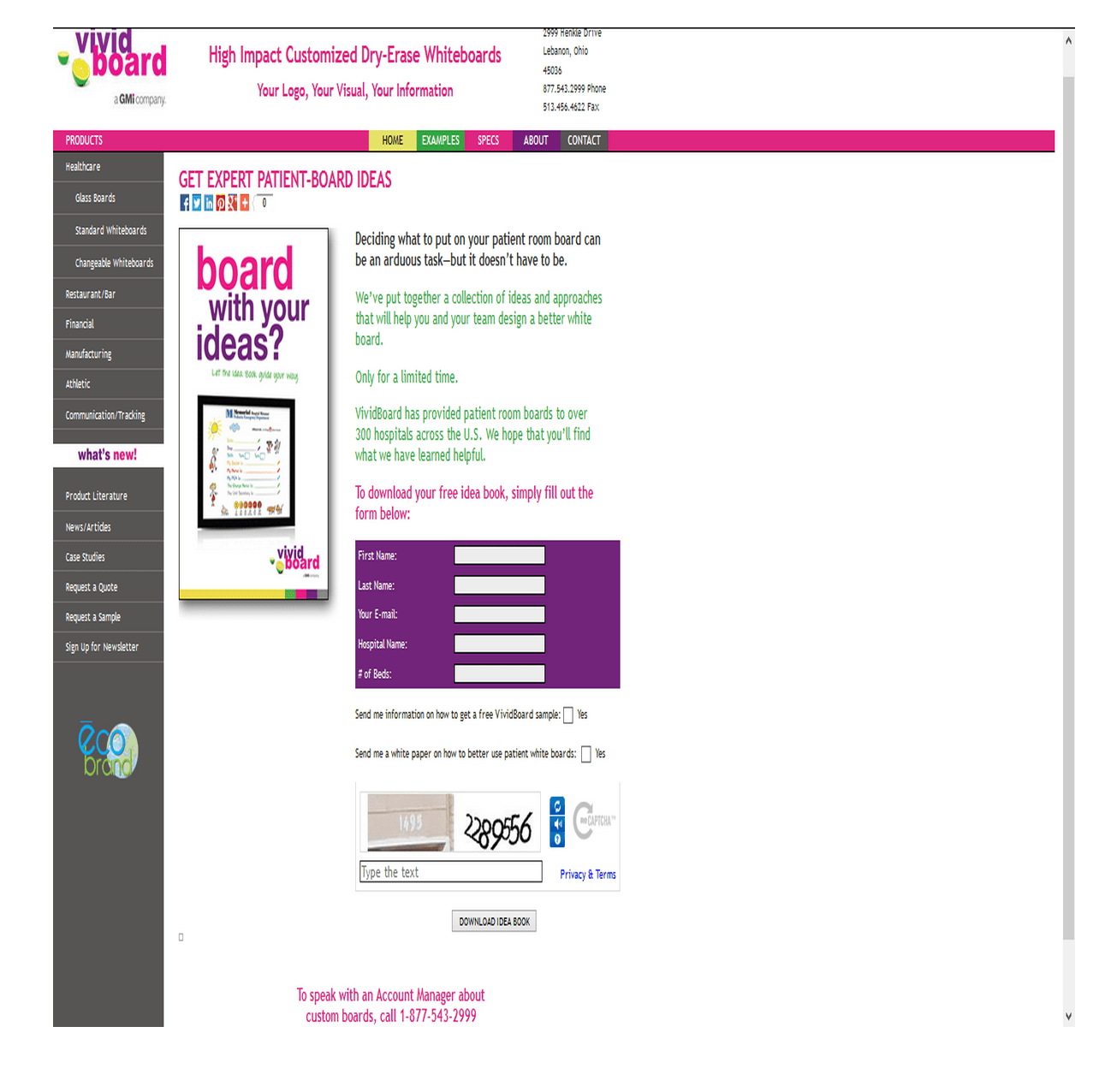
I know what you’re thinking – that’s not really a landing page. You’re right. VividBoard, which sells customized dry-erase whiteboard manufacturer, was using a standard web page as a landing page.
Big mistake.
During the time we worked together the page shown above was transformed into a proper landing page. Here’s a short list of the issues the page started with:
- The page had a scattered focus with numerous calls-to-action and other distractions that would tempt the visitor away from completing the most preferred action.
- The page was way too busy, making it difficult for people to spot the important elements on the page
- The form on the page asked for too much information and the copy was written almost exclusively about the company, instead of for the site visitor.
4 Tips for Boosting Landing Page Conversions
Here are the recommendations I offered:
1. Do One Thing and Do It Well
The previous “landing page” tried to accomplish too much. In addition to requesting the free ebook, visitors were also given the option to:
- Call an account manager
- Like/follow the company on various social media sites
- Get a free sample
- Explore all the other pages on the company website
In their purest sense, lead-generation landing pages should offer one choice and one choice only – either to take a specific action or to click through the page. Period.
I suggested VividBoard do just that: offer one call-to-action and eliminate anything else the visitor could do on the page. That way there was a singular goal: lead generation.
2. Create a Fluid Eye Path
If our goal is to have visitors download an ebook and add themselves to the VividBoard list, then all elements on the page should contribute to accomplishing that goal.
The original page had so many colors, images, doodads and whatnots that my eye didn’t know where to look first.
In order to strategically guide leads to the point of conversion (the form), a lot of clutter needed to be removed.
Taking away the navigation bars (top and left side), social media icons and the account manager phone number accomplished this.
This way, the purple form below the pink call-to-action gave just enough color contrast in the right places to create a fluid eye path.
3. Optimize Forms for Conversions
Have you ever been asked to fill out a detailed form on a website you weren’t familiar with? To say you were hesitant would probably be an understatement. Yet, as marketers we regularly ask our visitors to do something we wouldn’t want to do.
When optimizing forms for conversions, ask yourself this: What information do we absolutely have to have to complete this step?
It’s not about what information you ultimately want to collect. It’s about getting someone who doesn’t know you to take a first step.
On lead-generation forms, nine times out of 10 you only need a name and email address. After you get the prospect on your list, you can continue to communicate and collect other data.
4. Create Landing Pages FOR Customers, Not ABOUT Your Company
Half the copy on the first version of VividBoard’s landing page was about VividBoard.
I know, I know… we want to tell visitors how wonderful we are and why they should choose us.
Frankly, at this point, they don’t care. They are looking for a solution to their immediate problem, not to build a relationship with a company. (That comes later… hopefully!)
Prospects came to this landing page via a pay-per-click (PPC) campaign. The ad copy read:
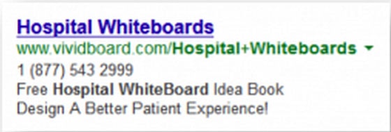
All they wanted was the free whiteboard ebook that was promised. That was it at this phase of the game. The landing page copy needed to focus on solving the lead’s problem, not on VividBoard itself.
Once we’re at it, let’s take a quick look at the ad copy. If the primary purpose of the ad is to attract people who would benefit from the free ebook, the ebook should be mentioned in the headline. And unless there’s a way for searchers to get the free ebook via telephone, I’d remove the phone number from this ad as well.
The Big Reveal
So, after making a few alterations to the original page, what did the revised landing page look like?
Here’s the version that took VividBoard from a 2% to 27% conversion rate (a 1250% lift):
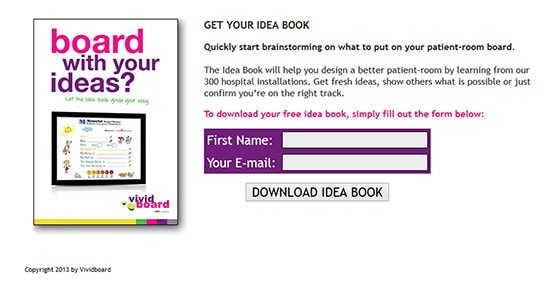
It’s short, goal-oriented and converts like nobody’s business.
Is your lead-generation landing page performing poorly? Applying these simple fixes could put you on the road to higher conversions.
