When creating a landing page, you’ve likely wondered, “How much copy should I include?” — a question to which copywriters usually reply, “Well, that depends…”
And it really does depend on the complexity of your offer and about a billion other factors.
Crafting concise copy is tough, so it’s only natural that many landing pages contain too many details.
You might be thinking, “Don’t added details help build a persuasive case for your landing page offer?” (Hey, sometimes you have a high-commitment offer on the table and y’gotta include what’cha gotta include.)
Well, yes… and no.
Including too much irrelevant info on your landing pages is dangerous because it dilutes your message, overwhelms visitors and hurts your conversion rate. If your visitors are slammed with excess copy, they can’t quickly determine what you’re offering, identify whether they want your offer or convert with your (buried) CTA.
You can often recognize a page suffering from information overload because it’ll use external links to direct visitors to even more info (oof!). Using links this way directs your visitors away from your page and, once visitors navigate elsewhere, you’ve lost a conversion opportunity.
Because excess copy is such a common problem, in this post we’ll explore:
- How to tell if your landing page suffers from info overload
- How to distinguish between need-to-know and nice-to-know information, and
- How to start including nice-to-know info on your landing pages without the visual clutter that hurts conversion rates
But first…
Why your pages might suffer from information overload
Typically, people err on the side of too much copy on their landing pages for the following reasons:
- The page is trying to be everything to everybody. Imagine if Adobe made a landing page for Photoshop and used just one page to appeal to designers, publishing houses, design schools and potential employees. This would result in including too many benefits. If you want your page to convert, you need to be clear on your persona and their specific needs.
- You’re not clear on your target audience’s stage in the buyer journey. Is your copy trying to appeal to customers in the discovery phase (those who are encountering your product or service for the very first time), or leads in the evaluation stage (determining if they want to purchase from you or a competitor)? Your audience’s level of familiarity with you will inform the amount of detail you should include.
- There’s confusion around how much info visitors need to convert. Sometimes offers are complex or high-commitment (like a conference ticket purchase) and you need to include fine details. Ask yourself (and test) which details are absolutely essential to persuade prospects to convert.
- You’re disregarding web writing best practices. Large paragraphs of text are overwhelming and people don’t read web pages like they do books. Everybody scans text online, so break up your copy into easily digestible pieces.
- The page contains more than one offer — meaning it’s not really operating as a true landing page with only one CTA). Stick to one single landing page (and a singular goal) for each offer you pitch.
An example of info overload in real life
To help illustrate how a good page and good intentions can become a victim to excess copy, let’s take a look at a real example. Art & Victus, an online monthly food subscription box, set up an Unbounce lead gen landing page to collect subscribers for their service:
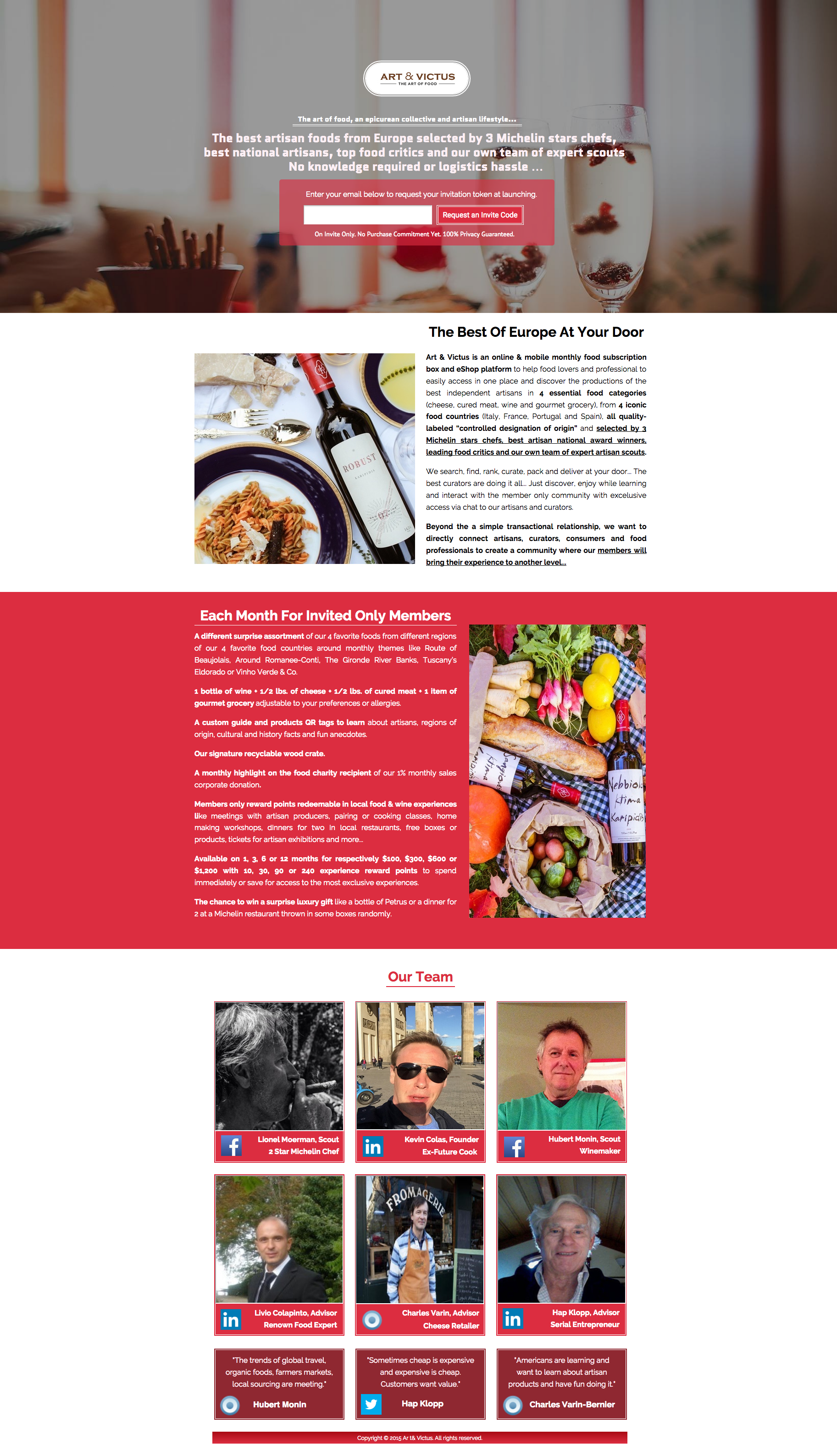
The page’s CTA prompts visitors for their email address in exchange for an access code to the invite-only food service.
Great, right?
But this page has limited conversion potential because it includes so much unnecessary info. Just look at those two massive paragraphs!
Moreover, the curators of the service are featured on the page using external links to their social profiles. If visitors click these links, they leave the page and the opportunity to convert is gone. We’re lookin’ at a classic case of info overload, folks.
The large paragraphs of text are signs that Art & Victus haven’t clearly defined need-to-know info versus nice-to-know info for the target audience of this landing page. Decluttering the page to display absolutely needed info more prominently would help this brand prompt a desire for their subscription service and hopefully increase this page’s conversion rate.
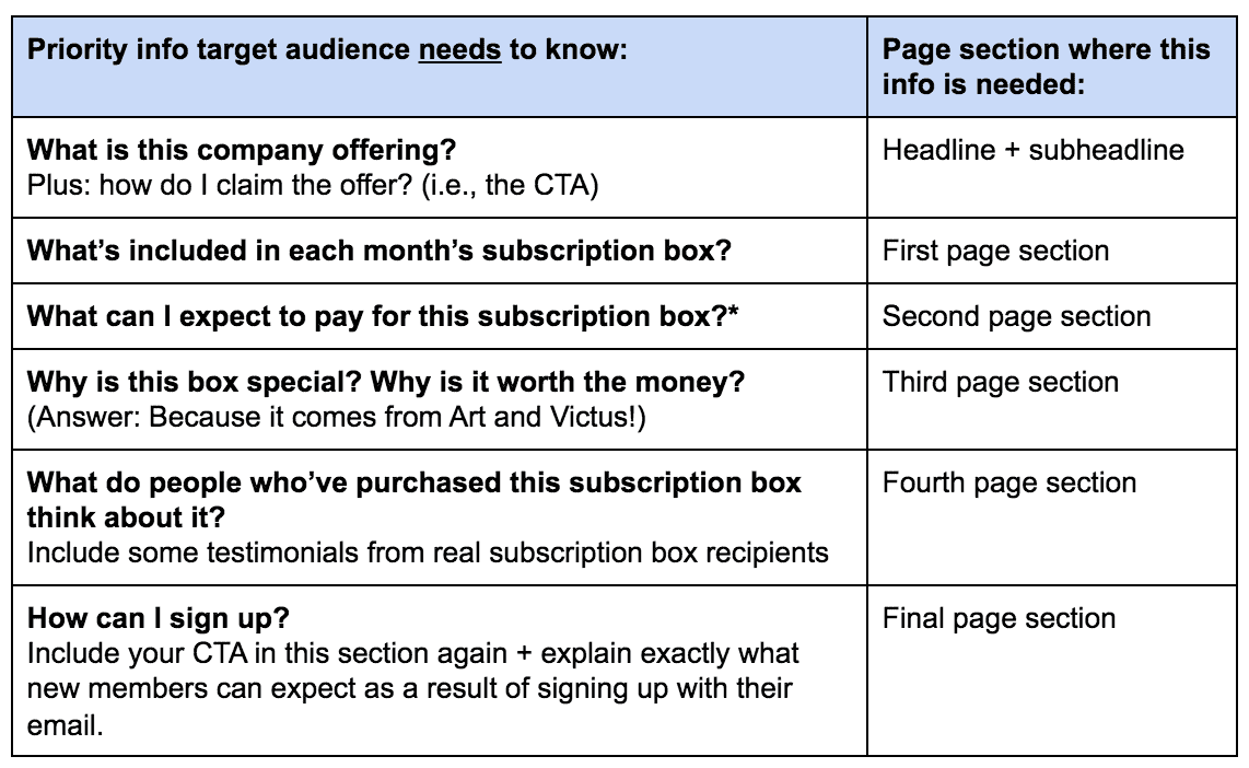
Introducing a helpful hierarchy
High-converting landing pages often follow a logical sequence of info that’s designed to persuade. The hierarchy is based on answers your target audience need to know to evaluate the offer on a base level, and these answers are provided in order of their importance (or relevance to the call to action).
While the Art & Victus’ example landing page is packed with seemingly random details on the monthly food themes, their food charity and even their reward points, these details don’t directly contribute to a visitor’s decision to want to sign up to receive a subscription box. The audience of the page needs to see other info first.
When creating copy for your pages, consider the questions your potential customers will ask and the order they might ask those questions in.
If a piece of info is directly relevant to your CTA – explaining the offer, or how to claim your offer – it’s need-to-know info. If it’s info describing an extra of any kind (like Art & Victus’ food themes, a charity your company takes part in, or your loyalty points), it’s likely nice-to-know info that you’ll want to include after your key points are covered.
It’s helpful to rank each piece of copy’s direct relevance to your CTA (like we’ve done below) as a means of deciding where it should be placed in the visual design of your page.
The more relevant something is to your CTA, the closer it should appear to the top of the linear design of your landing page.
For Art & Victus’ offer, the hierarchy might look something like this:
But what about all those nice-to-know details?
On the example page shown above, Art & Victus had a lot of nice-to-know info they wanted to convey, like their reward points, the custom guide included in the box to help you learn about the food, profiles of the individuals preparing the boxes and more.
Luckily, there’s an easy way to strategically sprinkle in nice-to-know info on your landing pages without the visual clutter associated with information overload…
Lightboxes: A remedy for excess copy
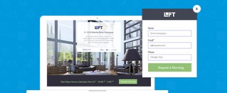
Lightboxes are modal windows that open over a landing page, filling the screen and dimming the content behind. They allow you to prominently display content requested by your page visitor (your visitors click a button to prompt them). You can see an example lightbox for a speaker bio below:
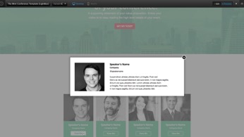
Lightboxes help you add nice-to-know details onto your landing pages (like speaker bios, featured products, your privacy policy or terms of service), all the while keeping your audience’s focus on your CTA. By designing your page with these in mind, you can include information a visitor would otherwise have to navigate away from your page to find.
Art & Victus could make their landing page offer more clear by using lightboxes to feature their nice-to-know information. After addressing all of their must-have info prominently, they could add lightboxes like:
- “Reward Points”
- “Also included in your box”
- “Who curates our boxes?”
They could also use lightboxes to:
- Outline the three different types of boxes available in their service (i.e. “Intro box,” “Amateur box” and “Expert Box”)
- Feature the curators’ profiles for those interested (instead of linking out to external profiles and losing potential subscribers).
Each lightbox would be triggered by visitors who want or need extra info before they convert (some will, some won’t), and would help to break up the massive paragraphs on the page.
Start using lightboxes to unclutter your pages
You too can use lightboxes to combat info overload and tidy up your copy.
Here are some examples of nice-to-have content that fits nicely in lightboxes:
- Speaker bios: Include details about your keynotes or location in a lightbox so visitors don’t navigate away from a potential ticket purchase.
- Extras and fine details: Extra product features, limitations, terms and contest rules
- Privacy policies: Every landing page collecting lead info should link to a privacy policy, but you don’t want to link away from your page. Include your policy in a lightbox so visitors don’t veer off-course.
- Lead gen forms – It’s a fairly popular marketing trend to include your contact form for a call to action in a lightbox. This tactic takes advantage of buyer psychology by empowering your visitor to decide when they’re ready to fill out your form. Check out this post to learn more about why you’d want to include a form in a lightbox.
")
Examine your own pages for potential lightbox opportunities
Start by reviewing your existing landing pages to see where they might be suffering from info overload.
Remember to check if you’re linking out to external pages — this is a sure sign that you’re confusing need-to-know and nice-to-know information.
Start making the distinction between these two info types for your audience, organizing your page with a better information hierarchy, and you’ll have a more streamlined message and more conversions in no time.
