Today, the author, Peep Laja (pronounced “Pep”), founder of conversion rate optimization agency Markitekt, and the popular blog ConverionXL, is going to look at 5 different landing page examples, expose how each company is designing their landing page incorrectly and teach you what not to do.
As a special bonus, Peep is going to be the special guest on our free webinar tomorrow entitled: The 10 Ways You’re Screwing Up Your Landing Page (And What To Do About It).
Watch and learn as we take a look at 5 landing page examples that are doing it wrong. In tomorrow’s webinar Peep will cover concepts like these in more depth, showing how you can mend your broken landing pages.
Over to Peep…
1. Where’s The Headline?
Everything starts with the right headline. This is the first thing the visitor sees. It’s your one chance to communicate what you’re about, create curiosity, explain your intentions and lure them in.
Here’s how this guy is doing it:
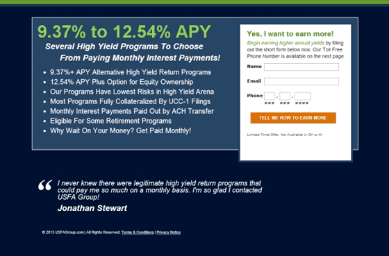
Biggest problems:
- That’s your headline, really?
- unclear and missing a value proposition
- Your offer to get people to fill out the form is so you can snatch their phone number? Oh how irresistible (insert sarcasm here)
- Poor call to action
- Uncredited testimonial
2 key questions to weed out bad headlines
When pondering a headline, see if you can answer ‘yes’ to both of these questions.
- Imagine your website would be just your headline and a call to action (sign up, learn more, call now etc). Would anyone take action based on the headline?
- Would you use the exact wording of your headline in a conversation with your friend where you explain the product/service?
Yes there are always exceptions, but use this as a guideline to get you on the right path.
2. Is That All The Copy I’m Getting?
Great copy is very important. A landing page without copy is like a mute salesman trying to peddle his wares- not very effective. The words you use make a huge difference.
The best kind of copy is clear about the benefits, geared to a targeted audience, makes a compelling case for the value the visitor is about to receive and gets the visitor excited.
Let’s be honest, not all of us are good with words. I know many people who struggle with saying even the simplest things. Like these guys:
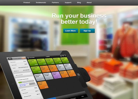
“Run your business better today” is the best you could come up with?
Biggest problems:
- What are you offering here?
- Be specific, always be specific
- Get me to agree with a problem or make me want the end-benefit
- You can’t ask for action after one sentence
The Principles for writing good sales copy
“The difference between the right word and the almost right word is the difference between lightning and a lightning bug”
Why is it that some books become bestsellers and other can hardly sell a 100 copies? It’s simple: the choice of words. Which words you use in what order make all the difference!
- Who are you talking to? You should talk differently to all of the people below – no brainer, right? Still most people try to write copy that works for everybody. Try to figure out what is the common denominator between all the potential buyers.
- You’re writing to your friend Don’t forget you’re dealing with people. Even if you sell B2B products, there’s always a person with a name and an identity reading your copy and making decisions. Forget buzzwords & business jargon and nonsense that doesn’t mean anything. Say it as it is.
- AVOID ALL CAPS AND DON’T USE EXCLAMATION MARKS!!! There are no good reasons to put your text in all-capital-letters. Putting a lot of words in all caps or all bold slows down reading, comprehension, and interest.
- Readability matters: If you want people to read your text, make it readable. Even the most interesting copy in the world is not read if the readability is poor.
3. Can You Figure This Page Out?
How much time does it take to figure out what you are offering? If the answer is not “immediately”, you need to do better. Clarity above all! People don’t buy what they don’t understand.
This is a landing page I was sent to after clicking an ad for the keyword “business”. Wow. These people don’t really know what landing pages are for, do they? Yet, they’re spending a bunch of money on an expensive keyword.
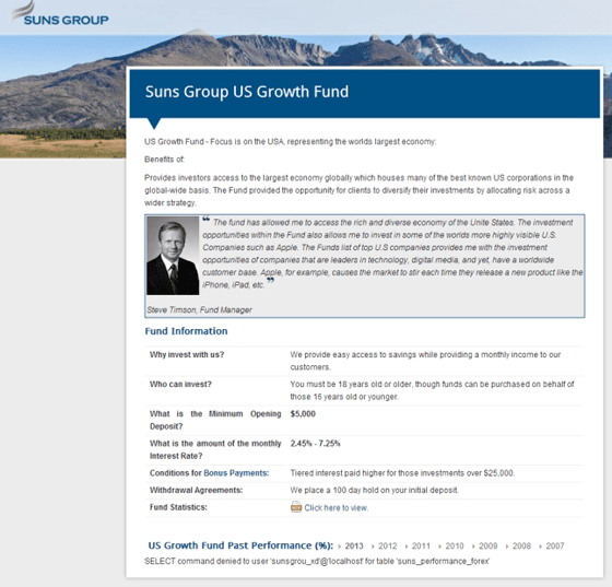
Biggest problems:
- That’s your headline? Do you even have one?
- No context, no content, no credibility, no call to action, no nothing…
- SQL error at the bottom to finish it off. Yikes!
Don’t make them think
Thinking is hard. Most people don’t want to do it.
They look at your copy and want to understand what is it that you’re offering here. If it’s not obvious in first seconds, they will move on.
Your main headline might be benefit-oriented, but underneath it describe in 2-3 lines what your product is, does and who is it for. A photo or screenshot of the product is a smart idea to add, people “get” images much faster than text.
4. Which Call To Action Should I Use?
Your call to action should be a trigger. It should stand out and make people want to click on it. The best kinds of calls to action avoid click fear, are worded clearly and/or loaded with a benefit. It has to be clear what happens after I click the button.
What do you think about this one:
Biggest problems:
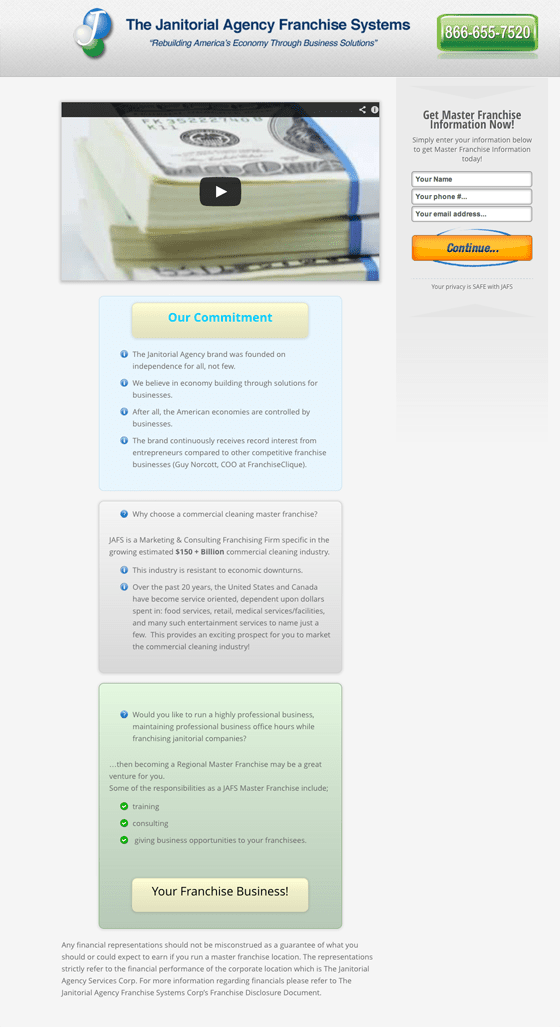
- “Continue” is the main call to action. While it’s better than “submit”, it still sucks ass. Why would they want to ‘continue’? Be specific about the value they’re going to get.
- Phone number at the top, “Our commitment” (who cares!) and “Your Franchise Business!” also looks like a button, but it is not.
- For a long page like this, your call to action should be repeated at the bottom.
- Social media sharing widget? Come on! Nobody shares a landing page offer. Scrap it.
- Copywriting couldn’t get much worse.
4 rules for naming your call to action buttons
Should you say ‘read more’ or ‘product information’ in your product category view? Which is better – ‘add to cart’ or ‘buy now’?
There’s a lot of information out there on call to action buttons (size, color, location etc), but I want to focus on a single thing about them – the wording.
- Use trigger words: While people are browsing your site, they’re having a silent conversation in their mind. They’re asking themselves ‘where is X?’ or ‘how do I do Y?’. In most cases, people are looking for a specific wording. Trigger words are the words and phrases that trigger a user into clicking. If the user is looking for ‘pricing’, and your link says ‘pricing’, they’re going to click on it.
- Call it what it does: The web is filled with bad call to actions (CTAs). The reason is that most people don’t think for themselves, but just copy others. Or just don’t know any better (examples include, submit, read more and next). When calling the user to action, instead of the above mentioned vague words, use brief but meaningful link text that explains what the link or button offers. Don’t be verbose. Use terms people understand.
- Don’t rush commitment. Most people are commitment-averse. The bigger the commitment that is being asked of us, the less likely we are to go for it. Volunteer at a homeless shelter for a day? Hmm.. well, I guess I could… Volunteer 3 days a week for 1 year? No, thanks (some excuse). Following the same principle, don’t ask for a commitment when you can delay it. The best example would be ‘buy now’ vs ‘add to cart’. When ‘buy now’ seems awfully final, ‘add to cart’ seems kind of risk-free and leaves the door open for changing the mind.
- Add benefits: You should definitely have a great sales copy before the CTA, but since people don’t read, you should communicate some value also next to the call to action itself.
5. Can You Give Me One Offer At A Time Please?
Always make it about a single problem, single product, single offer. These guys don’t:
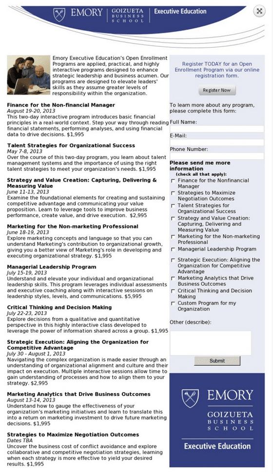
Biggest problems:
- 9 offers! Achala maquina. Take this landing page (but don’t actually take it) and split it into 9 specific landing pages. Once you get the lead in, you can sell them additional courses over email / phone.
- Where’s the headline?
- “Register today for an open enrollment program via our online registration form”. Wow what a sentence! You must need a degree from Emory in order to understand it (insert sarcasm here).
- Submit? Who wants to submit?
The best landing pages focus on a single offer.
And they’re ultra-specific and ultra-targeted. This will also make your ad CPC lower, CTR higher and your landing page will have a better conversion rate since you’re bringing targeted people to the page.
Are you guilty of screwing up any of the above? Join me for tomorrow’s Unwebinar at 11am PT / 2pm ET / 6pm GMT to find out more tips on how you can improve your landing pages, fix those mistakes and increase conversions .
See you tomorrow,
— Peep Laja
