Why your SaaS demo landing page isn’t converting (7 mistakes to fix)
Demo requests are down. Sales complains to marketing about lead volume and quality. Marketing puts more budget behind their demo ads. The problem persists.
One of the biggest mistakes marketers make is treating “request a demo” like a low-friction CTA. But asking someone to book time with sales is a much bigger step than downloading a guide, joining a webinar, or clicking through to a product page.
According to Dreamdata’s LinkedIn ads 2025 benchmark report, the average B2B customer journey is 211 days and includes 88 touches. High-investment software decisions take time, yet many teams still try to push demo requests before buyers have done enough research, built enough trust, or decided they’re ready to talk.
TABLE OF CONTENTS

Danielle Torrie
Danielle is a member of Unbounce’s content team. She loves how writers (and great writing) can create clarity in chaos. When she’s not tightly embracing her Nespresso machine, she’s either tuning out the world with a great book, spiking away stress on the volleyball court, or passionately debating the elusive Oxford comma.
» More blog posts by Danielle Torrie
Getting a buyer to submit a demo request form means asking them to raise their hand, share their information, and enter a sales conversation. That’s why buyers need to feel confident your solution belongs on their shortlist before they’ll submit the form.
It’s also why the success of your demo landing page starts before the visitor ever arrives. Most SaaS teams blame the page when requests are low, but the real problem is often traffic. Cold, low-intent buyers don’t magically become ready for a demo because you put the CTA in front of them.
Once you’re sending warm, well-researched buyers to your page, every block on your SaaS demo landing page should reinforce their decision, answer their remaining questions, and build confidence until requesting a demo feels like the obvious next step.
This post gives you a roadmap for both: how to send the right traffic, and a block-by-block breakdown of what your demo landing page needs to help buyers confidently say yes.
Where your SaaS demo landing page fits in the buyer journey
Marketers often hand out “request a demo” CTAs like candy, assuming that simply putting the words in front of someone will lead to a conversion. A buyer may need to see your demo CTA more than once before they act, but frequency isn’t the only thing that matters.
Only around 3–5% of your market is in an active buying cycle at any given time. What matters most is getting your demo landing page in front of the people who are actually ready to take the next step.
That means they’ve done their research. They understand the problem. They’ve compared alternatives. They’ve seen enough proof to trust you. Most importantly, they’ve decided your solution belongs on their shortlist.
To get them there, you need to educate them first.
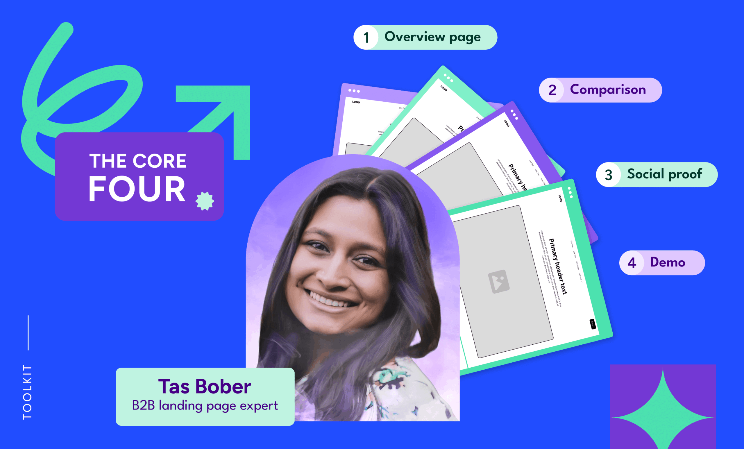
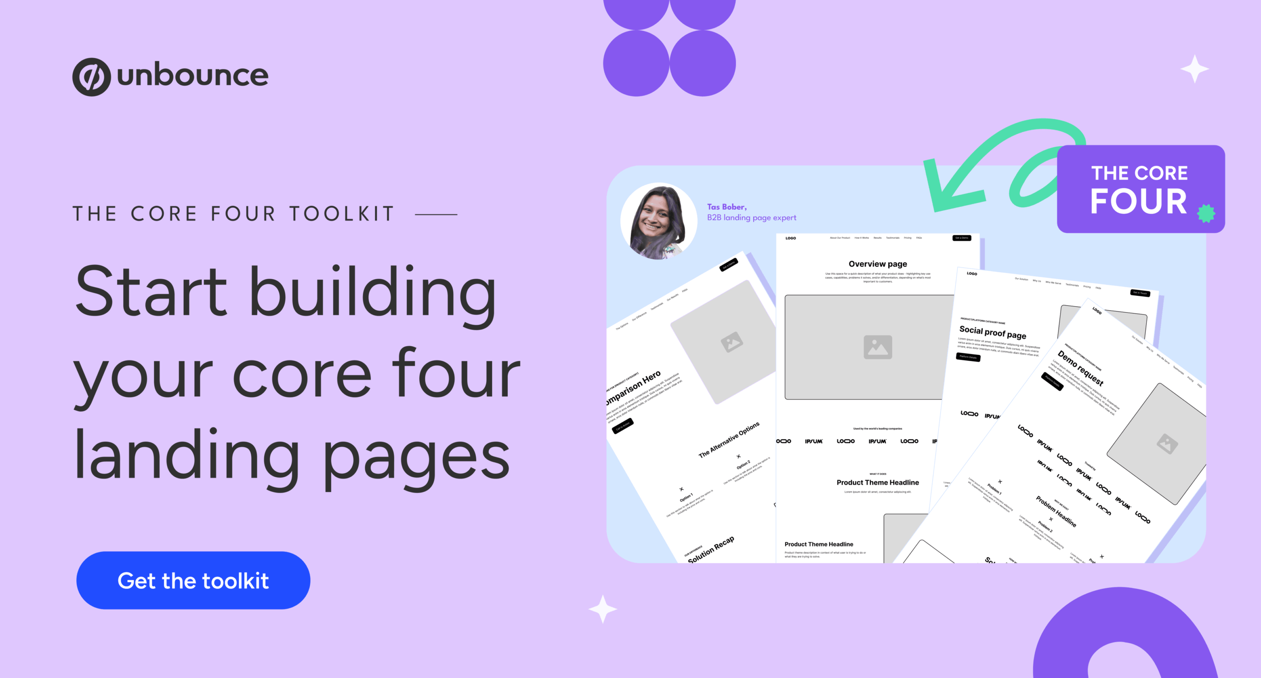
That’s the thinking behind Tas Bober’s “core four.” Tas, a B2B landing page expert, uses this framework to help paid media teams give buyers the information they need throughout the research process.
The four pages are:
- Overview page, or paid media homepage: explains what you offer, what problems it solves, and who it’s for.
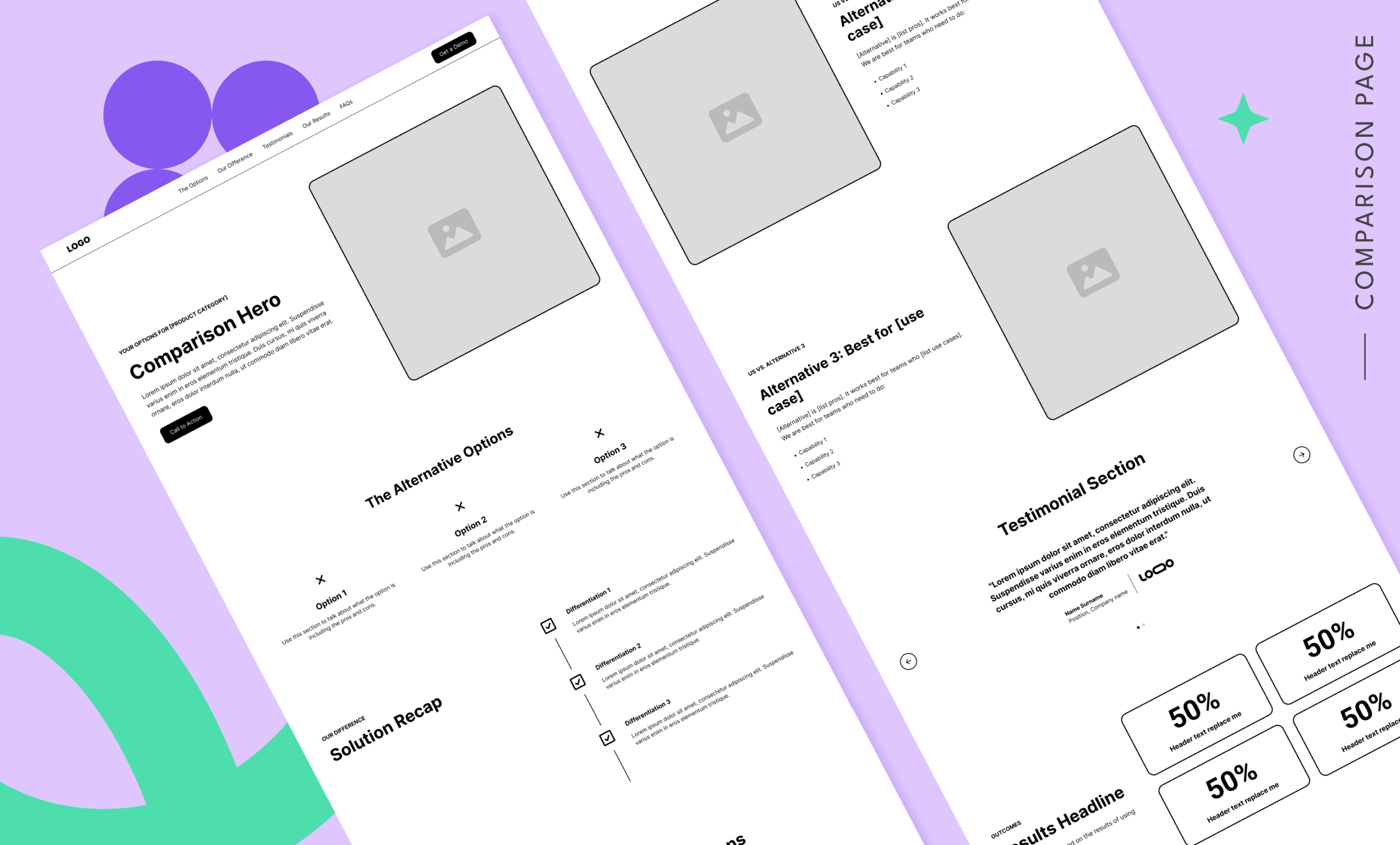
- Comparison page: helps buyers understand how you compare to alternatives in the market.
- Social proof/reviews page: brings reviews, testimonials, and case studies together in one place.
- Demo page, or trial page: makes the ask, reduces hesitation, and gives buyers the confidence to take the next step.
Listen to the podcast: The B2B landing page strategy every paid media team needs with Tas Bober
Access the full “core four” toolkit: Templates and resources to help you build the 4 pages every B2B paid media team needs
Your SaaS demo landing page shouldn’t be the first page your buyer sees. It should be the last page they see when they’re warm, well-researched, and ready for a conversation.
By the time someone lands here, they should already know what you do, who you serve, and why you’re worth considering. The demo page isn’t there to introduce your product from scratch. It’s there to confirm that taking the next step is worth their time.
Even buyers who are seriously considering a demo can hesitate before they submit the form. They may still be wondering what happens next, who they’ll talk to, how much pressure they’ll feel, or whether your solution is the right fit.
That’s why your demo landing page needs to remove final points of friction, answer last-minute questions, and reassure buyers they’re making a smart next move.
What’s the average conversion rate for a demo landing page?
According to Unbounce’s 2024 Conversion Benchmark Report, SaaS landing pages convert at a median of 3.8%. In more recent first-party research from B2B companies actively working to improve demo page performance, landing page expert Tas Bober reported conversion rates averaging around 3.1%.
That puts the realistic benchmark in the low single digits, with 3–4% serving as a reasonable proxy rather than a universal standard.
But the benchmark shifts significantly based on the traffic you’re driving.
If you’re sending cold traffic to a demo page, even a well-built page will eventually hit a performance ceiling. You can improve the headline, form, proof, and CTA, but you can’t optimize your way around the fact that most visitors aren’t ready to talk to sales yet.
If you’re following on-page best practices and sending warm, high-intent, well-researched buyers to your demo landing page, those numbers should start to climb.
![[Build - TOFU] Tas Bober Demo Template - V1 - 2026](https://unbounce.com/photos/Build-TOFU-Tas-Bober-Demo-Template-V1-2026-scaled.jpg "[Build – TOFU] Tas Bober Demo Template – V1 – 2026")
What are the 7 most common SaaS demo landing page mistakes?
Here’s a quick look at where most demo landing pages go wrong. Odds are, at least one of these issues is holding back your conversion rate.
- Sending the wrong traffic. Your demo page can’t force cold traffic to convert. If buyers haven’t researched the problem, compared alternatives, or decided you belong on their shortlist, the page is being asked to do more than it realistically can.
- Treating copy like an afterthought. Your demo landing page needs to give buyers context, reassurance, and a clear understanding of what happens next. If the form is longer than the copy on the page, you’re probably asking for too much without giving buyers enough reason to act.
- Burying the form. On most landing pages, putting the form above the fold can feel too pushy. On a demo landing page, the ask should be easy to find from the start.
- Not telling buyers what happens next. Even if you’re at the top of a buyer’s shortlist, the fear of being hounded by sales is real. If buyers don’t know what to expect after they submit the form, they may hesitate even when your solution is a strong fit.
- Not including enough social proof. One testimonial and a logo bar isn’t enough to build confidence. Volume matters. Aim for at least three strong proof points, with six to 12 if you have enough relevant reviews, testimonials, or case studies.
- Hiding pricing. Very few B2B companies show pricing on their demo landing page. You don’t have to give everything away, but even a starting range can help buyers self-qualify, improve lead quality, and reduce misinformation before sales gets involved.
- Removing all exit points. Stripping navigation used to be common practice, but Google’s ad quality model is another reason to rethink that approach. Buyers also need a way to keep exploring if they’re not ready to convert. Use anchored navigation to help them jump to the sections that matter most, then add a minimal footer with links to your other core landing pages in case they need more information.
The questions below cover each of these mistakes in detail, so you can walk away with a clear picture of what to change and why.
Who should I send to my SaaS demo landing page?
Demo landing pages aren’t built for cold traffic. They’re built for buyers who are warm, well-researched, and ready to take the next step.
Sending cold or low-intent traffic to a demo page is like walking into a store and being sent straight to checkout before you’ve had a chance to look around, compare options, or decide what you want.
When conversion rates are low, marketers usually start testing headlines, swapping CTAs, and changing button colors. But none of that will move the needle if the traffic isn’t ready to convert.
Only around 3–5% of your market is in an active buying cycle at any given time. That means your demo landing page shouldn’t receive the majority of your paid traffic. It should get less traffic, but better-fit visitors who are more likely to convert.
Best traffic to send to your demo landing page
- Audiences who have visited your other core four landing pages, including product or platform overviews, comparison pages, and social proof pages
- Retargeting audiences who have visited your pricing or product pages
- ABM campaigns targeting known accounts
- High-intent branded search, where people are searching for you by name
- Bottom-of-funnel nurture audiences
Traffic to avoid sending to demo landing pages
- Top-of-funnel paid traffic
- Cold email recipients who don’t yet know what you do
- Broad awareness audiences
If you have a lead quality problem, this is step one. Fix the traffic before you touch a single word on the page.
What should I put on my SaaS demo landing page?
Most demo landing pages ask for the meeting too soon. The form takes up more space than the copy, there’s no clear navigation, and there’s little to no information about what happens after someone clicks submit.
Every missing detail creates more hesitation for your buyer and wastes more of your ad budget.
Your demo landing page should be focused on three things:
- Reinforcing what the buyer has already learned from the other pages you’ve sent them to
- Building confidence in your solution and their decision to move forward
- Clarifying your sales process, including what to expect at each stage
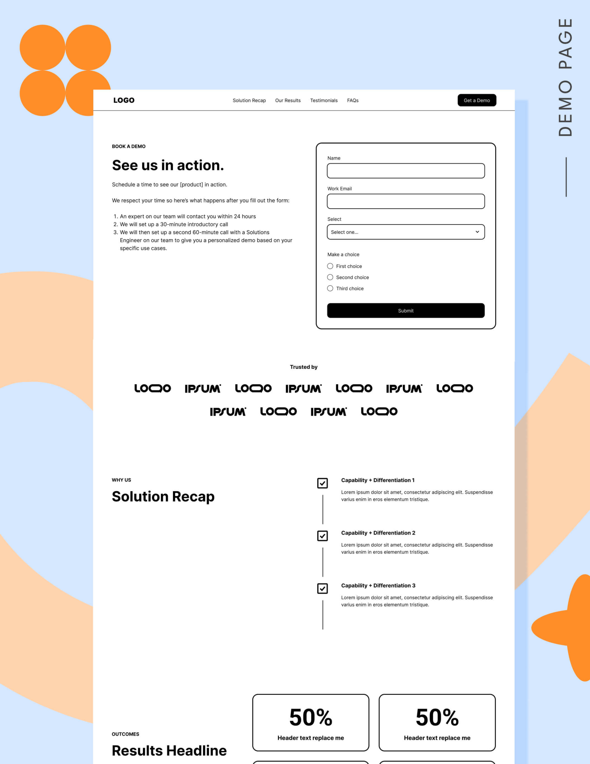
B2B landing page expert Tas Bober has been sharing her wireframe landing page templates for each of the core four landing pages paid media teams need.
Let’s walk through her demo page template so you can see exactly what to include.
Navigation
If seeing “navigation” and “landing page” in the same sentence feels wrong, you’re probably not alone. For years, marketers were taught to remove every possible exit point so visitors had one choice: convert or leave.
But that approach is getting harder to justify.
In 2025 Google updated its ad quality prediction model to reward landing pages that align with search intent and give visitors access to relevant next steps through navigation—and penalize pages that don’t.
On a demo landing page, removing every exit point can backfire. If buyers aren’t ready to request a demo yet, you want them exploring other relevant pages instead of hitting the back button and returning to search.
Your navigation doesn’t have to send people away from the page. You can use anchor links to help buyers jump to the sections that matter most, which you’ll see across many of Tas Bober’s landing page templates.
For your demo landing page, we recommend using both: an anchor nav for the page itself and a minimal footer that links to the other pages in your landing page ecosystem.
Use your main navigation to anchor to sections on your page, as indicated in this example:

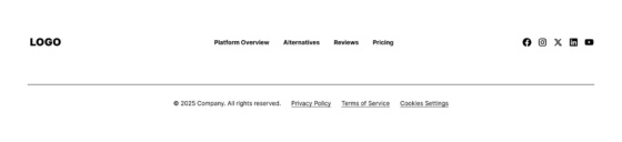
Use your footer navigation to link to the other pages in your landing page ecosystem that support the buyer’s decision-making process. In this example, we’ve linked to the other three core four landing pages buyers need before they’re ready to choose you:
- Platform overview: your overview page or paid media homepage, which explains your solution, who it’s for, and what use cases it supports
- Alternatives: your comparison page, which shows how you stack up against other solutions in the market and who you’re best for
- Our results: your social proof or reviews page, which brings testimonials, reviews, and case studies together in one place
You may also want to include your pricing page so buyers can continue to self-qualify before they request a demo.
Here’s an example of footer navigation that follows this approach:
Recommended reading: Your landing pages may be killing your Google ads performance
Hero
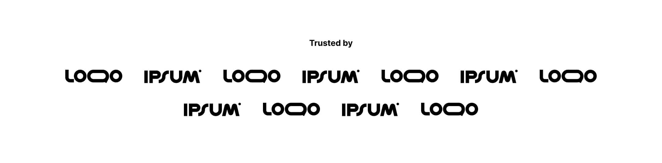
This is the one landing page where putting the form in the hero makes sense. The whole page is built around the biggest ask: booking a demo.
Alongside your form and call to action, the hero should clearly explain what happens after someone submits the form. The more buyers understand the process, the less room there is for hesitation.
Answer questions like:
- How quickly can they expect to hear from you?
- Will there be a short discovery or intro call before the actual demo?
- Who will they be speaking with?
- How long will the demo take?
Buyers may have more questions, but you can address those in other sections on the page. The hero’s job is to make the next step feel clear, low-pressure, and worth their time.
Tip: If you’re not sure what happens after someone fills out the form, this is the perfect time to find out. When sales and marketing both understand the process, marketing can communicate it clearly, and sales is accountable for following through when they said they would.
Logo garden
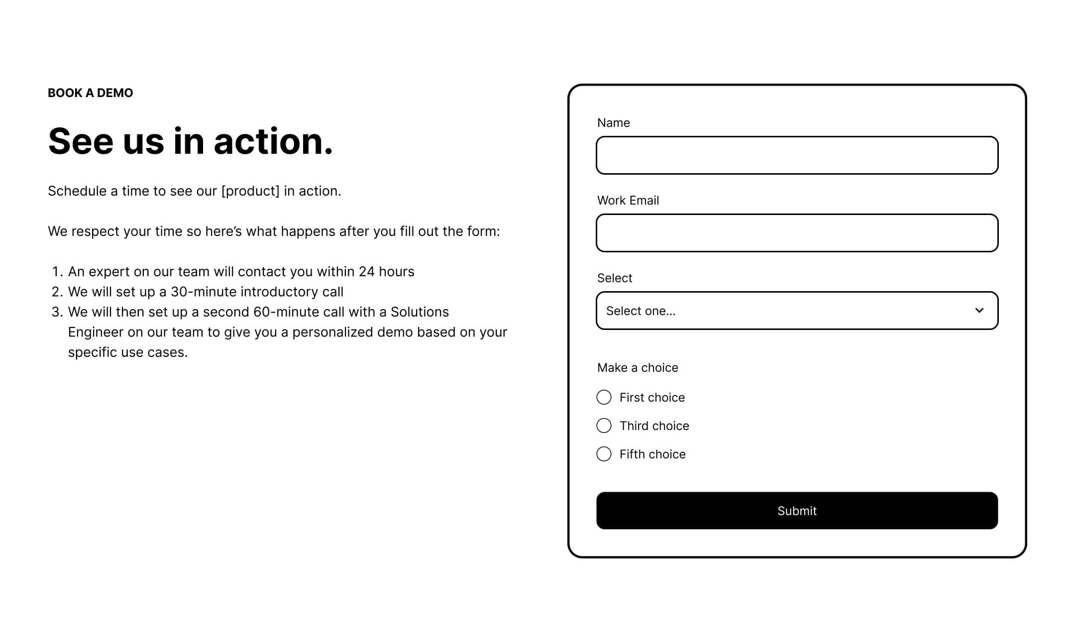
This is where you start stacking proof to reassure buyers that moving forward with you is the right decision.
If your buyers will recognize your customer logos, use this section as a logo garden and pair it with a credibility line like “Trusted by 10,000 digital marketers and agencies.”
If your buyers won’t recognize the logos, use light testimonials instead. Add one- to two-line quotes from customers that explain why choosing your solution was the right move.
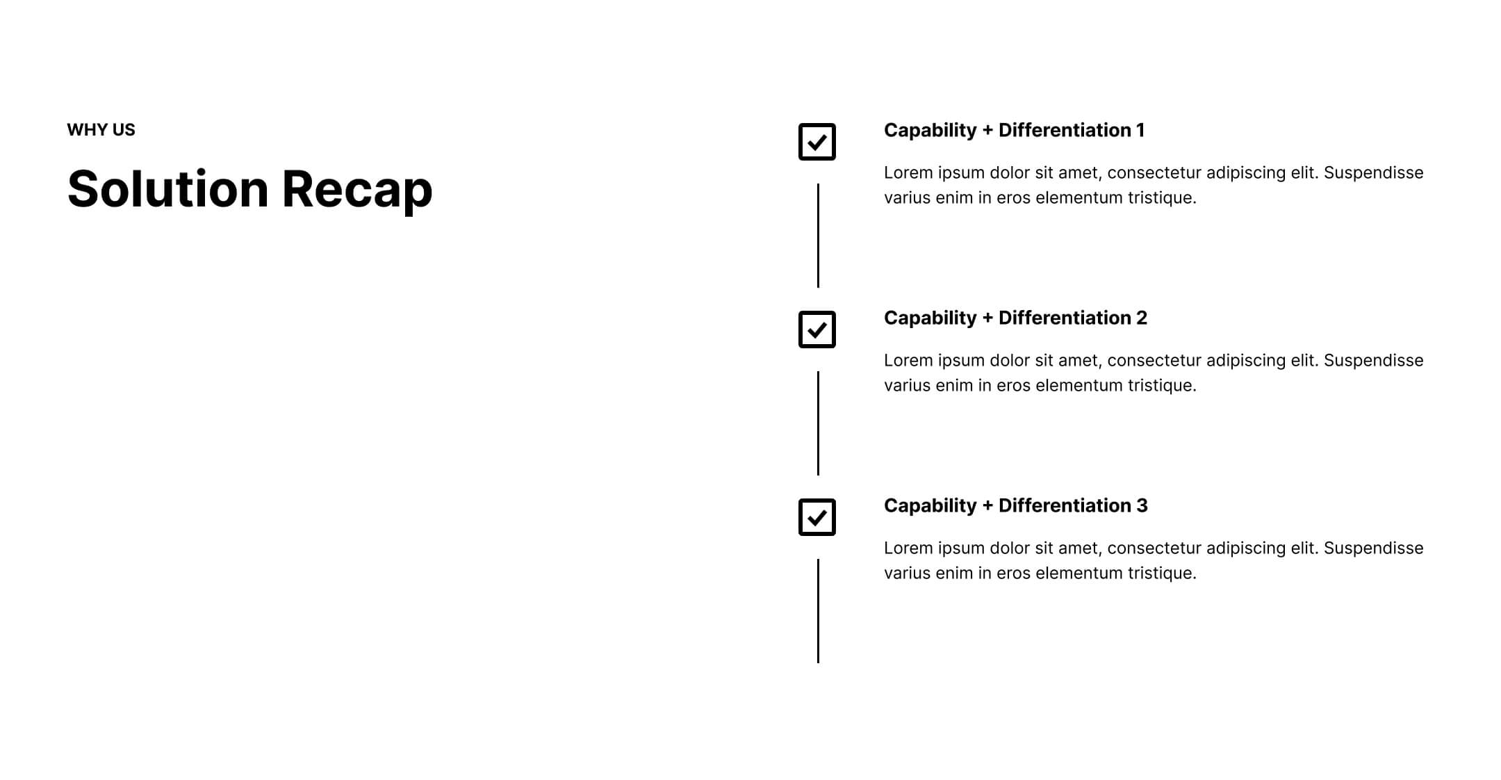
Solution recap
If you’ve been building your core four landing pages, this block should look familiar. Your top differentiators need to show up across the buyer journey because buyers don’t absorb everything the first time they see it.
On your demo page, this section is there to reinforce why they chose to move forward with you over other solutions. Remind buyers what makes you different, why that difference matters, and how it connects to the problem they’re trying to solve.
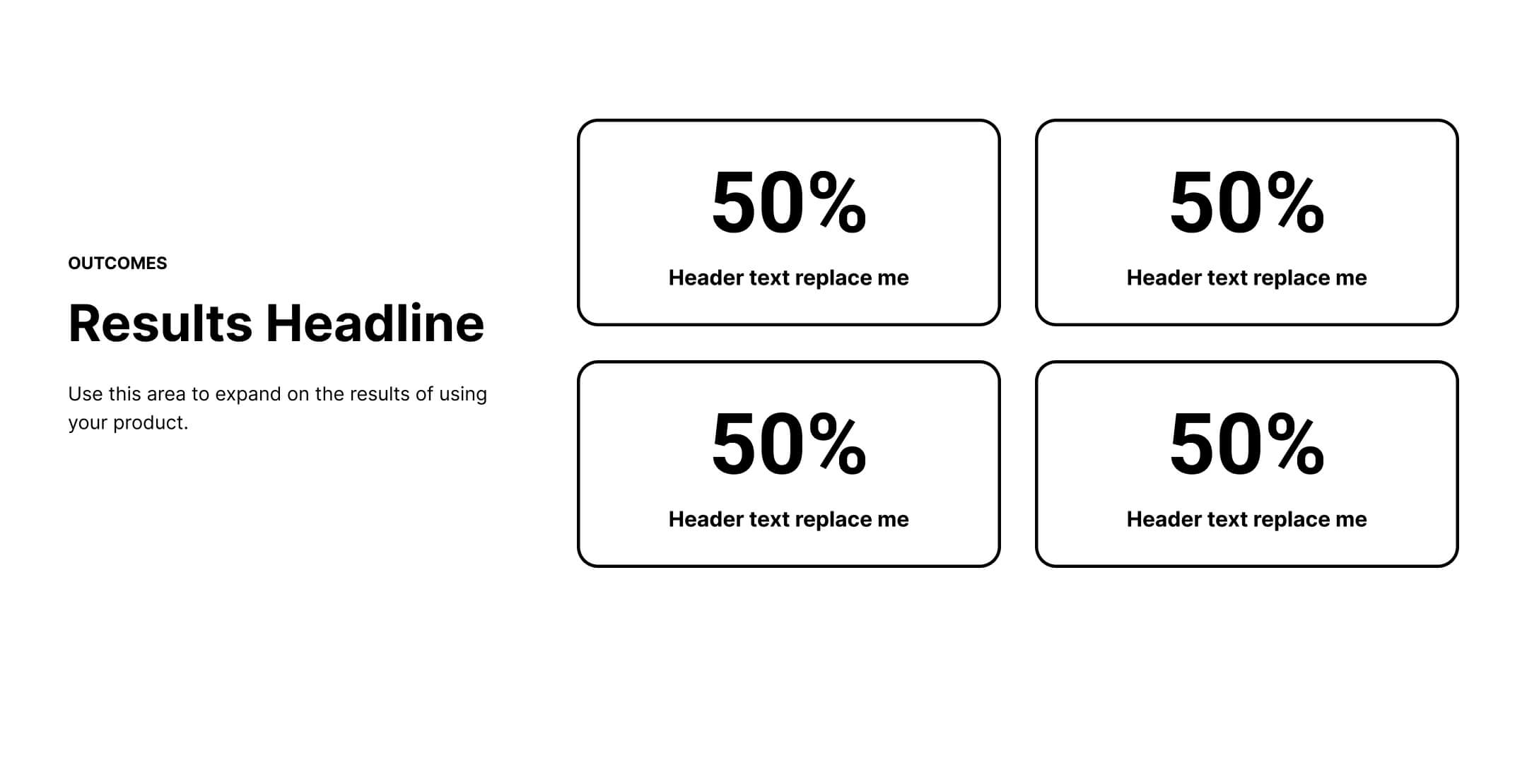
Results
This is where you reinforce your value with measurable customer results. Use clear, quantifiable proof to show what buyers can realistically expect when they choose your solution.
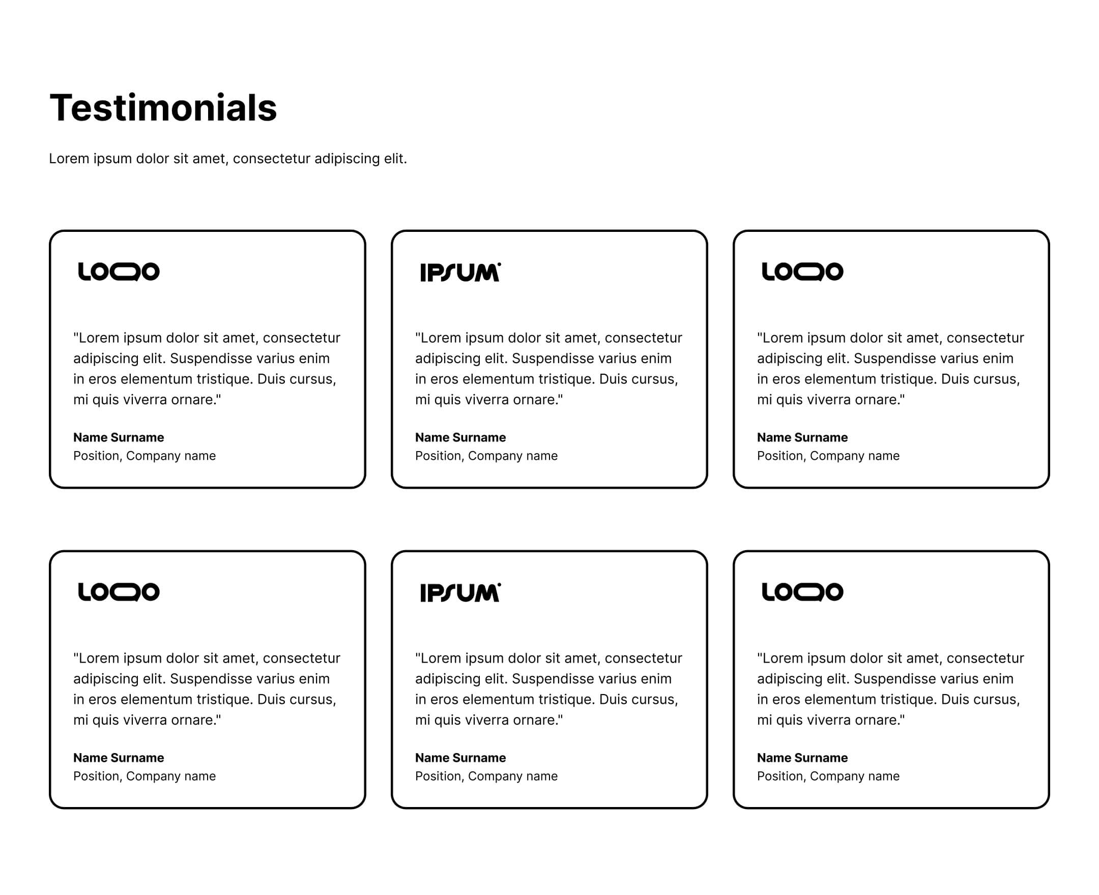
Testimonials
Social proof matters, but volume matters too. Think about the purchases you make on sites like Amazon. The star rating helps, but the number of reviews is what makes that rating feel trustworthy. More reviews signal more buyers, more confidence, and less perceived risk.
Take the same approach on your demo landing page. Include a minimum of three testimonials, but use six to 12 if you have enough strong proof to support it.
At this stage, buyers are looking for reassurance that you’re the right solution for them and that other people like them already made the same choice.
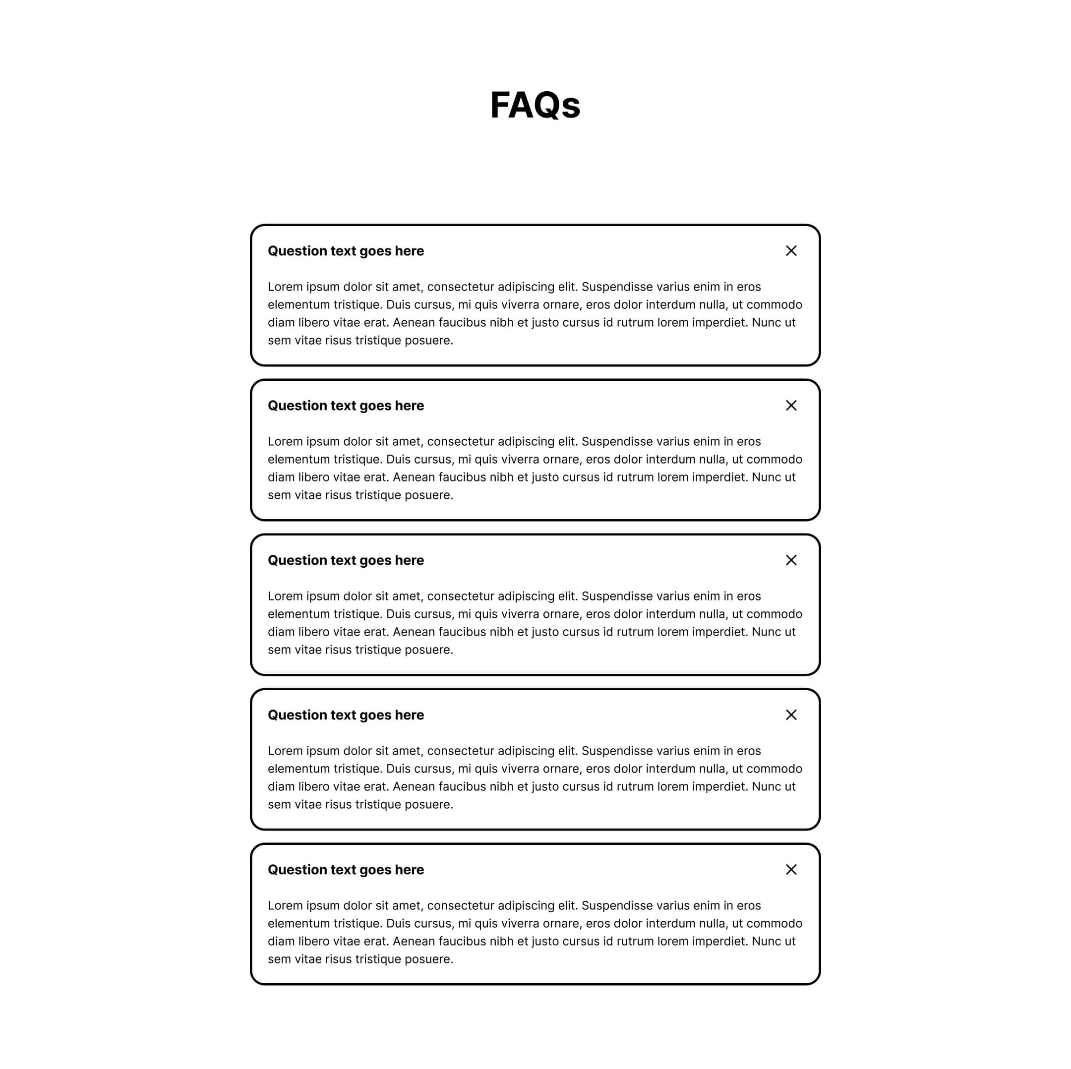
FAQs
On your demo page, your FAQs serve two purposes.
First, they give buyers final reassurance by addressing the three to four objections your sales team hears most often on calls.
Second, they answer common questions about the demo process itself, from what happens after someone fills out the form to how long implementation typically takes.
Should I include pricing on my SaaS demo landing page?
This is the section that makes teams nervous. Many B2B companies, especially those with sales-led motions, don’t show pricing at all. But even for sales-led businesses, there’s a strong case for putting at least a starting range on your demo landing page.
Here’s why it works in your favor:
- It lets buyers self-qualify. If you have a lead quality problem, a starting range can filter out conversations that were never going to close.
- It speeds up deals. Pricing helps buyers understand whether your solution is a realistic fit before they ever get on a call.
- It reassures buyers. They know they’re not going to waste time on something they can’t afford.
- It prevents confusion. Buyers are using AI to build their shortlists, but they’re also using it to answer questions your marketing doesn’t, including pricing. The risk is that the answer may be inaccurate, leaving buyers frustrated before the first call even happens.
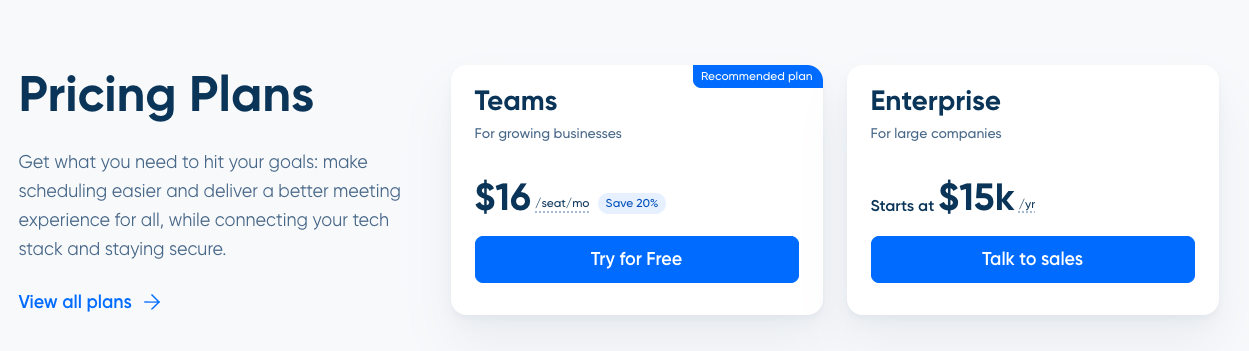
If you run a product-led business and also have a sales motion, you don’t need to publish your entire pricing grid. Consider showing the plan or plans your target audience buys most often, a starting range like “starting at $X/month,” or a condensed pricing grid.
Here’s an example of a condensed pricing grid from Calendly:
SUBSCRIBE
Don’t miss out on the latest industry trends, best practices, and insider tips for your marketing campaigns
How many form fields should your SaaS demo landing page have?
Fewer than you think.
These 2026 conversion benchmarks show a notable drop-off after five fields. Conversion rates fall from around 17% at five fields to 11% at seven fields and under 7% at ten or more.
Keep your form short and intentional. More fields create more friction, and more friction usually means lower conversion.
The case for more fields is lead qualification, which is legitimate. Test to find the right tradeoff between form length, conversion rate, and lead quality.
Tip: Choose the qualifying question that best indicates ICP fit, whether that’s company size, use case, team type, or another field that matters most to your sales team.
Should the form be at the top of your SaaS demo landing page?
On most landing pages, leading with the form is discouraged. This is one of the few landing page types where putting the form above the fold is recommended.
The buyers who land on your demo page should already be warm and well-researched. They came here because they’re considering a demo, so make it easy to take action the moment they arrive.
Should I use a form or Calendly on my SaaS demo landing page?
Both can work. The right choice depends on your traffic source, lead quality, and sales process.
A form is better when:
- You’re running paid campaigns to a broad or unverified audience and want to qualify leads before they get access to your calendar
- Your sales team requires a screening step before committing to a meeting
- Traffic quality is inconsistent
Calendly, or an equivalent scheduling tool, is better when:
- You’re running ABM campaigns targeting specific accounts
- You can route buyers to the right rep or account owner
- The buyer is warm enough that removing friction matters more than adding qualification
A booking link to a specific rep can create a great experience for the right buyer, but only when you’re confident the traffic is qualified enough to book directly.
You can also experiment with a short qualifying question before scheduling. This adds positive friction by screening out poor-fit buyers without making the process harder for the right ones.
The biggest question to ask is whether the experience works for both your buyer and your sales team. If it creates calendar chaos or lets unqualified leads book time, it’s not working, regardless of which approach you choose.
How can I get buyers to book a demo?
Here’s what your buyer may actually be thinking when they land on your demo page: “If I fill this out, someone’s going to call me four times before noon.”
That fear is real, but most demo pages don’t address it.
Be specific about what happens after someone submits the form. The more clearly buyers understand the process, the less friction they feel.
Consider adding a “what to expect” section that answers questions like:
- When will someone reach out?
- What is the first call actually for? (Qualification, discovery, or a live demo?)
- How long does the process take?
- When will they actually see the product?
If your process includes a consultation before a full demo, say so and explain why. “We do a 20-minute call first to understand how you plan to use our solution, so we can make sure the demo covers what matters most to you” is reassuring, not a deterrent.
Your CTA copy matters here too. “Request a demo” implies the buyer will see the product right away, which usually isn’t true. If you typically qualify leads with a consult first, more accurate language may be:
- Book a consult
- Talk to an expert
- See if it’s the right fit
- Schedule a chat
The data backs this up. When FORM changed its CTA from “Request a Demo” to “Take a Tour” and added an interactive demo to the landing page, PPC conversions increased by 33% and CPL in ABM campaigns dropped by nearly 50%.
You can also offer a softer path. A weekly demo webinar with a recorded presentation and live Q&A gives buyers who aren’t ready for a 1:1 call a lower-friction way to engage. It respects their time, answers common questions, and helps filter in buyers who are more serious.
Fix your targeting. Then fix your page.
When demo pages underperform, the issue often isn’t the page itself. It’s the traffic being sent there.
Before you rewrite the headline, swap the CTA, or shorten the form, check who you’re sending to the page. If it’s cold traffic, the best demo page in the world won’t save you.
Once the targeting is right, build the page for a warm but slightly hesitant buyer. Give them context, proof, and a clear picture of what happens next.
If you’re sales-led and not showing pricing, consider what that might be costing you in lead quality, buyer trust, and wasted sales conversations.
Related articles