We’ve all done it.
Spent time and money designing a beautiful landing page. Obsess over every word, the location of every image, poking and prodding until it’s just right.
After countless hours, you finally hit publish. And you wait.
You leave your analytics dashboard open, hitting refresh every minute to get updates in real time. After an hour, you know something is wrong. Traffic is landing on your page, but no one is taking action.
Could it be that you didn’t quite understand the science behind creating a highly effective landing page?
Sure you’ve heard all of the best practices on how to build a great landing page. But I wanted to find out why these tactics work.
By fully understanding the science behind why certain landing page practices work, you’ll pay closer attention to the nitty gritty details the next time you create a landing page.
Let’s take a look…
Social Proof

Most marketers know that having testimonials on landing pages will increase conversions. In fact, according to a recent study:
- 70% of consumers will check out product reviews or ratings before making a purchase.
- 63% of consumers are more likely to purchase from a site that has product ratings and reviews.
The results are staggering, but why exactly is this?
According to noted psychologist Robert Cialdini, the principle of social proof states that “we determine what is correct by finding out what other people think is correct. The principle applies especially to the way we decide what constitutes correct behavior. We view a behavior as correct in a given situation to the degree that we see others performing it.”
It’s no surprise then that some of the most powerful headlines in marketing read something like “50 Million American’s Can’t be wrong” or “Join the 10,000 people who are using our product”.
If you’re launching a new business or product and don’t have customers yet, then you can get social proof by offering free trials.
To make these testimonials even more credible, add a picture of the person who benefited from your product or service. A study conducted by researchers at the University of Wellington in New Zealand showed that pictures added to the feelings of truth conducted on participants.
Form Placement
Landing page 101 dictates that you should always place your form above the fold. Most of the time, readers aren’t going to spend enough time on your page to scroll through looking for the webform.
But did you know there’s even more to the story?
A study done by Neilson Group a few years ago with 232 participants reading thousands of websites show that the dominant reading pattern is in the shape of an F.
Look at the eye charts from the study to see exactly what I mean. The areas where readers looked the most are colored in red. Yellow indicates fewer views. And the blue indicates the least amount of views.
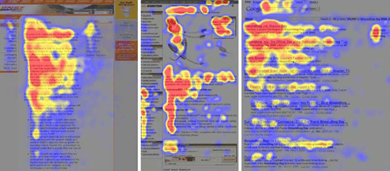
Typically, a reader starts at the upper left hand corner of the page and their eyes will horizontally scan the entire width of the text.
Next the reader will move down the page a little bit and their eyes will horizontally scan again.
Finally, the readers will scan the left side of the page from the top to the bottom.
Take notice a few things.
- Readers spend a majority of their time looking at the left hand side of a page.
- To no one’s surprise, most of the views come at the top of the page.
- What I found most interesting is the second horizontal scan that the readers make.
- This could be an opportunity to place a second, smaller, web form in the middle of the page, increasing your chances of allowing the prospect to give you their name and email address.
Is having two forms on a page in plain view of your readers’ eye scan patterns all that crazy? It could potentially increase the number of conversions on your page.
Eliminate Choices
When a person is confronted by too many choices, many times they succumb to analysis paralysis.
One Saturday, Sheena Iyengar, a researcher at Columbia University set up a free tasting booth to allow customers to try jam. She had 24 flavors available for tasting.
The next Saturday, she set up six flavors available for tasting.
According to her book The Art of Choosing, when she had 24 flavors, 60% of the customers stopped by to taste, but only 3% bought something. When she had six flavors, 40% of the customers stopped by, but 30% bought something. This turned out to be an increase in sales of 600%.
Unfortunately, most landing pages have far too many options. Marketers and business owners are reluctant to eliminate the choices they give their readers.
Features like the navigation bar, side bar, and links to internal pages are distractions from the main focus of your landing page.
On your landing page, decide on the one thing you want your reader to do and eliminate all other deterrents.
If a person wants to leave your page, they can always hit the back button.
Ask for Less information
A popular refrain from the experts is “ask only for the information you need right now to move the transaction forward.”
But why is that?
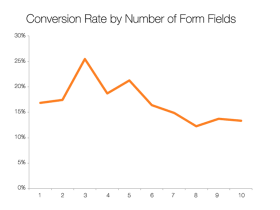
Dan Zarrella at Hubspot researched 40,000 web forms from their customers and discovered that the conversion rate increased by 50% simply by reducing the number of form field from four to three.
Use the Contrast Principle

In his book, Influence, Robert Cialdini describes how the Contrast Principle students. Each student takes turns sitting in front of three buckets of water – one cold, one hot, and one at room temperature.
After placing one hand in the cold water and one hand in the hot water, the student will then place both hands in the room-temperature water simultaneously.
Even though both hands are in the same bucket, the hand that was in the cold water now feels like it’s in hot water, and the hand that was in hot water now feels like it’s in cold water.
The contrast principle states that you can make an event seem different based on the context that surrounds it.
You’ve probably seen marketers and entrepreneurs use the contrast principle to sell their products many times.
Have you ever noticed that car salesmen won’t talk about options until after the price of the car has been negotiated? That’s because after spending $25,000 on a brand new car, a few hundred dollars for better tires or sporty headlights seems trivial in comparison. And before you know it, you’ve spent $3,000 in options alone.
You can use the contrast principle on your landing pages too.
For example, let’s say you have a product that promises to save your customers $500 per month. You offer them a free trial, coach them on how to use the product, and after 30 days, they’ve saved $500.
Compared to their $500 per month savings, a $50 per month subscription to use the product is a no brainer.
Contrasting the huge benefit of using your product to the relatively low cost of purchasing it.
Here’s the deal
Creating a killer landing page takes more than science. There’s definitely an art to it. The trick is to combine the two. The most effective landing pages make the science look beautiful.
But I’m guessing you already know that.
Your Turn
Right now, I’d love to hear from you
- Which of these five landing page tactics have you most ignored?
- And how will the science change the way you create your next landing page?

