If you want attention, you have break expectations.
For as many ways you can optimize a landing page, the truth of the matter is, your visitors expect a certain amount of “sameness” from sites like yours.
That’s a problem. Because when you blend in with others in your category, your messages aren’t fully heard. Fortunately for you, I’ve rounded up 5 unique landing page strategies that will help you break your visitor’s guessing machines, and open them up to what matters most – the content.
1. Video Watch Page
If you’re a business who frequently publishes video, it may not have occurred to you that a blog’s “reverse chronological” publishing style, may not be the most user friendly for someone interested in checking out all of your videos.
The “Video Watch Page” landing page strategy draws it’s inspiration from sites like Netflix & Hulu whose primary focus is making large selections of video easier to navigate. In fact, if there’s anything you should do with this page, it’s to get your visitors to the video as fast as possible.
Taking design cues from sites like Hulu, such as eye-catching cover art, or sideways scrolling through a category can improve views to existing content.
For Hulu, improving the video navigation in a massive redesign in October of 2012, helped the company to break 1 billion views in Q1 2013.
This article on Engadget details key elements Hulu focused on during the redesign, including:
- Focus on easily finding preferred content
- Bigger Artwork
- Easily navigate from category to category
- Highlight on New Content
But you run a business, your videos are meant to generate leads, right?
Depending on the size of your video library, it might make sense to deliver your video content (+ bonus materials) over an email autoresponder.
Your email then links to single video landing page which highlights a primary call to action like “sign up for your free trial” or “buy now” automating much of your lead nurturing process.
Going back to the main “video watch page”, displaying the opt-in form could be done by building it into persistent navigation, a dedicated popup, in the video’s description or strategically placed in between video categories.
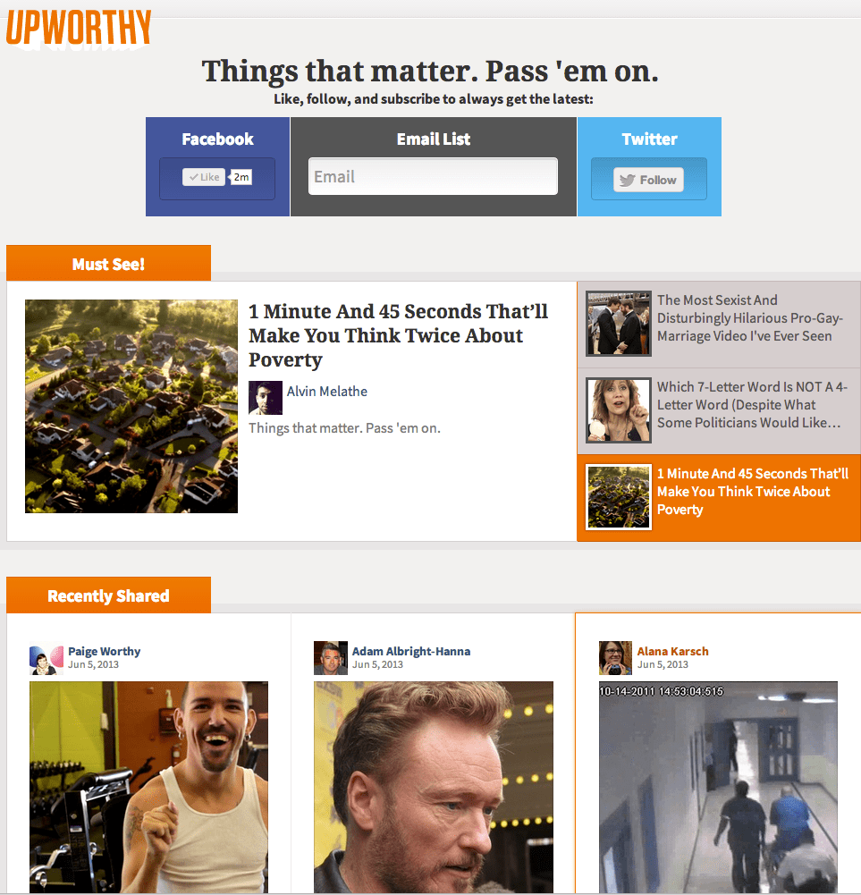
Also, if it makes sense for the page, including strong social sharing call to actions could improve the overall virility of your Video Watch Page. Upworthy demonstrates the social sharing call to action perfectly.
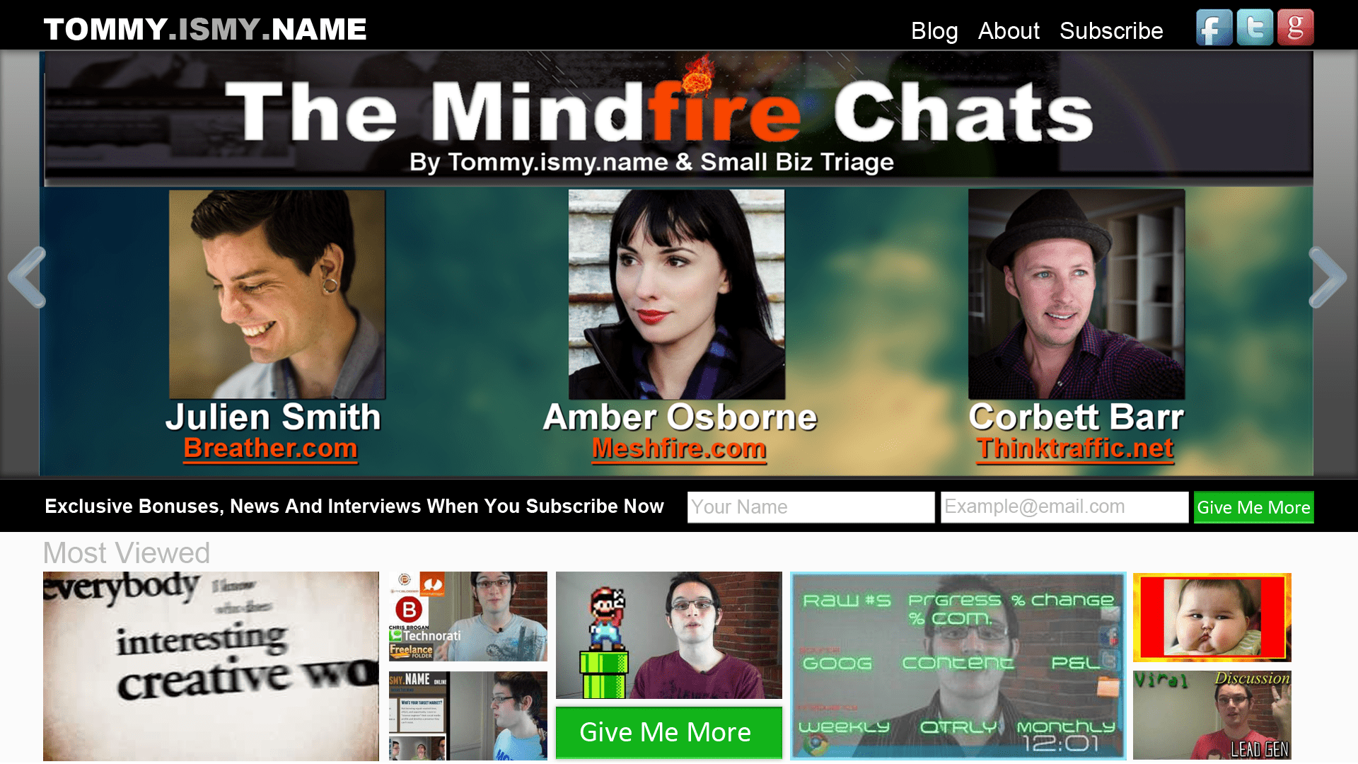
Below is a mockup from a redesign of my own site on “Video Watch Page” might look like:
2. First Log-On Welcome Page
After your visitor signs up for your paid offer, instead of sending them directly into the product or service, let them know a little bit about who’s behind the scenes.
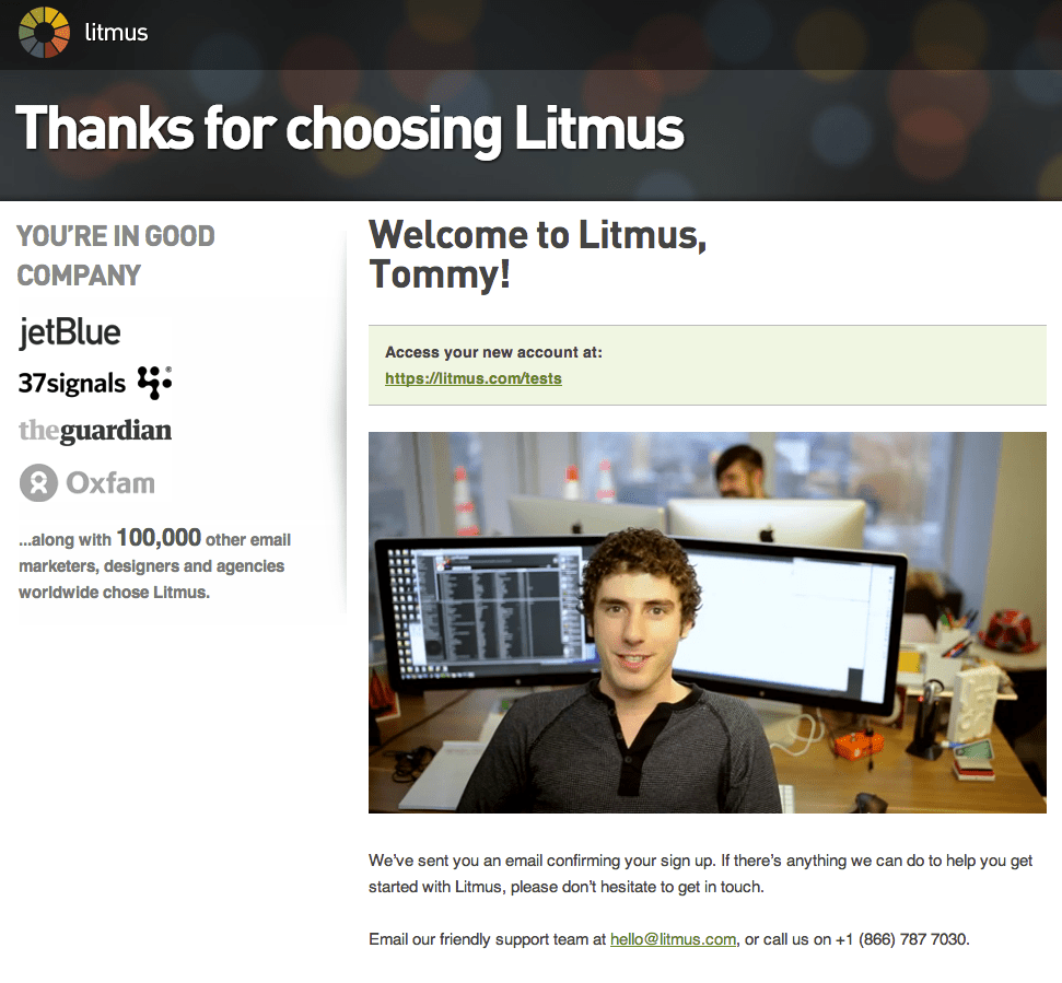
This page by Litmus does just that.
Understanding that you may feel a little on edge after handing out your credit card details, Litmus doesn’t send you straight into the product.
Instead, immediately after checkout, you’re greeted with a video of lots of smiling faces, saying “Hi I’m ___” who you learn by the end of the video, are the customer support team.
And while it’s not the primary focal point, the inclusion of other high profile clients on the left help to provide a sense of relief that you’ve just made a good investment.
These are not minor details just to make new customers feel fluffy either. Litmus offers a free 7 day trial, and this combined with a smart autoresponder series is intended to reduce the amount of churn from “free trial” to “paid subscriber”
Though Litmus declined to comment on how this has affected their churn, Moz.com employed a similar method in a much larger strategy that lead to an extra 170% improvement in conversions.
3. Resource Page 2.0
Originally, when I wrote about the resource page on ConversionXL, I featured sites that listed their primary resources as text based links.
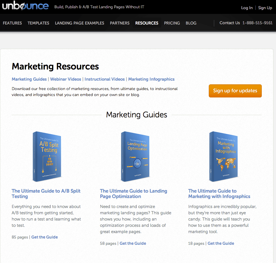
However, after examining the resource library here on Unbounce, it occurred to me that a text only approach not only does a huge disservice for visual learners, but also is a huge wasted opportunity for improving on partner and affiliate opportunities.
If you’re ambitious, take design cues from the Google Play book store, iTunes Books, and Amazon Books to make the Resource Page 2.0 a library of industry specific content, curated by category and content type.
Affiliate marketers could curate top webinars, ebooks, and courses, all through one portal page, allowing users to have a visually compelling hub for industry specific products and services.
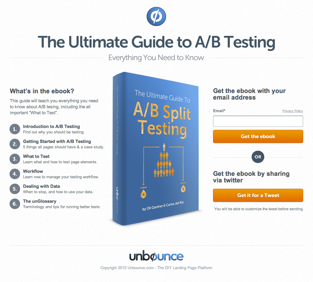
If you’d rather stick with your own material however, you could repackage old blog posts into beautifully designed .Pdfs and showcase those on the resource page. After clicking on the desired ebook, your visitor is able to download by entering their email address or paying with a tweet.
That’s what Unbounce does, and so far it’s been extremely effective.
4. About/Contact Page 2.0
Ok, so on most of websites, what do you find on the about page?
A quick blurb about the company mission, an introduction to the team, maybe a contact form?
While these are great, if you stop there, you could be missing out on great opportunities to connect with more of your visitors.
First, consider the user’s intent. A hit on your about page is the visitor saying “Hey, I like what you’re doing. Tell me more about yourself” If that’s not an optimal point of conversion, I don’t know what is.
Second, not everyone likes filling out forms. According to a Harris Interactive Poll, 77% of people want more live assistance when available with online purchases, and 54% want more human interaction with big ticket purchases.
It’s also common knowledge that filling out a form means receiving follow up email. The question is, how bad are they going to abuse your inbox?
Now this is the part where I say, “include a phone number on your About page.” and you roll your eyes. I know you’ve heard it before, but hear me out.
According to a study conducted by BIA/Kelsey, inbound phone calls are 10-15 times more likely to convert than an inbound web lead. In that same study, 61% of businesses rate their inbound phone leads as “excellent” vs only 51% giving their web leads the same rating.
If you’re like most online marketers I know, you don’t like to use your phone number as the call to action because as soon as a person calls in, you lose all your analytical data. But, you don’t have to.
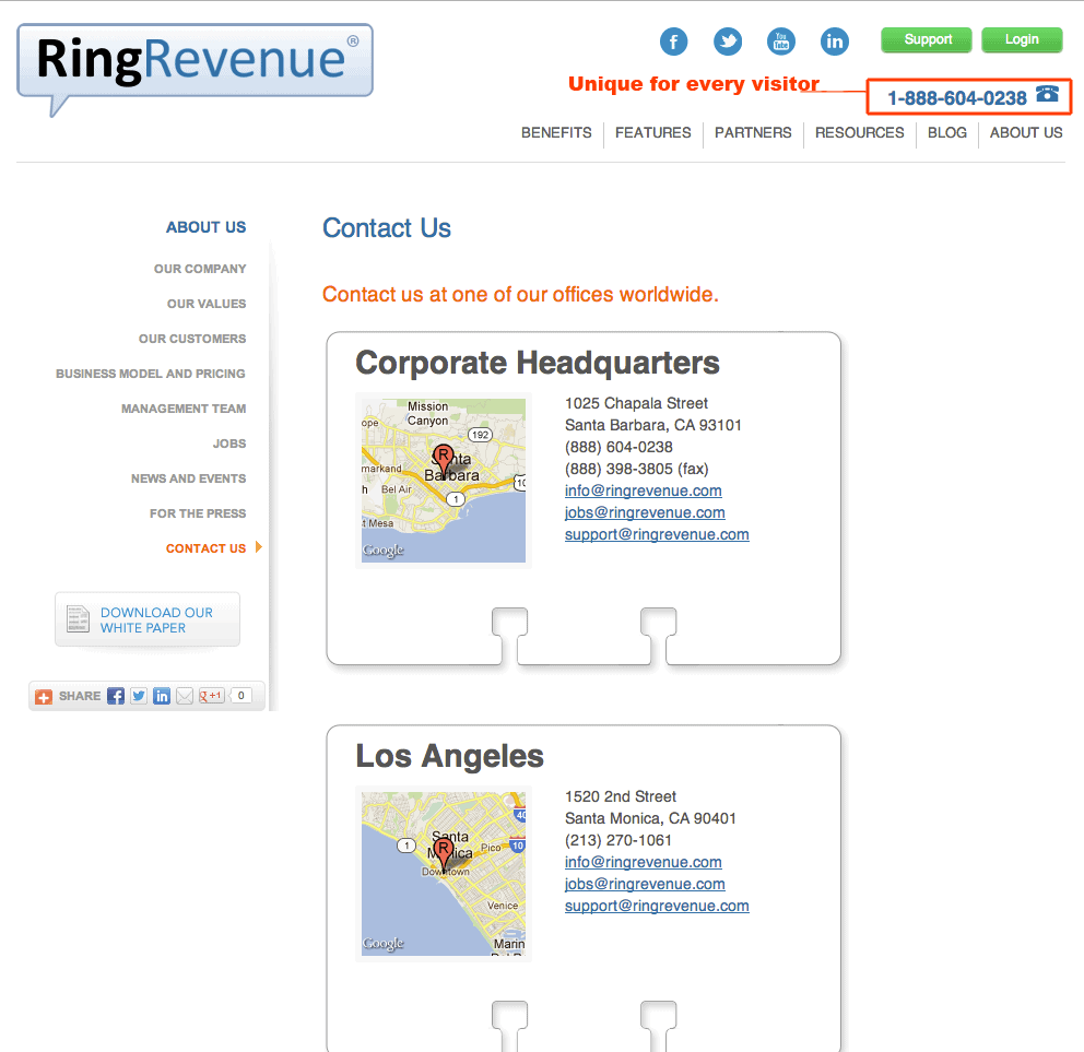
Using a call tracking service like Ring Revenue, you can generate specific phone numbers for every individual that visits your “About Page 2.0”.
Because the phone number is specific to the caller, when they call, their phone number syncs with Google Analytics, allowing you see which pages they visited before they decided to pick up the phone.
Over time, you can use this data to preemptively answer questions & overcome common objections before they ever pick up the phone, creating higher quality phone leads and hopefully more sales.
Bonus: If you want to take the About 2.0 Page a step further, use ad retargeting to display specific ads across the web, targeting only to those who call in.
5. Coming From (Social Media) Page 2.0
I’ve written about creating specialized landing pages for each social media profiles before.
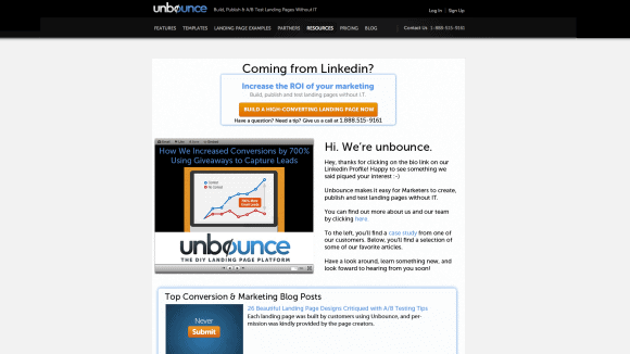
The idea is that by creating a landing page that acknowledges your visitor’s referral source, you can add an extra layer of contextual relevance for your visitor.
For example, understanding that Linkedin is more effective at lead generation, your “Coming From Linkedin” page could include company phone number (don’t forget call tracking), a slide deck with a company overview, and a selection of some of your best “why we’re awesome to work with” materials.
For this landing page strategy to really work, you have to first understand how traffic from each social network behaves. Because Linkedin visitors are most likely interested in working with you, giving them more lead generation material makes sense. With Facebook or Twitter however, offering an ethical bribe or easy access to sharable content might make more sense.
This is a great strategy for providing better message match with a social network, and quickly orienting visitors to content that is best suited from their social network of choice.
***For Advanced Marketers***
If you really want to get fancy, you can create a single “Coming From (Social Media)” page, but have the content areas change based on the visitor’s referral source.
In other words, you’d use the same url for all social networks, but your “Coming from (Social Media)” Page displays targeted content to visitors from each social network.
To do this, you must also integrate Unbounce with Visual Website Optimizer and use their “behavioral targeting” feature. While it may seem complicated, creating a visitor segment is as simple as making a few clicks.
The ideas are still the same as using individual pages, but with behavioral targeting, you can swap out headlines, content areas, and even opt-in forms targeted at each social network visitor.
***For Even More Advanced Marketers***
Now, let’s say you were hosting a Twitter-themed event in a new town, and you wanted to encourage Twitter followers from the area to RSVP for the event.
Using behavioral targeting, create a custom variation on your “Coming from” page that displays event themed information & calls to action only to Twitter traffic within the geographic region of the event.
Now when Twitter users within that specified area visit the “coming from” page from your bio, they’ll get all the relevant information regarding your event.
When non-local Twitter followers click that same bio link however, they’ll see your standard “Coming from Twitter” page, without ever having to be bothered about an event they won’t be able to attend.
Using these same tactics, online retailers could test making offers based on the physical markets where they have the highest social penetration. Using a tool like Followerwonk for Twitter or your Facebook insights, you can get an approximation of your follower’s physical location.
By creating an offer like, “20% for our Indiana Facebook Fans” you can really surprise and add an extra layer of relevance anyone curious enough to click the link in your social media profile.
Your Turn
Which of these landing page strategies would be the best for you?
I hope these strategies got your creative juices flowing and thinking around designing amazing experiences for your visitors. I’m looking forward to seeing what what you came up with.
