
It’s true—web designers are almost never taught the basic principles of what makes a website an effective business asset. This might sound strange until you realize that what universities teach about web design is approximately as good as what they teach about marketing—and you can get a PhD in marketing without any ability to attract customers to a business.
In this article, I’m going to reveal 3 things only 1 in 100 web designers know about designing an effective business site. If you’re a web designer, knowing these things will give you a leg up against your competition because you’ll be able to tie your services to financially significant goals in your clients’ businesses—instead of pretending a passion for web standards and the ability to be featured on design galleries is of real benefit to them. If you’re a business owner, knowing these things will let you profitably adjust your website—or give you an edge in choosing a web designer to create you a profitable website in the first place.
1. A Website Is Like A Shooting Target
It needs the following elements:
- A Bullseye. This is the element which gets a prospect to fulfill the site’s central objective. It represents the action that every visitor on the site will ideally take. The central objective is the one with the highest revenue potential. Usually it’s directly related to a long-term business goal: generating leads or sales. If there are multiple actions a prospect can take to achieve this central objective (or multiple objectives you regard as central), only one of them can be the bullseye on any given page. Different pages can have different bullseyes, but you can only have one per page. The other objectives will fall into:
- The Inner rings. Along with the secondary actions a user can take to fulfill the site’s central objective, the inner rings also include other elements representing other objectives. These are more indirectly related to your business goals and have lower revenue potential. Often they’re short-term—things like specials, promotions, featured products and so on.
- The Outer Rings. These are elements which fulfill tertiary objectives. They’re necessary for the site, but don’t really contribute to any business goals or have any revenue potential. They include things like the site’s navigation, legal disclaimers, and physical address details.
Any given page on your website can have a lot of “rings”—but it should only ever have one bullseye. It must be big, obvious, and easy to hit. Never turn secondary actions into bullseyes. Most websites do this wrong: they present several, equally-weighted options that compete with each other. This leaves prospects confused about what to “shoot at”—what to do…so they do nothing. Hence, most websites fail to achieve any of their objectives very well.
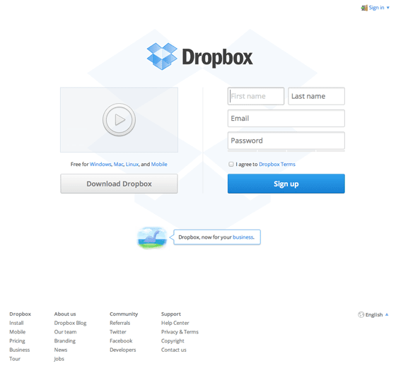
Dropbox’s homepage has a clear bullseye: to get prospects to sign up. This is supported by the promotional video and download link—the inner ring. Everything else is relegated to outer rings: the navigation is clear but understated, and the signin link is unobtrusively
2. Your Site Must Answer 3 Questions Immediately
These reflect the overriding concerns your prospect has in mind when he arrives on your site:
- Where am I?
- What can I do here?
- Why should I do it?
If you fail to answer these questions within 5–7 seconds, prospects will either not know where they are…or will be confused about what to do…or will not see any point in doing it. In each of these cases, they will solve the problem by clicking the back button or just close the browser altogether.
Answering these questions, in many respects, is well outside the purview of a web designer. His role is to lay out and style the content he is given—not to create it. But he should still know these questions must be answered, since he should be an adviser to his client (and frankly, most copywriters are as poorly trained in effective web writing as designers are in effective web design).
That said, a poor design can cripple the ability of even the best copy to answer these three questions. Thus, the layout of your site must instantly be clear—which means it must follow a format readers expect. Too many web designers sacrifice usability as a burned offering on the altar of creativity.
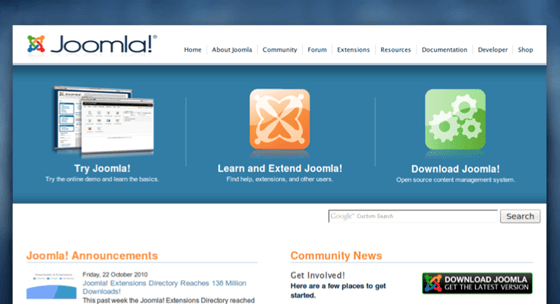
Top: Joomla’s old website failed pretty miserably at answering the Big Three Questions. There was nothing that instantly told prospects where they were—nor why they might want to try Joomla, learn and extend it, or download it.
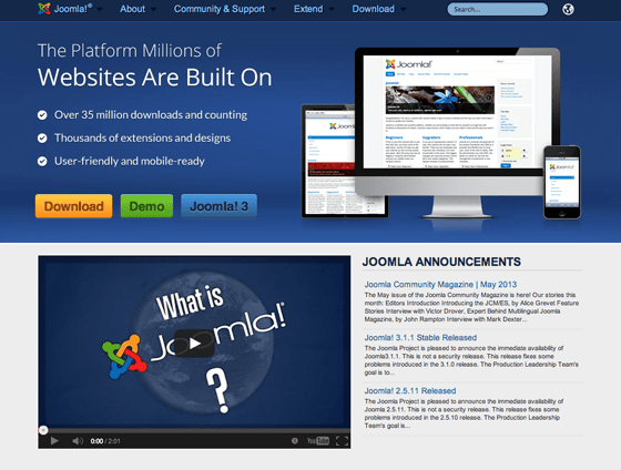
Bottom: Joomla’s current website is aimed squarely at the company’s ideal prospect: someone looking for a reliable, well-supported and tested platform to build a website. Thus, no words are wasted, and prospects have no doubt as to where they are, what they should do there (download Joomla or try it out), or why.
3. Readers Can Almost Never Find What They Want On A Site
This is directly related to the Big Three Questions—but it bears mention as a separate item because there is plenty to say about it. Here, for example, is web usability expert Jakob Nielsen:
Don’t assume that users know as much about your site as you do. They always have difficulty finding information, so they need support in the form of a strong sense of structure and place. Start your design with a good understanding of the structure of the information space and communicate this structure explicitly.
Discussing his research of website usability and trustworthiness, Brent Coker of Melbourne University says:
The biggest source of frustration for web surfers appears to be the ability to find relevant information on a website—that’s the biggest killer, the biggest driver of dissatisfaction. As soon as a web visitor is dissatisfied they will leave that website and defect to a competitor. And the best way that website owners can stop that or reduce that is by increasing the relevancy of information.
In other words, the major challenge for websites is helping people find what they want straight away. As Coker says, “you need a very good map to help people get around”. And Nielsen has discovered the same thing:
Uncovering navigation shouldn’t be a major task: Make it permanently visible on the page. Small children like minesweeping (passing the mouse around the screen to see what’s hidden), but teenagers don’t like it, and adults hate it.
Your site’s navigation is your reader’s fallback if he starts to feel lost or uninterested. It’s very important to make it as useful as possible. By this, I mean:
- Include a search field. If you have more than about four pages on your site, this is a necessity. Over half of all web users are search-dominant; to find something they may skip navigation entirely and go straight to searching. Position your search field near the top of the page—either on the navigation bar, or somewhere nearby. That’s where people expect it.
- Navigation should be identifiable and consistent. I’ve seen sites where the main navigation is made up of text links above a graphics-heavy masthead. This is no good, because readers won’t see them. I’ve seen sites where the navigation is styled like a banner ad. This is no good, because people ignore banner ads. Make your navigation obvious. I’ve seen sites where the navigation changes depending where you go. This is no good, because the whole purpose of the navigation element is to save readers from getting lost when they move about.
- Links should be named in a way people expect. I’ve seen sites where the navigation links have been given “cute” names. This is no good, because readers don’t know that “The Full Monty” is actually an About page. Even names like “Our Story” are much inferior to what readers are actually expecting: “About”. Resist the self-destructive urge to “brand” your navigation. Readers won’t click links they don’t understand.
- Link structure should reflect site structure. I’ve seen many sites with two navigation bars, and no clear difference between one and the other. This is no good, because people don’t know what the difference is between them, or which one you think the page he’s looking for should fall onto. I’ve seen sites with the Contact page under an About section. This is no good, because your reader doesn’t expect that organization. Your site structure must be logical, and clear from a quick glance at your navigation. A reader must be able to see where on your site they are, and where they can go. If you have a lot of content to present, use a large drop-down menu that clearly breaks up your content into logical divisions (called a mega-menu), and breadcrumb navigation which shows readers where on the site they are: e.g., Products → Information Products → Attention-Thievery 101.
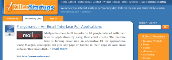
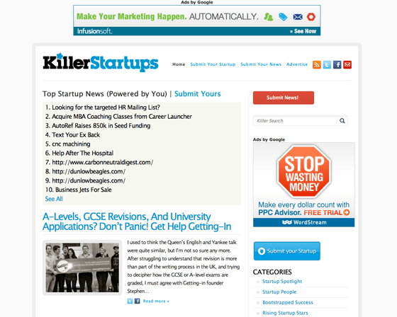
Top: KillerStartups’ old navigation suffered from some unintelligible options—where will “Dataopedia”, “Badge” and “Widget” take me?
Bottom: Look how much clearer and more comprehensible their new site’s navigation is.
What Critical Facts Have I Missed?
There are many other things web designers often don’t get taught, or forget about in the heat of battle. Have you come across any lately? Share you insights and experience below.
