
Imagine a potential customer is sitting in their car, waiting to pick up their kids from school. They’ve got 15 minutes to kill, so they pick up their phone and (because they’re 46 and don’t know about TikTok yet) scroll through Facebook.
Between checking out their best friend’s pictures from a tropical vacation and trying to untangle their Aunt Ida’s… uh, “unorthodox” political insights, they see your Facebook advertisement for gorgeous, handmade leather bags.
Your ads reach people like this because of tracking, pixels, lookalike audiences, and all the other technical magic that powers Facebook’s advertising platform. Facebook can see that this potential customer is in the market for a new leather bag (they were just searching for one last night!) and, based on the demographic targeting you’ve applied, shows them your ad.
There are only five minutes left until the school bell rights and children flood out the doors into the car, demanding snacks, Fortnite V-Bucks, and meaningful action to address global climate change. So, your prospect clicks your ad with the intent to buy.
Only… your Facebook ad doesn’t send them where they expected. Instead, it takes them to the homepage of your store. The beautiful leather bag you were advertising is nowhere in sight. Now the kids are in the car, the phone is back in the console, and the sale is lost. Where’d you go wrong?
In this article, we’re going to discuss how dedicated Facebook landing pages help you capture more of these near-miss conversions. Along the way, we’ll highlight ways you can optimize your pages to make ’em more impactful and share some examples of digital brands who’re doing it right.
Here’s what each section will speak to:
- What a Facebook landing page is
- Why you need landing pages for your Facebook ads?
- How to create a high-converting Facebook landing page
- 5 things your Facebook landing page must have
- Facebook landing page examples
- How you can start building your Facebook landing pages with Unbounce

What is a Facebook landing page?
A Facebook landing page is a dedicated page designed to convert visitors from a specific pay-per-click (PPC) Facebook ad.
These landing pages are different from other pages (like product pages on your website) because they’re tailor-made to complement your Facebook ad. They continue the story—the hook, the design, the call to action that was introduced to the reader as they scrolled through their Facebook newsfeed.
Years ago, Facebook offered landing pages within their own platform. These allowed businesses to gate their content for Facebook likes (earning them the nickname “like gate”), but they haven’t been available since 2014. And that’s almost a decade ago now. (No, we’re not feeling old at all).
In this post, when we talk about Facebook landing pages, we’re talking about the first page someone sees after they click on a Facebook ad—not to be confused with the on-platform landing pages Facebook used to offer.
Why do I need landing pages for my Facebook ads?
Everyone’s Facebook newsfeed is unique. The content and pages you like, the friends you’re connected to, the groups you’re joined—these things all influence the way your newsfeed populates. Because prospects’ newsfeeds are personalized and the ads they see are highly targeted, your Facebook landing page needs to be tightly aligned with your ad if it’s going to be successful.
But wait, do you know why you should be using a landing page yet?
This may be a simple question, but more often than not, the distinctions between landing pages and websites get ignored.
So, what’s the difference?
It’s simple, really. If you just want to raise brand awareness and aren’t looking for your visitors to take a specific action on your page, websites are great. But with so many different things to click on and so many different paths to take, they’re not the best for driving conversions
But if you do have a specific goal in mind—like getting more leads, sales, or signups—and want your visitors to take action immediately, landing pages are the way to go. Why? Because landing pages have less distractions and are literally designed for your visitors to take one single action.
Now that we’ve made the distinction, let’s get into some other reasons that having dedicated landing pages for each Facebook ad is good practice:
Potential customers need more information
Scrollers, readers, and browsers on Facebook need extra nurturing to go from ad click to purchase. These potential customers are in the brand awareness phase. To convert on your page, they’ll wanna see specific information related to whatever got them to click on the ad in the first place. A focused Facebook landing page—with concise info and a consistent message—is the best way to turn them into customers.
Mobile users are distracted users
People don’t log into Facebook for in-depth reading and focused learning. They’re filling time, or just picking up their phone for a quick check-in. And because 94% of Facebook ad revenue is from a mobile device, you should assume everyone who sees your ad only has five minutes or less to make a purchase.
That’s why you need to make it as easy as possible to go from Facebook ad to landing page call to action. Every navigation obstacle or confusing message risks losing your prospect’s attention and having them move on to something else.
Homepages are slow and overwhelming
Homepages are great for solution-aware prospects looking for specific information, but they can be overwhelming for visitors from social media. (Just think of all the distractions: nav bars, calls to action, lists of products and features.) A MECLABS study found that 44% of clicks generated by B2B companies send readers to a homepage and not a dedicated landing page. That’s a lot of businesses that aren’t optimizing for conversions.
An average visitor won’t wait more than three seconds for a page to load. Most websites are heavy with images, scripts, and other elements that make them slower than an optimized landing page. When you send your Facebook ad traffic to your homepage, you’re probably losing more customers than you realize.
How to create a high-converting Facebook landing page
You may be asking yourself: “How do I create a high-converting Facebook landing page?”. We’ve spent many days and nights thinking about the very same question.
It’s not rocket science, but it ain’t plain math, either. Here’s a step-by-step guide to building your (high-converting) Facebook landing pages.
1. Set your campaign goal.
Before you start building your Facebook landing page, you should have a clear campaign goal in mind. This will inform what content you need to have on your page, how to write your copy, and—most importantly—the exact call to action (or CTA) you’ll present to your audience. Depending on your industry, your goals could be anything from driving more sales to getting more conversions.
2. Write persuasive copy
What’s any page without words? If you’re trying to meet your goals for your Facebook landing page, you’ve gotta use strong, direct messaging that guides your visitors through the page and gets them to take the action you want ‘em to.
You don’t have room for a ton of copy on a landing page, either—so it’s essential to nail the headlines, focus on the benefits, and, most importantly, keep it simple. As we said before, this ain’t no website.
3. Present a strong CTA
Not to be dramatic, but this is a make-it-or-break-it moment for your Facebook ad landing page. Your CTA (or call to action) is the singular action you want your visitors to take after spending some time on your page. It’s a big moment, so be specific and create a simple and singular action item for your audience to take.
4. Design your landing page
Even though it’s been established that copy is more effective than design and imagery when it comes to conversions, visual elements are still pretty darn key for a successful Facebook landing page. Whether it’s choosing the right hero images that showcase your benefits or making sure your landing page is consistent with your brand and also mobile-responsive, your landing page design is another make-it-or-break-it moment. And hey, if you don’t have a knack for coding or dev, we’ve got you covered.
5. Preview and publish your page
It’s time to publish your Facebook ad landing page—butttt you shouldn’t do it before double (and triple) checking your copy, optimizing your page for SEO, and making sure all elements of your landing page are working correctly. You want that first impression to be solid, especially because there’s not anywhere else to look on a landing page.
6. Finally, drive traffic to your Facebook landing page
You can’t just build a Facebook landing page and then hang it out to dry. Now you’ve gotta get them in front of some sets of eyes. There are lots of ways to drive traffic to your landing page, but some of the surefire ways are through PPC (pay-per-click) ads, social media (including Facebook) ads, and email marketing.
But there’s so much more detail that can go into how to create your Facebook landing page, and it doesn’t stop here. We’ve got a detailed guide on how to create a landing page on Facebook, walking you through it all.
We’ve got a quick-reference list of Facebook landing page best practices below, but there are two things you really wanna keep in mind as you start building your page:
Know your audience. It’s no secret that Facebook has amazing targeting capabilities, but you won’t be able to take advantage of them if you don’t know anything about your ideal prospects. Before you shell out the cash for Facebook ads, make sure that you know your audience well. Spend time investigating how potential customers search for your solution, what words they use when describing products or services similar to yours, and what features or benefits interest them most.
Keep it consistent. When writing for a Facebook landing page, remember to keep the messaging consistent between your ad and your landing page. Marketers might think that repeating copy is repetitive, but it can help reinforce your message to prospects and reassure them they’re in the right place after they click. Same with calls to action: if someone clicks an ad about earning a doctoral degree, that’d better be the main focus of your landing page.
5 Facebook landing page must-haves
- Clear unique selling proposition (USP). Visitors should immediately be able to tell what makes your product or service a fit for their needs. Don’t bury the most important details lower on your page—show ’em above the fold.
- Strong, descriptive headlines. Your headline should make the reader want to know more or see more. The headline on both the Facebook ad and landing page should convey the same offer.
- Consistent design elements. The goal here is to continue the story you started on Facebook, and that includes visuals. If the images on your Facebook ad are neutral colors with images of smiling kids, then your Facebook landing page should also have neutral colors with images of smiling kids.
- High-quality images or videos. This seems like a gimme, but you’d be surprised how many Facebook landing pages use low-res visuals that scare off prospects right after they’ve clicked an ad. Make sure to use images or videos on your landing page that shows your offer in the best light.
- A singular, compelling call to action. You can repeat your call to action throughout the page, but you should only ask visitors to do one specific thing. Plus, your copy should tell them exactly what happens when they do that thing: for example, “get the ebook” rather than “submit” on a form.
Examples of Facebook landing pages done right
Of course, we’d never give you all this information without providing some concrete examples. Here’s a breakdown of Facebook landing pages from Unbounce customers who really know what they’re doing.
Quarters: Target your ads with demographic information
Quarters is an all-inclusive community living space in multiple locations around the world. They advertise their service on Facebook by highlighting their transparent pricing, contract flexibility, and included amenities.
This Facebook ad that Quarters is running has five variants. Each features copy and imagery designed to target people looking for housing in a particular city or neighborhood—say, Manhattan—allowing Facebook to surface relevant ads depending on audience location.
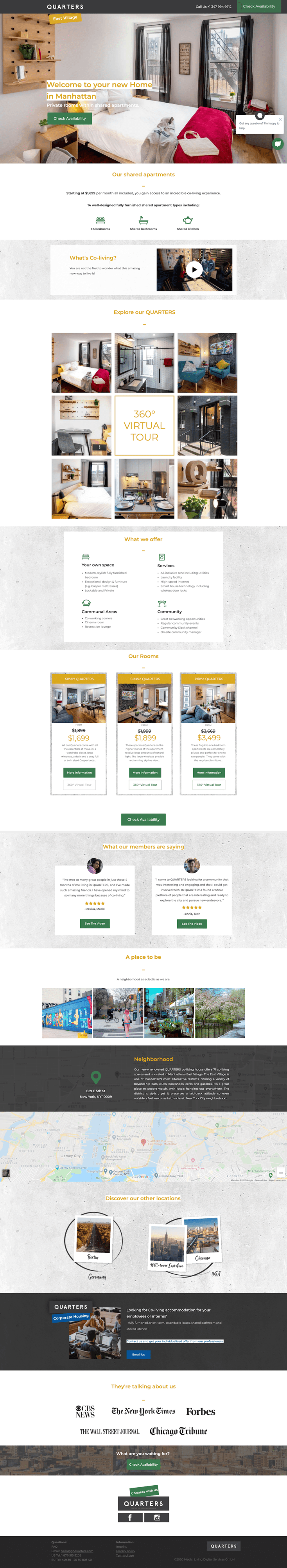
When someone clicks through to the landing page, Quarters encourages them to “Check Availability,” repeating the call to action throughout the page to keep it top-of-mind. This does a great job of guiding visitors to take the next step in the purchase journey.
Choosing a place to live can be a substantial expense (especially in the Big Apple), and Quarters anticipates their prospects will have plenty of questions. The landing page includes tons of useful information, including 360-degree tours of available rooms, details on the neighborhoods (with images and maps), and quick-reference lists of amenities and pricing.
TapSnap + Samuraw: Give visitors everything they need to convert
Here are a couple of landing pages that show it’s often more important to be clear than clever.
TapSnap is a photo booth rental company and their Facebook landing page makes that obvious. Above the fold, their message is super straightforward: they’re selling photo booths, they’ll deliver them to you, here’s how to get in touch. Boom.
Side note: Check out the arrow at the bottom of the fold that directs your eye to more information. Without it, the page might’ve created a false bottom effect, leading people to believe that they were at the bottom of the page when there’s actually more to read.

Further down, TapSnap provides a concise, skimmable list of features that help prospects quickly understand what they can expect from the product. Plus, the brand shows its booths in action with photos from real events (alongside examples of the different kinds of pictures available) to show off the experience they create.
TapSnap doesn’t leave anything to the imagination—and neither does Samuraw.
Samuraw offers a high-quality mineral and probiotic supplement made from natural ingredients, and this Facebook landing page (built by Webistry) delivers that message right away in the headline. By including the “add to cart” call to action above the fold, Samuraw also gives visitors a clear path to purchase.
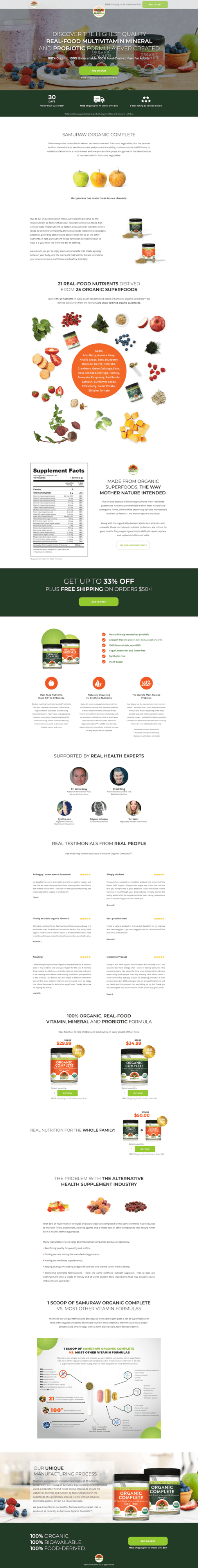
If you’re already in the market for a real-food multivitamin and probiotic (who isn’t?), you might choose to purchase right them. But if you’re curious about ingredients and other nutritional details, Samuraw has done a great job of providing all that information further down the page.
Another neat feature of this Samuraw landing page is the sticky call to action that follows visitors as they scroll the page. This helps keep the offer top of mind and makes it easy for readers to purchase the product when they’re ready to convert.
Wanna see how other brands are using Facebook landing pages to grow their businesses? Check out this post about how a baby food brand used Facebook to create an email list of 14,000+ subscribers, or this one about how Indochino drove 50% growth in just one year.
Taboola + TurnKey: Use proof points to establish credibility
Leveraging proof (like evidence of your supposed benefits or testimonials from happy customers) in your Facebook ad and landing page copy is a powerful way to create trust with your audience.
Take Taboola, an advertising and sponsored content platform that you’ve probably seen surfacing content all over the web. In this Facebook ad, Taboola makes sure to highlight their expansive digital network: “Reach 1.4B users – and get traffic that converts.”
That’s a huge benefit that’s sure to get the attention of businesses who wanna get their message in front of loads of prospects.
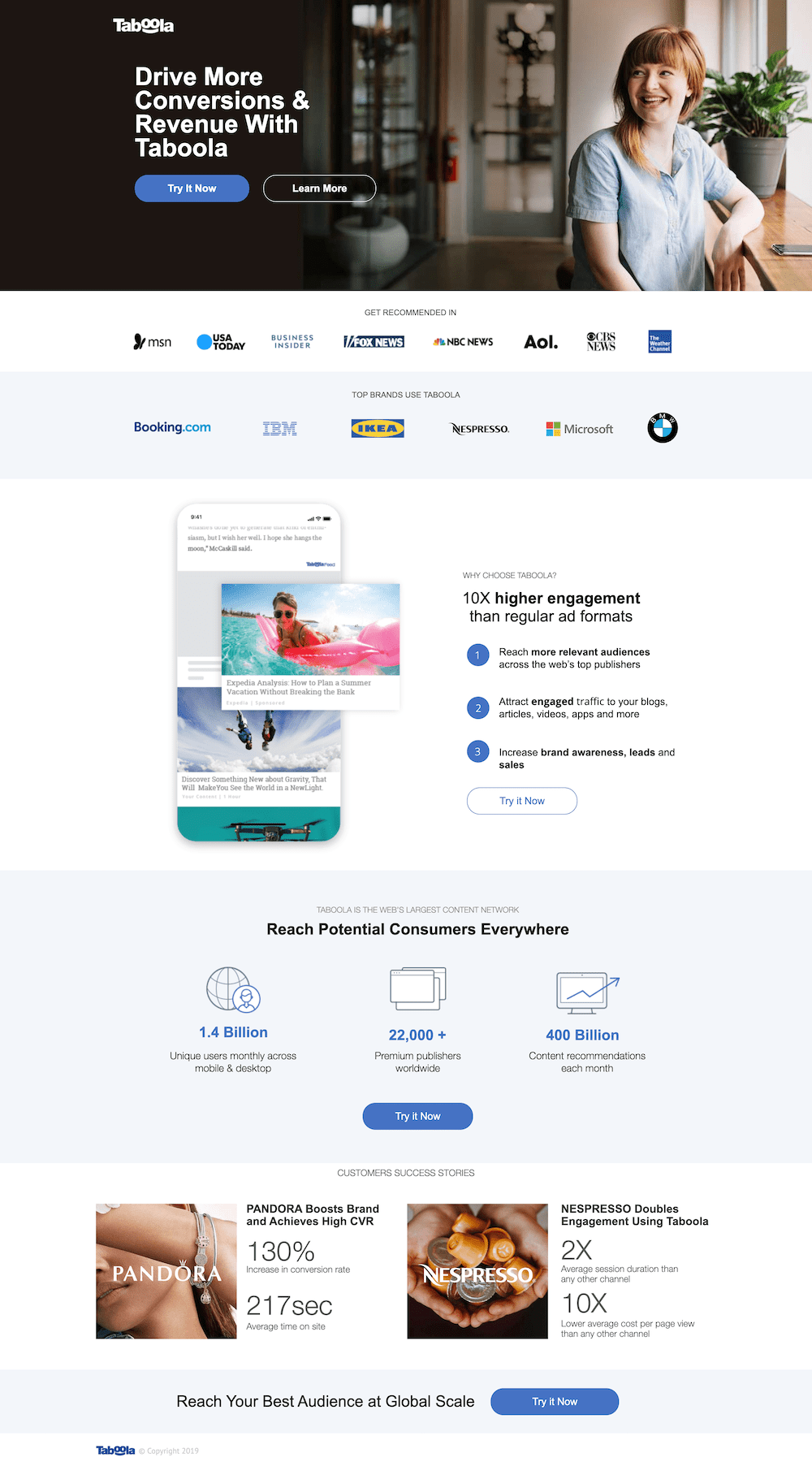
Taboola continues to build trust on their Facebook landing page. Above the fold, they’ve included a banner of some of their most recognizable partners and customers: USA Today, IKEA, and Microsoft, to name a few.
Further down, Taboola even includes concrete results that brands have gotten with the platform. It’s one thing to say you can increase someone’s conversion rate or audience engagement. It’s another thing to prove it with hard numbers.
TurnKey gives us another great example of how to use proof on your Facebook landing page. As a vacation rental platform, the company needs visitors to trust that their properties will be handled with care. They do that by including featured media logos and various awards in a banner above the fold.
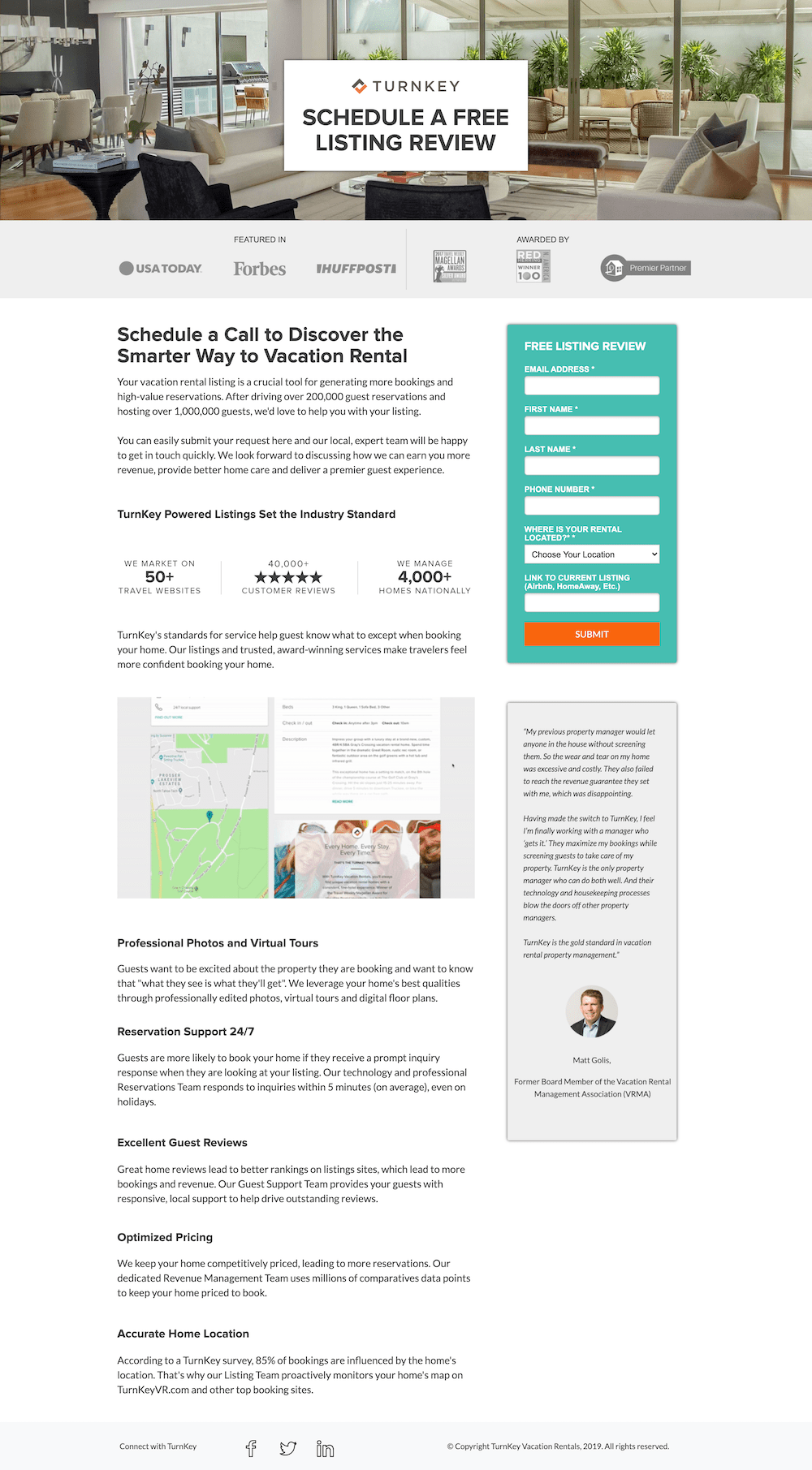
But the most compelling proof on this page is a testimonial that TurnKey includes lower down. This customer totally lays out TurnKey’s unique selling proposition: other rental platforms have left their home in shambles and failed to earn them what they expected, whereas TurnKey puts their mind at ease by protecting the property from damage and generating more revenue.
You’ve gotta hire this guy, TurnKey.
CommuniCloud: Convert more with a compelling incentive
Sure, your offer is great—but to really get people converting, it can help to give ’em a little something extra. For ecommerce companies, maybe it’s free shipping or a discount. For SaaS brands, it’s usually a no-commitment free trial.
That’s how CommuniCloud is driving registrations on this Facebook landing page. The brand keeps things simple: along with a quick description of their benefits and some social proof, we’ve got a quick form that asks just for necessary information.
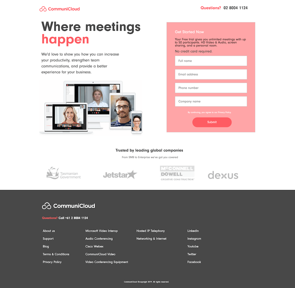
It’s important to note that CommuniCloud doesn’t require a credit card to sign up for their trial. That’d create some serious friction at this stage, so better to capture contact details and sort out the payment side later.
Schedulehead + HiredHippo: Show off the product In action
Some products are… let’s say, more photogenic than others. It’s easier to get people’s attention with a picture of food or clothing than something like software. Still, showing off your product—whatever it is—can better (and more quickly) communicate what you’re offering than words alone.
Schedulehead is a software platform that helps companies manage their employee scheduling and payroll. On this Facebook landing page, the brand is sure to highlight their user interface right from the beginning—before even getting into the specifics of their functionality.
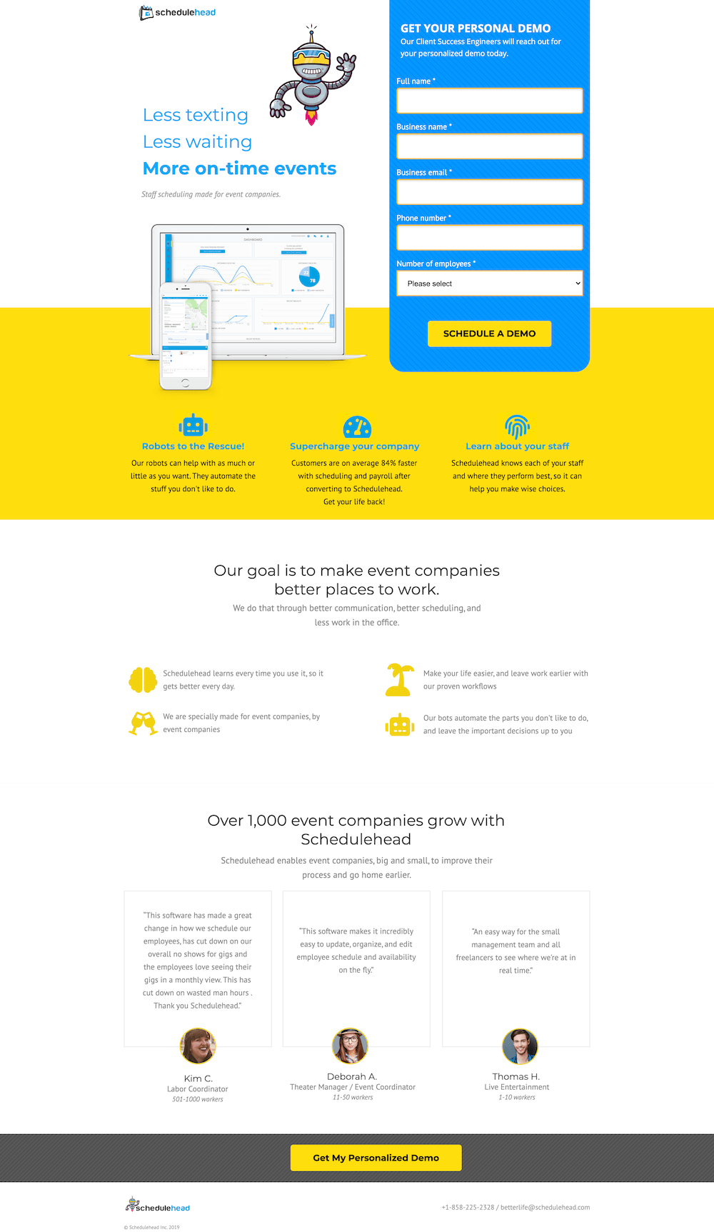
This helps visitors understand that Schedulehead isn’t some overrated spreadsheet. There are at-a-glance graphs and charts, map and calendar integrations, and loads of other features to help track your workforce.
And check out this page from HiredHippo, a job search network that automatically matches professionals with hiring companies. (Love this headline, by the way. Finding job opportunities without updating a dull resume sounds like a dream come true.)
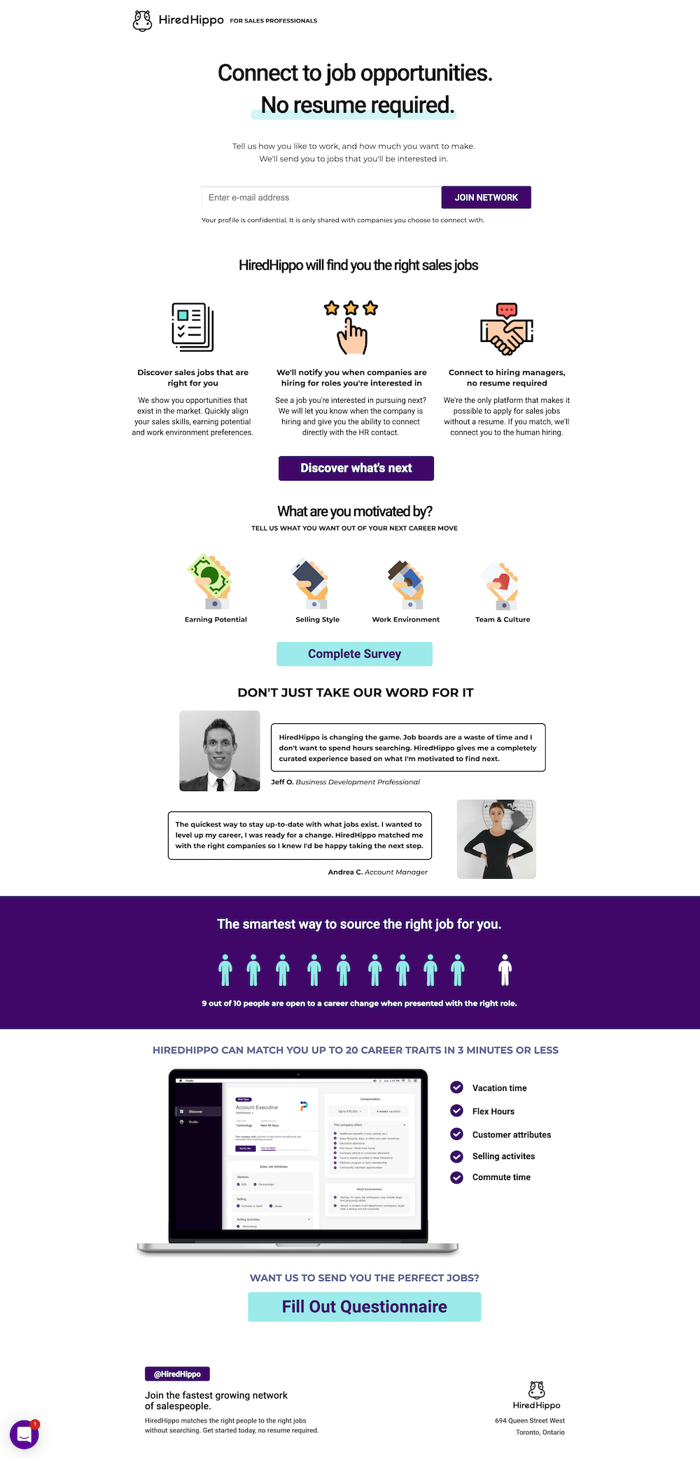
After listing some of the benefits and sharing testimonials from users, HiredHippo is sure to include a snapshot of the platform to show visitors what they can expect. Even just from this image, we can see that the dashboard makes evaluating job opportunities way easier by sharing the key details in a bulleted list.
Zapier: Get more granular about your product
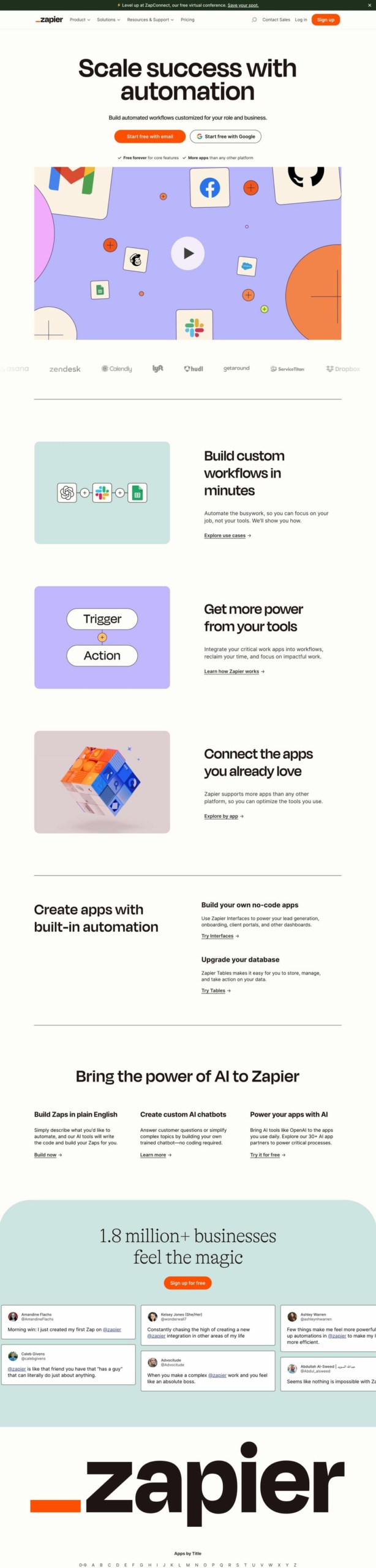
Delivering the high-level value of your product is always key, but Zapier shows that you shouldn’t be scared of combining that with a more product-specific page. Zapier trusts that the right audience will get what they need with this landing page. Most of the page addresses exactly what visitors could do with a product like Zapier (create custom workflows, create AI chatbots) instead of trying too hard to convince the visitor why they need it in the first place.
The bonus? It’s a pretty darn beautiful Facebook ad landing page to look at, too.
StackAdapt: Create a longer page (if your product/service needs it)
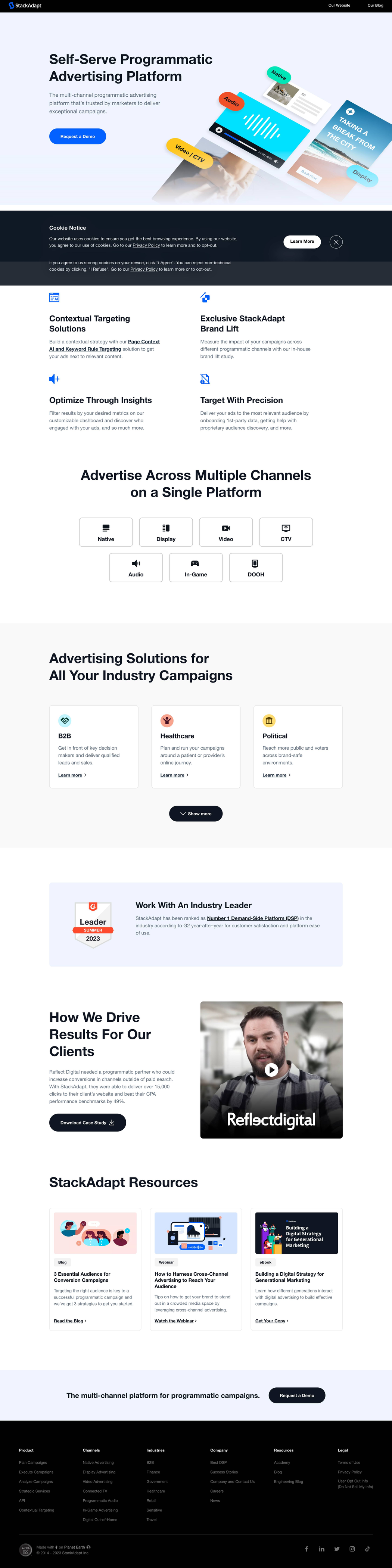
Not unlike Zapier, StackAdapt is also not afraid to get more specific with their product. But sometimes the more specialized your product or service is, the more time you need to spend explaining it. As a self-serve programmatic advertising platform (gosh, even that in itself is a mouthful), StackAdapt knows to use many tools in its arsenal to convince prospects to request a demo. That means using explainer videos, in-depth product features and benefits, and even additional resources from their blog on their Facebook landing page.
What can we say? Sometimes you really need the full picture.
Start building your own Facebook landing pages with Unbounce
Ready to create a landing page for your next Facebook ad campaign? Be sure to check out how Unbounce helps digital brands turn more followers into customers. Then head over to our templates to get a head start building a customized landing page that’ll keep your campaigns consistent and convertin’.

