They say “beauty is in the eye of the beholder” but it’s hard to think of anyone but a hardcore conversion junkie finding these web pages beautiful.
Although the very best landing pages are both beautiful and convert like crazy, some of the highest converting pages place functionality over aesthetics – and the results speak for themselves.
Have a look at these examples and see if you agree.
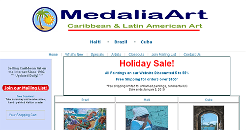
1. Medalia Art
Medalia art specializes in Latin American and Caribbean art. They wanted to test the positioning of a holiday sale announcement on their page to see how the discounts would affect their bounce rate. While their page looks like it was ripped right from the internet archives of 1996, their conversion rate will amaze you.
Here was the original:
They tested this large, prominent holiday sale message against an alternative sidebar version:
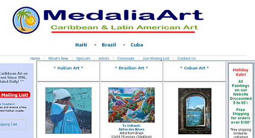
Medalia Art considered a conversion as any click from the homepage to any other page, which also enabled them to test the effect of this change on their bounce rate.
Which one would you choose?
Would you believe that the more prominent, in-your-face message outperformed the sidebar? Conventional tests tell us that large, bold messages are a major turn-off to users. But in this case, Medalia enjoyed a conversion rate of 40% and a 20% reduction in their bounce rate with the larger message.
This is the perfect example of why you should always test rather than relying on someone else’s “best practices.”
2. Six Pack Abs
Since 2008, this site has been one of the highest performing vendors on the ClickBank affiliate network. Although it’s not a true landing page – it includes navigation at the top – it does incorporate key landing page elements, including bullet points, video and clearly-labeled calls-to-action.
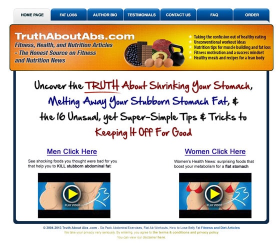
If you’ve been on the web for any length of time, you’ve no doubt seen those fake “health ads” promising weight loss by touting some alien-looking fruit that’s supposed to melt away fat.
The Six Pack Abs website takes a page from these marketing playbooks to talk about “16 Unusual Tips” and features clearly-labeled clickable links to go deeper into the site.
Does it smell of marketing hype? Nearly every affiliate product is practically marinated in the stuff. But this site is ranked #1 in both the diet and health/fitness ClickBank categories – not a simple feat by any means.
What’s more, this recent redesign has caused conversions to soar, with an average rate of 54%
Hate the design or not, this product is making its promoters some nice commissions and has been able to dominate the ranks for the last six years.
3. Dot Com Secrets X
Here’s another example from ClickBank – this time, one of the all-time highest earning sites in the coveted internet marketing category. Yes, these sites are sleazy but you can still learn a thing or two from them about how to convert like a badass.

Dot Com Secrets X puts a lot of stock in its online video – which is neither mind-blowingly great, nor jaw-droppingly bad.
Like so many products in its niche, it’s an online marketing program with a $200+ price tag. While they won’t reveal exact numbers, the program has been a consistent top earner through various affiliate networks.
The page is pretty – pretty ugly! – but what makes it convert beautifully are two distinct elements: Two add-to-cart buttons and a video. So people are forced to watch the video, buy the product or leave the site.
That means they practically segment themselves right from the start – something that any conversion-focused marketer would love to have happen on their own landing pages.
The Good, The Bad, and the High-Converting
These examples show that sometimes function and practicality trump attractive design – an important point to remember when you’re building your landing pages.
That being said, conversion centered design can be truly beautiful and the web will be a better place (your brand will be stronger) if you design your landing pages with both aesthetics and conversions in mind.
Have you seen some truly hideous landing pages that get the job done? Share them below in the comments!
Editor’s note: This post was updated with new examples on March 21, 2014.
