
In the post below I am going to share a step by step case study in which we increased conversions 336% (that’s not a typo or stuck key – it’s a legit 336%) for a client who owns and operates a career college. For this client leads are their life-blood.
By walking you through each step, from the hypotheses, to the strategy, to the goals, the setup, the test, the results and the next steps, I hope to give you a very clean very easy to follow strategy for you to start applying the same sort of approach to your site/pages or your clients sites and pages – immediately after reading this.
At the end I have a very ‘neat analytics nugget‘ that showed up as an ‘Accidental Results‘ discovery in this case study.
Let’s get started
As mentioned above, this post walks you through a case study in which we increased conversions by 336%…(can you tell I love that percentage?). The client runs a college, whose business is graduating very talented students. But in order to graduate talented student, they need to start by enrolling students – and that’s where I came in.
The Test
I start all initial testing with an ‘Apples to Oranges‘ split test.
The A/B Test (or Apples to Oranges) I ran for this client can be seen below:
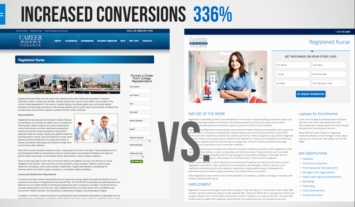
The original (Version A) was converting at 3.12%. That conversion statistic in itself, is not great, but also not too bad considering it was less that 2% when we took it over and immediately applied as many best practices as we could (as bandaids) in order to “stop the bleeding” from the original site.
The Hypothesis
The hypothesis for this test was simple:
The Test Setup
Mobile traffic was high – mobile traffic has been increasing in general, but for this target group ‘potential college students’ it was really high – 59.84% during the last 90 days, including this test timeframe, was Mobile.
- Both A & B Versions were mobile responsive
- We noticed with this client that mobile traffic seems to support the middle of the funnel – but the conversions happen (99.9% of the time) from a web browser
- The B Version removed Primary navigation, had a dramatically different theme with the same colors, and had a single image with a larger “human”
- The A Version had a Quality score of 8, while the B Versions had a Quality Score of 10
- All traffic for this test was from Google Adwords – Pay-Per-Click marketing.
- By making URL’s for Adwords only available from Google Experiments via Adwords you can ensure no organic traffic comes through and your referral traffic will also be almost non-existent.
- For Data and Page analytics, we used Google Analytics
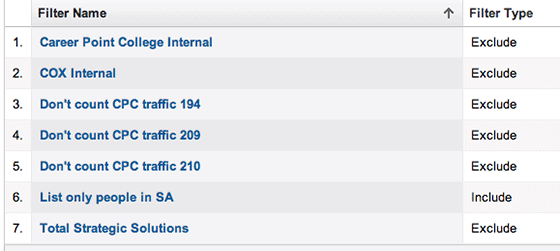
- It’s important to note that on all tests, we set filters to filter out all Internal and development traffic in order to get as accurate traffic and test results as possible
- For rotating the A & B Versions of the pages we used Google Experiments
-
- **Please note, while Google Experiments is a very decent tool, at times they ‘take too much control’ of your testing, often stopping a test and declaring a winner automatically. This is why you will see a lower number of visitors than what we recommend (100 minimum) on the test below.
-
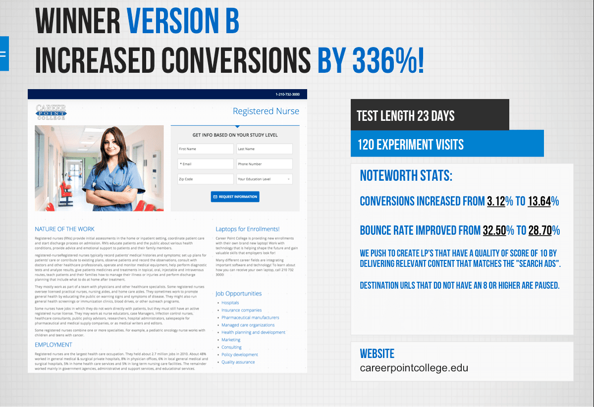
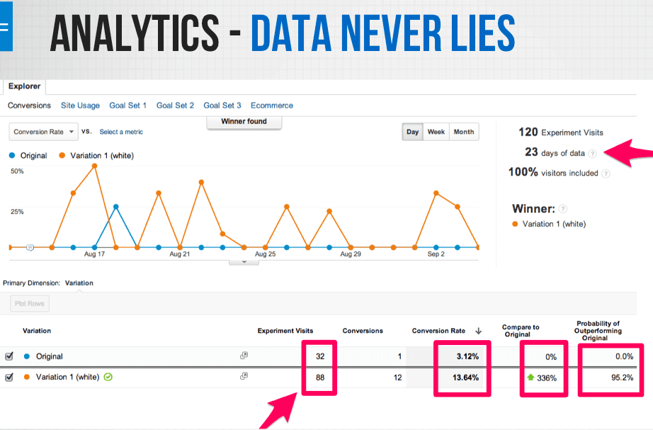
- The test ran for 23 days
- In 23 days it had exactly 120 experiments – Pure PPC visits
- This is nice because some tests can take a LOT more visits and experiments to determine a clear winner.
The Results
The winner by a landslide was the Challenger – the B Version.
Additional Learning & Results
But wait, there’s more!
While having a winner, and validating a hypothesis is rewarding – the real magic happens sometimes when you dive deeper into the metrics and analytics “around the perimeter”.
In this case the “bonus” findings were:
- Bounce Rate Improved from 32.50% to 28.70% – pretty cool, but not earth shattering
- 88% of the clicks were below the fold. Now this is worth a look, right? Especially since we didn’t have any navigation on this page (other than social links opening in a new tab/window)
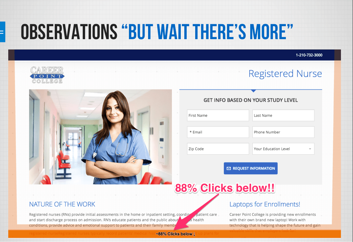
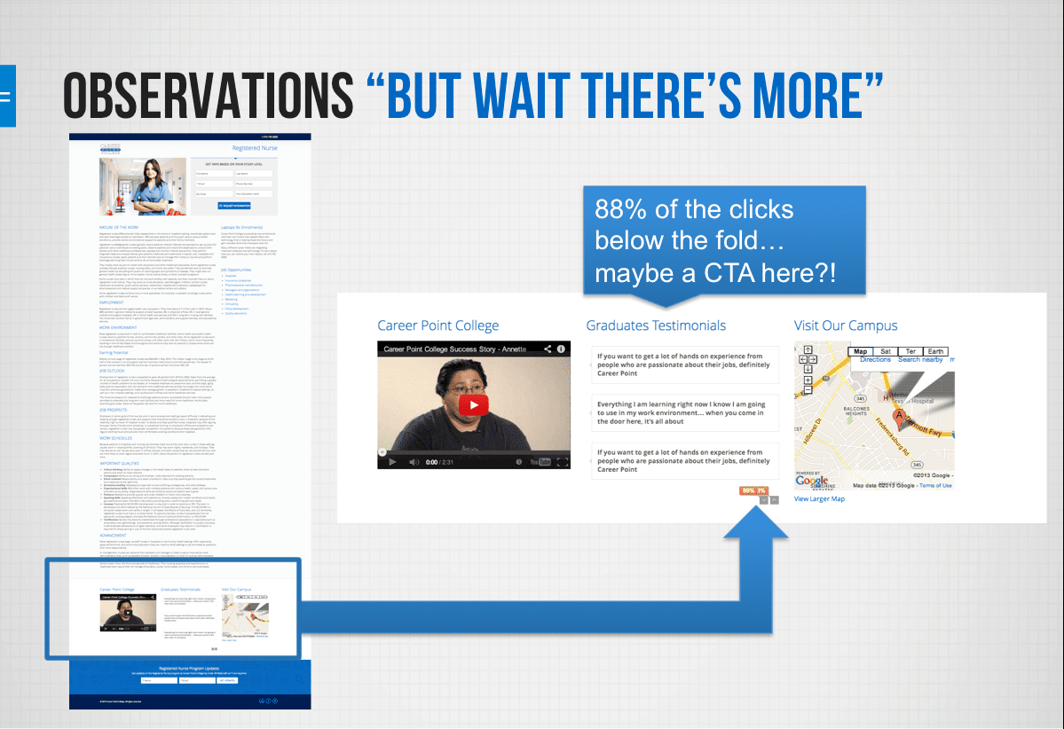
Visitors were scrolling ALL the way to the bottom and clicking through the testimonials! This is very likely the Middle of the Funnel people looking for that coveted “social proof – “What are other people saying?” “What are other people doing?” “What are other people buying?” (pst – don’t know what the Middle of the Funnel (MOF) is? Read this post.
*Please note: While this test was a success and we learned a ton, the information in this case study is very fresh – only a few weeks old. We are currently in the process of rolling out these changes.
Your Turn
The reason I wanted to share this case study so soon after getting the results was that it’s a great example of how to:
- Create a very simple hypothesis.
- Remember every hypothesis should be geared to “IMPROVE” a situation. SO when you write your hypothesis – literary spell it out…the test is to try to improve, click thru, conversions forms filled out, phone numbers called etc.
- Start A/B split testing to compare to very different versions “apples to oranges”.
- If you still aren’t sure about this – contact me in the comments below.
- Use a tool to serve and rotate the Control and Challenger pages.
- Review the results against the hypothesis
- This will be an easy review – did your B Version test/challenger page improve, weaken or not change your baseline of results before you started testing?
- Dive deeper into the Analytics to see “what else can I learn about this test”
- Get a cup of coffee and literally wade through allreports and metrics for the test and the timeframe the test ran.
- Make notes and observations – these will help build your NEXT round of testing
- Use the Champion page as the new Control page and create a new Challenger page.
- Now get on with juicing more conversions out of your pages or the pages for your clients
I want to quickly thank two people I couldn’t have done this case study without. A big shout out to my associate at COX Media, Alfonso Montemayor and developer, Kyle Sanders.
Keep testing and never hesitate to reach out via email or the comments below – I reply to everything.
