Long-form sales pages are ugly. Most businesses feel icky about the very prospect of landing their prize traffic on – shudder – long copy.
It doesn’t seem to matter that long-form sales pages work like a charm in countless cases, for a wide range of products and audiences… not just for the late-night, miracle-cure, impulse-shopper club. Doesn’t matter. They’re ugly. They feel icky. You don’t want anything to do with them.
But did you know that some of the highest-converting short copy on the web today is based on simple long-copy principles? True story. And it doesn’t even need to be hard to pull off—try Smart Copy’s landing page copy generator to do the writing for you!
Let’s take a look at just 3 landing page copywriting tricks you can steal from long copy today – and test on your own short-copy landing page.
Testable Landing Page Copy Trick 1:
Center and Bold Your Headline
This is a super-obvious trick… but it’s (surprisingly) rarely used in short copy design.
Long-form sales copywriters know damn well that your page is nothing without a stellar headline that:
- Is prominently positioned on the page
- Taps into a pain or problem – and takes the time to bring that pain to life
- Includes at least 1 specific outcome/benefit
- Uses captivating words, phrases and rhetorical devices (like onomatopoeia)
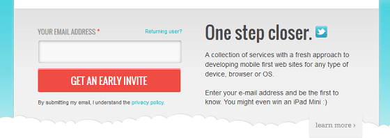
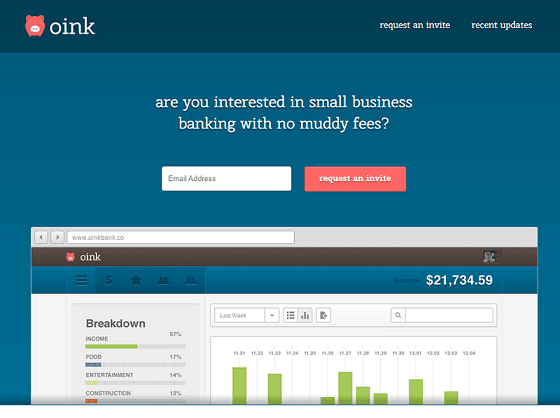
Compare that to short copy. Most short copy landing pages cram a headline into 300 pixels shoved off to the side of an image. Which usually leaves you with space for about 3 to 5 words. Which means you can’t say anything specific – and you have to use ultra-short, bland words.
You don’t have to write an insanely long headline like they do in the long-copy world. But you should test centering and bolding your headline at the top of your page. This is one of the first recommendations I make to every client I have. For example, check out the before and after for my client’s website InspirePay.com:
BEFORE – Free conversion of 3%
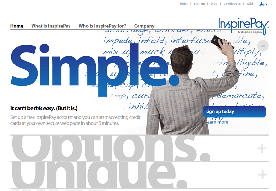
AFTER – Free conversion of 18.7%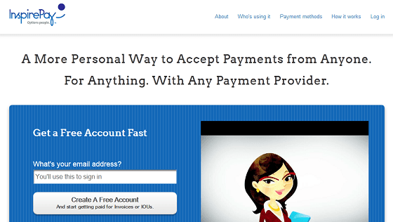
Now, the reason this new version has so strongly outperformed the original likely has more to do with the words in the headline than the physical positioning of it. But the takeaway here is that if people are able to find and read your most important message (i.e., your headline), they are more likely to consume it and make decisions with it. If a visitor can’t find your key message, they can’t consume it… and conversion could be negatively impacted. Hence, test physical positioning.
So don’t treat your landing page headline like this:
But, rather, treat it like this:
Testable Landing Page Copy Trick 2:
Use Meaty, Detailed Testimonials
While long-form sales pages are made powerful by unmissable cascading waterfalls of testimonials, short copy too often edits all the juicy details out of testimonials. Think of testimonials as mini-stories or studies – not just a line of “social proof”.
Now, you probably don’t need a “waterfall of testimonials” on your landing page, but you should aim for:
- Meaningful testimonials that include at least 1 specific detail – ideally describing the before-and-after experience of using your product or service
- A photo alongside every second testimonial
- A short ‘summary header’ above each testimonial, which should describe a takeaway that scanning eyes can grasp quickly
- Testimonials from people that your ideal customer either relates to or aspires to be like
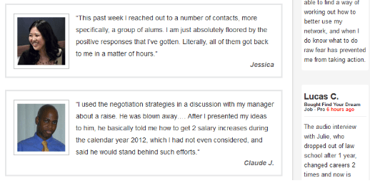
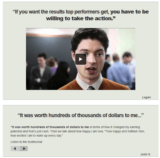
If you use video testimonials – and kudos to you if you do – give your landing page visitors a text-based taste of what’s inside the video by using a caption… so they’ve got a reason to click and watch. Here are some representative long-copy testimonials from Ramit Sethi’s Dream Job 2.0 sales page:
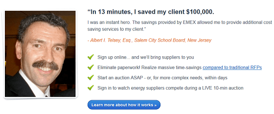
And here’s how I used the best of long-copy testimonial treatment on a key short copy landing page for Energy Market Exchange:
SIDE TIP: Need to get testimonials? Need photos to go alongside them? Simply ask for them – that works more often than not. Reply to “happy customer” emails with a request to use their words as a testimonial, with the proposed testimonial written right there in the email. For best results, include the benefit for the customer: I’ll happily include a link to your site – which is great for SEO – with your testimonial and photo.
Testable Landing Page Copy Trick 3:
Directly Break Thru One Major Objection
Do you know why long copy is so damn long? It’s not because the writers don’t know how to edit themselves. (At least, not always.)
It’s because long copy gives you the space you need to tackle objections and neutralize anxieties one by one.
In the short copy world, we’re so busy telling ourselves that people don’t read.. and they only scan.. and they’re too busy for you… and they’d rather have a video – and, and, and, blah, blah, blah – that we end up summarizing all of the points our visitors need us to spell out for them. In an effort to keep things short and scannable, we imply half the story, put only the softest messages on the page and end up saying nothing at all. Ugly ol’ long copy runs around converting at 10%, and we’re happy when our short copy converts at 2%.
But is it any wonder why short copy fails to sell most of the time? It’s not doing any convincing!
You’ve GOT to help your target market or segment overcome its biggest objections to choosing you. I’d like you to overcome as many objections as possible on your landing page, but let’s start with just one. And let’s use an example to get you there: I recently helped App Design Vault optimize their site, including their home page, which doubles as a landing page for many of their ads, emails, etc. The control used the following body copy:
The headlines in that control copy are your typical short-copy headlines. “Saves you time and money”. “Professional look and feel”. “Up and running in minutes”. Soft, soft, soft.
You need to push past the obvious, bland messages you read everywhere. You need to figure out what your visitors’ biggest objections are, and take them apart. Piece by piece. On the page. That’s exactly what I did in the following copy, which we tested against the above control:
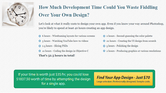
The objection: Visitors believed they could design their own app – so they didn’t need to invest in the app designs on App Design Vault. And, if they were going to invest, they weren’t going to spend $70 on an app template. We knew we had to take the time to spell out exactly what was wrong with such thinking.
The copy: We listed out the actual hours that a developer might spend on designing their own app… and we did simple calculations – right on the page – to show how much time-as-money our visitor could waste by not spending $70 today.
The result: We increased paid conversions by 51%.
You don’t have to write or design an “ugly” long-form landing page to realize the benefits of long copywriting. Small tweaks like those shown here can bring you big results. So take 10 minutes today to:
- Write a meaty headline for your landing page, and center and bold it at the top of the page
- Email 2 people that have given you testimonials, and ask them if you can use X photo of them (which you should be able to find by googling them) on your site
Then, set aside an hour this week to write new copy that breaks thru an objection you know visitors have. If you don’t know what their biggest objections are, you can use pop-up survey tools like Qualaroo to ask questions that could help you better understand; alternatively, if you use click-tracking on your landing page, you may be able to identify areas that people want to know more about simply by seeing where they’re clicking.
When tested, these 3 small to-dos could yield conversion rates that at least come within the vicinity of the average long-copy conversion rate.
