Whether or not you know how to optimize the customer-meets-business interaction, the simple truth is that conversion – and the optimization of your conversion rate – is the most fundamental element of a successful online business. (Disagree? Jump to the comments and let’s discuss).

Conversion’s purpose is to provide the maximum return on your marketing spend. A concept rooted in common sense, yet shrouded in the mysteries of behavioral psychology.
To click or not to click. That is the question.
Conversion is the mechanism and process of pouring targeted consumers into, through, and out the other side of the marketing funnel. Persuasion is not a dirty word, when spoken in the right way, at the right time, to the right person. This is the essence of “Clicking Me Softly”. Convince, don’t coerce. Guide, don’t deceive. And remember that sustainable marketing success is only achievable when you help people get what they want.
Conversion Fundamentals
For the next five days we’ll explore the ideas, tools and methodology necessary to maximize the efficacy of your customer’s life on the page. In doing so we’ll make your pages better, more focused, more persuasive and ultimately more successful.
Each day contains a concept coupled with a short task designed to turn you into a conversion expert, including:
- Day 1: The Economics of Conversion
- Day 2: The Call To Action
- Day 3: Sorry, Your Homepage Sucks at Converting!
- Day 4: Introducing Landing Pages
- Day 5: Optimization & Testing – Every Page can Convert Better
Let’s get started…
Day 1: The Economics of Conversion

Most people know that it’s cheaper to keep an existing customer than it is to find a new one. Similarly, it makes sense to get the most from your existing flow of inbound traffic by improving the conversion rate. Sounds blindingly obvious right? But many businesses are either too content or too lazy to invest in conversion improvements.
There are two options when it comes to driving traffic to increase business:
- You can buy more traffic
- You can spend a portion of your budget on improving your site
If you are in any doubt about which of these options makes more sense, I’ll make it easy for you – it’s the second one.
An example
If you have a marketing budget of $1,000/month dedicated to driving traffic to your site, you may observe the following scenario. Note: these numbers are based on some average Google AdWords pay-per-click stats.
| Traffic Budget | Conversion Investment | Cost Per Click (CPC) | Visitors | Conversion Rate | New Customers | Cost Per Acquisition (CPA) |
| $1,000 | $0 | $1 | 1000 | 2% | 20 | $50 |
Now if we use strategy #1 to buy more traffic – doubling the budget.
| Traffic Budget | Conversion Investment | Cost Per Click (CPC) | Visitors | Conversion Rate | New Customers | Cost Per Acquisition (CPA) |
| $2,000 | $0 | $1 | 2000 | 2% | 40 | $50 |
Notice how the cost of acquiring a customer remains the same and your budget stretches in a predictable manner. This is why many companies just thrown more money at their marketing. More cash = more customers. It’s predictable, but it’s lazy.
For strategy #2 we’re going to take some of the budget and spend it on optimizing the destination page to increase it’s conversion rate. Remember that you goal should be to reduce the cost of acquiring a new customer.
| Month | Traffic Budget | Conversion Investment | Cost Per Click (CPC) | Visitors | Conversion Rate | New Customers | Cost Per Acquisition (CPA) |
| 1 | $1,000 | $100 | $1 | 900 | 2.5% | 22.5 | $44.44 |
| 2 | $2,000 | $200 | $1 | 1,800 | 2.75% | 49.5 | $40.40 |
| 3 | $2,000 | $0 | $1 | 2,000 | 2.75% | 55 | $36.36 |
What this shows us is that as we increase the investment in conversion optimization, our traffic spend decreases resulting in fewer visitors, but the improved conversion rate more than makes up for this by bringing in more customers and ultimately reducing the cost per acquisition (CPA).
By month 3, the effect of pausing the conversion investment produces a further drop in CPA.
The beauty of conversion optimization is that once your page is converting better it stays that way indefinitely.
Alternatively, you may choose not to use your traffic budget and instead invest a few hours of your (or an employee’s) time on optimization.
If you are just getting started with conversion optimization, you’d be smart to get a free expert review by a company specializing in optimization to uncover some initial opportunities for improvement – with no impact to your traffic budget – a win win. See the resources below for companies that offer this service.
Day 1 Resources
Check out the book Web Design for ROI for extended discussion of optimization investment vs. traffic spend.
Check in with Naomi Niles from ShiftFwd for optimization services.
Optimization experts, Wider Funnel are offering a free landing page evaluation for qualified businesses.
Brian Massey, The Conversion Scientist – offers a free 45min consultation.
Day 1 Task
If you have a marketing budget, plug your own numbers into the tables above to see the effect it could have. Then use this ammunition to convince your boss (or yourself) that conversion matters.
Day 2: The Call to Action

How do people convert? In simple terms they interact at a designated conversion point. They do this – and are triggered to do this – by a call to action.
What is a call to action?
A call to action (CTA) is an interactive instructional device intended to solicit an action from your visitors. There are four main components to a CTA:
- The Call: This is the instructional language used to request that the user interacts in your desired way.
- The Action: On the web, the most common action one can take is to click a button.
- The Outcome: The Outcome is what happens when the action is taken, and it should correlate strongly with The Call. In other words, it’s the delivery on your promise. e.g. [Download free whitepaper] indicates that clicking the button will instigate a file download (without any request for payment).
- The Design: How your CTA is presented visually plays a big part in how people respond to it (size, color, shape, contrast to rest of page).
A CTA for every page
As Mick Jagger said so eloquently: “You can’t always get what you want.” But if you don’t ask for what you want, you won’t get anything. For this reason, any page you create is a wasted opportunity if it doesn’t specifically make a request of your visitor.
Every page needs a purpose and every page needs a call to action.
Consider the following scenario:
Employee #1: “Nobody is signing up for our newsletter!”
Employee #2: “What newsletter?”
Employee #1: “We have a Feedburner email update that’s sent out when we write a blog post.”
Employee #2: “How do people sign up for that?”
Employee #1: “Ummm, they have to click on the RSS icon and then select email as the delivery mechanism and such.”
Can you see what’s wrong with this conversation? The goal is to have their customers read a blog post and then register to receive the blog newsletter. It’s configured so that it’s technically possible, but there is no instruction to persuade the visitor to take the desired action, and the working solution is so convoluted as to not be obvious or useful (both of which are conversion faux pas).
In this situation, it would be smart to place a CTA at the end of each blog post to engage the blog readers at their point of highest interest (assuming fairly that if they read to the end of the post, then they most likely enjoyed it).
For example (taken from the end of this post – and inspired by our friends over at KISSmetrics.:

The headline encourages the user to respond by leading with a hook into their emotional reaction (“if you enjoyed this post”), and makes a direct request for them to subscribe. Also note how The Call describes succinctly what will happen when you click it.
Tip: The word “Submit” on a button is like the inbred cousin of good Call’s as it tells you nothing about the Outcome. Avoid at all cost.
CTA’s for different page types
Here are some examples of calls to action that can be considered for other ares of your site.
- Blog posts: The email subscription example above is a classic use case. Others include recommending related posts, and suggesting that people bookmark or share the post with their network.
- 404 pages: Your “page not found” page should help people to recover from being lost. Do this by making suggestions for what they should do. Include links to your most popular content, or start them down the sales process by linking to a product tour. Placing a large banner graphic on this page can also be a good way to tease a positive action out of a negative situation (just make sure it’s advertising your product, not someone else’s).
- Confirmation pages: Engage your customers while they are in a positive “buying mood” by adding a CTA to your transactional confirmation pages. You can extend your reach by asking people to follow you on a social network, or set a future date for re-engagement by inviting them to a webinar.
Day 2 Resources
There’s a great showcase of CTA examples, along with design theory, in a classic post by Smashing Magazine on CTA best practices.
Day 2 Task
A good test is to print out some of your pages (a product page, blog page, homepage etc.), pin them to the wall and give them “the six foot test”. Standing 6ft away, can you see a clear and identifiable action on each page? If it’s not blindingly obvious what you want people to do on your page you’ll be losing conversions.
Day 3: Sorry, Your Homepage Sucks at Converting!
Conversion is about focus – slapping blinders on your customers and shuffling them toward the bright light that is your call to action. Every marketing campaign should have distinct conversion goals and metrics for measuring them, so that you can design experiences that maintain focus.
For most businesses, your homepage is simply not the most focused page on your website. Why?
Your homepage has too many messages
Even if your website promotes a single product or service, there is the potential for message overload. Perhaps you are driving prospects from your email list, encouraging them to visit you for details of a new feature: If they arrive at your homepage – where there might be other features, seasonal promotions and special offers – they can get distracted and wander from your intended goal.
A common train of thought is, “well as long as they buy something then I don’t care where they go, or what they do.” The problem here is that the campaign you are running, measuring and paying for isn’t being given a fair opportunity to succeed (or fail). Marketing can only really be effective when it’s measurable and you are accountable.
Your homepage has too many interaction points
Similarly, there are way too many links on your homepage for it to be a closely guided conversion experience.
Changing your homepage can be difficult
As companies grow in size – adding departments and products – getting buy-in from different stakeholders to “test your new idea” can become fraught with political challenge. IT, software or QA personnel can create roadblocks due to the risks of changing your most frequently viewed page. Corporate infrastructural rules can also mean that updates to the site are only published to the production servers on a defined weekly schedule – by which point your campaign may have lost it’s timeliness.
Changing your homepage can have knock-on effects
Imagine if you made messaging changes on your homepage to improve SEO, or better align with an email or social media campaign. All of a sudden your pay-per-click quality score dives (due to decreased message match with your ads) and your cost of acquiring a customer via that channel rises. It could be that your SEO rank improves – great! But you can see where this is going: Change creates risk and monitoring the impacts of changes when you have multiple inbound marketing channels becomes overly complicated.
This is not to say that you shouldn’t change your homepage. On the contrary, you should be continuously optimizing to increase conversions. Rather, the problem lies in how you are driving the traffic to your site.
What’s the answer?
The solution to these problems is to use campaign or promotion specific landing pages that can be managed and optimized in controlled isolation.
Day 3 Task
Go to your homepage and count how many different messages, paths, links and CTA’s you have. These numbers will be a useful comparison when you get to day 4.
Day 4: Introducing Landing Pages
Technically speaking, a landing page is any page on your website that customers arrive at or “land” on. However, for the purposes of this crash course, when I say landing page, I’m referring to a page that is created as a standalone entity – a campaign or promotion specific page – designed to be free from the shackles of your homepage as identified on day 3.
Standalone landing pages have a few general characteristics:
- No global navigation: Preventing customers from wandering off the conversion path.
- Single entry paths: They are accessible only via a promotion or campaign specific marketing link (social media, PPC, email, banner).
- One conversion goal: The page has one purpose and usually a single primary call to action.
A good example of a standalone, campaign specific landing page, can be seen below from Webtrends.

The benefits of landing pages
As I mentioned earlier, landing pages remove the restrictions and complexities of your homepage, and can improve your conversion rate in the following ways:
- Improved message match: When you design a page with a single focused message, you create a simplified experience that better represents the expectation created by your upstream ad.
- Improved quality score: A focused message improves visitor conversion behaviour, and as a bonus, pay-per-click engines such as Google AdWords like it better too. A higher quality score can reduce the cost of your paid advertising.
- Separation from primary site architecture: By removing your landing pages from the main site (e.g. setting them up on a sub-domain) you can empower marketers to manage their own operations and be more agile and responsive.
- Easier to test and optimize: Technical and architectural separation lets you run optimization experiments (A/B or multivariate testing) without impacting the rest of your site.
- Improved measurability through segmentation: An advanced strategy is to create a separate landing page to segment each of your inbound traffic sources. This makes your metrics much simpler and allows you to see which channels perform the best for your audience. Most importantly it allows you to test different ideas, messaging and content appropriate to the channel (e.g. social media widgets for your social media traffic) without affecting the conversion rate of your other channels. A good example of this would be if you were changing your page to improve email conversions: by doing this you might affect the quality score for your PPC campaign by knocking the message out of sync with your Adwords ads. Segmented landing pages avoid this problem.
Landing pages vs. homepages
To help illustrate the points above, compare the Webtrends homepage (below) to the landing page shown earlier.

This is a beautifully designed page, but it’s also (very necessarily) focused on multiple things. There are five concepts presented in the main promo area (via the rotating banner), four supplementary messages below that, and a total of 25 interaction points. This is a great destination for branded organic search traffic, but not as good as the previous landing page when driving traffic targeted on a single topic.
Day 4 Resources
Landing page creation tools: There are several online tools available for the purpose of creating (and testing) landing pages.
- Unbounce (hey that’s us!) – lets you easily create and A/B test without help from IT. Designed for the small to medium business market.
- LiveBall – Like Unbounce, LiveBall is an all-in-one platform that lets you create and test landing pages. Focused on enterprise and agency clients that require end-to-end professional services.
Day 4 Task
Check your message match. Take a look at your current marketing initiatives (PPC, email, banners, social media) and compare what they say when compared to the first thing you see when arriving at your homepage. Start thinking about how landing pages could allow you to have multiple simultaneous campaigns and still keep the messages aligned from ad to page.
Day 5: Optimization & Testing – Every Page can Convert Better
Once you start walking down Conversion Avenue, you’ll probably find that it’s a one way street – there’s no turning around and the traffic flows much better in a single direction.
Optimizing your landing pages can become an addictive pursuit in search of the perfectly converting page. Like unicorns and fairies, this page doesn’t actually exist, and while there is no magical pixie dust to sprinkle on over your website, there are processes and techniques you can use to make the most of your conversion opportunities.
The best part? No matter what your page is for – it can always convert better.
The most obvious business reason to start a testing and optimization process is the economics – do it right and you’ll get a higher return on your marketing spend. A no-brainer.
Aside from the financial angle, other benefits include:
- Solving boardroom arguments: We’ve all been there – sitting around the boardroom table discussing a page on the website, or if you’re nice and advanced, a landing page. Opinion pushes back and forth about the main headline, what color the button should be or, horror of all design horrors, the dreaded request to make the logo bigger.It’s time to realize that internal democracy, experience, and the HIPPO’s (HIghest Paid Person’s Opinion) really don’t matter. Having a disagreement about a concept? Then test it. Let the crowd decide.
- The customer is STILL always right: If you are serious about conversion optimization then this is really lesson #1. It’s a beautiful thing to turn the power over to your user base for conflict resolution. Say NO to archaic subjective opinion! Say YES to learning something about your customers!It’s true that you still need the expertise of your team in order to create a new version of the page to test, but instead of debating who’s right ahead of time, run an experiment and discuss the results. You’ll learn which message or design works best for the people who truly pay your salary.
Got an idea? Test it… Start an experiment…
The foundation of conversion rate optimization is what’s called an “experiment”. This is where you create competing page variants and simultaneously run traffic to each page to see which has the highest conversion rate.
Something to note is that you need to run enough traffic through the experiment and leave it running long enough to obtain statistically viable data – testing tools call this the confidence level. By allowing the test to run for at least a few weeks, you can remove daily variance from the statistics (perhaps people react differently to your weekend Vegas vacation ad during the week compared to a Saturday).
There are two primary testing methodologies:
- A/B testing: As the name implies, this involves a simple comparison between 2 pages (although you can include as many pages in the experiment as desired – A/B/C/D/E etc.). After determining the best performer, it is declared the winner or “champion” and becomes the sole recipient of all traffic. In the example below, the position of a signup form is being tested with page B emerging as the winner. Usually, you’d use A/B testing to test a single idea, wait for results and choose a victor. This can sometimes make it slow, but very effective as teaching you (a – patience, b – how to optimize individual areas of your page). Testing can be frustrating, but is always fun, and almost always surprising.

- Multivariate testing (MVT): Multivariate testing is a more advanced method whereby multiple versions of your page are generated to facilitate comparison of every possible combination of page variants. For instance, if you want to test two variations of the page title, call to action position and form length – your test would produce 8 (23) or more variations depending on the specific method of MVT model being used. The impact of this approach is that you need a long time and a significantly large traffic volume to achieve valid test results. For this reason it’s only really used for pages receiving thousands of visitors.

Optimization is the process of iteratively repeating test experiments to improve their effectiveness.
What to test
This is a very common question and ultimately depends on the content and purpose of your page. However there are some basic elements that most people can test as a starting point.
- Page headline or title: This is where you state the unique selling proposition (USP) of your product/service/offer. It’s the page element most open to interpretation by your visitors, as it’s usually what they see or read first. As such, it has a great impact on conversion. Remember though that this will also have a big impact on your message match. So keep it tightly aligned with your ad copy.
- With or without video: Video has been shown to increase conversion rates by as much as 80% (source: eyeviewdigital.com, pdf). A classic A/B test is to add video to your page showing a demo or a face-to-face personalized message.
- Video auto-play on or off: Usability pros will know that turning on the auto-play feature is a bad practice that often makes people back out from a page, especially if they are in an environment sensitive to sound. However, this is where CCD (Conversion Centered Design) differs from UCD (User Centered Design). You need to weigh up the cost/benefit of any increased conversions against a potential negative brand impact.
- Call to action attributes: Another classic test is to play around with the size, position, shape, color, and text of your CTA buttons. Different colors have different emotional meanings and can sometimes have an impact, although a more important aspect is the contrast between the color of the CTA and the rest of the page (making sure it stands out). Remember to make the text represent The Outcome (what happens when you click, as defined on day 2).
- Number of form fields in a lead capture form: Increase conversions by lowering the barrier to entry with fewer form fields.
- Required or non-required fields: Experiment with making different fields not required.
- Length of copy: Some products or services demand a long and exhaustive description but generally short and succinct is better. The only way to know for your own business is to try it out. When refining your message for the short version, simplify your copy using bullets and take the advice of Usability guru Steve Krug for the main bulk of content: “cut it in half, then throw away 50% of what’s left”.
Day 5 Resources
A/B testing on Wikipedia
Multivariate testing on Wikipedia
Testing tools: Google Website Optimizer, Unbounce, Visual Website Optimizer, Optimizely.
Day 5 Task
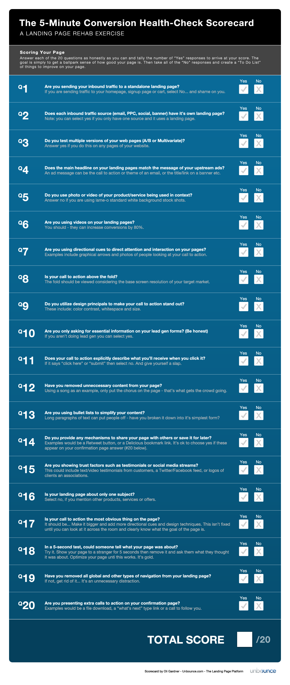
Getting started: When deciding on what to test in your first (or any) experiment, it helps to have a checklist of common problems to rate your page in it’s current state. The 5-minute conversion scorecard can help you identify any major holes in your page. Pick a page on your site (ideally a standalone landing page, but you can try it on any page as an exercise) and see what score you get. Any items left unchecked can be used as a to-do list for your first experiment.
