Design rules. Design RULES! A subtle difference, but which would you pay more attention to? My guess is the second, as it’s been crafted (albeit not very subtly) to be more persuasive. Designed.
The image above is all about design, you just need to know what to look for:
- A directional cue: shows the motion of the butterfly, by way of the trail of stars and bubbles.
- Whitespace: is shown by the lack of clutter around the subject.
- Color & contrast: are used to make the butterfly stand out from the dominant hue of the photo.
- And finally the golden spiral is utilized, where the inferred location of interaction between the subject, and it’s destination, is positioned directly on a dynamic focal point.
With that in mind, I’m taking this post old-school, to show you how fundamental design principles can be used to increase conversions on your landing pages, breaking it down into two important aspects of conversion centered design:
- Persuasive design for lead gen forms
- Persuasive design for calls-to-action (CTAs)
Part 1. Persuasive Design For Lead Gen Forms
In the first segment we’ll explore the progressive design of a lead gen form, applying the design principles of encapsulation, color & contrast and directional cues to take your form from zero to hero in three simple steps.
If you have a form on your page, it’s likely to be your conversion goal 99% of the time (if not, it shouldn’t be there), so why bury it? Your form should stand out from the rest of the page, and be designed in a way that draws your eye directly to it – in the same way the intro photo drew your attention to the butterfly. Step one of our lead gen form’s evolution is the use of encapsulation:
Step 1: Using Encapsulation to Increase Conversions

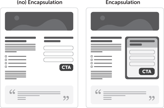
Encapsulation refers to the use of a container to highlight what’s inside. It’s a classic technique used to hijack your visitor’s eye and create a tunnel-vision effect. Think of it like creating a window on your landing page where your CTA is the view. In the example opposite, a circular arch creates a frame for the feature in the distance, preventing your eye from wandering elsewhere in the photo.
Landing page tip: Use strong dynamic shapes to constrain your point of interest. This can be seen in the progression below, where the form goes from being lost in the page, to becoming a focal element by virtue of the encapsulated area.

Step 2: Using Color & Contrast to Increase Conversions

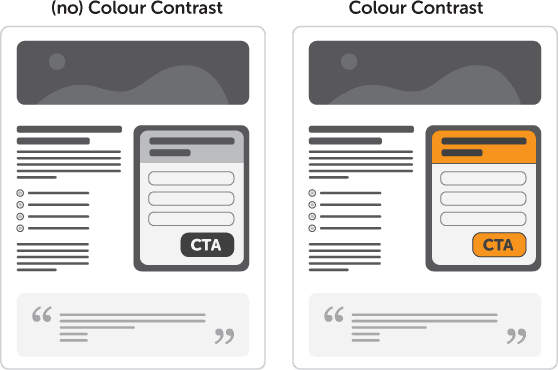
Color can be used to create an emotional response from your visitors. Orange, for example, is known to generate positive feelings and as such is a great choice for the color of your CTA. (You can also consider the positive affect of Green for go, or Blue, as the classic ‘click-me’ link colour).
The idea of using color & contrast is founded on the concept of “isolation via difference”. An “in your face” approach if you will.
Some say that button color is irrelevant, but this a falsehood. Color contrast is the real problem. Yes, red might not perform better than green under normal circumstances, but if the page is dominantly green, then a red button will naturally attract more attention than a green one.
Landing page tip: Use a single color (with a variety of tones) for your entire landing page – except for the CTA. Make it jump off the page.

Step 3: Using Directional Cues to Increase Conversions

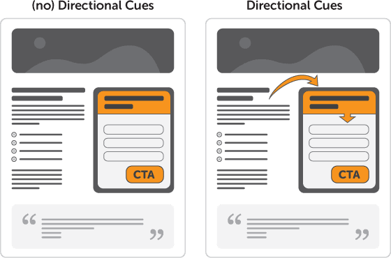
As directional cues, arrows are about as subtle as a punch in the face – which is why they work so well. With so little time on your page, guiding the user to the checkout is a smart move.
Arrows let you say, “ignore everything else and pay attention to this please.”
The example opposite shows 3 cues all at once. The arrow is a directional pointer, the man opposite is then firing you right back to the guy with the arrow using his eyes, and finally the upside-down text acts as an interruption that make you stop and stare (and most likely rotate your head to figure out what it says).
Landing page tip: Call attention to your most important page elements by using strangely placed and angled arrows. Tie a sequence of arrows together to define a path for the visitor to follow, ending at your CTA.

» So there we have it. A more effective lead gen form created using the principles of design.
See how I used arrows there?
Part 2. Persuasive Design for CTAs
Your CTA is the second most important element of your landing page – after the headline. After all, nobody will consider clicking your CTA if they weren’t coerced into sticking around to convert by a persuasive headline. Here, as in the form design section above, I like to use what I call the M.I.R.B.O principle – Make It Really Bloody Obivous.
In this second segment I’ll get more specific and focus just on two steps: your CTA design using whitespace, and your CTA copy placement.
Step 1: Using Whitespace to Increase Conversions

Whitespace (or more correctly termed blank space) is an area of more or less nothing surrounding an area of importance. The reason I say blank space is that the color of the space isn’t important.
The purpose is to use simple spacial positioning to allow your Call To Action (CTA) to stand out from it’s surroundings and give your eye one (and only one) thing to focus on.
Landing page tip: Give your CTA some breathing room to make it stand out from the rest of your design.

Step 2: Using CTA Copy Design & Placement to Increase Conversions
Finally, I want to touch on a technique that utilizes different approaches to CTA copy placement and layout to create a more powerful and descriptive button. You really want your CTA to encompass two concepts. 1) To be short and sweet and 2) to describe exactly what will happen when clicked. Let’s look at some examples:

In the first example you can see that if you need a longer description in the CTA copy, you would have to use a large button to accommodate the long button text. Not a bad thing, but not always possible depending on your overall design.
The ideal technique here is to break up the copy into primary and secondary statements, with the secondary copy supporting the primary. Examples two and three show different approaches to this: one inside the button and one outside. The choice is up to you, but they are both more effective than the first example at communicating without breaking your design.
