When it comes to conversion rate optimization and landing pages, the casual cliché “less is more” really rings true. Less distractions, less links, less “leaks” and ultimately less choice equals higher conversion rates, more leads and more money in the bank. But what does “less” actually mean?
When it comes to landing page optimization, “less” really means one.
“One Page. One Purpose. Period.” – Oli Gardner
So yes, a landing page should have one purpose – one fundamental conversion goal – but what about those finer conversion details?
Like, how many forms fields should you put on your lead gen form? Or, how many social sharing buttons should you include on your blog to maximize reach? If less is more, how much less is optimal for increasing your conversion rates?
This post will look at just that. First we’ll recap the psychological study behind choice that Oli Gardner, Gregory Ciotti & Neil Patel have referenced in relation to conversions.
Then we’ll dive into a collection of fascinating case studies – including one that has never been shared before – that look at how many options you should give your visitors.
Toothpaste & Jam: The Psychology of Choice
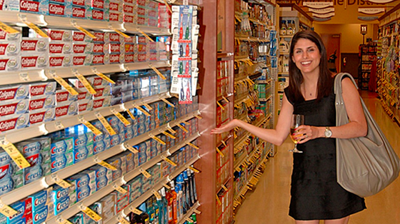
Something as simple as buying toothpaste can be overwhelming. Do you want the anti-tartar kind or the cavity-busting option? Sensitive enamel protection or the one with whitening? Fluoride, non-fluoride? Then there’s flavor: crystal mint, intense mint, fresh mint or sparkling mint – and that’s just mint.
“Too many choices can overwhelm us to the point where we choose nothing at all.”
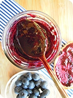
The famous jam study, conducted by Professor Sheena Iyengar and referenced in her book The Art of Choosing is often cited when the topic of choice comes up.
During multiple Saturday afternoons in a high-end grocery store, researchers presented shoppers with two alternating sampling stations – one showcasing 24 flavors of jam and one featuring six options.
It turned out that when 24 flavors of jam were available, only 3% of those who tasted the samples went on to purchase the jam. However, when there were only six options available, 30% purchased at least one jar of jam.
While the larger selection attracted more onlookers, the smaller selection actually generated more sales. The study suggests that people are often overwhelmed by too many choices, which leads to what has been called action paralysis.
So we now know that fewer options can lead to more sales in a supermarket, but how does this psychology work online? How many options should you give visitors on your online marketing platforms to maximize conversions and ROI?
These case studies will give you some guidance, but any true conversion badass will tell you to #alwaysbetesting.
How Many Social Share Buttons?
If you’re an online marketer with a blog you likely have some social buttons somewhere. At least if you want your visitors to share your content (and who wouldn’t want that?).
But have you considered that the number of social share buttons you include can have an effect on your social shares?
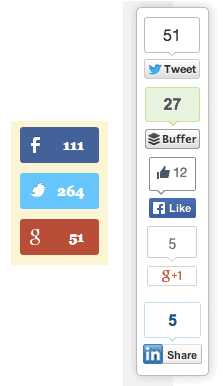
On QuickSprout, Neil Patel offered three social share options: Facebook, Twitter and Google+. Wanting to increase his total social shares, he tried adding LinkedIn and Pinterest to the list. The additional social share options actually decreased overall social shares by 29%.
This case study goes to show that your social media buttons are like mini calls-to-action; if you offer too many choices, you may confuse your readers into not sharing anything at all.
So which social share buttons should you include?
If you’re not sure how many social buttons or which social buttons will maximize your social sharing, you should start by digging into your referral traffic and audience demographics.
Referral traffic will tell you where your visitors are coming from (exclude the one-hit wonder outliers), while demographics will show which networks your users are more likely to be on (more women are on Pinterest, B2B professionals are on LinkedIn, etc).
And if you’re more or less active on a particular network, it might be important to take that into account as well. Ultimately, you should know your readers and include the buttons that are right for them, without flooding them with too many options that will impede their likelihood to share altogether.
So don’t just add whatever’s offered to you in the plugin. Choose your buttons wisely. Test, optimize and make sure you make those buttons work for you.
Maybe you don’t need any social share buttons at all
The case study above speaks to social share buttons on your blog, but these buttons are found on many many pages across the web – on landing pages, product pages, you name it. But are they always necessary?
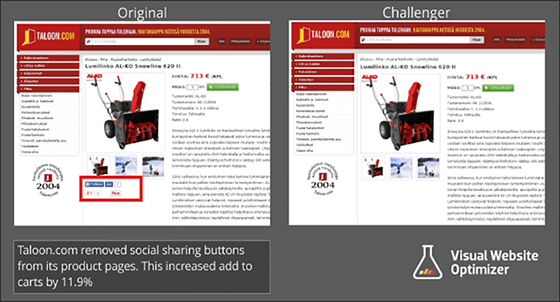
This recent case study by VWO showed how Taloon.com, a Finland-based hardware eCommerce store, increased their conversion rate by 11.9% on their product page by removing the social share buttons.
The case study boiled down the test results to two main factors:
- Lack of Social Proof: According to Taloon the number of shares on their product pages were low to zero. Joanna Wiebe sums up negative social proof this way: “A lack of a reaction IS a reaction.” She points out that it takes two clicks to tweet someone’s page or post, so if you don’t have any tweets you are telling visitors that your page isn’t worth two clicks. That doesn’t mean it’s no good, but sometimes perception is everything.
- Distraction from the main goal: Although Taloon used prominent CTAs, it was clear that the social buttons acted as a distraction from the main purpose of the page. Remember: “One Page. One Purpose. Period.”
How Many Webinar Registration Options?
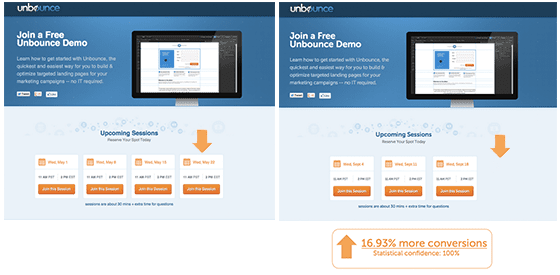
Unbounce hosts a weekly “Master Unbounce in 30 Minutes” demo. Not fully satisfied with our conversion rates, Ryan Engley, Director of Customer Success, conducted an experiment that tested the number of registration options on the landing page.
By simply reducing the number of registration options from four to three, the landing page increased conversions by 16.93% with 100% confidence.
Again, it seemed to be a matter of too much choice hurting conversion rates. Offering a more limited number of options made it easier for visitors to commit to a webinar date and ultimately convert. Keep in mind that although there are multiple CTAs on the page, there is still one central purpose.
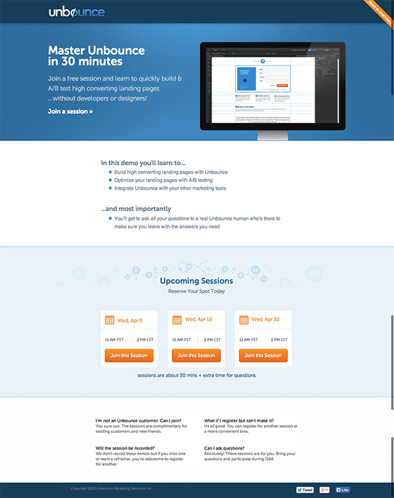
Since then, Ryan has tested 10 different variations on the landing page, improving conversions with slight changes. Below is the most current page. Although, there are several elements that are different than the first two pages, I’d like to point out the location of the social share buttons.
The previous version of the landing page had social share buttons above the fold in a very prime location, whereas the most current version has the share buttons at the very bottom of the page.
Ask yourself: How important is social sharing to my landing page? Is it worth distracting people from my main call to action?
How Many Form Fields?
Here’s the eternal question: How many form fields should your lead gen landing page have?
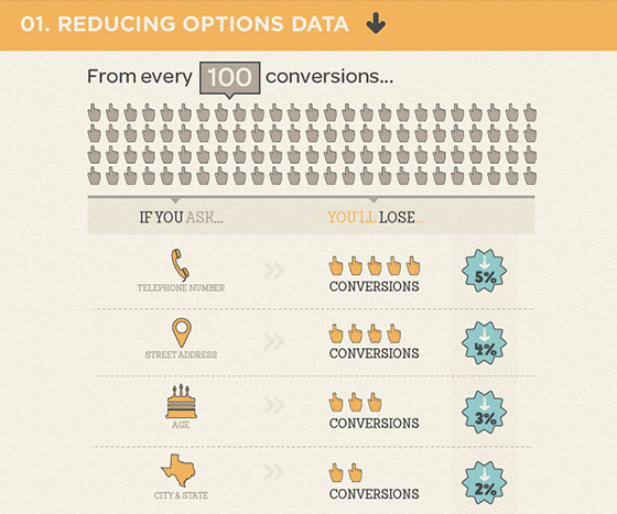
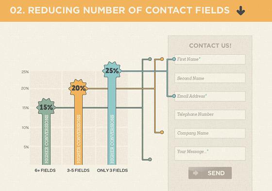
The infographic above shows that a quick and dirty way to increase conversions is to simply decrease the number of form fields in your lead gen form. Less is more, remember? ImageScape reduced the number of form fields from 11 to 4 and the number of forms submitted increased 160%, all while the conversion rate increased 120%.
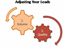
But the real question you need to ask yourself is: Do I need more leads or more high quality leads?
If your answer is more leads, then keep your form short and simple. If it’s more high quality leads, than maybe it’s time to add some more form fields.
You should also keep in mind your marketing funnel. Is this a first touchpoint? If so, you might want to stick to a few form fields. It’s like the first time you meet someone – you don’t want to overwhelm them by asking for too much information. Once you see them again – maybe they’ve downloaded another piece of your content or registered for a webinar – you can ask them for a bit more.
Again, you should always test your form fields. Not only the amount of form fields, but also the hierarchy (order) of information you’re asking for – and what you’re asking for in the first place.
Brand new case study! How asking for a phone number can decrease conversions by 52%
The University of Wisconsin-Extension focuses on online education. Their campaign goal was to generate leads for student recruitment.
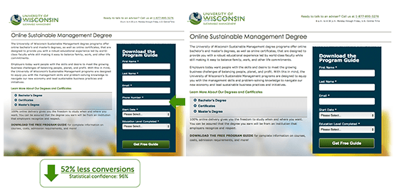
Chris Hofmann, Director of Marketing, had a hunch that requiring a phone number on a given form field was hurting conversion rates. Within 24 hours Chris was able to measure a 52% drop in conversion with a 96% confidence when making a phone number mandatory on the landing page form field.
After quantifying the results, The University of Wisconsin-Extension made the phone number on the form optional. Their goal was to get as many students as possible in the pipeline. In other words, more leads versus more high quality leads.
Again, this case study exemplifies that every conversion decision revolves around the singular purpose of your landing page.
In an older study, MECLABS tested moving the phone number field from the first step to the second and conversion rates on their lead gen form increased by 68%.
Again, testing where and when you ask for information is just as important as what you’re asking for.
Over to You
So there you have it. Several case studies demonstrating that more is less when it comes to your social shares, landing pages and form fields.
- Let me know in the comments what you thought of these case studies. Was there anything that shocked you?
- Do you have any case studies you’d like to share that embody the “less is more” conversion theme throughout the post?
Thanks for reading – I’ll see you in the comments!
