Ecommerce sites have an average cart abandonment rate of 55% to 75%. Arg. I’m not sure about you, but as an obsessive conversion rate optimizer it drives me freaking crazy. The good news is that if that is the average, there must be some sites doing a really good job – and probably don’t want to share their secrets with you.
What exactly qualifies as a cart abandonment? It’s simple enough, but asking the simple questions helps you to figure out a solution. Knowing what abandonment is and more importantly, where it’s happening, can help you develop a hypothesis to optimize your purchase funnel and get back those lost sales.
Shopping cart abandonment can be described as:
- A shopper places an item in their cart but doesn’t enter the checkout phase of the funnel
- A shopper begins the checkout process but doesn’t complete it
Below are 7 reasons that people are abandoning their carts, along with 7 ways you can use conversion optimization techniques to reduce shopping cart abandonment, and fix your broken ecommerce funnel.
Problem 1: The shopper is just browsing
Okay, you know that a lot of your shoppers are browsing or comparison shopping, so what do you do to maximize the potential of bringing them back when they are ready to make the purchase?
Let’s look at the stats:
- 57% of of shoppers that weren’t ready to purchase were there to estimate shipping costs
- 56% of shoppers aren’t ready to purchase but want to save their selection for later
Optimizing for shipping cost researchers
The fact that people are abandoning the cart once they have figured out the shipping costs illustrates a bigger problem. The shipping calculator is in the wrong place. They have no business being in the funnel at this point and are essentially poisoning your analytics. Your true conversion rate shouldn’t include these people as their intent wasn’t to purchase.
Instead of making people “hope” that they’ll be able to find out what shipping charges are at some point in the funnel, present them with a calculator right on the product page. Not only will you be creating a superior user experience, but you become established in the shopper’s mind as useful and transparent. People like to return to companies that provide them with a valuable experience.
Once the shipping cost is established, it’s the ideal time to ask them to add to cart. Knowing that your lead is still in research mode makes it important to word this request the correct way. For example: “Add this item to your cart to guarantee this shipping cost”. What you’ve done here is add an extra incentive to save the item for later.
It also gives you the opportunity to ask if your visitor would like to havereduced shipping cost if they place their order now, establishing some urgency and potentially tipping them towards an actual purchase intent.
Optimizing for “save for later” shoppers
Knowing that people like to save their choices for later, you should leverage this by once more using the right wording on your call to action. “Save for later” is very clear, and “Add to wish list” really makes it clear that you are building a shopping list, a way of saving your in a personalized location. Subtle difference in wording add a different emotive response. Taking it a step further, a wish list can be shared with others who might be looking to buy you a present.
It’s important not to limit the time that the items remain in the cart or wish list. There’s no reason to ever empty the cart, and by leaving the items in the cart you give the shopper time to make their decision.
Once an item is in the cart, you can send follow up emails (if they have an account) to remind them to make their purchase – and also to send them recommendations based on their choices.
Shoppers who add items to the cart are more likely to make a purchase than those who do not.
Problem 2: Shoppers don’t trust your site
This is an obvious one. People won’t complete an ecommerce transaction if they don’t trust you. Even if you’re a big name brand, there are ways you can improve trust factors. Remember that many shoppers are there for the first time, and there are still generations of people who didn’t grow up with the internet and will have doubts about buying online.
Here’s a crazy stupid stat:
Only 65% of brands display security information within the checkout process
» Tweet This «
Really?
Here are the standard ways to improve trust:
- Display security logos: let people know that their credit card is safe with you
- Display a satisfaction guarantee: shows that you are willing to accept returns for items that can’t always be fully inspected online (such as clothes)
- Make it easy to find customer service contact information: people with unanswered questions will be much less likely to continue
- Provide customer testimonials
Customer testimonials – and reviews
One thing the infographic fails to mention are customer reviews. Testimonials are great to establish trust in the company. Reviews are critical in establishing belief in the item being purchased. And they often feel a lot more real than a quote of someone saying “I love these guys! They deliver on their promises” yawn.
Humans are herd animals in many ways, and the power of the crowd is essential in making a purchasing decision. We’ve all done or seen someone standing in an electronics store with phone in hand, checking reviews and prices in other stores.
If you don’t have reviews on your site, people will Google for reviews and invariably land on a competitors site that does have reviews. Boom. Opportunity and sale lost.
Problem 3: The checkout process is too complicated
If it’s not easy to do, why would people bother? The solutions presented in the infographic are:
- Only ask for essential information (you’ll see a great example of this in problem 4 below).
- Minimize the amount of information on any given page.
- Require as few pages as possible to complete the checkout process.
For example, use standalone landing pages. You want to focus any given page on exactly one purpose and one purpose alone – to progress further along the checkout process.
Landing pages (good ones) have only a single purpose and a single action to make.
On a checkout page you typically have the “Next” button (the important one) and the “Previous” button to step backwards to edit information.
Here’s a tip. Make the next button big and button’y, and make the previous button small and a text link only – not a button. This is the correct visual design hierarchy, placing the emphasis on the method of progression. People like to be led, lead them as much as you can to make the process seem less complicated.
The average online checkout process includes 5.6 pages
» Tweet This «
Problem 4: Creating an account to check out is too complicated
Forcing people to create an account before checking out is utterly ridiculous. That’s the type of thing confirmation pages are for! Once they have made a purchase, they are happy and you have the opportunity to leverage this by saying something like, “checking out will be much easier and faster next time if you have an account, it just takes 60 seconds yada yada.” This way you are presenting a benefit rather than throwing up a barrier to entry.
Here’s a doosie of an example for you. Rand Fishkin from MOZ.com recently did an Unwebinar with us – you should watch it, his energy and knowledge is infectious.
In the presentation he gives an example of the massive lift in revenue by removing this barrier.
In another example, from a Crazy Egg article, Walmart does a great job of eliminating the checkout pain, giving visitors 3 options: You can login with your existing Walmart account, register now, or wait until later to create your own Walmart account. Well played, Walmart.
40% of shoppers are hesitant to create an account because they expect to receive spam
» Tweet This «
Problem 5: Shipping Times Are Too Long Or Unclear
Check out this infographic from comscore that demonstrates the importance of delivery time, shipping & returns processes.
24% of shoppers abandoned due to delivery times, did so because a clear delivery estimate was not provided
» Tweet This «
This gets back to the idea of presenting the shipping calculator up front.
Problem 6: Shipping is Expensive
If you’re thinking of different ways you can offer shipping, read How to choose a shipping strategy for your online store.
Want to offer free shipping, but not sure if it is feasible? Read this piece on How to Offer Free Shipping without Going Broke.
Think about it this way:
What would you prefer? A slightly lower margin due to reduced/free shipping which nets you 100 sales of a product. Or full-price shipping that turns shoppers away and leaves you with only 76 sales? Seems like a no brainer.
The ‘Free Shipping’ pioneers
- Amazon: offers free shipping on qualified orders over $25 and free 2-day shipping for all Prime members.
- Walmart: for the Holidays, offered free shipping on nearly 60,000 online items, including most electronics, jewelry and toys.
- Zappos, the most infamous for free shipping policies: offers free shipping as part of its deep-rooted customer service commitment that includes free shipping BOTH ways plus 365-day return policy and 24/7 customer service. TOny Hsish, Zappos CEO, treats free shipping as a marketing cost as Zappos operates under the theory that people aren’t shopping based on price, but rather on a superior customer experience, which ultimately leads to strong word of mouth marketing.
93% of customers would make more online purchases if shipping was free
» Tweet This «
Problem 7: Returns Are Complicated & Expensive
When you shop in a brick-and-mortar store, you know how and where to return your purchase if you change your mind.
But what if you are buying clothes online?
The companies that are successful doing this are those with exceptional processes for returning items.
There are simple concepts involved in doing this right:
- Celebrate your return policy! Make it one of the most dominant elements so everyone can see it.
- Include explicit instructions on how to return an item – ahead of time. Don’t assume that people will be happy to figure it out when they receive their item.
- Ship items with prepaid return envelopes/boxes. This makes it a no-brainer to order something online.
89% of shoppers indicate that they “always” or “sometimes” check return policies before buying
» Tweet This «
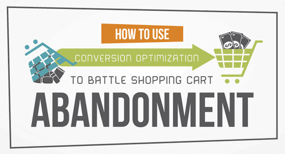
Now check out the immensely long infographic for yourself. I hope I was able to disseminate the data in a way that was easier to digest.

![]()
