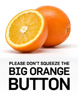
Inspired by a conversion tip from our friends at Wider Funnel, where they suggest that BOB – the Big Orange Button – is an overtly clickable button color, I thought I’d talk a bit about what the web is doing to help improve marketing’s most important element – the Call To Action (CTA).
Buttons on the web have always been a bit lame, forcing designers to find creative ways to improve the customers’ level of click desire.
Well listen up, cos it’s all about to change. Sorta. Kinda. Perhaps in a little while.
Or right away if you use the Safari web browser (sadly I don’t – I’m still a Firefox lover).
I’m talking about Radioactive Buttons!
The folks over at Zurb.com have come up with some pulsating and vibrant buttons that really don’t suck. And I quote: “Using CSS animations in Safari, we’re able to turn an otherwise ordinary button into a glowing, radioactive mess of awesome.”
As you can tell, you need to be using Safari for the full effect, but they still look pretty decent in other non-Microsoft browsers due to the rocking colors. Hopefully the other browsers will catch up shortly and you’ll be able to add big, shiny, glowing buttons to your landing pages.
The important takeaway from this is that they are created purely with CSS (that means no images to cut up) – so once you’ve followed the instructions on how to code it up you’re good to go. (See the links at the bottom of this post for more details on how to do it).
Keeping the Customers Eye on the Prize
While I wouldn’t advocate using 26 buttons on one page like that example, I do know that being able to draw your customers eye to your most important interaction point is a great way to improve your conversion rate.
Conversion Optimization Tip #29
“Have you tested a Big Orange Button? We call him BOB. He works hard.”Chris Goward
Wider Funnel
The Power of The Big Orange Button
I think the image at the top of this post speaks for itself. It’s big, juicy and delicious and if it doesn’t make your mouth water just by looking at it, then you’re probably color blind. In which case you might have spent your life thinking there was a fruit called Purple.
According to Wikipedia, Orange represents energy, enthusiasm, and a ‘get-it-done’ attitude. Sounds like a call to action to me.
Get it done. Click.
Want More Awesome CTA’s?
Smashing Magazine has a couple of posts on the subject, including a new and more in-depth article by the guys from Zurb.
