No matter what you call them – About, About Us, Meet the Team – website About pages are important. Really important.
If you’re surprised by this, don’t be. Your About page is a primary connection point for customers. It’s a place where they can not only find out more about what makes you, your business, or product tick but more importantly, what you can do for them.
Which is why this often overlooked page needs to be a copywriting tour de force.
Your About page should be a conversion-friendly hub where your visitors are directed to shop, jump on your email bandwagon or begin a free trial – all after being informed and inspired. If you’re not using your about page to convert customers, you’re losing out.
Fear not those of you with less than stellar About pages. Here are a few things you can work on to make your About page anything but a waste of space.
It’s Not About Me, It’s About You
“I invented, ‘It’s not you, it’s me.’” -George Costanza
Making it all about yourself doesn’t work so well when you’re trying to break up with someone. Same goes for trying to get with them. On your About page, that is.
The reality is that most people – your mother aside – don’t care how great your business is. That isn’t to say that visitors to your site aren’t interested in knowing you’ve got the skills to back up your services or that your products are universally loved. They simply want to know these things in the context of how it will best serve them.
So, how do you do that? In a word, framing.
The way you frame a statement or argument, even a question, has an impact on how people perceive it. Psychologists Kahneman and Tversky (1981 study) found that by altering the way they phrased questions about the risks of various treatments of a deadly disease, they could influences the choices people made.
Basically, people were given a choice between two possible outcomes, both of which were the same. Only one was framed positively and the other negatively:
- “A 33% chance of saving all 600 people, 66% possibility of saving no one.”
- “A 33% chance that no people will die, 66% probability that all 600 will die.”
72% of people chose option #1 while only 22% chose option #2. While this example speaks to risk aversion, the concept of framing has been shown to affect decision making and attitudes in various other contexts.
The big takeaway?
Use your About Page copy to tell visitors how your product or service will be able to benefit them. Keep bragging rights to a dull roar and think about framing everything you’ve accomplished in a way that will positively impact your customers.
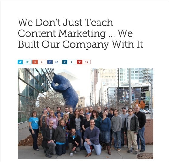
Take a look at Copyblogger’s About page. They do a terrific job of framing their story within the context of providing value added to their readers and customers.
They tell you how the company came to be and why they’re experts – without losing sight of what’s in it for you, the visitor. It makes taking that next step towards joining their email list or buying one of their products much smoother.
Value Propositions Aren’t Just For Home Pages
Value propositions, or as I like to call them, “reason for being” statements (raison d’etre en Francais), are your chance to tell your visitors clearly and concisely what’s on offer and why they should care when they land on any given page.
They are your primary headlines – your opportunity to grab people’s attention, tell them how you’re going to solve their problems and make it worth their while to read on.
Don’t make your headline “About,” “About Us,” or any variation on the theme.
Provide a better reason for your visitors to move down the page and do it in a way that gets to the point while still being compelling.
Remember, people have very limited attention spans, not to mention time. If you force them to think too much about what they’re looking at, chances are they will move on.
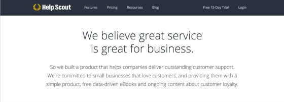
Here’s Help Scout’s headline and sub-headline for their About page.
The crux of their value proposition is the importance of customer service to business success. Not terribly unique.
But they combine that with the fact that they have created a product along with free content that can help other businesses with customer service. Suddenly it’s a lot more intriguing to keep reading down the page.
I also love the conversational aspect of this About page copy – how the sub-headline responds to the headline, preventing the value proposition from sounding trite.
A Little Personality Can Go A Long Way
People often make decisions based on their emotions and then justify them with reason after the fact. To demonstrate this, researcher and neuroeconomist Paul Zak presented study participants with a short, sad story about a father and son.
Zak found that the story produced the neurochemicals Cortisol and Oxytocin in the subjects and that the release of these chemicals, which are associated with distress and empathy, increased the degree to which individuals were willing to make a charitable donation.
The people being studied were not aware that these chemical changes were occurring or that they influenced their decision-making. But they did.
Does this mean you should be telling sad stories to sell your products? Probably not.
But, by infusing your About page copy with an element of emotional storytelling you can create a connection with your visitors. Stories engage the brain in a way that mere facts don’t, inspiring people to take action.
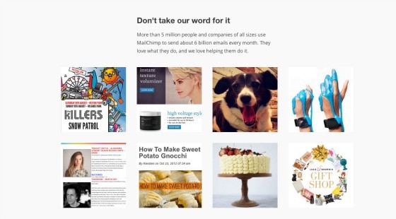
Think about MailChimp, the email marketing plaform. Their product can be considered quite boring but they’ve built their brand messaging on a fun, conversational style.
Looking at MailChimp’s About page, you can see it not only discusses the benefits of the services they provide and who they serve but also the story of how the company has created value in its hometown of Atlanta. The About page grounds their work in the lives of real people.
How do you know what kind of personality works for your brand?
It’s all about the tone in your writing and making sure your copy matches the values of your business and the expectations of your target market.
This is where spending some time doing a bit of qualitative research will serve you well. Conduct surveys and interviews with your current and past customers. Ask them questions about how they would describe your product or business.
Check out services like Qualaroo, Survey Monkey and Typeform for generating questionnaires.
Then, think about how you want your brand reflected online and see where the two intersect.
Tell People What You Want Them To Do
With every set of eyeballs that lands on one of your pages, you have an opportunity to move them further through your sales funnel. Your About page is a perfect place to shuttle people along towards the next step you want them to take.
After giving visitors a multitude of reasons to believe in your company’s abilities to provide them value, take them by the hand and make it painfully obvious what to do next.
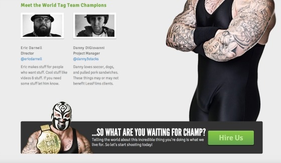
Less Films, a video production company, has a crystal clear call to action at the end of their About page. They use a high contrast color for the CTA along with copy that makes it apparent that the next thing you should do is contact them.
Decide what action your want people to take when they get to the bottom of your About page. Consider running an A/B test on your call to action copy to determine how you can make it more effective. Should you change what you’re asking them to do, or simply how you’re asking them to do it?
Sometimes More Is Just More
As human beings, we can only handle processing so many things at once. Subjected to various fonts, flashing images and complex page formats, our brains suffer from cognitive overload. Basically, we are limited by what we can take in at any one time.
Take a look at Vertical Response’s About page quickly and see if you can recall anything other than the fact that they have won a few awards.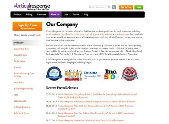
Back in 1956, the psychologist George Miller hypothesized that a person’s short-term memory could only hold between 5-9 chunks of information (groups of letters, faces, etc.). More recent studies have shown our limits to be even lower: 2-6 chunks.
When we’re presented with a myriad of distracting elements on a page our brains have a very difficult time remembering what we’ve just seen.
What’s the lesson here?
Stuffing your About page (or any page) with dense patches of text or graphics will make it difficult for your visitors to figure out what they need to do or get from your page.
Reduce cognitive load whenever possible by doing things such as overlaying explanatory text onto a graphic so that the viewer doesn’t have to move back and forth between the two.
See John Sweller’s research into Cognitive Load Theory and how it affects learning and instructional design.
And try to break up your About page copy into small, easily digestible chunks with appropriate sub-heads. Your visitors will thank you by not hitting the back button immediately.
Tiny Blue Orange, a web design and development company, does a nice job of using headings and short punchy paragraphs to keep the eye moving down the page. The inclusion of high quality images along with just the right dose of personality gives this About page a compelling twist (get it?).
Putting It All Together
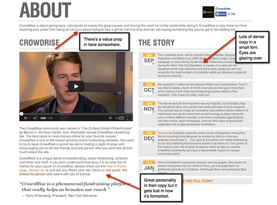
Let’s pick apart an About Us page to see where it’s lacking and how we can make it more effective. Crowdrise, an online platform that enables individuals to raise money for their favorite charities has an About page that could use a little help of its own.
Just looking at the top half of the CrowdRise About page (the bottom not shown), we see loads of densely packed text in a too-small font competing for attention.
We can’t miss that we’re on their About page with that giant title but with no easy to read, compelling headline we’re left asking ourselves a big, “So what?”
What can make this About page copy better?
Well, let’s piece together everything we learned in this post:
- Create a solid value proposition and implement it in the form of a headline and sub-headline at the top of the page. An alternative might be:
Join the crowd
And have a whole lot more fun raising money for charity than you thought possible - Break up the copy into smaller, more manageable chunks – use bullet points and sub-headlines to help with this
- Integrate “the story” into the other copy in a way that tells potential users how Crowdrise can benefit them
- Decide where to direct visitors – choose between “How it Works” a “Contact Us,” highlight the copy and make it a more compelling CTA to click
Keep in mind that these are all just suggestions. Remember that every landing page, website and business is different. What works for one marketer may not work for another. Do your research then test, test and test again.
Are you ready to turn your About page into a conversion hub?
(top image via Amazon)

