According to a study by Google, it takes between 1/50th and 1/20th of a second for a user to judge whether a web page is “beautiful” or not.
To put that in perspective, 1/50th of a second is about the same amount of time it takes for a popcorn kernel to pop.
Now, it’s clear that “beauty” (or beautiful design) plays a huge role in the landing page optimization process beauty has been the subject of many existential debates across the centuries.
So how do you make your landing pages “more beautiful” when beauty is so subjective? It would be arrogant to claim I have the secret but my guest post landing pages do convert at over 15%, so I might be on to something.
Proof:

What it all comes down to is some smart research and a willingness to think beyond the immediate product offering.
I’m going to take you down the rabbit hole of my landing page design process. Stay with me. You’re going to come away with some super actionable steps for optimizing your landing page design.
What Are Your Customers Interested In, Really?
I have a theory: people look at their computer monitors the same way they look at their TV screens. What we’re interested in when consuming media for entertainment speaks to our interests as online
consumers.
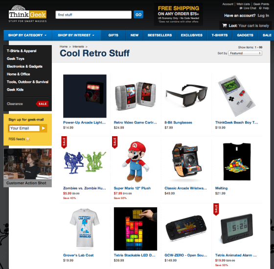
For example, I have a sweet spot for Nintendo-era video games. So websites that appeal to my 8-bit sensibilities automatically have a chance of grabbing my attention. This product page on ThinkGeek is a no brainer:
But it’s not always so neat is it? Sure, a product page with 8-bit knick-knacks is cool, but how could you tap into my interest for retro gaming to sell something like software?
This gem of a campaign by the folks at Grasshopper does a brilliant job of marrying my love for 80’s nostalgia and business.
Now, sadly this video doesn’t exist on any sort of transactional landing page, but it begins to scratch the surface of how to package a pitch in a way that is unique and entertaining to its target audience.
What does this have to do with landing page design?
Well, when I approach landing page design, I ask questions like:
- What movies are my ideal buyers into?
- What kind of music do they like?
- What kind of stories do they read?
- What’s their favorite television show?
The answers to these questions all give perspective on the visual language and overall tone that’s necessary to grab and hold my visitor’s attention.
This allows me to go beyond standard landing page optimization and design techniques to build a landing page that’s both unique and familiar to my audience.
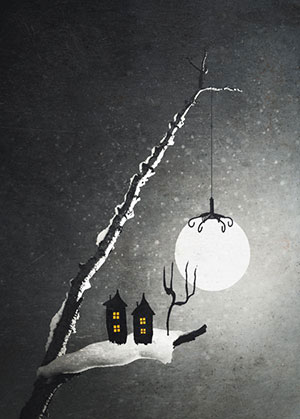
For example, if I were asked to design a landing page for this piece of art on Displate.com, I’d first ask who might be the most interested in this piece.
- People who like Tim Burton films?
- People who listen to Evanescence?
- Twilight fans?
- People who like the movie Coraline?
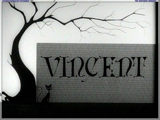
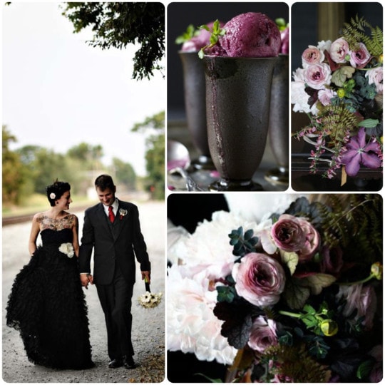
Using these pieces of media as a baseline, I could experiment with a visual style to present the offer in a unique way. Here are just a few images that may guide those design decisions:
When we design our landing pages, we get so caught up in the way to present our products, or what our competitors are doing, that we forget to design for the people who we’re trying to reach.
Let me show you how I’ve done it.
How I Get Over 15% Conversion Rates on My Guest Post Landing Pages
Here is a screenshot of the landing page that has the 15.35% conversion rate I was showing you earlier:
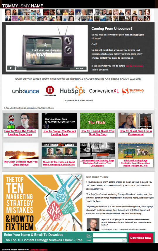
I know, I know. In many ways, it violates landing page best practices. The call to action is at the very bottom of the page , there are way more things to do than sign up via email, and there are lots of elements asking for your attention.
But, what this page does do right is it:
- works within a color palette that I know Unbounce visitors will find appealing
- uses imagery that I know visitors will find “interesting”
- acknowledges that visitors are coming from Unbounce
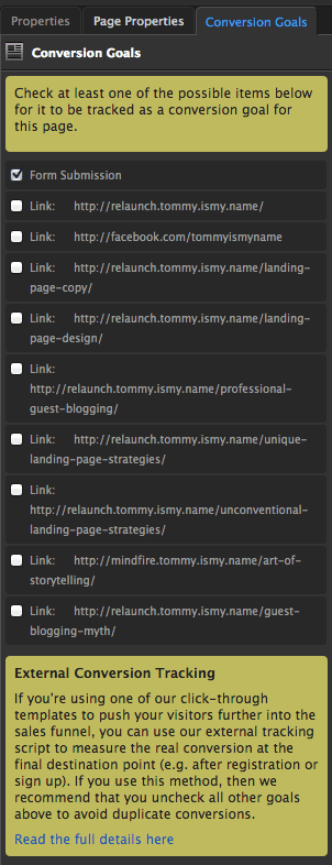
Just to make sure you don’t think I’ve inflated my conversion numbers by tracking multiple conversion goals:
I know the screenshot doesn’t really prove anything, so I guess the next best option is just to tell you what kind of research I did to arrive at this design.
Enter Facebook’s Graph Search
Just a moment ago, I said the page used imagery I knew Unbounce visitors would find appealing. How could I possibly know that?
Well, I believe that a person’s movie preferences say a lot about them.
Think about it. You pay insane amounts of money to sit in a dark room and stare at a screen with a bunch of strangers while you all watch other adults play make believe for the duration of the film.
More importantly, each movie has a signature visual style, language and sound that had enough of an impact on you that you went home and “liked” it on Facebook.
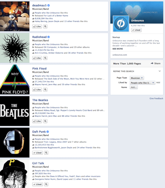
Thanks to Facebook’s Graph Search, I can search for Movies Liked By People Who Like Unbounce:

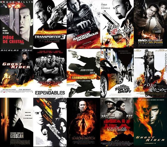
What does this have to do with landing page design? Well, scroll back up to the landing page from earlier, then take another look at the movies Unbounce fans (that’s you!) like in common.
Fight Club, Inception, The Matrix… each of these movies has a similar visual language. And they all have a certain “mind hacking” not-everything-is-as-it-seems aspect to them.
I know what you’re thinking. Whoa.
That’s right. Using what I know about Unbounce fan’s movie preferences, I used the color schemes that tie these movies together to design my guest posting landing page.
I also deliberately included links to other posts that allude to the world not being exactly as it seems (guest blogging myths, unconventional landing page strategies, etc).
If I wanted to go deeper I could discover the music that Unbounce fans like and use it to score the video on my landing page.
Daft Punk, deadmau5, Girl Talk. Looks like an upbeat, electronic soundtrack would probably resonate with y’all.
Why I Believe This Works
According to research in the area of memory formation, when new information enters your brain, your brain essentially asks, “Do I already have some information on this?”
If the answer is “no”, your brain has to make a conscious decision to make room for the new memory and that’s best done through repetition and associating it with other familiar elements in the brain. Ain’t nobody got time for that.
By incorporating familiar movies, music and other relevant elements into my landing pages, I’m laying the groundwork for my customers to be open and receptive to my offer.
But honestly, this isn’t anything new. Hollywood’s been doing it for years:
Now, you may be thinking to yourself, “Yeah, but that’s for a guest post landing page, what about my landing page? while I’m not at liberty to share my clients’ results, I can tell you that this works just as well for PPC marketers with conversion-oriented landing pages.
Action steps
- Go to Facebook Graph search and type in “Movies people who like [your or your client’s Facebook page]” Like. Do this with your competitor’s pages as well to try and get a sense of the overall market. Also search for music, books and TV shows to get as complete a picture of your customers’ consumption habits as possible.
- Try and find a common theme. In my example found a trend toward mind-bending action movies and electronic music. You may find that your customers are health conscious or politically minded or into dumb humor. It’s different for everyone, but finding the theme once all that information is in front of you is easier than you’d think.
- 3. Look for outside inspiration. Once you find your themes from mainstream media interests (movies, music, books, etc) use Google to find additional sources of visual inspiration that share the same theme. Searches such as “Movies Like ____” or “Artists like___” in Google Image search will yield all sorts of fun inspiration.
Pretty cool, right? Or do you think I’m crazy? Let me know if you have any questions and I’ll be sure to answer them in the comments below :-)

