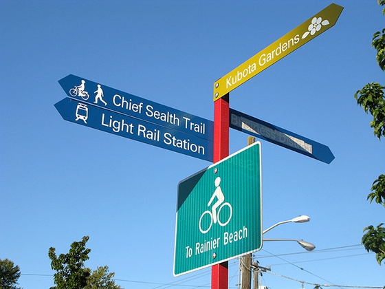
To successfully travel from point A to point B in the real world, we rely on a wide variety of cues from our physical environment for help. Good signage prevents us from getting lost. It helps us reach our destination quickly, economically or easily.
Good signage, then, is like a great tour guide. Great tour guides inform people of where they came from, where they are now and where they’ll go next.
Marketers are like tour guides, except we call our tours the customer’s journey to purchase.
And just like in the real world, we rely on a series of wayfinding conventions – familiar visual cues – to guide our “tourists” towards the goal.
Here’s how you can use wayfinding conventions to help guide visitors toward the goal, create better experiences and increase conversion rates.
What are wayfinding conventions?
Wayfinding conventions are essentially rules and symbols that help us orient ourselves. They help us figure out where we are and what paths are available to us.
In the real world, we rely on cues such as street signs, traffic lanes, crosswalks and building numbers. Many of them are so ingrained in us that we only notice them in their absence.
Try the exercise below.
What might the rectangle below represent?

Not sure? How about now?
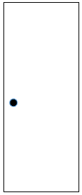
Okay, so it’s a door.
So, why did Figure A fail to do its job as a door?
Because most objects, like buttons on a landing page, have two jobs:
- Job #1: Act like a door by opening and closing to provide a path between two divided areas
- Job #2: Look like a door by using standard dimensions, symbols and affordances (such as a doorknob) expected of a door
These are wayfinding conventions.
Don’t make users think
The cost of Figure A failing to look like a door is that it makes us think (see: Steve Krug).
It disobeyed those rules that doors tend to follow, and would lead to an awfully frustrating experience for anyone in need of a bathroom.
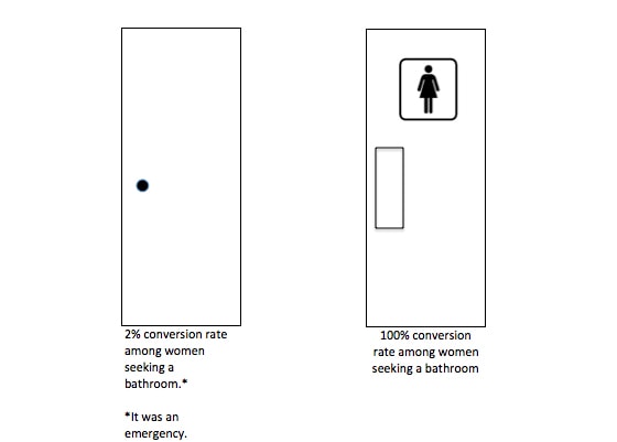
When you make users think, you create friction and you reduce conversion rates.
Effective conversion optimization moves user from confused to informed, from frustrated to relieved and from lost to inspired. It optimizes for action.
To optimize for action, your landing pages need to include cues that acknowledge where users came from and where they should go next.
Use position and color to establish priority
Position and color, or structure and style, are among the first elements you should test on your landing page. They help impatient visitors understand what they can and should do as quickly as possible. Color and position establish visual priority.
Consider, for example, exit signs. Where are they located in a movie theater? And when you imagine an exit sign, what does it look like?
Probably something like this:
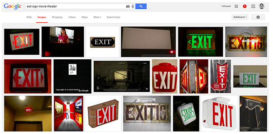
You immediately know where and what to look for.
That’s because exit signs use wayfinding conventions. They’re typically all caps, right? And they share that same exit sign typography and they’re almost always well above eye-level.
The same applies to your landing pages. Good cues provoke action, but they also help you call attention to page elements that are most important.
Evaluate your landing pages with this guideline.
What is the main goal of your landing page? Do all design elements support that goal? Do your buttons look like buttons? Do they contrast with the rest of your page and beg to be clicked?
A poor example of color and position
Consider the first step of investment company Vanguard’s onboarding process.
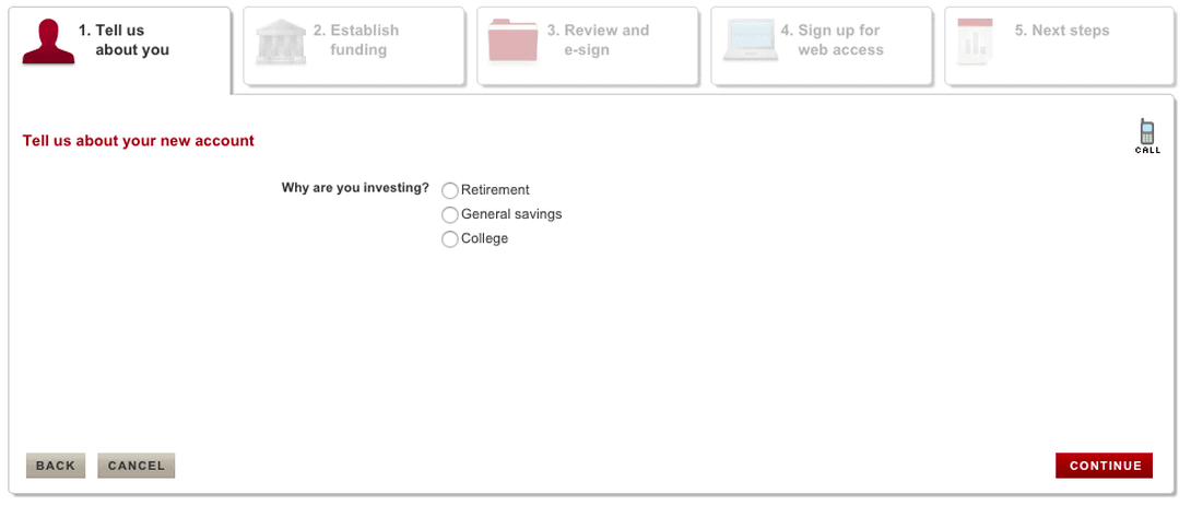
Three gradient buttons tell us there are three actions that we can perform: go back, cancel, or continue.
But, there are a few issues:
- The “Continue” button is isolated from the radio button inputs. Don’t make users search for a way to proceed. Buttons should be positioned in a way that allows users to immediately send their information, which is often at the bottom or to the right of inputs.
- The step labels raise questions. Why is step #5 labeled “Next steps”? I thought the last step in the flow would be, well, the last step. You’re telling me there’s more? If elements of your landing page prompt questions, either answer them immediately or cut them from the page.
- Counter-intuitive colors. We connote red with stop, pause, caution, and danger. And blood… JK. ;) Using a red button to “Continue” makes users stop, think and actually read the label of the button before proceeding.
A better example from Netflix
Netflix’s design incorporates a lot of red, but their landing pages do a better job of using color and position effectively.
The page makes it immediately clear where I should click to continue.
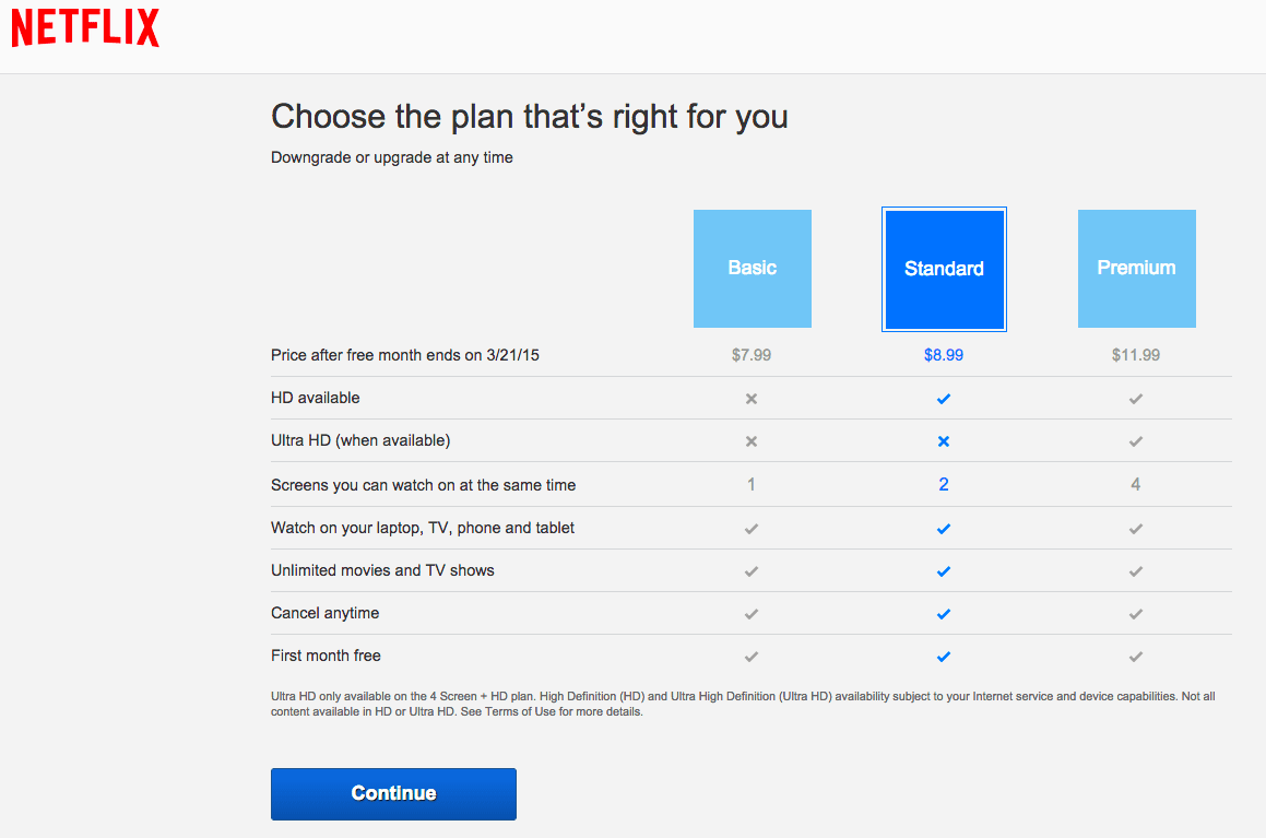
Where could this page be improved?
Use clear, descriptive button copy
In the example from Netflix above, “Continue” fails to explain where the user will go after clicking.
Good button copy communicates to users what’s behind the door, or where their click will take them next on the tour. It needs to be transparent and anticipate (and answer) any questions the user might have:
- What will happen if I click?
- Will you let me learn more by downloading a PDF, or do I have to request a sales demo?
- Will you ask for my credit card information, or can I just start my trial without one?
- Is this form 1 of 1, or 1 of 4?
Avoid using buttons with mysterious or misleading outcomes.
Instead, opt for precise language, such as “Request Demo” over vague language such as “Get Started.”
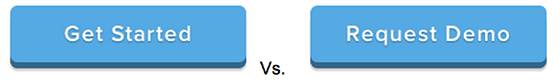
“Get Started” may be more compelling, but it’s also misleading and likely to deliver a frustrating user experience when I realize I can’t actually get started right now (and instead must request a demo or contact sales).
Most importantly, it’s a missed opportunity to build trust.
To optimize for trust is to optimize for profit, not clicks.
Become a great tour guide (get out of the way)
The best tour guides are are often the ones that you don’t remember. They let the tour – the experience – do the work. Their voices don’t distract you from the city’s history and their pace is just right. It neither exhausts nor bores you. It’s all just right.
Similarly, using wayfinding conventions help to create an experience where the visitor forgets that there is a marketing and development team behind-the-scenes, hard at work trying to create a frictionless experience.
They don’t remember how many steps they took to create an account or complete a purchase – they just know that it was really easy.
And that’s what they’ll tell their friends.
Over to you – which wayfinding conventions do you use on your landing pages to help users find their way?


