When smart marketers design landing pages, they follow the principles of Conversion-Centered Design, which are focused on guiding the user toward completing an action that serves a single business goal.
But in the process of corralling as many conversions as possible, it can be easy to lose focus on the needs of each individual user. If people have a terrible experience on your landing page or at any step of your campaign, you’re gonna have a bad time when you start counting your conversions.
That’s why all marketers could stand to learn a little bit more about user experience (UX) design.
Depending on who you ask, you’ll get entirely different answers for what UX design means, so let’s keep it simple: it’s designing the way users interact with and consume content, and is concerned much more with how a design works than how it looks.
Whereas Conversion-Centered Design persuades users to take action, user-centered design seeks to enable users to accomplish those actions as easily as possible. Ideally, both of these design philosophies should lead to the same endpoint: the user gets what they want, and the business gets what they want. Everybody wins!
Ready for more win-win scenarios in your marketing campaigns? From mobile modals to the science of clickability, here’s some of the best content in the UX community right now — with some campaign-specific takeaways just for you.
1. How to Create UX Personas by Gregg Bernstein for UX Mastery
Meet Jane. She’s in her late 20s, lives in New York City, and tends to use her phone more than her laptop to access the web. She’s a manager at a small boutique that is looking for tools to help her manage her inventory without breaking her budget.
She also doesn’t exist. She’s a persona, a fictional character meant to serve as a stand-in for a segment of the market that shares specific traits.
Personas are one of the backbones of modern marketing. By creating personas and targeting our campaigns toward them, we can deliver focused messaging and offers rather than just targeting everyone and hoping it works out okay. A landing page designed with Jane in mind is going to look a lot different from a page targeted at someone in their 40s who isn’t technically savvy.
Both marketers and UX designers use personas to better understand the needs, desires, limitations and even the personalities of our audiences. UX designers use this information to design products that are frictionless and fun to use; we can do the same for our marketing campaigns.
This three-minute video from MailChimp’s research manager, Gregg Bernstein, illustrates a great persona framework for marketers and designers alike.
2. Modals on Mobile: How to Use Them Wisely by Chris Wigley for UX Magazine
Overlays (also known as modals) have been in the spotlight a lot recently. Once largely relegated to the realm of interface design, they’re now a mainstay of lead generation campaigns. In particular, exit overlays — which trigger only when the user’s cursor moves to close the tab — have been shown to have hugely positive effects on landing page conversion rates.
Despite their efficacy, opinion is pretty split on whether these overlays provide a good user experience. A poorly designed overlay can transform into an unconscionably bad user experience, especially on mobile.
In this piece for UX Magazine, Chris Wigley highlights the pitfalls of not redesigning your modals for mobile, and starts off by pointing out that these things are really not designed for one-handed interaction.
Since the close button is usually in the upper-right of the screen, reaching it with your thumb can be tough — especially as phones get more gargantuan every year. Worse, the consequences of tapping in the wrong spot can be frustrating:
Upper right placement of the close button also increases the likelihood of the dreaded accidental refresh (when I fat-finger the refresh button instead of the close button because they’re both so small and on Safari they’re right next to each other).
(If this seems like a detail that never would have occurred to you: welcome to the wonderful world of user experience design!)
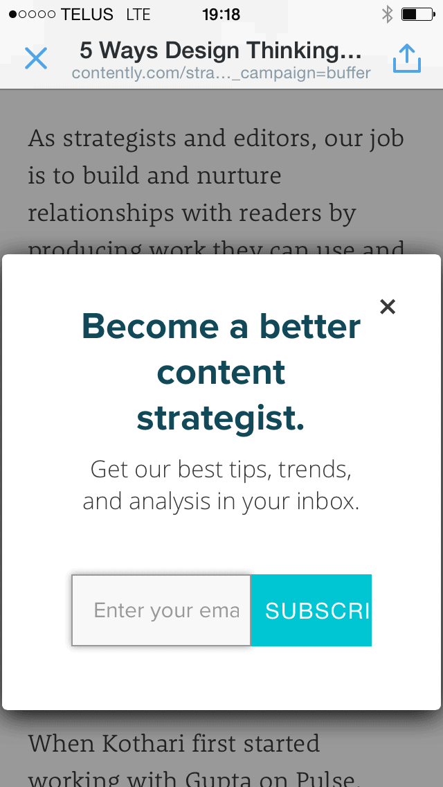
Wigley recommends exercising caution when using modals on mobile, and I’d recommend the same. Just look at this overlay I got from Contently on my phone the other night:

Thankfully, the close button was low enough to reach one-handed, but looking at the email field and submit button, it’s pretty clear that nobody thought about making sure this modal was a good fit for mobile.
Check out the full piece at UX Magazine for more smart overlay advice.
3. Beyond Blue Links: Making Clickable Elements Recognizable by Hora Loranger for Nielson Norman Group
Whether it’s opening a page or submitting a form, the click is the action that conversion-centered marketers hold above all else.
Beyond Blue Links: Making Clickable Elements Recognizable begins by tracing the link back to its humble blue-and-underlined origins, and goes on to highlight the consequences of the enduringly-trendy flat movement, which abandons simulated dimensionality (bevels, gradients and shadows) in favour of a purely-digital look that focuses on typography and flat colors.

While flat design may be a bit easier on the eyes, it comes with some serious tradeoffs. As Hoa observes:
The idea behind flat design is to simplify the interface. However, stripping away too much undermines this objective by making the interaction more complex. A major issue with many flat designs is that one of the strongest clickability signifiers — the 3-dimensionality — is removed from the equation. Textures that users were long relied upon for cues are stripped away, making it difficult for users to determine what is clickable and what is not.
I don’t know about you, but anything that includes the term clickability signifiers gets my blood pumping. (It’s a real problem and my doctors are at a loss to do anything about it.)
Conversion-centered marketers have known for a long time that making interactive elements stand out and appear tactile has a very real impact on conversions, but this article breaks down in stunning detail exactly what it is that makes something irresistibly clickable.
4. Why Great Web Design Needs Great Copywriting by Jerry Cao for Creative Bloq
Compelling copy is the cornerstone of a high-converting landing page — that’s why we always advise that you write your page’s copy before you start designing it.
That’s an idea that’s gaining a lot of steam within the web design community, too. UXPin’s content strategist Jerry Cao makes the case in this piece for Creative Bloq:
Regardless of whether you use a copywriter or not, the important thing is that your design factors in the writing earlier rather than in the later stages.
Jerry explains that there are two main reasons that you want to incorporate copy very early into the design process:
Reason #1: Copy dictates the tone and personality of a page
It would be pretty weird if a page with somber, somewhat cautious copy was matched with a design that was colorful and fun, right? But that’s exactly what can happen if you design a page before you’ve seen the words that go into it. Cao writes:
Phrasing, tone, and word choice all affect the personality the site design exudes … It’s not enough that the tone match the visuals – the tone has to match the product as well. The writing is, after all, the product’s voice.
Moving copy to the top of your priority list will help you ensure from the beginning that the messaging and visuals both work to best represent the campaign you’re developing.
Reason #2: Copy must be “designed” so that users actually read it
Compelling copywriting is about more than just the words themselves; it’s also about how those words are structured. As Cao writes:
It’s now common knowledge that users will not read every word on your site, and the more blocks of text they see, the more likely they are to scan for what they’re looking for.
Copy has to be laid out in such a way that optimizes readability and pairs the right words with the right visual elements. But how are you going to do that when your copy is some latin gibberish?
When designers and writers work concurrently with each other, it can make the process feel more complicated, because each is adjusting their work based on the feedback of the other. But the result is almost always better.
Continue reading at Creative Bloq for more tips on integrating copy into the design process.
5. Why You Should Ignore UX Best Practice by David Mannheim for UX Mastery
Perhaps it’s just me, but there seems to have been an increase in scrutiny toward so-called “best practices” over the past few months. That’s probably due, at least in part, to recent high-profile failures of best practices.
Crocheted birdhouse emporium Etsy found that their users wanted more results per page, and they wanted those results faster. So the team at Etsy did the obvious: they started testing an infinite scroll implementation, so that users could simply continue scrolling to see more items. Surely a big UX win, right?
Not so fast. In an article for UX Mastery, conversion rate optimizer David Mannheim breaks it down:
The team knew that this is what users wanted, and the user need was backed up by research. Surely this exciting new feature was embraced by the subset of users involved in the test?
Hardly.
Etsy discovered that:
- Visitors seeing infinite scroll clicked fewer results than the control group
- Visitors seeing infinite scroll saved fewer items as favourites
- Visitors seeing infinite scroll purchased fewer items from search
The thing about best practices is that they’re actually just assumptions based on someone else’s success. And you know what they say about assumptions!
(They say you shouldn’t make them, because claiming something is true without evidence could cause you shame among your family and/or peer group if those claims turn out to be unfounded.)
Now, I’m not advocating that you start breaking every rule in the Conversion-Centered Design book. Keep your visually-prominent buttons and your directional cues — we know they work.
But go crazy with testing out new ideas instead of simply following what other marketers are doing. Just because something worked well for someone else doesn’t mean it will work well for us, too.
Learn more about how breaking the rules is cool in the full article.
Broadening your horizons
Every single marketing campaign includes aspects of graphic design, UX design, copywriting, data analysis, SEO, CRO and countless other marketing disciplines.
While I’d never recommend one dedicate their energy to becoming a jack of all trades yet a master of none, staying abreast of marketing and technology trends, regardless of whether or not they’re your specialty, can only serve to make you a better marketer.
After all, if you never peek your head out of the box, how can you be expected to think outside of it?


