
We’ve all had it happen to our ecommerce email marketing. You meticulously craft an email campaign that’s gonna help you sell a ton of products. You build a beautiful HTML template, write engaging copy, and A/B test your subject line. You implement an obvious and compelling call to action.
And after all that work, the ecommerce landing page that your email directs folks to has a high bounce rate—or worse, a low conversion rate.
What gives?
It could be that your emails are writing checks your click-through destination can’t cash. If you send out a 15% off promotion for dog treats and link your audience to someplace with no mention of the discount, visitors are gonna be confused—and they’ll lose interest in a hurry.
Bottom line: Failing to match the messaging in your email with the copy and visuals on your landing page will hurt your conversion rate.
Maybe you already know it’s a problem, but you feel like you don’t have the resources to pair all of your offers with campaign-specific pages. Fortunately, there’s an easy fix. Here’s why you need to match your emails to your landing pages in your next ecommerce campaign, and how you can do it really, really well.
- Why email recipients aren’t buying what you’re selling
- Why every ecommerce email should have its own landing page
- How to match your emails and landing pages to maximize conversions
- Examples of effective email and landing page pairs
- How *not* to message match your ecommerce emails
The Real Reasons Your Email Subscribers Aren’t Buying
Let’s be honest. Sometimes in marketing, you can get away with doing less—and that’s a problem.
Email marketing offers some of the best ROI in the business. When you’ve already got someone’s email address, you can expect them to open 14% of the emails you send, with click-through rates just under 7% overall. Estimates suggest that there’s $44 of revenue generated for every dollar spent on email marketing.
With stats like these, you can just half-butt your ecomm email promotions and still do pretty good, right?
Not exactly. If your emails are paired with landing pages that have high bounce rates or low conversion rates, you’re not just leaving money on the table—you’re also bombarding your potential customers with marketing that just doesn’t resonate.
Here are some of the common reasons email promos underperform:
1. Your storefront product page isn’t enough
Data indicates the average bounce rate is 9%, even with load times of less than two seconds. If you’ve seen higher bounce rates on the destination page of your email promos, it might be that you’re not linking to a relevant enough page in the first place.
Your online store’s product pages are specific no-no’s for this purpose. They’re often short, lack details mentioned in your email, and don’t create a consistent experience from click to click.
2. You’ve got too many escape routes
Another problem with your online store’s product pages is that it’s too easy for customers to get distracted and leave. Think about all of the escape routes: website menus, product navigation, highlighted deals that have nothing to do with your email.
Your ecommerce landing page needs to be built as a distraction-free, conversion-optimized funnel. Always encourage your customers to go forward, not sideways.
3. You’re a victim of the paradox of choice
Even if you cut down on the escape routes, too many options can lead to fewer conversions. As Barry Schwartz explains in his book, The Paradox of Choice: “What we don’t realize is that the very option of being allowed to change our minds seems to increase the chances that we will change our minds.”
The same is true for your visitors. Landing pages with just one call to action have been shown to have 2% higher conversion rates than those with five or more.
4. Your landing page is trying to do too much
When your landing pages are more specific, you can get away with using fewer words. You may also find that it’s better for your conversion rates: landing pages with less copy tend to outperform pages with too much copy at a rate of 14% to 11%.
Josh Garofolo, CRO expert at Sway Copy, explains:
A product page will never do more than an “okay” job because it needs to cater to everyone—every persona, every use case, every traffic source.
Sending subscribers to a focused landing page that leverages everything you know about them—including the context behind the link they’ve just clicked—is the most reliable way to increase conversions.

Why Every Ecommerce Email Marketing Campaign Needs Its Own Landing Page
To summarize some of the things we’ve already covered, here are some of the biggest reasons that you should be pairing email promotions with dedicated landing pages:
- Avoid confusion and frustration. When someone clicks a CTA in your email for a specific offer, they don’t want to end up on a page that doesn’t mention that promo. They may wonder if the offer is even valid.
- Target specific customer groups. More specific landing pages help you hit on more customer segments. In one example below, you’ll see how Samuraw targeted specific customer groups with unique pages for each.
- Maintain purchase momentum. A customer clicking your email offers is further in the sales cycle than a customer who just discovered your product pages. Creating specific landing pages helps you target those customers who are more prepared to buy and streamlines their path to purchase.
B2B email expert Sophia Le makes the case for pairing emails with landing pages this way:
If ecommerce brands take the extra step to make a landing page, it allows them to create a consistent story arc between the email copy and the actual conversion goal.
The more seamless it is, the more likely the conversion. Plus it’s less jarring for the email subscriber when the transition from email to landing page is a smooth one.
How to Match Your Emails with Your Landing Pages (& Maximize Conversions)
Here are some quick tips for creating landing pages that convert more of your email subscribers:
- Be consistent in design. The first thing that visitors are going to internalize is how the landing page actually looks. When someone clicks on your CTA in the email, the last thing you want to do is surprise them. To create a seamless experience, include consistent design elements like colors, fonts, and images.
- Minimize navigation. This is a landing page, not a launching page. Yet too few ecommerce marketers seem to realize that: only about 16% of landing pages are free of a navigation bar. Be sure you’re not in the other 84%.
- Reduce friction. Automatically fill in whatever information you can for visitors on your landing page. For example, if they clicked on a coupon code, make sure it’s already applied to their cart. This reduces the amount of clicking a customer has to do when they’re placing an order.
- Make one offer per landing page. While 48% of landing pages make multiple offers, you can reinforce the specificity and consistency of your own promotion by focusing on just one offer per page.
- Make sure the offers match. Don’t make the mistake of promising a discount in an email without also mentioning it on the landing page. Keep the messaging precisely matched so customers don’t have to wonder if they’re in the right place.
Val Geisler, email expert at FixMyChurn, offers this advice:
Landing pages help you be super specific with your audience, and they help your audience feel seen and heard. You can create custom landing pages for various segments of your email list and—using targeted content based on what you know about them—speak directly to their needs.
So, what should a great ecommerce email landing page look like? Let’s check out some examples.
Ecommerce Email Marketing & Landing Page Examples
Example: Codecademy
Let’s kick things off with an incredible example from Codecademy, an online learning platform with courses in programming languages like JavaScript and Python.
This email promotion offers a 25% Black Friday discount on annual memberships for Codecademy Pro, a paid subscription that unlocks all of the platform’s educational coursework. In addition to the savings, Codecademy’s pitch here is all about reaching your potential: unlock the tools, get an actionable plan, achieve your goals.

Recipients who click on Codecademy’s email call to action are directed to an attention-grabbing landing page that expands on the email offer:

Yeah, it looks great—but this Codecademy page is also converting almost half of everyone who lands here. This is why the promotion works:
- Incredible design from start to finish. Codecademy uses bold colors and layered patterns to create a promo email that jumps right out of your inbox. Those elements carry over to the landing page, delivering a seamless experience throughout.
- No introduced distractions. There’s no navigation on the landing page, and none of the ideas are new—just more information about the things we saw in the email. Codecademy repeats its pitch around harnessing your potential, explains its value props, and includes a testimonial as social proof.
- Focused call to action. There are three buttons on this landing page, but they all point to the same place: checkout. Codecademy uses a sticky bar to remind visitors about the email discount and keep the savings top-of-mind.
Example: Samuraw
Next is Samuraw, a multivitamin and probiotic formula that comes in two versions: one for children, one for adults. The challenge? Addressing each of those target segments with a single campaign.
Another Black Friday email marketing promotion, Samuraw starts by highlighting its holiday discount. Scrolling down, customers find two specific offers—one for each version of the formula.
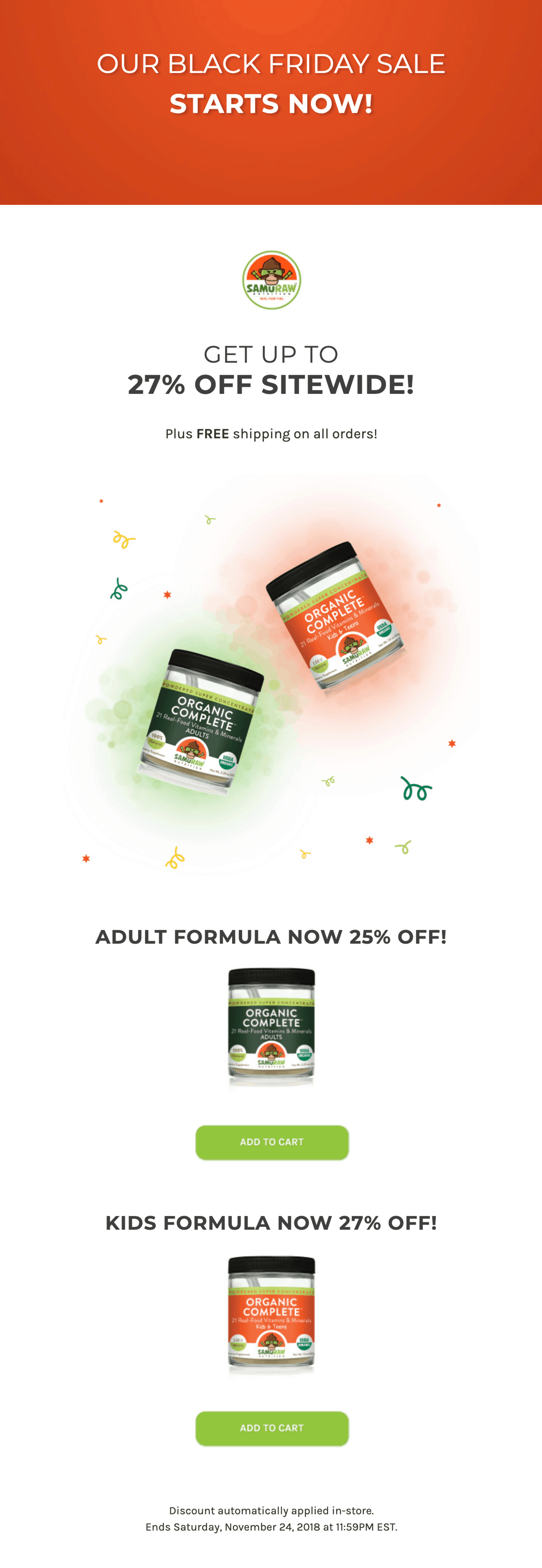
When someone clicks either “Add to Cart” buttons, they’re taken to a landing page (built by Webistry) that corresponds with the selected formula.

Pretty intuitive, huh? But that’s not the only reason this example from Samuraw is awesome. Here are some other things they’re doing right:
- Consistent branding and messaging. The offer being highlighted appears above the fold in the email and on the landing page. The color schemes are the same. Even the product pictures don’t vary. It’s hard to imagine any visitor getting confused when they wind up here.
- Reduced friction and streamlined checkout. The discounts offered in the email are automatically applied once someone clicks through to the landing page. Samuraw makes it simple for customers to reach the final purchase decision.
- Segmented customer messaging. “Add to Cart” is a call to action that almost begs to point to a product page, but Samuraw instead links to two specific landing pages aimed at either adults or kids to close the sale. With added details, these pre-cart landing pages do a better job of selling than online store pages.
Example: Great Wolf Lodge
Next up is Great Wolf Lodge, a family of indoor water parks and resort hotels.
Over the summer, they drive bookings through an email marketing campaign that touts their Summer Camp-In event, which includes campfires, pool parties, BBQs, and all kinds of other outdoor fun—only, y’know, inside.
To spur interest, Great Wolf Lodge sent out this well-designed email campaign that highlighted some of the main activities going on, as well as lots of images showing families having an awesome time.

From here, recipients are invited to “Book Now” through the email’s CTA button, which leads to the following tailor-made landing page:

As they scroll down the page, the potential booker gets lots of details about what’s included during the event, sees compelling visuals that evoke positive feelings, and even gets a coupon code for a summer-themed suite.
So, well else is working well here?
- Seamless look and feel. The custom graphics create a consistent experience across the two different touchpoints and generate a feeling of nostalgia with their classic 1950s look.
- Strategic call to action. The booking CTA on the landing page becomes a sticky bar as the visitor scrolls, so it’s always right at the top of the page and never out of sight.
- Reinforced discount offer. The coupon code offer is consistent and referenced both in the email and the landing page, helping keep the promotion top of mind.
Looking for more ecommerce landing page examples? Check out our Ultimate Ecommerce Landing Page Lookbook, which features pages from 27 of the top online retailers.
How *Not* to Match Your Emails with Landing Pages
The examples above show a few companies who understand that it’s not enough just to send a great email. Your landing page has to reflect that email if you want to convert your subscribers.
Let’s look at an example of an email and landing page mismatch. Motorsport.com recently ran a Cyber Monday email promotion that promised “better than half price” discounts for customers. Here’s a snippet:

Interesting visuals and a clear call to action make this good so far. But when you click “Subscribe Now,” you’re linked to a landing page with this pricing overview:

It’s great that the link to subscribe sends you to a subscription page. But pay attention to the subtle messaging inconsistencies:
- Where’s the mention of the “better than half price” sale? Cyber Monday customers that wind up here might wonder if they’ve missed their chance. Are they receiving the discount, or not? This sort of confusion can lead them to bounce.
- If a discount was applied, is it the one we were promised? Is $8.60 per month “better than half price”? Is so, there’s no indication of that here.
- Why is there a different call to action? “Subscribe Now” becomes “Get the Full Story” and “Select Package.” There’s a missed opportunity here to more carefully match the messaging and imagery from email to landing page.
Visitors who wanted a unique deal might click anyway, but since the landing page doesn’t even mention the discount, lots of people are going to conclude they’re in the wrong place.
Turn Ready-Made Email Clicks Into Ecommerce Sales
Email conversion expert Laura Lupoch sums things up nicely:
To get an email subscriber to make a purchase, you need a series of touchpoints where they keep saying “yes” to you. That sets the stage for the big “yes” at the end when you ask them to buy.
Think of your landing page as another major step in that “yes” journey towards making a purchase.
If you see high click rates on your ecommerce email marketing but not high conversion rates on your landing pages, it doesn’t necessarily reflect on the quality of your emails. It might just be that your emails have promised something your landing page failed to deliver—and that’s hard to say “yes” to.
This is where a landing page builder helps. You can quickly drag-and-drop together specific pages for each email promotion (all without a developer) and deliver a consistent purchase path from inbox to checkout.

