
Branding is all about first impressions. Those impressions matter on a landing page.
CXL highlighted a British study asking participants about their perception of health websites. When the people who took part gave feedback on the website, 94% of their comments related to design.
The design elements you choose for your landing pages—including typefaces—affect your brand’s reception and recognizability. If you want visitors to recognize and trust your brand when they see your marketing campaigns, you’ve gotta be savvy with the fonts you use.
So, how can you build a recognizable brand with your typefaces? This guide will teach you about the different typeface categories and how to use ‘em to make your brand stand out.
Typeface Categories and Their Meanings
Fonts fall into four categories of typefaces—serif, sans-serif, slab serif, and script. Each group triggers different feelings, reflecting your brand and its tone. Let’s see what they’re all about.
Serif
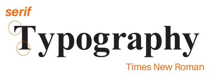
Serif fonts have divots known as serifs at the end of each letter’s strokes. These typefaces give off a classic feel, so you’ll see them used a lot in long-established and formal brands.
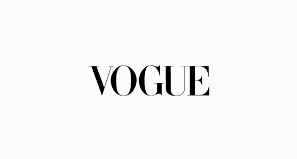
Fashion magazine Vogue has been in business for more than 100 years. Here’s how the publication uses a serif in its logo:
Sans-serif
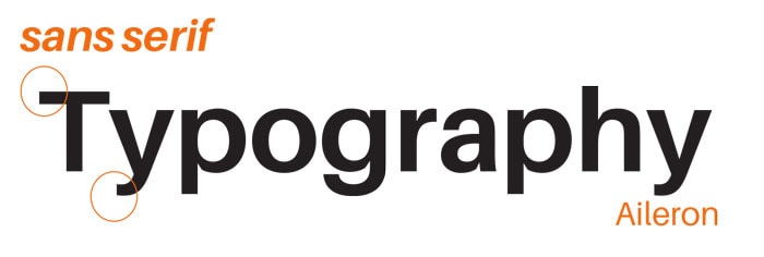
Sans-serif fonts don’t have any of those serif divots at the end of each letter stroke, resulting in a more modern look. A study of over a million web pages found that 85.5% use sans-serif typefaces in both their header and paragraph text. You’ll see sans-serif fonts used by brands shooting for a contemporary feel, like iTunes:
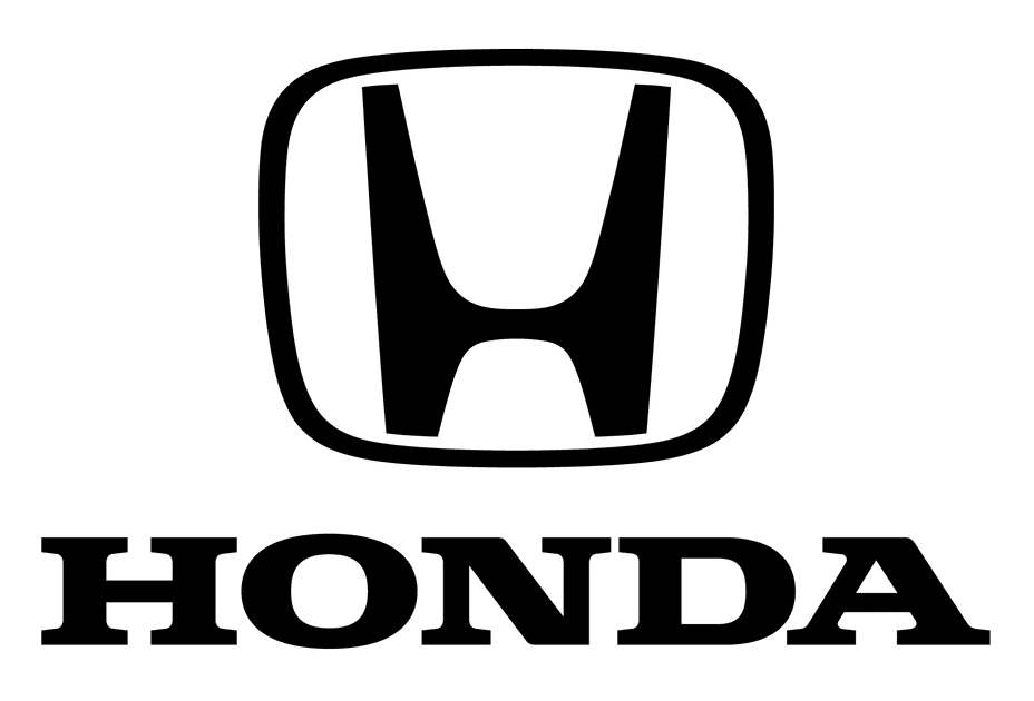
Slab
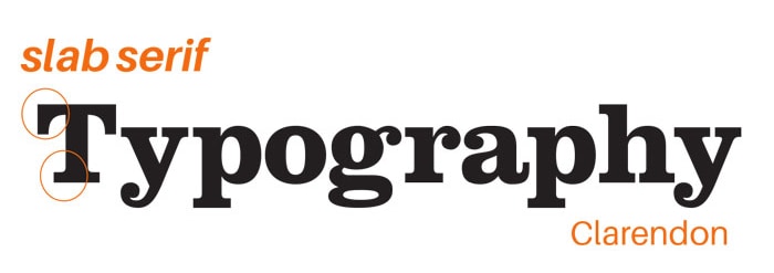
Slab fonts have super thick letter strokes and come with or without serifs. Brands like Honda use them to give a bold impression:
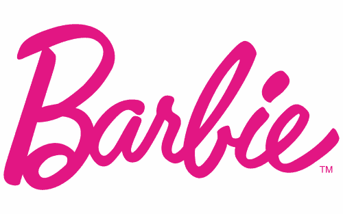
Script
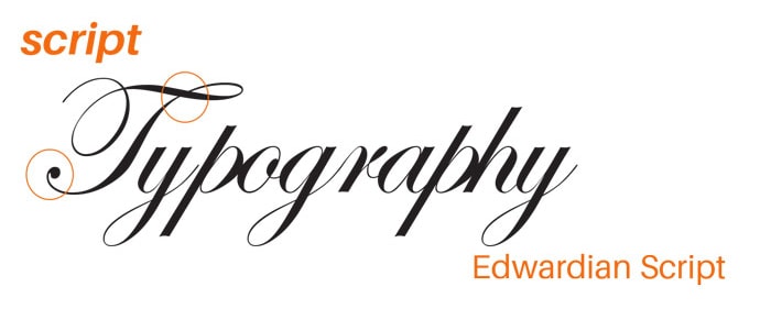
Script fonts use curvy lettering with connected strokes to resemble handwritten cursive letters. These typefaces give off an elegant feel. Some brands also use them to communicate femininity, like Barbie:
How to Boost Brand Recognition Through Your Typefaces
Now that you understand the four typeface categories, how can you use that knowledge to make your brand more recognizable? Let’s go over three tips.
Match your typeface to your brand
The typefaces you use in your marketing content, including non-logo materials like landing pages, should fit your brand’s tone.
Imagine you’re shopping for a Pretty Pink Princess doll and you click on the landing page you find in Google results. For some reason, the header font is in a Gothic script—the kind you’d see on a medieval chamber metal album. You’d wonder if you got the right site, wouldn’t you?
Think long and hard about how your typefaces should express your brand theme and values. Duolingo went so far in this process that they created a typeface based on their logo and mascot. So, don’t be afraid to dedicate time to choosing fonts that fit your brand.
Let’s see how typefaces can work with a brand’s tone on this landing page contest entry:
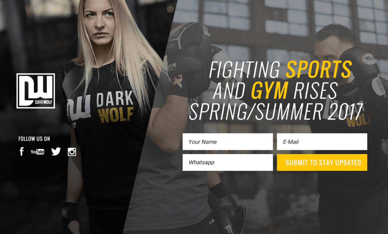
This page uses an all-caps, thin, and italic font to give the page a serious and intense mood for an upcoming fighting sports gym. This typeface choice shows that the fictional DarkWolf brand means business about the high-intensity, competitive sport it specializes in.
Keep your typeface consistent
Customers can’t recognize your brand if you constantly change its look. After you choose typefaces that fit your brand, stick with them across your marketing materials. Keep your typeface consistent across your copy, platforms, and products to maximize the chance of your audience recognizing your brand.
After all, consistency is the third principle of conversion-centered design. If you don’t know where to get started, try using your main website as your style guide. Establish the fonts you want to use there, then use those same typefaces everywhere else you do marketing.
While font might not seem as big of a deal to match across platforms than other design elements, it really does make a difference. As we covered in our conversion-centered design guide, our brains process visual information up to 60,000 times faster than text. So, we’re processing what text looks like before we even know what it says.
Check out how you can tell these two landing pages come from the same people:
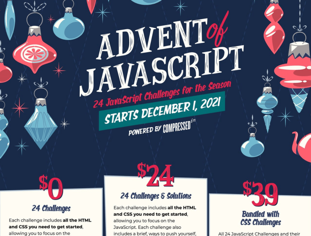
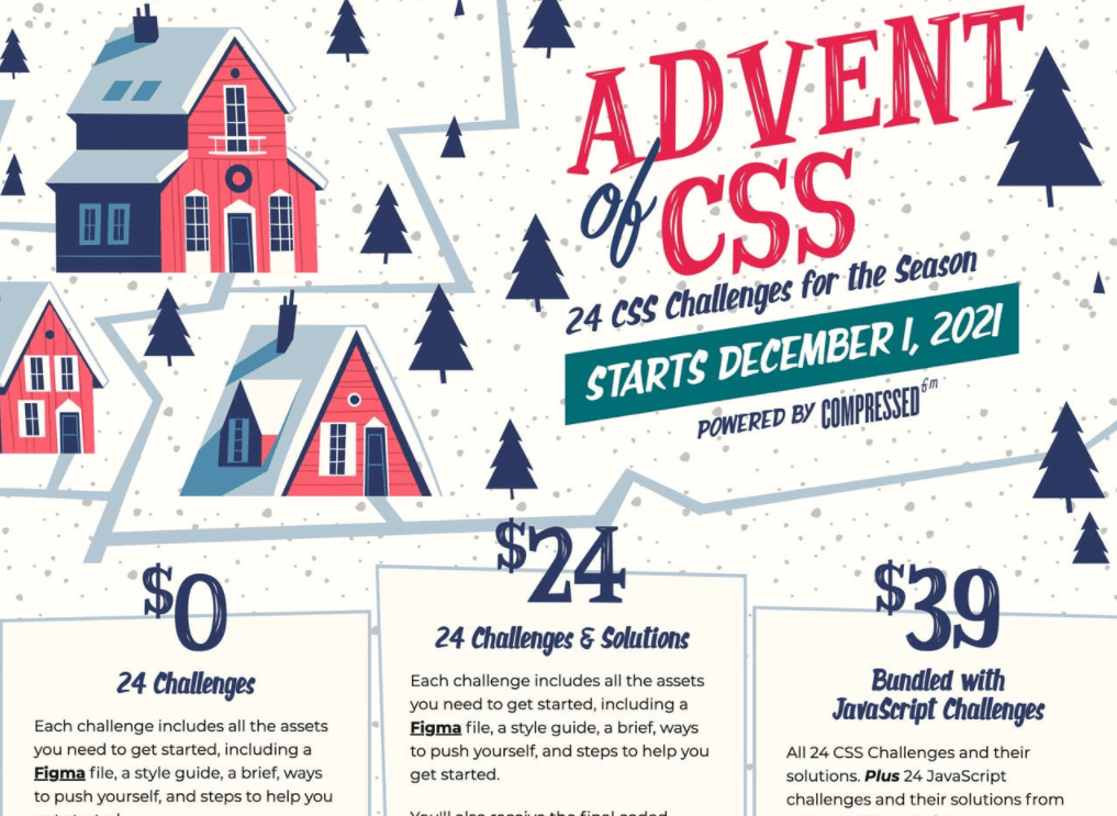
While both landing pages have similar design layouts, it’s the “Advent of ____” header at the top that ties them together. They use the same sequence of fonts to keep both events on-brand.
Keep your font combinations simple
After you gather fonts that match your brand, you might end up with a long list. Cut it down to a handful of fonts to use for headers and body text, and make it even shorter for your landing page designs.
We recommend sticking to two typefaces for landing pages—a header font and a body font.
Why? We understand most folks reading this blog are scrappy marketers with a lot on their plates. If you don’t design web pages for a living, it’s hard to design with and track more than two fonts on a landing page.
It’s popular for designers to mix fonts from different categories or use a bold typeface as the header for a regular body typeface. Experiment with your font pairings to find a combo that fits your brand. Tools like Fontpair will help you nail the right mix.
You can see a serif and sans-serif combo in action on Sprout’s landing page:
Sprout uses a serif font in headers and sans-serif font everywhere else. Both typefaces feel friendly to match Sprout’s status as a videoconferencing software for hanging out. Even though the page only uses two fonts, it differentiates subheader, button, and body text by playing with typeface sizes.
Keep Your Typeface Style on Point
After you choose typefaces that mesh with your brand, teach yourself how to use them on a landing page. Get familiar with font sizes, kerning, and leading to keep your text legible. Our guide to landing page typography will get you started.
A landing page builder with built-in templates and style guides will also make your life easier. The templates will handle font formatting for you, while the style guide will note your font choices for future reference. Unbounce’s Smart Builder’s got ‘em both.

