In the United States small business accounts for 44% of GDP and employs 60 million people. In the United Kingdom, small businesses are responsible for 60% of private sector jobs.
That’s a lot of money and a lot of jobs. It’s also a big market place. In this article we’ll be looking at landing pages that are focused on selling to small businesses and asking one thing: do they cut the mustard?
Despite their importance to the economies of the US and UK and their combined buying power, selling to small businesses requires a particular approach: one based around value, not scale, and focused on ease-of-use, not enterprise features. Lined up below are eight landing pages from big and small organizations; let’s see how they get on.
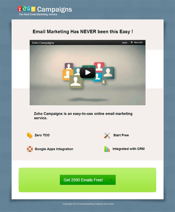
1 – ZoHo Email Marketing
ZoHo are a provider of cloud-based services for businesses, including CRM, Email Marketing, Accounting and Project Management. They also have an online office suite that is a direct competitor to Google Docs.
For their email marketing product they’ve taken the simple approach, both in terms of copy and visuals, and it’s an approach that resonates with small businesses. Everything on this page says “Easy to use”, from the headline to the sub-header and on to four bullet points. Two stand out in particular:
- Zero TCO (Total cost of ownership): it costs me nothing to run, so doesn’t hit my cashflow.
- Google Apps integration: ZoHo understand that Google Apps has a large userbase within small business, so integration is a real selling point.
By using video to deliver the details, they can avoid information overload.
The clincher – “Get 2500 emails free!” – is also good for small businesses, as for small businesses with small client lists, 2500 emails goes a long way.
Overall, a well thought out page that strips away any clutter and concentrates on benefits.
2 – Google Apps for Business
Google Apps is the market leader in providing small business software. The Apps suite, by their own admission, “is used by over 4 million businesses”. And as well as making very good software, they also make a good landing page.
Google’s competitor in this space is Microsoft – as they’ve cornered the office productivity space for many years through Microsoft Office (and to a lesser extent Microsoft Exchange) – so it’s important for Google to display their credibility.
This page does this excellently. How?
The initial focus of the page is on a carousel of five case studies – two of which are video-based. There’s good attention to detail here, as each consists of an image and quote, so testimonials are front and center. The case studies are all of small businesses, and across a number of different industry areas. This is important for credibility, as customers want to know that people like them, with the same challenges and issues they face are also using the product.
The secondary element is a set of tabs – one per product. Each of these acts as a landing page in and of itself. The copy is sharp – bullets are used to pick out key benefits and make it easy to absorb information. There’s another testimonial statement to support the individual products, and finally, there’s a product video where you can find out more. The repeated call to action – one at the top, one at the bottom (with additional information to push the viewer to convert – support and ‘no credit card required’) also work well.
This is a brilliant landing page. It’s visually appealing, well-structured, and has oodles of information for those who want to explore, all without looking cluttered. Google, I doff my cap to you.
3 – Wave Accounting
The format of the page is a little different to a standard top-down pages; it’s split into columns and uses tabs to uncover supporting information such as testimonials and media. Usually I’d like to see these a little further upfront, certainly the testimonials, and I think it would be worth performing some A/B testing to understand that element.
That said, the page is structured well – the headline is unequivocal “Free Accounting Software”, there are large images that show clear details of the product, and a set of three clear bullets that address the key questions that small businesses are going to ask about a free product:
- Are you going to sting me for money once I really start using it (no)
- Is it limited to just one user (no)
- Is it safe to leave my information with you (yes)
It’s a good example of how to talk to small business, where budgets are tighter and there are fewer resources to support systems.
4 – Vocus Marketing Software
Vocus creates cloud-based marketing and PR software which is able to track your campaigns across traditional and social media channels.
As far as landing pages go, they’ve got all the right elements in place, but this page contains one of my biggest bug-bears: asking for too much data.
Conversion is all about making it easy, something we’ve seen from all the landing pages so far. Vocus have unfortunately made a rather daunting form to request a demonstration of the product. There are thirteen fields in all and all of them mandatory! The worst of these is the field for Annual Revenue, which contains three options, the smallest of which is $4m. A lot of small business don’t turn over this kind of money and immediately it makes the product look like it’s designed for larger companies – it’s a real turn-off.
If you’re setting up a landing page, make sure you understand your audience. It’s easy to know where the click came from, so make sure your messaging is right for that audience. In this case, Vocus should either remove the field altogether for small businesses, or provide some more appropriate options. Personally I would do the former, as it’s too early in the conversion funnel to be asking this sort of information – get them interested before you start to segment your potential customers.
A good start let down by a poor sign-up form.
5 – ZoHo CRM
Two from ZoHo – am I turning into an advocate of their software? Fear not, I’m simply picking on them to show how one company can take two very different approaches to product landing pages.
There are some good elements in this page: the “25,000 customers and counting” gives credability, and the repeated use of the phrase “Get more leads, close more deals & save 50%” can be effective in driving home a message. But…
- It’s really busy: Give your users something that is short and memorable to read. Eleven bullets is too much. Focus on the important elements and let the user explore the rest (as we saw with Google Apps), either through video or additional tabs and pages.
- There’s no imagery beyond the logo: Visuals are so important. If it’s truly “EASY Online CRM”, show me! It should be a selling point. There’s also no iconography. Icons can be used to help users to easily identify the subject of different bullet points or areas of the page – here they could have been used to help separate the bullet points into functional groups, making the content easier to consume.
- The testimonials are good: But they’re hidden away. Don’t hide your testimonials – they help people to identify with you, and it’s especially important for small businesses. They want to see other small businesses benefiting from the product.
- Finally, and a real gripe: If you do click through it takes you to a page that asks you to sign up for a fifteen day trial of “Enterprise Edition”. NO! So far you’ve been talking about FREE software – you know, the last bullet point where you say “Get started with Free edition – 3 users FREE!” So I click on ‘Get Started Now’ and you take me to something that isn’t what you promised. It’s a poor experience and the user will feel like they’re being swindled. Make sure your messaging is consistent throughout the sales and conversion funnel.
6 – Xero Accounting
Wow, I’m glad I got that off my chest. Let’s have something a little more simple and effective.
Xero Acounting make “Beautiful Accounting Software”. They’ve also made an effective, if quite functional, landing page.
Moving away from ZoHo CRM, this is a real lesson in how to do the basics well. We’ve got a clear call to action with supporting statements to aid conversion, clear imagery showing that the software can run on desktop and mobile, clear typography that highlights the key benefits and two testimonials.
It might not be the most beautiful landing page, but it is put together well.
It could be improved by the use of video – preferably to augment the imagery rather than add more elements to the page. An A/B test would prove the relative effectiveness of this change.
7 – Sanderson Unity Express
Here’s an interesting one. Sanderson have been around for a few years – I know this because I remember them sponsoring the Southampton and Sheffield Wednesday football kits back at the end of the 90’s – but I’ve never seen an online advert for them before this. To be honest, if I have to wait another fifteen years for the next one it won’t worry me.
It’s got a lot of the right elements, don’t get me wrong, in fact it’s got too many of the right elements. It’s also got corporate-copy-itis, a dreadful condition where copy grows to double it’s normal size. Here are two reasons why the page doesn’t work:
- CTA: The page contains three competing Calls To Action, a recipe for confusion. The least useful of these (Download a brochure) is also given number #1 billing at the top right of the page. The other two are shown in buttons that contain exactly the same styling, giving me no indication of what they want me to do. Should I request a call or a demonstration? Here’s a suggestion – why not do both at the same time through one form, and give the brochure away as an added extra.
- Poor video quality: The running time is great, it’s bite-size at 34 seconds, but it feels much longer. Instead of a voiceover or a demonstration, there’s simply some stock-bought muzak and a few phrases floating about on screen. When it does eventually show you a screenshot, it’s underwhelming and in 360px resolution. Video can make or break a page, so invest in something high quality and well scripted.
Effective landing pages keep things simple and have a clear journey from headline to conversion. I reached this page from an advert that was served to me as a small business – all this page makes me think is ‘corporate’ and it’s a real turn-off.
Sanderson really need to think about the key CTA for this page and redesign based around that action.
8 – Halogen eAppraisal
On the outside, Halogen eAppraisal’s landing page looks like it will do the job, but it’s all about the details and this is where the page lets itself down. Small Businesses should not be treated the same way as Enterprise customers – I’d go so far as to say that you should try to segment your customers as much as possible for really good conversion rates.
Halogen make that mistake here. It’s great to have client logos on your landing page, but they must resonate with your target audience. Small businesses don’t see themselves in the same context as BMW, Sharp or Toshiba, they want to hear from their peers. This theme continues throughout the copy.
And there’s the final lesson for today – one we can all learn from – if you’re spending money on paid search and attracting clickthroughs to your landing page, make sure your attracting the right sort of audience. Because if you aren’t, you’re throwing money straight into the garbage disposal and nobody wants to do that, right?
What are your tips for marketing to small businesses? How do you make your landing pages tick the boxes for SMB clients? Let us know in the comments.


