Your business is awesome. You design and build a brilliant product that adds real value to other businesses. Maybe you provide a service, maybe you do consulting, or maybe you just connect other businesses together so they can help each other. Whatever it is that your business does, you need to get the word out and generate leads and customers… fast.
Your first step is to find the traffic. Setting up a PPC (pay-per-click) campaign is an excellent way to get tons of other business people to your site, ready to learn about your products or services.
In comes your landing page (because if you’re reading the Unbounce blog you would never send PPC traffic to your homepage, right?). Your landing page will do the heavy lifting and convert your new traffic into leads and customers.
But how do you get the most out of your traffic and make sure you’re not leaving conversions on the table? Let’s take a look at 12 B2B landing page campaigns and how they can improve their conversions and generate more leads.
1. Cfactor
Ad:
Landing Page:
Short, punchy PPC ad
The ad for this campaign is brief, to the point and even has room for a small call-to-action (“see demo”). Well done, but even small changes to a PPC ad can have CTR and Conversion consequences. Always test like hell.
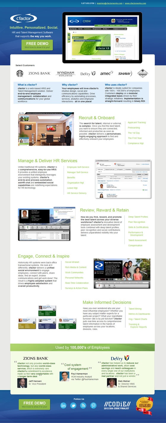
This page needs a copywriting overhaul
The headline is awful. It’s just 3 words. If I’ve just clicked on an ad for “Human resource software” those three words mean nothing. Try something like this:
End to End Employee Management, Collaboration and Communications made simple
I shouldn’t have to scroll down to the first content section to know “what is cfactor”. That information should be available to me as soon as I land on this page so I can make a decision about whether I want to see a demo.
The copy throughout this page is also too long. There are a lot of paragraphs that say the same thing twice and can be tightened up. Try to remember that you want to address customer concerns, not just talk about how great your product is.
What the hell are these images?
The images don’t have captions and therefore are useless on this page. The primary image at the top of the page looks almost like the landing page that we’re on. It doesn’t add any VALUE.
This page could either have captions under each image, or use images that are more obvious. I would lean towards just adding a caption to explain what the screenshots are.
Someone is BOLD happy
The bolding on this page just doesn’t make any sense to me and is WAY overdone. Bolding certain words can add value to a page, but if you’re going to bold 5 or 6 phrases in every paragraph it just loses it’s weight.
Instead, choose only 1 thing in every paragraph to bold (and your product name shouldn’t be it).
Where’s the call-to-action at the bottom of the page?
Oh right, it’s in the footer. But why? More attention needs to be put on the bottom call to action. Right now it has the same emphasis as the social icons.
While we’re talking about social icons, just remove them all together. Are you trying to get a ‘like’ on Facebook with this page? Or are you trying to make conversions and sales? Choose one.
2. Babytel
Ad:
Landing Page:
PPC ad is clear, but needs a call-to-action
This ad is clear about the service that Babytel provides, but adding a call-to-action would make it more powerful. Something like learn more or even better: Create an account.
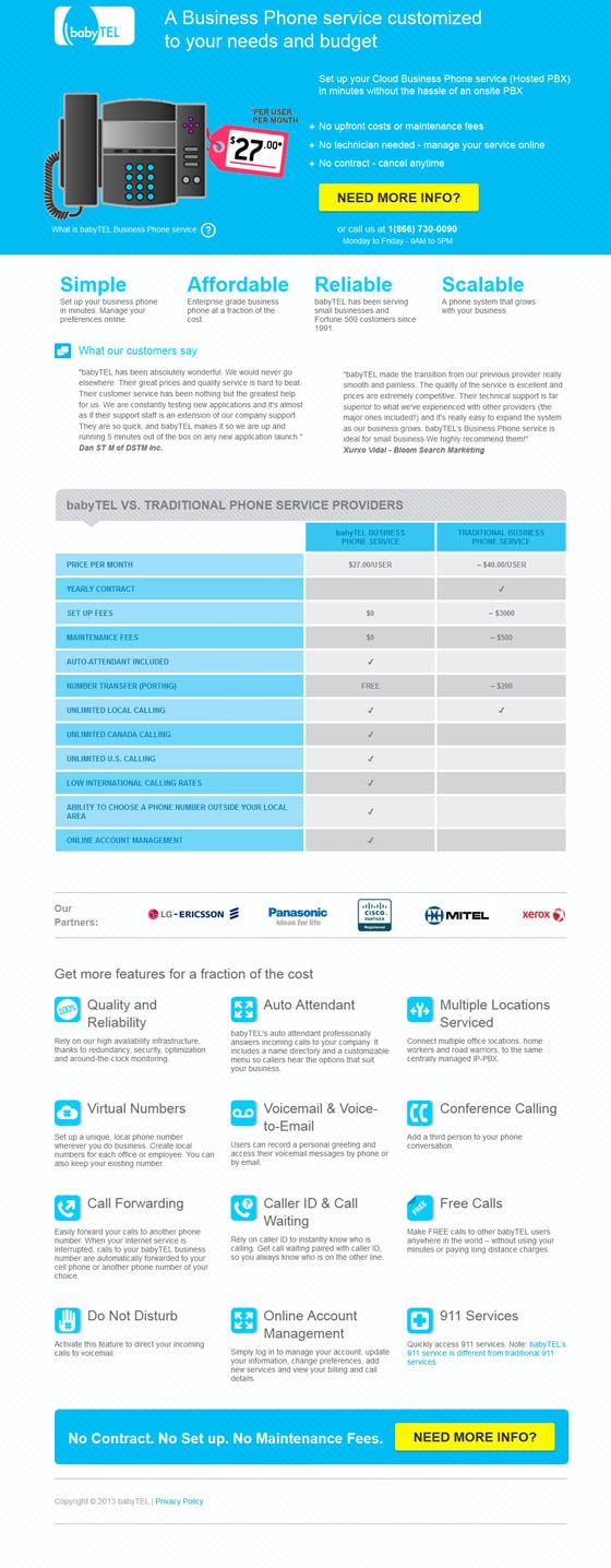
Great colours and contrast
This page makes great use of contrasting colours to help the call-to-action and important information stand out. The price and the call-to-action leap off the page as soon as you land here.
Call-to-action needs help
What exactly am I clicking on this call-to-action for? Isn’t this page designed to give me “more info”? Why not skip the more info part and go straight to creating an account. There is enough information on this page to make a sale.
Testimonials could be shortened
Having two testimonials at the top of the page is a great addition to this page. However, the testimonials are just large paragraphs and seem like a chore to read. They would add so much more value to this page if they were just short and punchy statements like this:
babyTel has been absolutely wonderful. We would never go elsewhere. Their great prices and quality service is hard to beat.
Features are great, but cut down on the explanations
Listing the features of the product in the lower section is a great addition. However, keeping the explanations of each feature brief will keep the flow of the page going.
3. Designcrowd
Ad:
Landing Page:
The PPC campaign is relevant
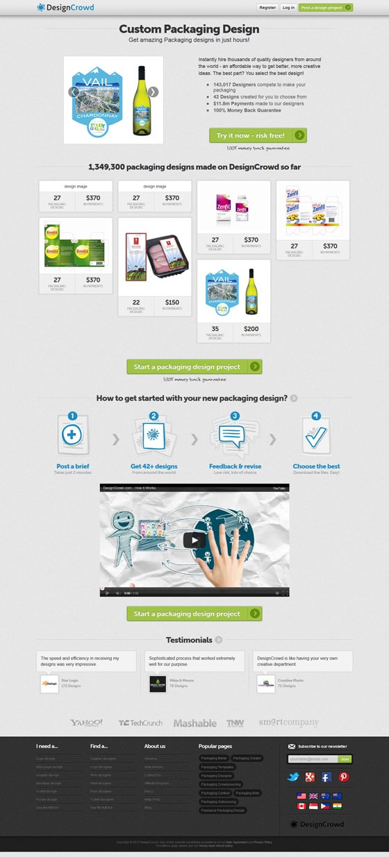
The PPC ad and the landing page are a match made in digital heaven. The headlines are the same, leading the visitor to believe that they are in the right place.
Try a different approach to examples
The primary image at the top of the page displays just one example of a product designed using this service. I would instead use an image that combined a number of examples into this space. The reason being twofold:
First, it shows that many people are using the service, and secondly it allows the visitor to connect with more than one example.
Yes, there are more examples further down the page, but you want to capture the visitors imagination as quickly as possible. Your visitor will likely have objections like “will this service work for my type of product?” and by providing many examples up front you’re able to quickly dispel that objection.
Also, with 1.3 million designs on the site so far, why do you use the same example twice? (Vail chardonnay)… it doesn’t make any sense.
The intro copy is awkward
Am I really instantly hiring designers from around the world? Or is it in “just hours”? Also, I think that the explanation of what this site does could be done better. Here’s an example:
Designcrowd is an affordable way to get better, more creative ideas for your packaging design. Tap into the creative energy of hundreds of thousands of designers worldwide and you only pay for the very best design
4. Halogen
Ad:
Landing Page:
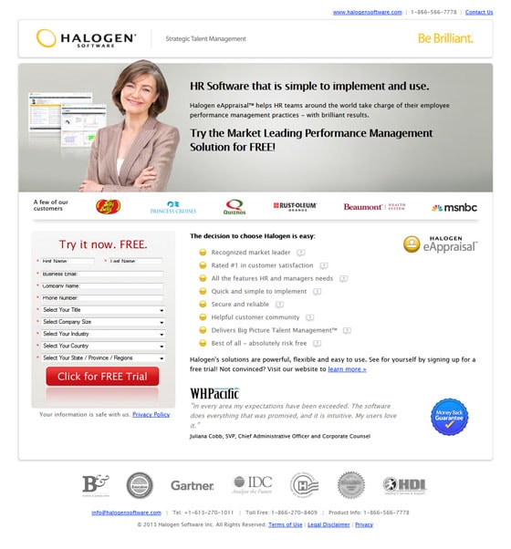
Who is this woman?
If she doesn’t work for your company or use your product or service then lose her. Use someone who actually means something and adds value to the page. Why not use a testimonial? If this company truly is a market leader it should be no problem to get photos of REAL users of the software.
Still not convinced? Bounce.
This page links back to the homepage of their site, stating that if you’re “not convinced” then you need to “learn more”. Well I’ve got news for you: The whole point of this landing page is to do the convincing.
If a visitor is not convinced, they are going to bounce off of your site instead of going to your homepage to learn more.
This is bad form
The actual lead form uses a nice juicy red button. The only problem is that the form looks cluttered and long. Aside from the apparent coding issues that are causing some of the fields to be too small, this form needs less fields.
Grab the location information in the background using some javascript. Or better yet, let users create their account on this page using just a name, email and phone number. Then, make it mandatory to “fill out your profile” in the software itself. The profile would ask for the remaining information that your sales team needs to qualify the lead.
What ARE the features that a manager needs?
There are a lot of bullet points on this page. Most of them however are just blah blah statements that don’t add much. Most managers have issues that they would like to resolve. Paying for a service that is a “recognized market leader” is not one of those problems and shouldn’t be the very first benefit of your service.
Instead, list out what features are important to the software, and how they will make HR and managers’ lives easier. This will connect with visitors on a much deeper level and increase free trial signups.
5. Iaquire
Ad:
Landing Page:
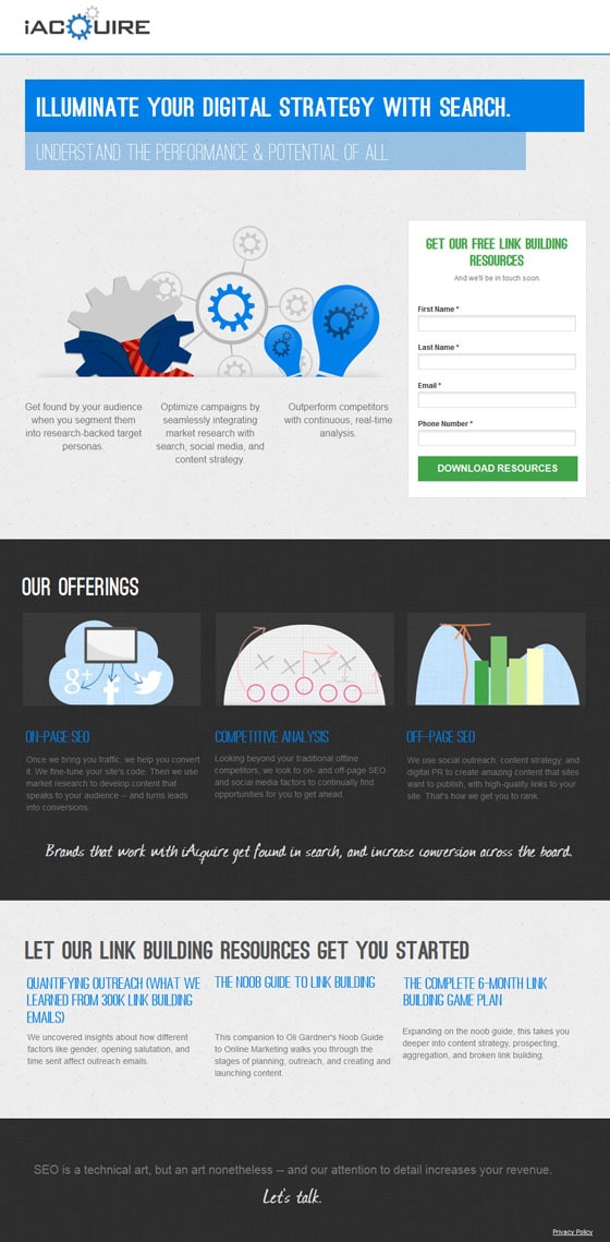
PPC ad and landing page headline are a nice match
iAquire does a nice job here matching the sentiment of both the PPC ad and the landing page. The words Illuminate run through the campaign and everything feels relevant.
The headline is a little ambiguous and general, and might be better served connecting more with the purpose of the page – being to get access to some free resources.
6. Merchantadvance
Ad:
Landing Page:
PPC ad needs a call to action
This PPC ad would probably get more click throughs if it had a simple call-to-action at the end. Something like “Get a free quote”.
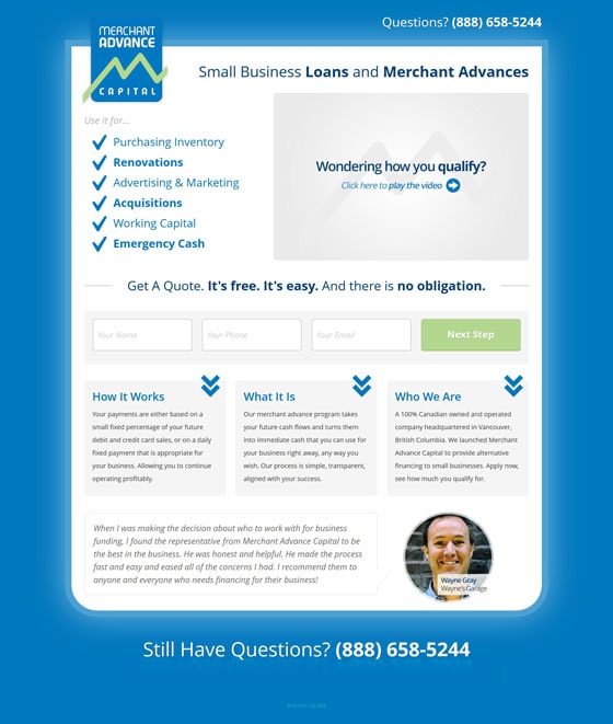
Headline is simple and to the point
This headline doesn’t screw around. It’s not fancy, quirky or smart, it just says exactly what they are offering.
And you know what? That’s perfect. Why get cute when you can just tell your visitor straight up: Here’s what we can do for you.
Examples are great
These examples add a lot of value to this page by helping visitors to visualize what they can use the loans for. Most business owners are going to know what they are seeking money for, but these examples may spark some additional needs that they hadn’t yet considered.
Form needs more emphasis
This form blends in to the rest of the page. This may be on purpose in order to emphasize the phone number call to action, but if they want more web form signups they need to change the colour of the call-to-action to help it stand out, and darken the light grey box that is around the web form.
Speak to someone real
Use the phone number to your advantage. Don’t leave the telephone call-to-action at just “still have questions”, instead add to the benefits of calling by saying something like:
Still have questions? Speak to a loan consultant now about securing your next business loan
7. Odesk
Ad:
Landing Page:
Are they sales consultants or sales experts?
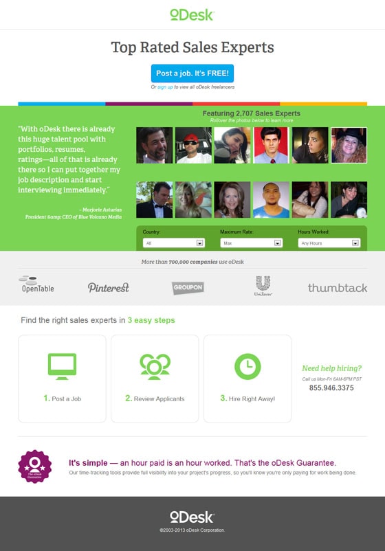
This campaign could be improved by making sure that the words are consistent. Make sure that the landing page mirrors the statement “Sales Consultants” instead of “Sales Experts” to ensure that visitors know they are in the right place.
This call-to-action is VERY important
The wording of this call-to-action could make or break this campaign and oDesk needs to make sure that the CTA is thoroughly tested. I would test some call to actions like these as a starting point:
Find a sales consultant
Post a job now. Free.Post Your Job Now. Free.
Browse Sales Consultant Resumes
On the topic of the call to action, there should be a similar call-to-action at the bottom of the page as well. It would make it easier for visitors to read to the bottom of the page to continue on to the next step.
Need help hiring is a Perfect lead generation opportunity
The section that gives a phone number contact for hiring help is a perfect opportunity for lead gen. If you already have a sales team on board, then why not have a feature that allows visitors to “request a call back”. They fill out a small lead form and the hiring consultant will contact them. This also allows you to market to them on a regular basis with email.
8. Openair
Ad:
Landing Page:
Contact who?
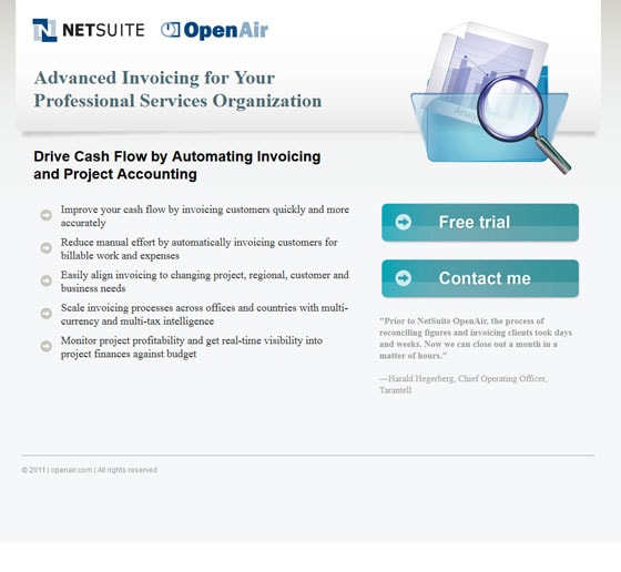
Who am I contacting? There is no indication that this page is made by an individual, so having a call-to-action that says “contact ME” is strange. On top of that, there’s really no need for it on this page. Is this page meant to sign people up for a free trial? Or is it trying to collect contact information. Make a choice and stick with it.
Speak to me!
What a drab button: Free trial. Why not speak to your visitors with a more powerful call-to-action like this:
Start your free trial now
And while we’re at it, change the colour of the buttons to make sure the call-to-actions don’t blend in.
9. Protomold
Ad:
Landing Page:
PPC ad is clear, but sitelinks may be taking away from conversions
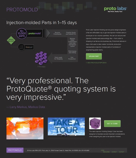
This ad is quite clear about what the company can provide. That being said the sitelinks (view sample quote, molding design guidelines etc.) are probably taking away from the effectiveness of the ad.
Protomold needs to take a look at their ad stats to see how many visitors are clicking on these links, and if they are getting a better/worse conversion rate from those visitors.
I’m willing to bet a crisp $100 bill that the ad extensions are leaking conversions instead of adding value.
Why make things harder on yourself?
The designer who made this page may think that they were doing something cool with a dark grey patterned background, but most likely they are just destroying their conversion rate.
Protomold needs to test a white or light grey background against this page to see if they are leaving conversion on the table. The small white text above a dark background that has white lines running across it is just plain difficult to read.
Headline is pretty straightforward
This headline says exactly what Protomold delivers and that’s why I like it. There’s no need to get fancy with this headline, but I would punch up the font size a bit. Especially when compared to the testimonial that is further down the page.
The call to actions are confusing
“Upload a part” is a strange call to action. I know what they are trying to say, but it doesn’t come across very clear. Maybe something like this:
Order your prototype
Also, at the bottom of the page there is a different call to action: “Get a cube”. I’m not even sure what that means so it should either be made more clear, or it should be removed.
The other elements at the bottom of the page (what looks like a video and the “take a tour” image) are just pointless. There is no explanation with them and they don’t flow with the rest of the page.
10. RBC
Ad:
Landing Page:
Good use of headlines
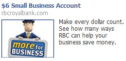
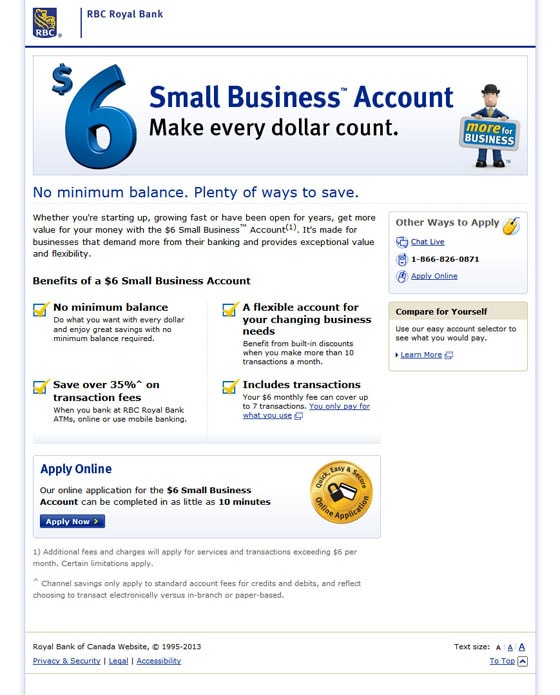
Both the PPC ad and the landing page make great use of headlines. They are to the point and tell the visitor exactly what they’re being offered. The landing page continually hammers home the idea of saving money (something every business owner wants) and makes a big deal about the account being just $6.
Great copywriting
The copy on this page is friendly and to the point. It’s never redundant and it’s nice and short. I especially like how they’ve told you how long the application takes.
Test a two-step application
Here’s where I think that RBC can improve this page: a two-step application. Bank applications are long. They have a lot of fields. Sure, this one can be completed in under 10 minutes, but that’s still a lot of obstacles for a visitor to jump through.
Why not have the name and email address be the first step in the application. That way if a visitor abandons, RBC can send them a quick email asking why, and offering another link to the application. If the visitor STILL doesn’t apply, RBC can send them a short survey to try and find out how they can improve their process and improve conversions. This type user data is VITAL to a long term, high converting campaign.
11. Ringcentral
Ad:
Landing Page:
Welcome to jargontown, population: ringcentral
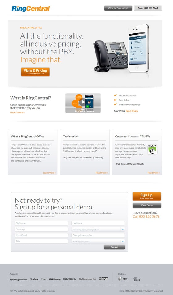
PBX is not a term that an average business person would know unless they’ve been a part of choosing a phone service in the past. Lose the jargon and keep your headlines clean and to the point.
Which of these statements would your clients rather have:
- No PBX
- A seamless, easy to use and inexpensive phone system that just works.
My guess is #2 so try to focus your copy on these points. In fact, the section for “what is ringcentral” is actually a really great headline. It explains what the company does and how it can help you. It’s much better than the attempted clever headline above.
Let’s learn about distractions
This page uses a lot of “learn mores” and “read mores”. If visitors need to learn more in order to make a decision then you need to add more information to your landing page.
There’s always a submit in the bunch
I look forward to the day when I can critique a bunch of landing pages and not a single one of them uses “Submit” as a call to action. Today is not that day unfortunately.
Not only is the form at the bottom of the page a cop out (it gives visitors an option to NOT convert), but it also is a horribly designed form. The fields are really faint, it’s not obvious which fields are required, there’s no mention of privacy, and they use SUBMIT as the call to action.
Scrap the entire form and focus on getting signups.
12. Zoho
Ad:
Landing Page:
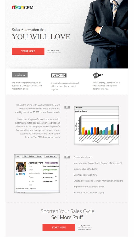
Am I buying a suit?
Does Zoho think that sales is about suits? Why is there a photo of a man (with his arms crossed which is uninviting) but only his suit is showing?
This is probably one of the worst uses of stock photography that I’ve seen in recent memory. Zoho is a good sized company. Surely they can afford to do a proper photo shoot of an actual client and use them in their marketing.
Cement my love
So your headline says that I’ll love Zoho’s solution. They should tell me why in 2 or 3 brief bullets right above the call to action. Something like:
- Shorten your sales cycle
- Simplify your scheduling
- Improve your customer service
These are all things that a good sales rep will appreciate
What’s Next?
It’s time to take a good hard look at your own campaigns and make improvements. Remember to keep the goal of each landing page clear to the visitor and relevant to your PPC ads.
As always, if you have any questions about these landing page examples leave us a comment below.

