Landing page design is easier when you have some inspiration, so I dug out some of the cool pages our customers have been building in Unbounce. Would love to hear your thoughts about the pages in the comments section.
Enjoy…
Loop 11 Usability
Page Details
Type of landing page: Click Through
Website: Loop 11
Built using Unbounce?:Yes
Why I Like It
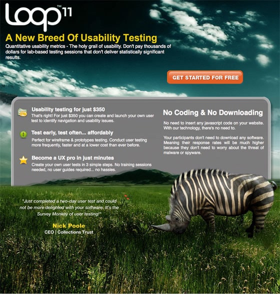
It has a Zebra crossed with a Rhino! How can you not like that?
It’s a very congruent page, where the imagery supports the headline (a new breed). The call to action is very obvious, using conversion design principles (whitespace and contrast) and has text that explains a key benefit (that you can try it for free). The compelling design kept me on the page for a long time and more importantly, made me want to share it with other people. Having a viral quality is a big bonus for a landing page.
Optimization Suggestions
- Considering the viral quality of the design, I’d like to see some type of “Share This” social media button (Facebook or Twitter).
- After clicking through to the destination page (a sign up form) – I noticed that the application can be used on an iPad. It would be a great test to have a video on the landing page that plays inside an image of an iPad. Showing the tool in action could provide the extra information required to inspire a sign-up.
College Ready or Not?
Page Details
Type of landing page: Lead Gen
Website: College Ready or Not
Built using Unbounce?:Yes
Why I Like It
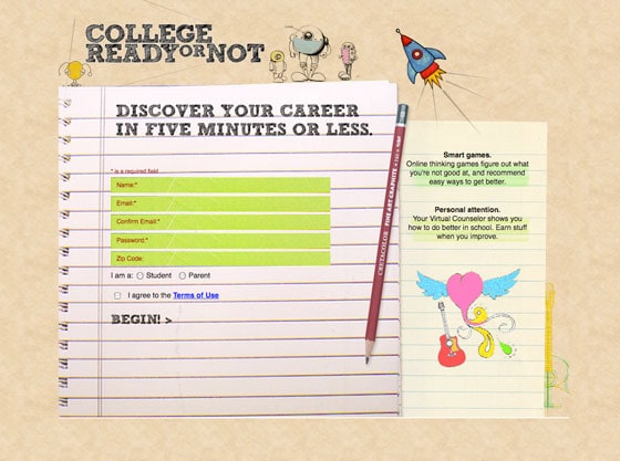
The design is fun and original, and helps establish the tone of a learning environment. The form stands out well due to the contrasting color and makes it very obvious what the intended conversion goal of the page is. The sidebar is set up well to provide a list of benefits – easy for testing.
Optimization Suggestions
- The page could use a stronger headline that describes the unique value proposition of the service. It takes a little while to understand what you are signing up for.
- The CTA should describe what it is you’ll get by registering.
- Ideally the submit button would be more distinct. Right now it doesn’t look like a button. Although, it’s only small factor on a page this simple.
- Consider having different landing pages for the separate demographics (students and parents). This would allow you to target your messaging more closely to their needs.
Styllist
Page Details
Type of landing page: Lead Gen
Website: Styllist
Built using Unbounce?:Yes
Why I Like It
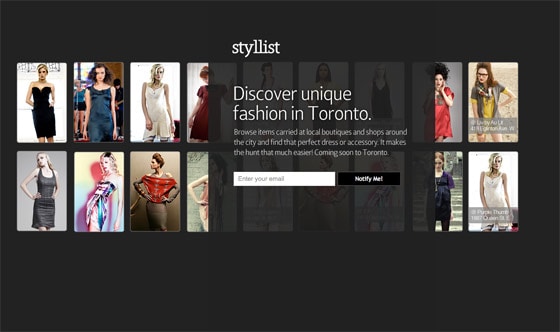
It’s instantly obvious what the page is about. Fashion. The headline spells out the core value of the service and the single field lead gen form provides a low barrier to entry for people interested in receiving updates.
Optimization Suggestions
To encourage more people to sign up, I’d like to see a few extra pieces of information on the page:
- An example of the type of information you will receive. A lightbox popup containing an example email, that shows the inside information subscribers will get, might convince me to register.
- A short privacy statement to let me know you’ll not abuse my email address.
- Perhaps an indication of when you might launch?
- Who is it for? If it’s just women’s clothing, you should probably state that in the copy. It’s implied by the photos, but not explicitly stated. If it will cover men’s fashion, either include some male models in the photos or create a separate landing page for each segment.
What’s The Dealio? San Francisco.
Page Details
Type of landing page: Lead Gen
Website: Where’s the Dealio
Built using Unbounce?:Yes
Why I Like It
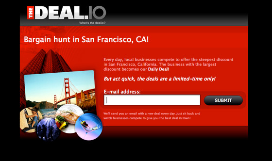
Firstly, a beautiful design that echos the vibrant color of the Golden Gate Bridge. From a conversion standpoint, the fine print beneath the form lets you know what to expect – a daily email.
Optimization Suggestions
- The main headline is being A/B tested on different versions of the page which is great. From the three I saw, the one shown seemed to be the strongest (but you can never tell). I’d like to see a very direct statement here that says something very simple like: “Get a new San Fran discount every day”.
- Like the previous example, showing a sample of what you’ll get might be of benefit, although it’s less of an issue here as the service is live and you’ll get something sent to you almost immediately.
- I’d change the CTA to say something like “Send me the dealio” rather than “Submit”.
360 Feedback
Page Details
Type of landing page: Lead Gen
Website: 360 Feedback
Built using Unbounce?:Yes
Why I Like It
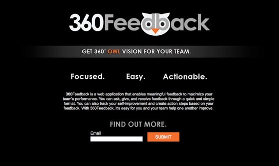
Simple clean design, with a subtle directional cue (the owls beak) that points to the form and matches the CTA color. The informational hierarchy encourage reading: brand->value proposition->benefits->details->CTA.
Optimization Suggestions
- Like the previous example (above), it breaks a fundamental rule of conversion – the non-descriptive CTA. Change the button text to describe what you’ll get when you click it.
- The statement “Find out more” doesn’t provide enough of a sense of what I’ll receive. Will it be another page? A PDF? An email full of information? To find out more, I might just type the brand name into Google, rather than give up my email. Let visitors know what they’ll receive and make it a worthwhile trade.
- If the product/service hasn’t launched yet, make this clear. If it is live, then provide access to some screenshots or a video of it being used.
Smooth Sailing
Page Details
Type of landing page: Click Through
Website: http://events.cheznouspresents.com/smooth-sailing-2010
Built using Unbounce?:Yes
Why I Like It
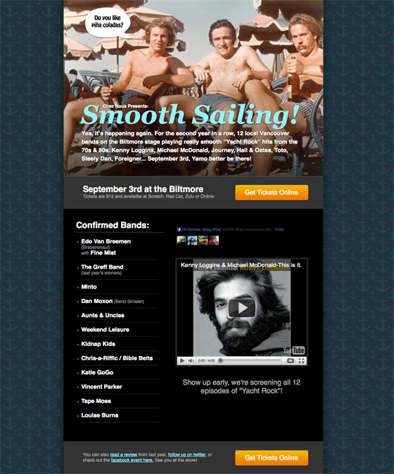
Ok, this one’s a touch controversial as it was created by one of the co-founder’s of Unbounce (Carter). I’m including it in this list for two reasons: I like the page and it’s use of social widgets, but re importantly, I couldn’t resist the opportunity to say what I think is wrong with it :)
On the plus side it’s got a great aesthetic, indicative of the genre of music that it’s promoting and it has a wide range of modern landing page features to increase engagement:
- Video: you can listen to some smooth music while you check out the band list.
- Social Proof: the Facebook widget shows photos of anyone you know that’s “recommended” the page alongside a count of smooth music fans.
- Secondary CTA’s: the footer has a couple of extra ways to stay in touch.
Optimization Suggestions
To keep people on the page longer and enhance the chance of a conversion, I’d suggest the following:
- Provide a clearly stated secondary headline beneath Smooth Sailing, which describes what the event is. “12 Vancouver Bands Play Yacht Rock Covers from the 70s”. This would make me understand it a lot more quickly.
- Add a play button beside each band to let you hear an audio preview (a la iTunes).
- Put a lighter background behind the Facebook widget – right now it’s hard to see.
- Throw up a lightbox style popup with a Map to the location “The Biltmore” – to prevent people leaving the page to figure it out.
SmartyPants
Page Details
Type of landing page: Click Through
Page link: http://deals.wearesmartypants.com/back2school3b/
Built using Unbounce?:Yes
Why I Like It
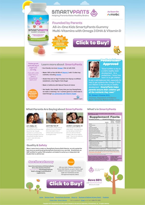
I like the idea of vitamins being kid-friendly and the design reinforces the fun factor. As it’s targeted at parents, they do a good job of answering three core concerns a parent might have: Will this help my kids take vitamins? Is it safe? What’s in it?
I also like the safety net CTA which offers up a phone number if you have any questions. The “As Seen On MSNBC” is also a good trust signal to potential buyers.
Optimization Suggestions
- I would be interested to see how much information is required to make a purchase of this type of product. Typically, landing pages perform better when you remove extraneous navigation from the page. A good test might be to remove the 16 links found on the page. Perhaps the target buyer (mothers) like to spend the research time. A technique to keep them on the page longer would be to use some modal popup windows that show the explanation of scientific terms and the doctor bio without making them leave. As an example, check out the “Contest Rules” link at the bottom of our contest landing page.
