Working on new landing page tests can sometimes get tedious.
What do I test? What’s going to give me the biggest lift in conversions? Where do I get ideas from?
Critiquing your own landing page can be difficult especially if you were the one who designed it. Sometimes you can get too close to a project and lose sight of easy opportunities that are right in front of you.
This post will give you ideas to help you to build your own high converting landing pages and win over your traffic.
The biggest thing to take away from this post is an emphasis on clarity. Most of the test opportunities mentioned below have to do with making the end goal easier to understand to the visitor. And don’t forget to make it crystal clear what they should do next.
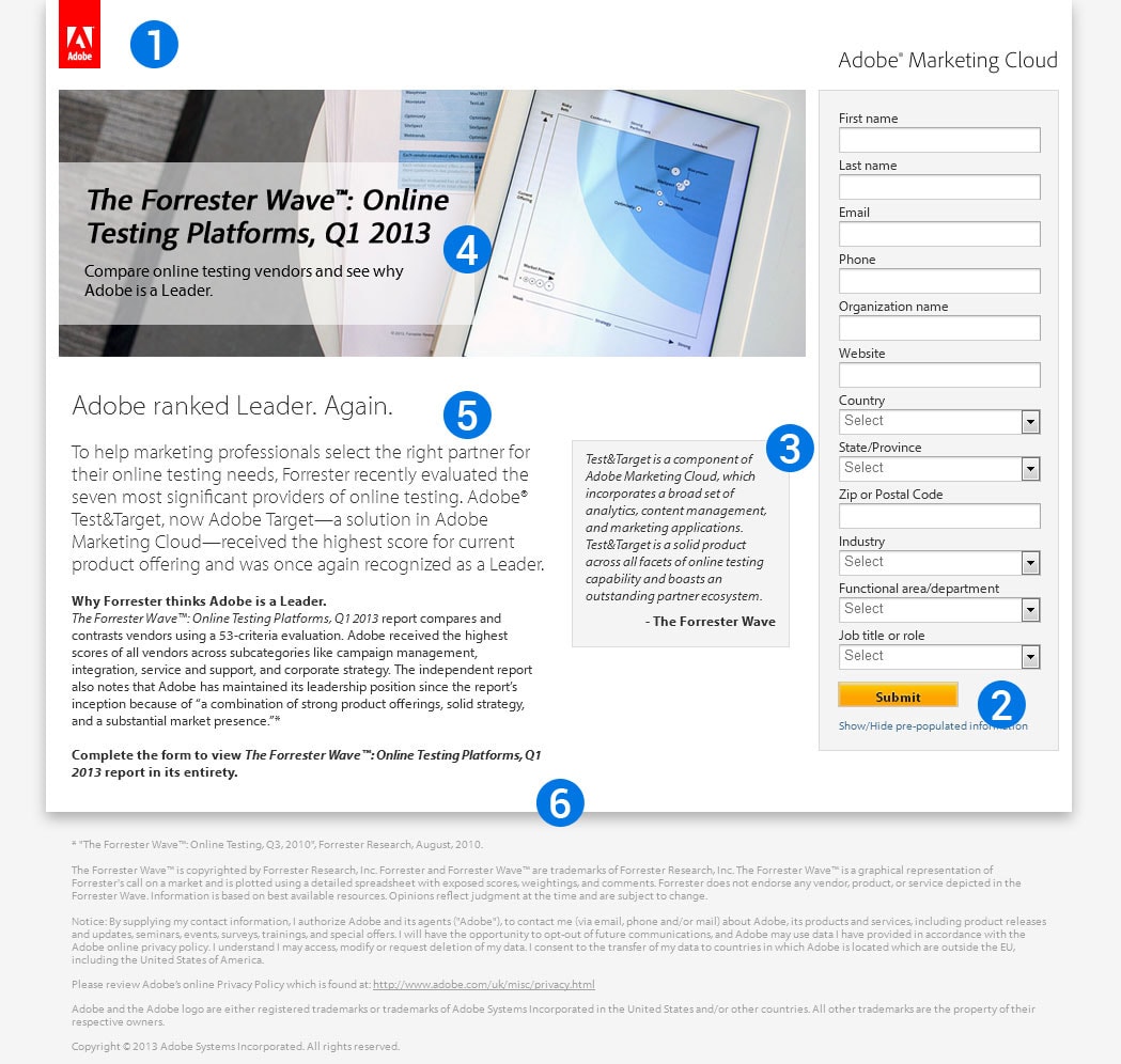
Adobe Marketing Cloud
1. Clean design with good color contrast
If it ain’t broke, then don’t fix it. Adobe doesn’t get fancy with their design cues, fonts or colors. The result is an easy to read page with good contrast and flow. Well done.
2. This form is a conversion KILLER
I’ll start with the amount of form fields in this form: keep it simple stupid! If all of these fields are really necessary (and I believe they aren’t) then test a two-step form that collects the basics at first and leads visitors though a funnel to collect extra information. This alone should boost the effectiveness of this page.
Also… “Submit” as your button? Get real, “submit” doesn’t add any value, therefore it doesn’t belong on your landing page.
3. Testimonial is in a great spot but…
This testimonial is in an effective spot but I feel that Adobe could use a shorter, punchier quote that would be more effective.
4. What kind of headline is this?
This is boring. It seems like the headline you’d see on a privacy policy, and it is horrible for cold traffic. There is no benefit statement at all and it doesn’t introduce me to the page. However the sub headline is better, so how about combining the two like this:
Discover Why Adobe Marketing Cloud’s Analytics Can Give Your Business The Insight It Needs
This headline combines the product name with it’s benefit to catch the visitor’s attention.
5. Great. Now what can you do for ME.
It’s all fine and dandy that you’re a leader. But who cares? Does your success mean that my business is going to run more smoothly? I want to hear about how you will help me. Rule #1 about selling: Make it about the customer.
6. Tell me what I get
This little text is the only place that tells me what I will get if I fill out the form. Adding supporting text to the form box itself (above the first name field) would be more effective, preventing the reader from having to read it all to ascribe value to what it says.
Overall this page needs a clear purpose. As a visitor I’ve arrived on this page and they start telling me how great they are. Instead they need to find a clear benefit that will make my life easier/better/faster/cleaner/more lucrative and focus on that.
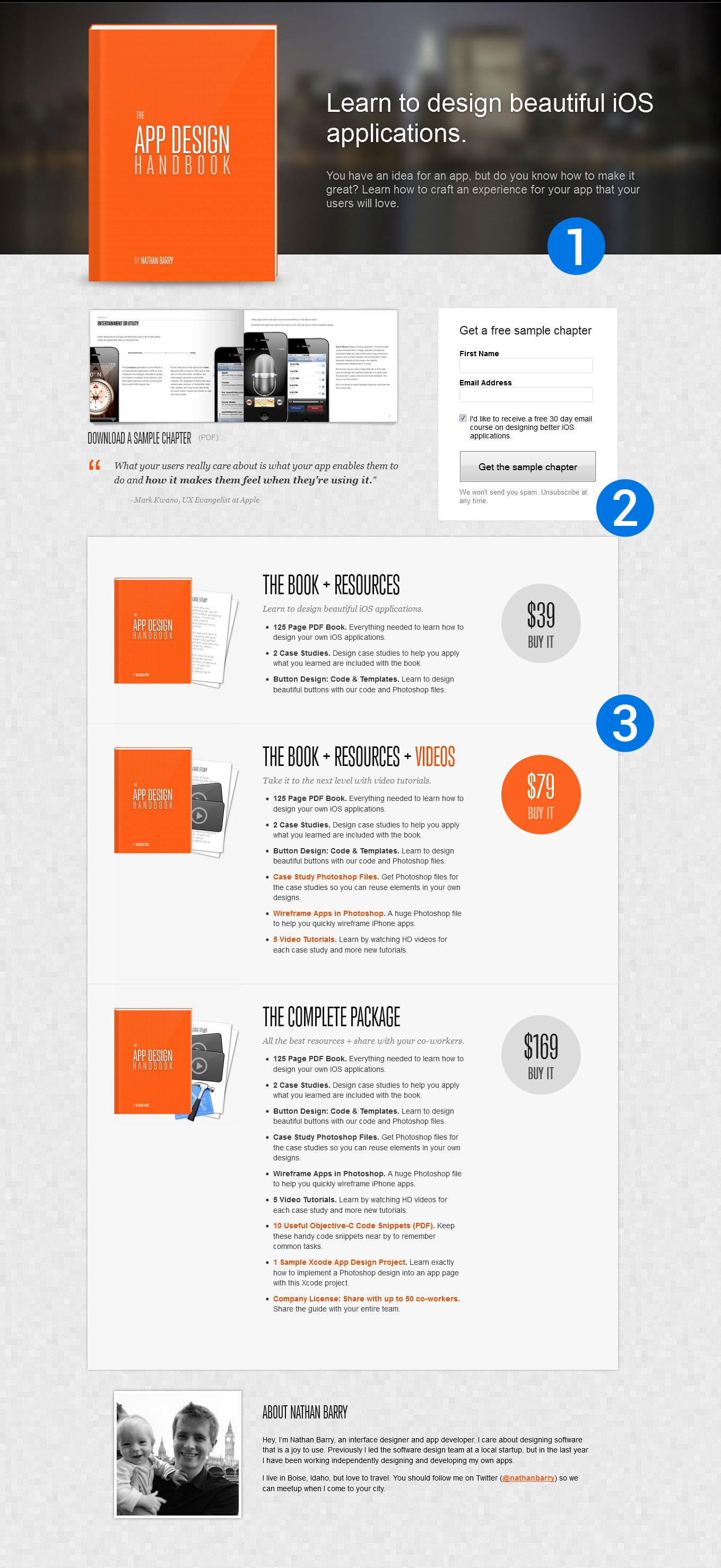
App design handbook
1. Fantastic Design
The page pops, it’s clean and the text contrast is ideal. All in all it’s easy to read and navigate through. The testimonial above the fold is powerful enough to push a visitor towards a conversion.
2. Nice, short form
This is the type of form that I like. Simple, easy to understand and just enough form fields to get me started. Well done. What I would test on this form is a more benefit driven headline. Try:
“Get a free sample chapter and design better apps”
3. Wait… what am I doing here again?
The only thing that bugs me about this page is a sense of purpose. Does this page want me to sign up for a free chapter, or buy the book? Visitors hate choices so why give them a choice? If you want to sell, then make this page about selling the book. My recommendation would be to give away the free chapter and then try to sell the book on the thank you page and through email marketing.
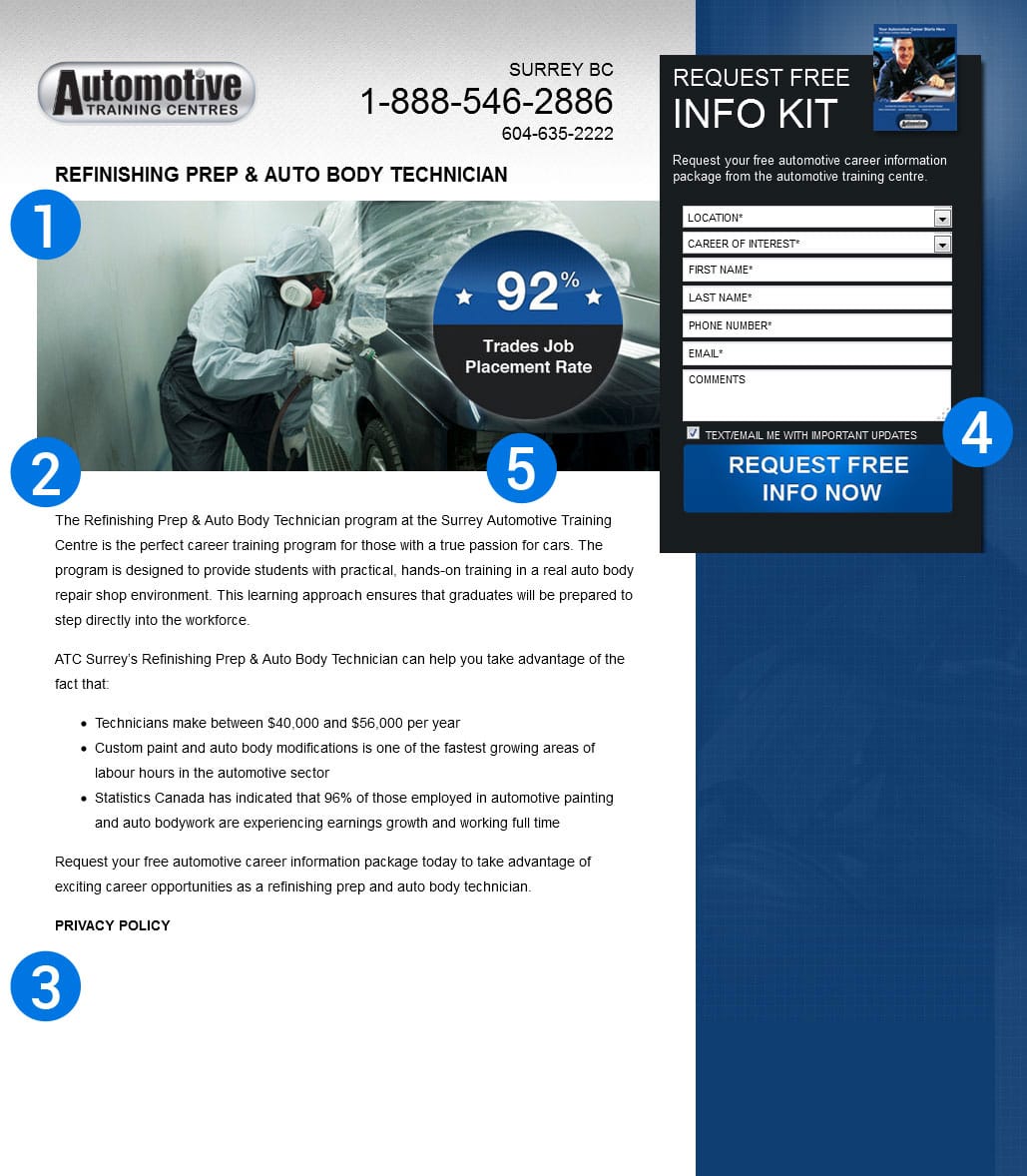
ATC School
1. Headlines headlines headlines
This headline is okay, but it could be improved by adding a simple “Become a …” at the start. Also a benefit driven sub-headline would serve the page better. Try something like this:
“Excel in a new, stable career with professional training from ATC”.
2. Large images need to be tested
Whenever you use images that are a large part of your landing page you need to test them very well. Certain images will be conversion monsters and others will perform horribly.
3. Where am I headed?
Turns out, this page is designed to convert me on their privacy policy… wait, huh? This link looks like a call to action. Either throw it under the form or in a footer, just don’t make it look like a goal.
4. You’re almost there!
This form is close, but it’s still too scrunched. I’d space out the fields more and add the labels above the fields instead of inside them. When you place the name inside the field the name disappears once clicked on, often resulting in visitors clicking outside again to remember what the label said.
AtTask
Oh boy, this is going to be fun…
1. Hello bounce rate!
You have just a few seconds to grab a visitor’s attention. All of which is entirely wasted with this page. I’m assuming the logos next to the headline are a mistake (please tell me they’re a mistake) but even if that were forgivable the headline is just rubbish. “Task Management Software” tells me nothing about what I’m doing here and what I’m going to do next. Let’s try something like this: “Manage your tasks effortlessly from one easy interface” or “Unchain yourself from the calendar and help your team get things DONE”.
2. Features are great but…
What do they do for me? What will universal compatibility do for my workflow? A small benefit below each feature would make them 10 times more powerful and connect with the problems that this software solves. Also, since when did Project Management become a feature?
3. Are all of these REALLY required?
Why is this form so long just to see a demo? This form needs 4 fields: Name, Company, Email, and Phone Number. A few lines of code can pull a country, and everything else can be found out by the sales rep who is obviously going to be contacting the lead for the demo.
4. Add insult to injury
As if this page wasn’t bad enough, there is that pesky “submit” button again. Lose it or be stuck in a rut of bad conversion rates for the rest of eternity.
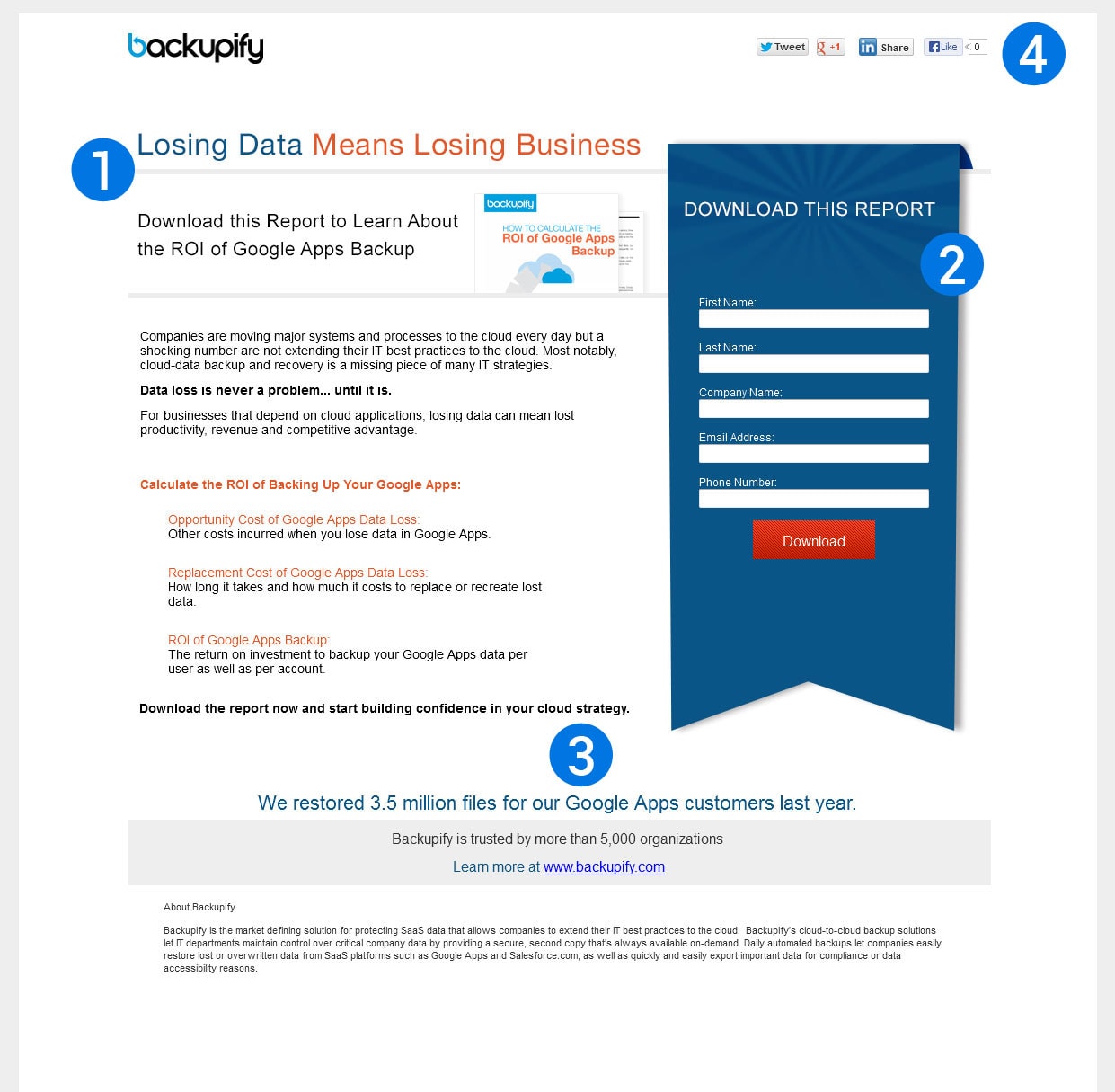
Backupify
1. Great headline
This is what I like to see. Not only is the headline clear, to the point and hits on emotional triggers, but backupify has used color contrast and encapsulation to emphasize the most important part of the page – the lead gen form… beautiful.
2. An opportunity missed
“Download this report” can easily be improved with a benefit statement. How about
Download the report and eliminate the threat of lost data
Fill out the short form below to get instant access
Speaking of “Short Forms”, this is not one of them. First/Last name can be consolidated at the very least, but I’m not even sure if company name is necessary.
The call to action is also in need of some work. How about “Download the report now and start building confidence in your cloud strategy”
3. These trust symbols are excellent
These trust statements at the bottom of the page do a good job of communicating the benefit of the solution and it’s ability to handle large amounts of data.
Overall this is a good landing page, but with a few tweaks it could be a great one.
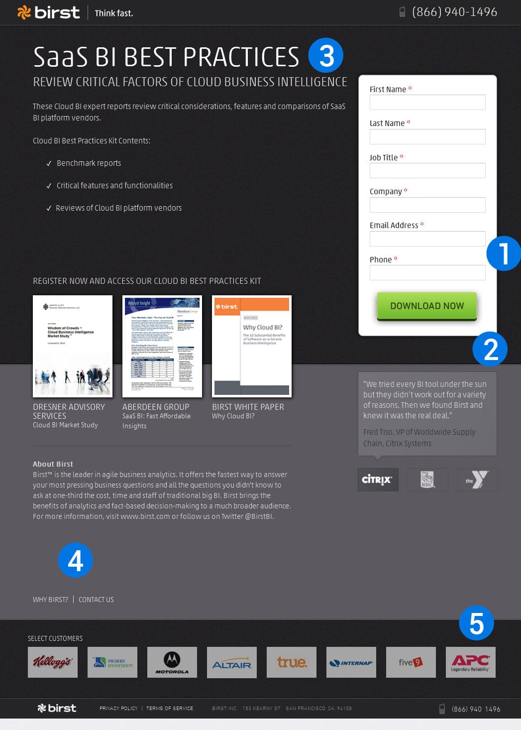
Birst
1. Possible conversion leaks
Again there is a good use of contrast and encapsulation for the form area, bringing your attention to the conversion goal of the page.
2. Assure me that I’m making the right choice
The CTA is a nice contrasting color but more of a benefit statement instead of “Download Now” might boost conversions. Something along the lines of:
Download Now
Improve Your Business Intelligence
The testimonial right below the call to action is a nice touch. This adds some social proof right before the conversion takes place, although it would be nicer if it stood out more and was directly connected to the form area – perhaps by also using a white background inside the testimonial bubble.
3. Possible confusion
People in this industry might understand the headline, but I would test a more explanatory headline against this one to see if they are losing any traffic to confusion.
4. Not so leaky links
Nice placement of the why Birst and contact us links at the bottom. Small enough not to cause leaks but still there in case someone wants more contact information
5. PS. We work with big brands
The recognizable brands at the bottom of the page are a nice anchor that adds additional credibility to the page.
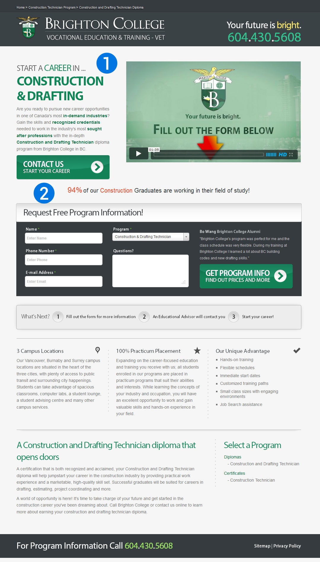
Brighton College
1. Colors make your eyes jump around unnecessarily
They are clearly trying to make the green elements stand out, but this does is throw the clarity of the page under the bus. Your eyes spend so much time jumping around that it’s super hard to get a grip on which order to read the information.
2. Why two calls to action?
Why not consolidate this page and avoid any confusion? Website visitors don’t like making choices. If these are the same action then make them say the same thing or eliminate one of them to create one definitive action.
Full Sail University
1. Help me see the headline
This headline isn’t bad, but the execution of it can be improved. Because there are so many elements on this page the headline needs more space to stand out. This will make sure that visitors read it first and want to continue reading.
2. “Free Information” has no value
Free is no longer a selling feature of information. Give me a reason why your information is worth MY time. How about this:
Start a fast paced career in animation. Enter your information below for program information.
Or you could also use some urgency
Space is limited. Fill out the form below to receive upcoming program information.
3. Submit again? I should start a petition or something
Submit: Not Even Once.
4. TEST TEST TEST
If you’re going to use an image that is as big and bold as this one you really need to test it thoroughly. I especially think this one could be improved by brightening the eyes because eyes (even on a computer screen) will create a lot of connection.
5. Great amount of information
Good use of bullet points and organization of information.
HRtrack
1. These don’t belong here
Stock photos don’t add value to a landing page. Lose them and find something that will actually connect with your visitors. Real photos work, but nothing at all would also work better.
2. What the hell is going on here?
I count 5 calls to action on the page. What does this page want me to be doing? A selection between a free and paid version is fine, but consolidate it into ONE choice instead of a confusing mess of CTAs all over the page. This page needs simplicity and clarity.
3. I’m mad as hell and I’m not going to take it any more
“Submit” I think you get the point.
Also, the form header needs to specify the benefit of form completion, something like this would add clarity:
Download the HRtrack software and start managing your employee information now
Leadbolt
1. Where am I?
Where is the logo? Seems like a lost branding opportunity.
2. I’ve lost my head…line
This is a strange place for the headline. It should be above the video and the first thing that people see. Your headline is the reason why a visitor wants to view the video. Some grumpy looking guy is not going to get a lot of video plays all by himself.
3. Back to basics
I would test a new form with white form fields against this one and a better call to action. T
4. Great call to action link
This is a great way to get visitors to go back to your sign up form. I would also insert one at the bottom of the page.
5. Ad Units take up a lot of space
Does anyone else know what an Ad Unit is?
Magento
Now here’s a landing page! Finally something I can’t gripe too much about. However, there are some things I would test to try and make this page even better.
1. Who’s Dave?
I’d put the name and role right next to Dave’s head so people immediately see how their enterprise software is related to a big company.
2. Don’t make me think
This headline is not bad, but I think for extra clarity, there could be a tagline next to the logo that quickly explains what Magento do.
3. This form is gorgeous
Save this form right now and use it as inspiration in your future landing pages. It ties in a short, well-organized form with good copy, a bright call to action, and even a subtle arrow to point you in the right direction. Sublime.
4. Don’t be redundant
The company name here is redundant. Use this space more effectively by drawing the reader into the first paragraph. I would drop the company name and instead use A complete eCommerce solution for businesses
5. Features and benefits galore!
These features connect with the reader and are very effective at getting across the benefits of the product. Well done!
Netsuite
Oy, where to begin…. this page is stuck in 2004 and needs a complete overhaul. The copy is all over the place and there is no clear direction of where you’re supposed to read. Clean up the layout and have a progression in your copy to lead the visitor through a thought process. Let’s at least talk about WHY these elements are so bad.
1. Sad looking headline
This headline at least tells me what what I’m about to click away from. The headline doesn’t say a thing about me and my business. There needs to be a connection between the site and the visitor. Why not start right away with the benefits of this software?
The one accounting solution that can lower your IT costs and improve productivity
2. Am I being punked?
Are these testimonials supposed to grab my attention? They’re not even all the same color. Hard to read and floating in space, these testimonials need to have contrast, readability and be a part of the page.
3. Finally copywriting
These bullet points seem to be the only part that has been written by a copywriter and are the only saving grace of this page.
4. Too bad this won’t be seen
The call to action section isn’t half bad either, but it’s a shame that the rest of the page is so bad and has so many areas of the same color as the button.
PS. The copyright in the bottom says 2010… get some dynamic scripts!
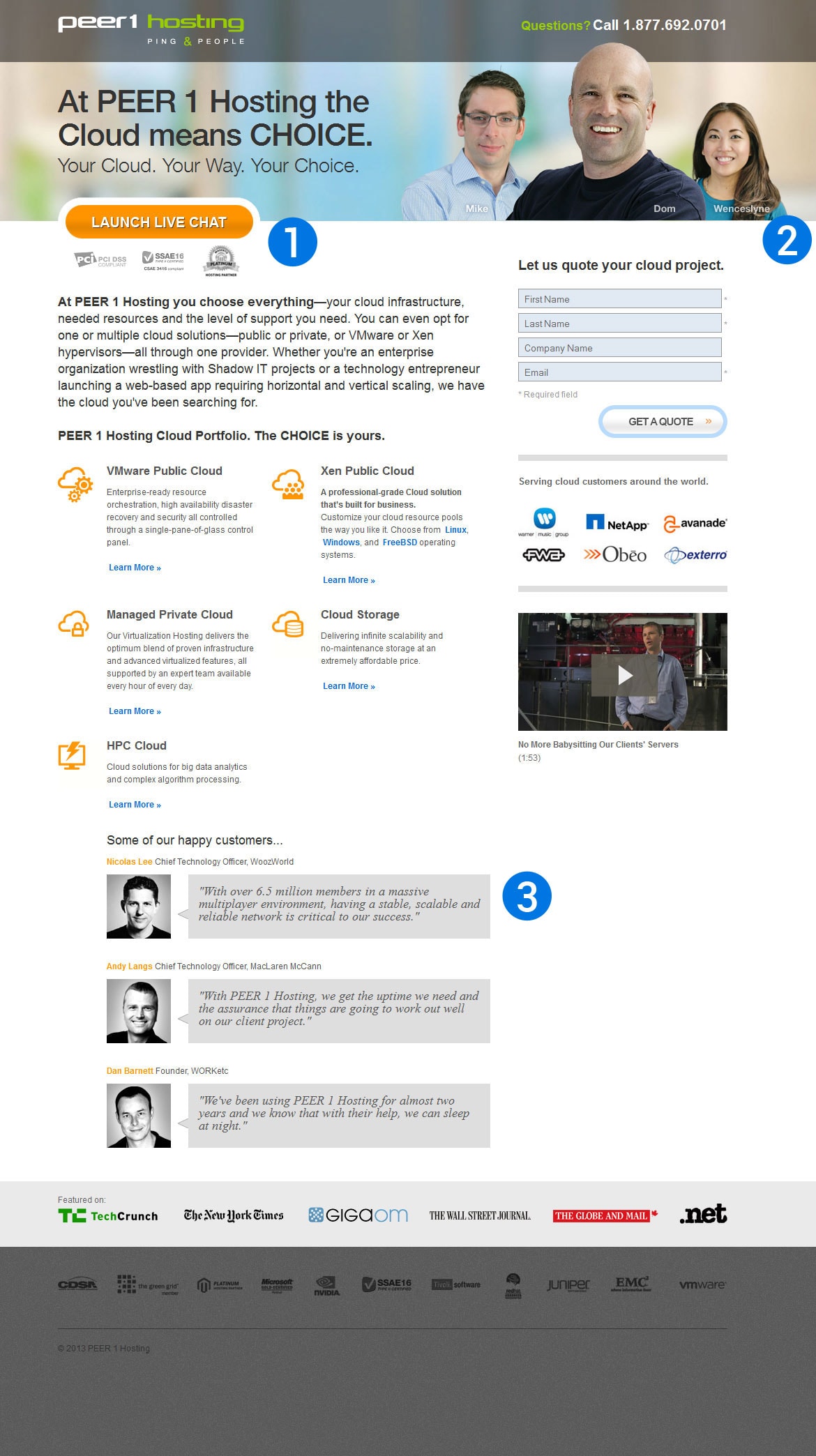
Peer1 Hosting
1. What is the goal on this page?
It’s hard to tell without looking at user data, but I think this page should decide to do either live chat or a quote. Right now the two calls to action conflict. Testing needs to be done not to just determine how many quotes/live chats you get, but more importantly sales.
2. Who are you?
TEST your images. I’m not sure who Dom, Mike and Wenceslyne are. Are they customer support people? Customers? Stock photos? If they are real employees then be proud of them and show it. This will create a connection with your visitors that will be stronger than just listing their names.
3. Nice testimonials but…
Were your testimonials all done by the same photographer in the same studio? This may look good to your design team, but it also looks kinda fishy. I would make them more real and push one of them above the fold.
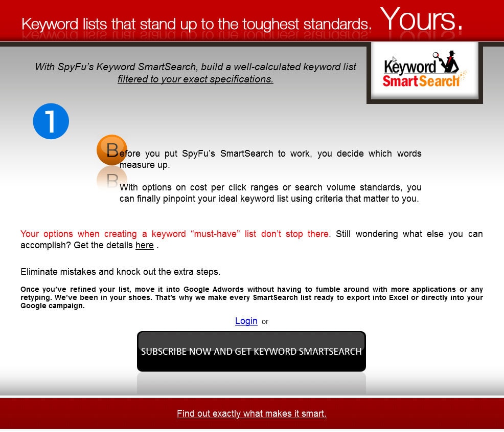
Spyfu
1. The only number that’s needed
This page is garbage. It looks bad and it reads bad. It’s like a bad joke from before css was invented. Scrap it all and build a new page. The only piece of copy that I would keep is this line:
With SpyFu’s Keyword SmartSearch, build a well-calculated keyword list filtered to our exact specifications.
If this page was made in the last 4 years you need to find a new designer.
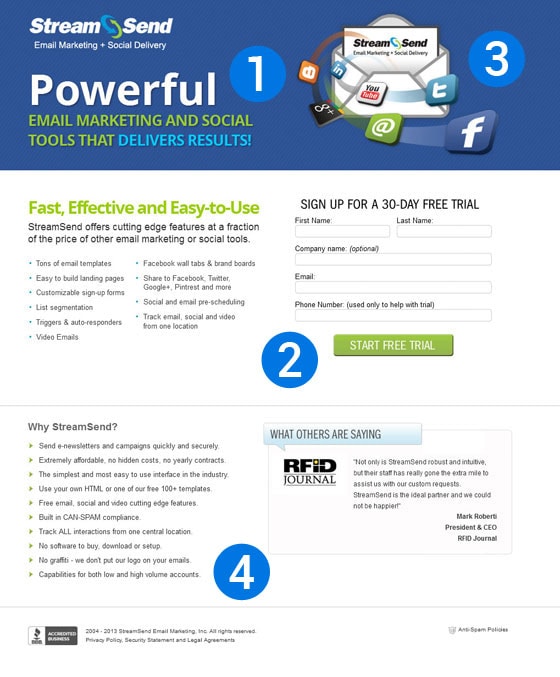
Stream Send
1. A “Powerful” headline?
What’s powerful? Come on people. Change the first line of the headline to say “Powerful Email Marketing”.
2. Punch up the form
This form could grab a lot more attention if it was given a little facelift. Even putting the form inside a contrasting background color would draw your eye. Adding a benefit to the call to action would be a nice addition that would be a worthy test. Something like this:
START FREE TRIAL
Send your first email in just 5 minutes
3. Always Be Testing
Test bold visuals like the one in the top right. You never know what will create a strong connection with your visitors.
4. Someone has a bullet point problem
Ok, so it’s not really a problem with this page, but there are a TON of bullet points (20 to be exact) and no paragraphs. People like real sentences too sometimes.
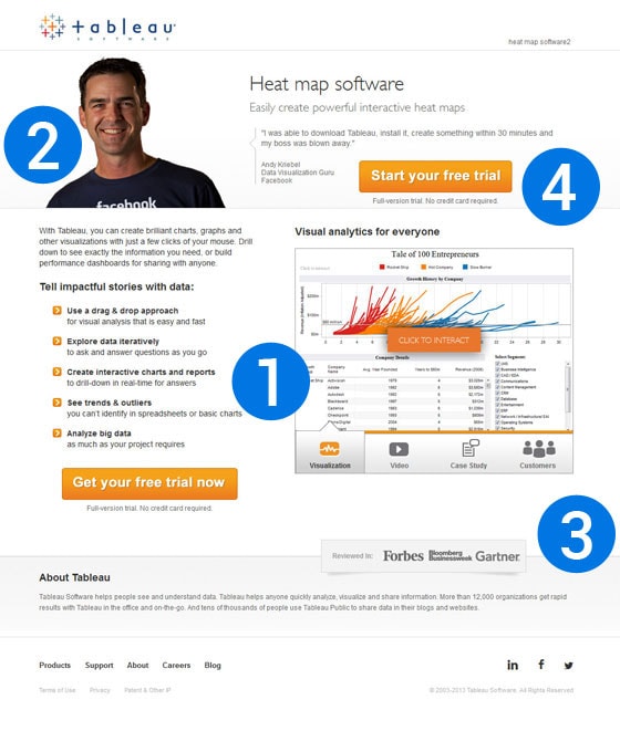
Tableau
1. Get your story straight
So you’re selling me “heat map software” but you’re showing me a graph? One of these things is not like the other my friend. Make your images relevant to your headlines and you’ll see your conversions go up.
2. Test your subtle name dropping
If you are trying to convey that Facebook is a customer, then show the whole logo! Really? Why would you risk people missing this? You have a perfect opportunity to entice interest here.
3. Clean footer
I like the footer of this page. It gives some additional company information and some social proof if needed.
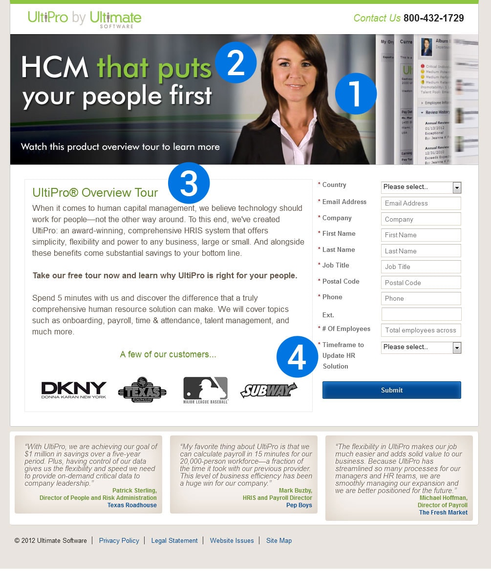
Ultipro
1. Just because you can…
… doesn’t mean you should. Cheap stock photos look nice to your hippos but don’t add a lick of value to your landing pages. Pull the stock photo and replace it with a relevant product image or a real person.
2. Don’t make me feel stupid
I’m guessing most HR professionals will know what HCM is, but why risk it? Replace this headline with something simpler and benefit based. Try this:
Flexible Human Capital Management For Businesses Large & Small
3. What does this mean?
Wait, so the “overview tour” is really just a couple of paragraphs? That can’t be right, the copy talks about taking a free tour now to learn about UltiPro… but where is the tour? Am I missing something?
No, the copywriter missed something. The entire point of the page! There isn’t a single part of this page that tells me to fill in the form for the “tour”. This page is basically an introduction to the product with a form floating around on the right hand side. Conversion prognosis: NEGATIVE.
4. This form is all wrong
The design of this page is alright, but in their rush to make things look good they completely forgot about the point of the page: get people to sign up. .
My solution: Give the form a headline:
Discover how UltiPro can improve your company’s workflow right now. Fill in the form below for instant access to our 5-minute product tour:
Then get your form down to 3 or 4 fields (Name, Email, Phone #, Company).
And finish it off with a really kick ass call to action because if I see another “Submit” button I’m going to need a whiskey:
Take me to the UltiPro tour
There it is, 17 roasted and toasted landing pages and how to improve them. Have any other ideas for the landing pages in this post? Let me know in the comments below. See you there!
