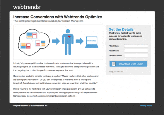
Today’s landing page example comes from WebTrends.com, a web analytics company. It’s a great demonstration of how to make B2B lead capture simple and clean.
Type of Landing Page: Lead Gen
Source: WebTrends.com
Built Using Unbounce: No
Landing Pages Elements
- Infographic: Visual aids on a landing page are “worth a thousand words” and can improve understanding among the attention-challenged internet generation. In this instance I’m not sure I completely get what it’s trying to demonstrate, but the intent is good, and stylistically it captured my attention.
- Directional cues: The arrows in the diagram are used to show the flow of information within the infographic. But they also have the subtle effect of pointing at the primary action area – the lead gen form.
- Lead gen form: The form is encapsulated in a separate area from the content and is placed on the right hand side of the page – which has been shown in some tests to be the best location (presumably to do with western reading direction).
Why I Like It
| Thumbs Up | Reason |
| Descriptive CTA | The form button describes exactly what you’ll get when you click it. (A data sheet). |
| Drop dead simple | There’s a value proposition, graphic, supporting text and a form. Absolutely no confusion about what you’re supposed to do. |
| Focused design | The dark background focuses your attention on the information – sort of like looking through a camera. |
Final Thoughts
I would prefer to leave the form CTA button as the only thing that is shown in blue – simply to amplify its attention as the only interactive component (aside from the privacy link) – but that’s a very minor point unlikely to have an impact on conversion with a page this simple.

