Got a mobile app you want to sell? Then listen up. We just created a new set of mobile app templates – currently for iPhone and Android apps – and to make sure we got them right, we collaborated with a team of world class mobile “appsperts” (that’s app and experts rolled into one). Namely,
 Ken Yarmosh
Ken literally wrote the book on mobile app development App Savvy a #1 mobile book on Amazon and a must read for anyone wanting to create mobile apps.
 Jen Gordon
Jen is an extraordinary mobile app designer and the creator of Tapptics.com which houses a huge collection of mobile training and design resources.
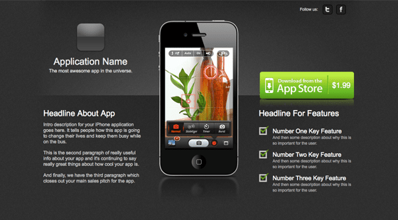
To help explain how we arrived at the final template designs, I’ll walk you though the architecture and design of 10 important elements of a successful mobile app landing page and how they can impact your conversion rate.
1. Use a sexy design – mobile is sexy!
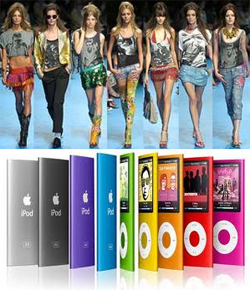
Apps are new. Apps are cool. Apps are sexy. iPhones are sexy. iPads are sexy.
These are the Androids you’re looking for.
Given that the brands that manufacture these devices exude professional, modern design, you’d be crazy not to follow suit and use a sexy landing page for your apps. Or in other, less eloquent, words…
You wouldn’t dress a supermodel in dirty underwear, so don’t wrap your app in crap.
Sex sells. Sex also sells apps. Just check out the use of the beautiful and talented Lisa Bettany on the Camera+ app landing page.
2. Show an image of the device
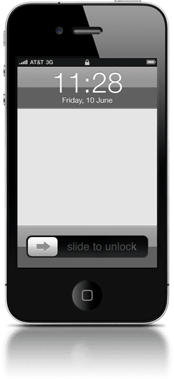 Showing the device (iPhone, iPad, Android phone etc.) front and center establishes the first of two levels of context of use – instantly reinforcing that you’re looking at a page about (in this instance) something for your iPhone.
You can then include a screenshot or video inside the viewing area of the image to illustrate how it will look while being used.
3. Use bullets to shoot key features into the buyer’s mind
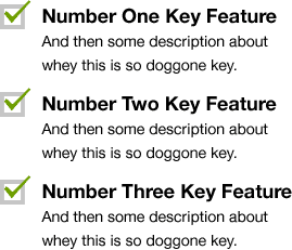 Reading reams of text is tiresome, so break down the most important features of your app into a few simple bullet points, and place them at the top.
This lets your visitors get a feel for the app’s purpose (and whether or not it solves their problem) in the first few seconds of their visit. By saving the detailed information for a section further down the page, you allow them to consume at their own pace.
4. Use a video to demo your app
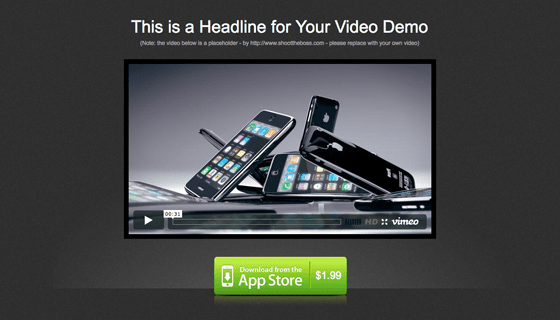
This is where we take context of use to the next level – actually showing the app being used for real. The goal of “context of use” is to illustrate the benefits of your product. In the example below you get to see exactly what the app does, and the benefits it can bring to your life, playtime or whatever purpose the app serves. Using video on your landing page has been shown to improve conversion rates by as much as 80%.
Watch the video below for a great example:
5. Social permalinks for verifiable social proof
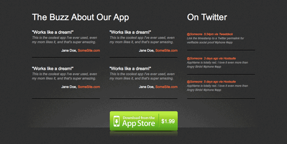
We all know that word of mouth (WOM) is the single strongest marketing mechanism, so use testimonials and you’re conversion rate will increase right? Not always. The problem with most testimonials is you can’t tell if they’ve been made up or not. Social permalinks remove this doubt and allow you to show verifiable social proof to your potential customers.
Twitter is a great place to find short and honest testimonials. But instead of just showing a quote with a link to the person who is praising you (which is of little use as the comment has long since passed through the stream), what you want to do is reference the permalink of the quote! It’s pure magical pixie dust.
Twitter maintains a permanent repository of every tweet made – each with it’s own individual page – giving you a way to prove that the people behind the quotes are in fact real.
How to find a Twitter testimonial permalink
Let’s walk through a quick example based on a tweet that appeared on the @Unbounce stream:
NaomiNiles 5:28pm via TweetDeck

@unbounce is the awesome. Set up a landing page this weekend in like
If you click on the timestamp you’ll arrive at the permalink page, which looks something like this:
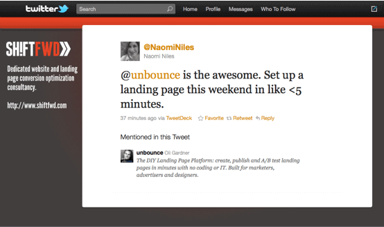
Not only does this provide real social proof, but it gives a little bit of exposure to the source of the testimonial (in this case Naomi Niles, who has a nice Twitter background with her branding and website address). This acts as a nice way of giving some love back to those who are saying nice stuff about you.
6. Screenshots of your best features
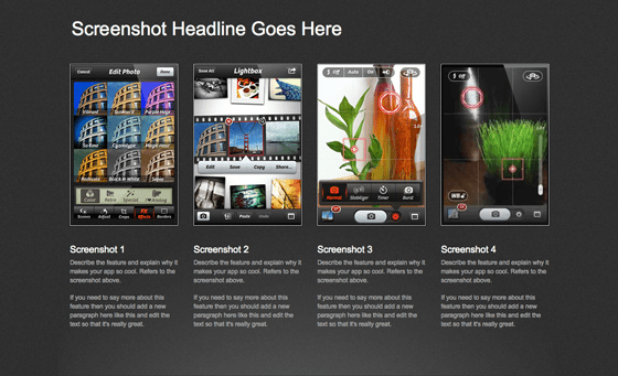
This is an extension of point 3. Take each of your best features and provide a thorough description and a screenshot to demonstrate it visually. Apple do a great job of laying out their feature design pages. Check out the iPad features page for some inspiration.
7. Easy access to customer support
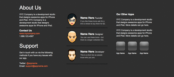
Good customer service and support is essential regardless of the low price of most mobile apps. Make a point of providing a few different contact methods on your landing page: phone, email, contact form, Twitter and Facebook are all viable mediums for engagement. If you want to get really personal, you can embed a live chat widget on your page.
Benefits of including support mechanisms on your page are:
- Word of mouth marketing: Providing stellar support creates a positive experience turning customers into ambassadors.
- Cross-sell & up-sell: Customers returning to your page for contact info can be exposed to other apps that you’ve created.
- Sphere of interaction: Asking customers to follow you on Twitter and Facebook enables you to communicate with them on an ongoing basis, with feature updates, new versions and other apps.
You should also consider adding a personal touch by including mugshots of the app development team – or if you have a face made for radio, a cute avatar will suffice :)
8. Embrace the new rules of long page design
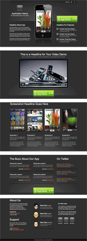 Long single page landing pages are cool again, but in a much different way to the old-school sales letter style (you know the ones I mean – the get rich quick pages with about 2,000 words of aggressive sales vocabulary and a million fake testimonials).
Learn to chunk information
A commonly emerging technique is for design and information architecture rules to take what would previously have been a four or five page site, and splitting it into chunks of content all on a single page.
Try to think in terms of page sections as opposed to pages – where each page section (or chunk) – represents what would have previously been an entire page.
Each chunk represents a piece of your overall product story.
To create a long page successfully, you should use clear headlines for each section, insert visual dividers to break up the content, and most importantly of all, repeat your call to action (CTA) throughout the page.
Which is a perfect segue into my next point…
9. Repeating your CTA – you never know which chunk will trigger the buying impulse
As I mentioned above, on a long page, you need to repeat your CTA. This is for a couple of reasons: it makes it easier to find (you don’t have to scroll all the way back to the top) and it keeps your point of conversion within your customer’s line of sight.
Because your page is now nicely chunked (if you’re paying attention), there will be page sections for all, or most of, the following:
- App description
- Demo video
- Feature list
- Feature photos
- Testimonials
- Contact details
- Other apps
There is some complex psychology involved in the simple act of buying a cheap app, meaning that the impulse to buy could be triggered at any of these points. If your CTA is right there when the purse strings start to loosen, it stands to reason that you’ll get more clicks.
10. Showcase your other apps
I normally advise against adding distraction to your page that may lead people away, but if it’s done in a subtle way it can help your chances of a conversion by demonstrating that you’re not a one trick pony. It can also cause a reaction like “Oh these guys made that app too! cool, now I’m definitely going to buy it, they know what they are doing.”
My advice would be to stick them at the bottom so they are more of a subtle nudge rather than a navigable distraction.
The Final Mobile App Templates
The templates we created can be seen below and in our gallery of landing page templates. We’ve started with a light and dark version of iPhone and Android templates. The designer, Jen Gordon, wrote a piece about how she came up with the designs which you can read over on the Tapptics blog. Ken Yarmosh also put together a blog post with some of his mobile app theory on the concepts that led to our decisions in layout and information architecture.
(Click the images for a live demo).
Got a mobile app you need to sell online?
If you’re tired of your apps getting lost amidst the enormity of the app store (which is also full of competitors), then you should build your own landing page to showcase your apps and start driving traffic there. That way you can cultivate visitors that want to buy your app before they get to the store.
Give our app templates a try with a free Unbounce account
And if you can think of anything we’ve missed from the templates, please let us know in the comments below.


